Are you looking to add a form in WordPress? Adding a form to your WordPress website is a great way to collect information from your visitors, whether it’s for contact inquiries, newsletter signups, or feedback.
With the Form block from Nexter Blocks, you can add a fully customizable form to any page in the WordPress Block editor.
Required Setup
- Make sure the default WordPress Block editor is active.
- You need to have the Nexter Blocks plugin installed and activated.
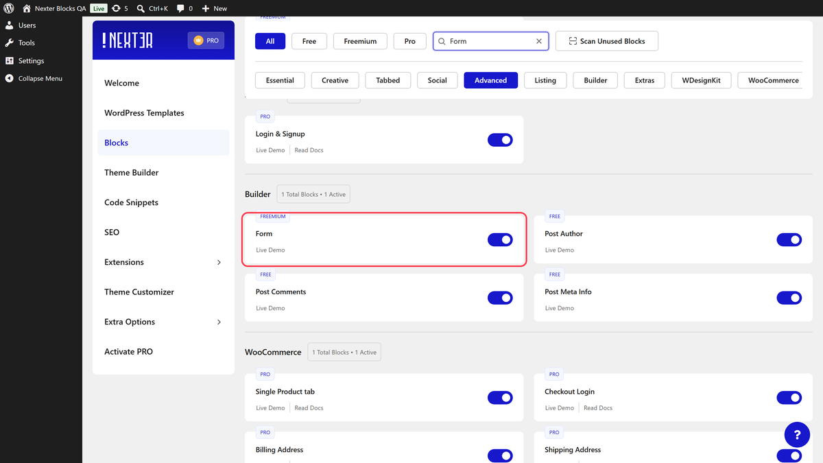
- Make sure the Form block is activated. To verify this, visit Nexter → Blocks and search for Form and activate.
- This is a Freemium block. To unlock extra features, you need the PRO version of Nexter Blocks.
Learn via Video Tutorial
How to activate the Form Block?
Go to
- Nexter → Blocks
- Search the block name and turn on the toggle.

Key Features
- Two Form Types – You can select from two form types, Simple Contact Form or Newsletter Form.
- Database Entry (Pro) – Store form submission entries in the dashboard.
- Google reCAPTCHA (pro) – You can add Google reCAPTCHA to WordPress Form.
- Cloudflare CAPTCHA (pro) – You can add Cloudflare Turnstile CAPTCHA to WordPress Form.
- Custom Email – Customize the email confirmation.
- Custom User Email (Pro) – Customize the email confirmation sent to the user.
- Redirect – You can redirect users from the form.
- ActiveCampaign (pro) – You can add users to ActiveCampaign from a WordPress form.
- Brevo (pro) – You can add users to Brevo from a WordPress form.
- ConvertKit (pro) – You can add users to Kit (formerly ConvertKit) from a WordPress form.
- GetResponse (pro) – You can add users to GetResponse from a WordPress form.
- Mailchimp (pro) – You can add users to Mailchimp from a WordPress form.
- MailerLite (pro) – You can add users to MailerLite from a WordPress form.
- Drip (pro) – You can add users to Drip from a WordPress form.
- Slack (pro) – You can send a message to a Slack channel from a WordPress form.
- Discord (pro) – You can send a message to a Discord server from a WordPress form.
- WebHook (pro) – You can send data to a Zapier Zap from a WordPress form.
How to Use the Form Block?
Add the Form block to the page.
Click the Design from Scratch button to design the layout from scratch.

Note: By clicking on the Import Pre-Designed Template button, you can import a preset template and customize it as per your requirements.
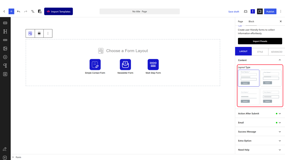
Then you have to select the form type from the editor. Here you’ll find two options –
- Simple Contact Form – This will create a simple contact form.
- Newsletter Form – This will create a newsletter form.

Let’s select Simple Contact Form here.
Note: You can customize both form types to create different types of forms.
Content
From the Layout Type (Freemium) section, select a predefined style.

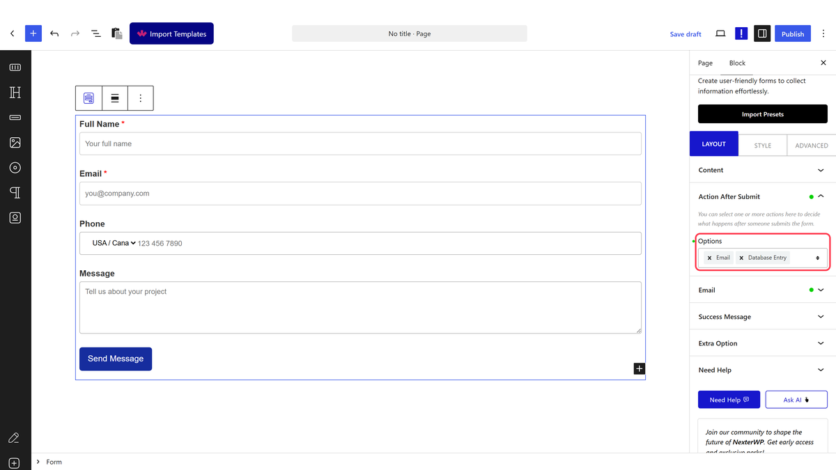
Action After Submit
From the Options dropdown, you can select the action after form submission. Here you’ll find the following options –
- Database Entry (pro) – To add form entries in the WordPress dashboard.
- Email – To send email confirmation.
- Auto Respond Email (pro) – To send email confirmation to the user.
- Redirect – To redirect the user after form submission.
- ActiveCampaign (pro) – To add users to ActiveCampaign from a WordPress form.
- Brevo (pro) – To add users to Brevo from a WordPress form.
- ConvertKit (pro) – To add users to Kit (formerly ConvertKit) from a WordPress form.
- GetResponse (pro) – To add users to GetResponse from a WordPress form.
- Mailchimp (pro) – To add users to Mailchimp from a WordPress form.
- MailerLite (pro) – To add users to MailerLite from a WordPress form.
- Drip (pro) – To add users to Drip from a WordPress form.
- Slack (pro) – To send a message to a Slack channel from a WordPress form.
- Discord (pro) – To send a message to a Discord server from a WordPress form.
- WebHook (pro) – To send data to a Zapier Zap from a WordPress form.
For each action, you’ll find additional options. So select the actions as per your requirements.
Success Message
In the Success Message field, customize the message shown when a form is submitted successfully. Use this to confirm receipt of the submission or direct the user to the next step.

Extra Options
In the Form ID field, add a unique ID to the form. This is useful when you have multiple forms on the same page or need to target a specific form with custom CSS or JavaScript.

Note: Make sure the form ID is unique and not used anywhere else on the site.
Edit the Form Fields
To edit a form field, click on the field in the editor.
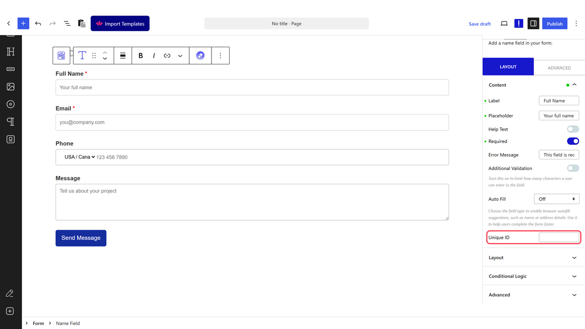
For instance, let’s select the First Name field, i.e., the Name Field.
Content
Edit the field label directly in the editor, or use the Label field in the settings panel.
In the Placeholder field, add placeholder text to guide users on what to enter.
Enable the Help Text toggle to add a description below the field. Use this when a field needs extra context, such as accepted date formats or character limits.
Enable the Required toggle to make the field mandatory. When enabled, set the error message displayed when the user submits the form without filling in this field.
From the Additional Validation toggle, limit the number of characters a user can enter in the field.
From the Auto Fill dropdown, select the type of value to pre-fill in the field. In the frontend, that value will appear in the field automatically.
Then in the Unique ID field, you can assign a custom identifier to each form field. This ensures the field’s data is mapped correctly when sent through a webhook. You can also match these IDs with your CRM or other integrations for seamless data transfer.
Layout
From the Icon Type section, add an icon or image to the field.
Adjust the field width from the Field Width section for different device sizes.
You’ll find similar options in most of the form fields.
You can click on the + icon to add a form field, You’ll find the following fields –
- Name Field – To add a text field.
- Email Address – To add an email field.
- Phone Number (pro) – To add a phone number field.
- Message – To add a text area.
- Submit – To add a submit button.
- Dropdown – To add a dropdown option.
- Radio Button – To add a radio button.
- Checkbox – To add a checkbox.
- Numeric Input – To add a number field.
- Pick a Date (pro) – To add a date picker.
- Agree to Terms (pro) – To add an acceptance checkbox.
- Website URL (pro) – To add a URL field.
- Hidden Field (pro) – To add a hidden field, which can pass values to integrations without displaying them to the user.
- Security Code (pro) – To add security to the form. You can add Honeypot, Google reCAPTCHA, and Cloudflare.
Note: In the Dropdown, Radio Button and Checkbox fields, for each option, you’ll find two fields. In the first field, you have to add the label name and in the second field, you can add a custom value or keep the label name as the default value.
How to Style the Form Block?
To style the Form block, go to the Style tab.
Label – Controls the style of the field labels.

Input – Controls the style of the input fields.
Checkbox/Radio – You’ll see this option only if you’ve added checkbox or radio buttons. From here, you can style the checkboxes and radio buttons.
Button – Controls the style of the submit button.
Dropdown – You’ll see this option only if you’ve added a select field. From here, you can style the dropdown field.
Success – Controls the style of the success message.
Advanced options are shared across all Nexter Blocks. You can explore all their options from the Advanced tab documentation.