Skip to content

How to Add a Popup in WordPress?

Key Takeaways

  • Nexter Blocks Popup Builder works in the WordPress Block editor (Gutenberg) and creates popups from patterns, block content, or shortcodes without leaving the editor.
  • Popup Builder offers five popup types: Standard, Slide, Push Content, Slide Along Content, and Corner Box, each with different layout uses such as lead capture forms, off-canvas mobile menus, filter panels, and cookie notices.
  • Popup Builder supports three trigger types, Button, Icon, and Hidden, plus display conditions like On Page Load, On Scroll, Exit Intent, After Inactivity, and Arriving From Specific URL.
  • Popup Builder includes Extra Options and Style tab controls for popup loading animations, Esc key close, outer click close, fixed toggle button positioning, padding, background color, close icon styling, and content scrolling bar styling.
Table of Contents

WordPress popups are one of the fastest ways to move visitors toward a specific action, whether that is a newsletter signup, a limited-time offer, a lead magnet download, or a sales checkout. A well-timed popup pulls attention without asking the visitor to leave the page they are on.

But how do you create a WordPress popup without adding a heavy standalone plugin?

The Popup Builder block from Nexter Blocks is built specifically for the WordPress Block editor (Gutenberg), and it lets you design dynamic popups from patterns, block content, or shortcodes, all without leaving the editor.

Required Setup

  • Make sure the default WordPress Block editor is active. 
  • You need to have the Nexter Blocks plugin installed and activated.
  • This is a premium block, you need the PRO version of the Nexter Blocks.
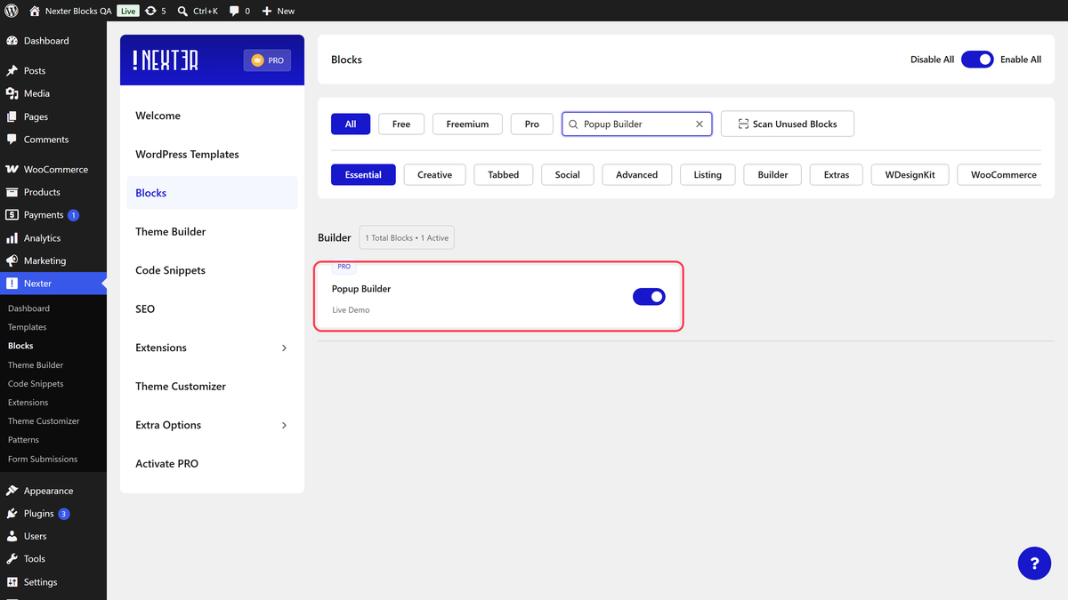
  • Make sure the Popup Builder block is activated, to verify this visit Nexter → Blocks → and Search for Popup Builder and activate.

Learn via Video Tutorial:

Youtube video

How to activate the Popup Builder/Off Canvas Block?

Go to 

  • Nexter Blocks
  • Search the block name and turn on the toggle.

Key Features

  • Create different types of popups – Build Standard, Slide, Push Content, Slide Along Content, and Corner Box popups from a single block, so you can match the popup style to the campaign.
  • Multiple ways to add content – Add content through a saved Pattern, inline block content, the editor, or a shortcode, whichever fits the popup layout you have in mind.
  • Multiple popup trigger elements – Use a button, an icon, or a hidden trigger for scenarios where the popup should open automatically without a visible control.
  • Different ways to close the popup – Choose from Esc key, outside click, or a styled close icon. See how to close a popup with Esc or clicking outside for the full setup.
  • Fixed Toggle Button – Pin the popup trigger to any position on the page. See how to show a popup from a specific URL.
  • Show Menu Scroll Offset – Reveal the trigger only after the visitor has scrolled a set distance. See popup after page scroll in WordPress.
  • Multiple display conditions – Combine trigger and timing rules to make the popup dynamic based on visitor behavior.

How to add content in the WordPress Popup Builder?

Add the Popup Builder block on the page.

Content

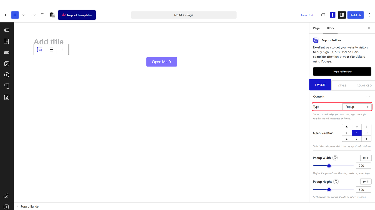
Choose the type of popup you want to use from the Type dropdown.

Under this, you will find five popup types.

  • Popup – For creating a standard centered popup, best for hero calls to action and lead capture forms.
  • Slide – For creating a sliding popup that enters from the side of the screen. This is the option to use when building an off-canvas popup menu for mobile navigation.
  • Push Content – In this type, the popup pushes the page content aside while opening and closing, which works well for filter panels and shopping cart drawers.
  • Slide Along Content – This option slides the content along with the popup, creating a similar effect to Push Content but with a smoother transition on longer pages.
  • Corner Box – For creating small popups pinned to the corner of the page, useful for chat prompts, coupon nudges, and cookie notices.

Depending on the popup type you pick, the block shows relevant settings for open direction, size, and position.

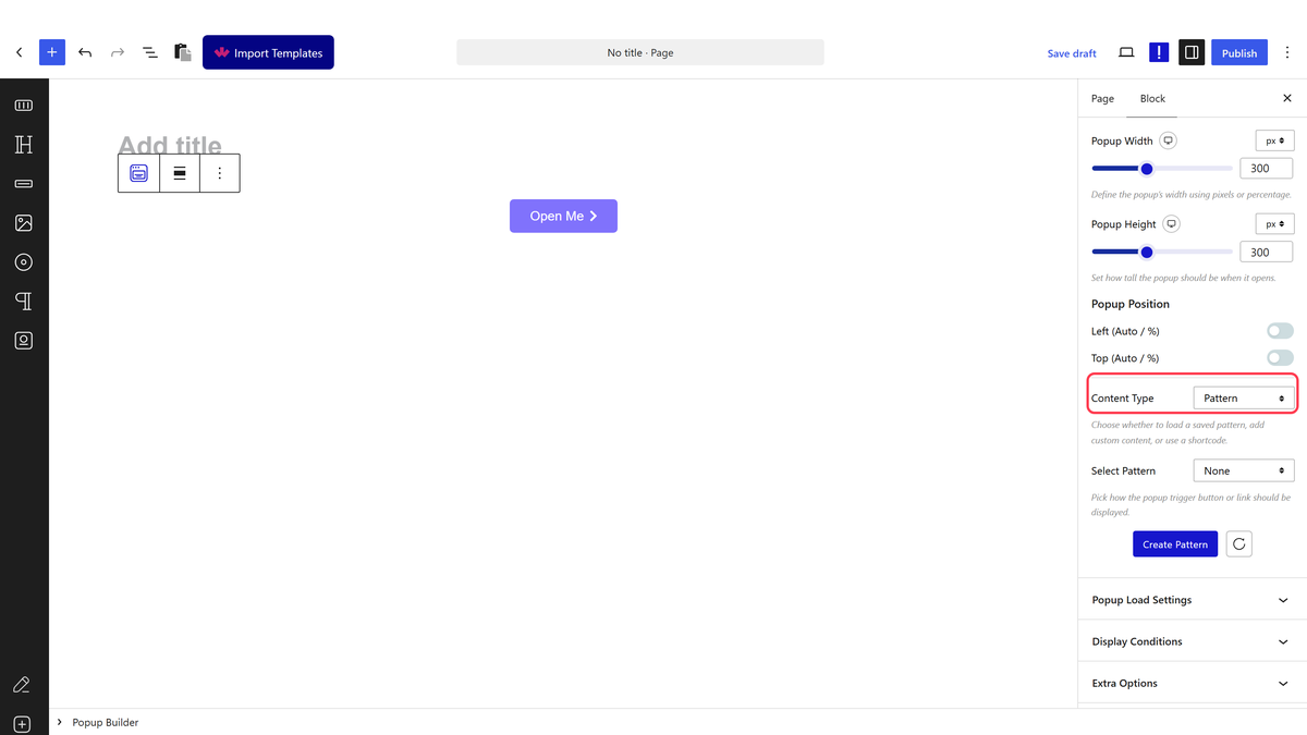
For the content of the popup, use the Content Type dropdown to choose how the popup body is built.

  • Pattern
  • Content
  • Editor
  • Shortcode

Pattern

Pattern is the option to use when you want a fully designed popup layout. Since a Pattern is built in the WordPress Block editor, you can add images, videos, product cards, or newsletter signup forms inside the popup.

To use a Pattern, first create and save a Pattern in WordPress, then choose Pattern from the Content Type dropdown.

After that, pick your saved Pattern from the Pattern dropdown.

You can also click the + Create Pattern button to build a new Pattern from within the block.

After choosing the Pattern, you will see a Backend Visibility toggle. This is off by default so the editor stays uncluttered. Turn it on temporarily to see the popup content while you style it, then turn it off before publishing.

Note: You have to click the popup trigger button to view the popup content.

Content

In this option, you can write the popup content directly in the block editor. Use this when the popup only needs a short line of text, such as a promo message or a compliance notice.

Editor

The Editor option is as flexible as the Pattern option, since it also uses the WordPress Block editor to build the popup layout.

To use the Editor option, select Editor from the Content Type dropdown. To access the layout area, click the popup trigger element on the page in the backend. The popup content will open, and you can edit it there.

Shortcode

With this option, you can display any shortcode inside the popup. This is the option to reach for when you want to load a WPForms, Fluent Forms, or WooCommerce block inside the popup without rebuilding it.

Popup Load Settings

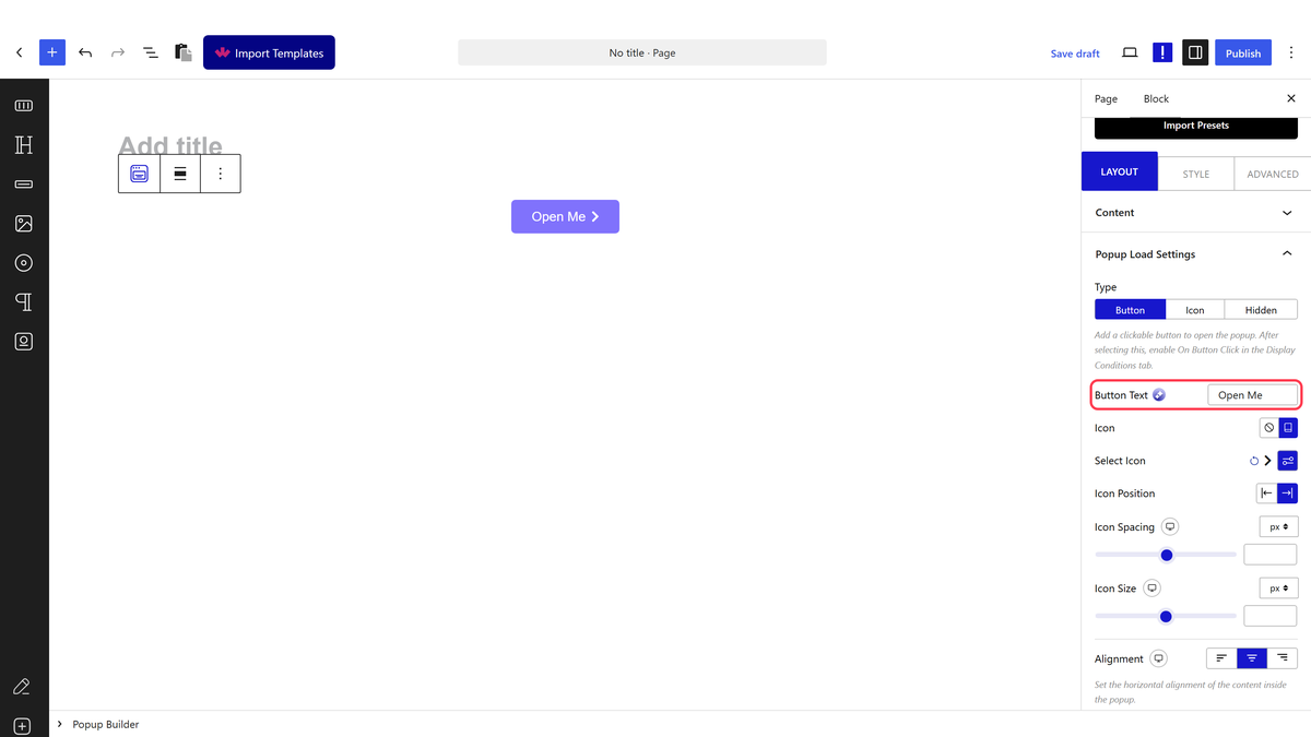
Once the popup content is in place, choose the trigger element from the Popup Load Settings tab.

Under the Type section, you will find three trigger options.

  • Button – Adds a styled button to the page that opens the popup when clicked. Use this on landing pages where the popup is tied to a clear call to action.
  • Icon – Uses an icon as the popup trigger. This is the setting to use when building a compact popup menu or a floating help button.
  • Hidden – Removes the visible trigger. Use this when the popup should open from a display condition such as page load, exit intent, or a specific URL, without any visible control on the page.

Depending on the trigger you pick, the block reveals matching customization options for label, icon, alignment, and animation.

popup template demo

How to set Display Conditions for Popup in WordPress?

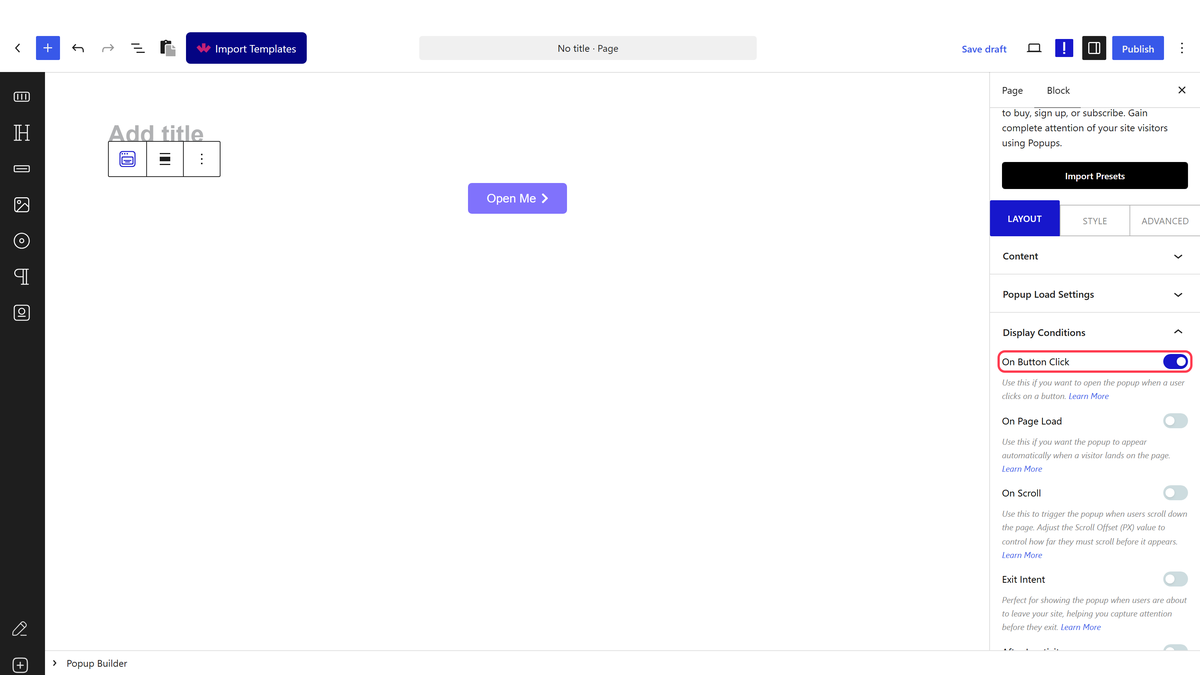
Popups are only useful when they show up at the right moment. Display conditions are how you control when and where the WordPress popup appears, so it feels helpful instead of intrusive.

The Popup Builder provides a full set of display conditions inside the Display Conditions tab.

You will find each condition under the Display Conditions tab, and each one has its own dedicated doc for a deeper walkthrough.

Youtube video

Extra Options

Under the Extra Options tab, you will find controls that fine-tune how the popup behaves.

Popup Loading Animations – If you selected Popup as the popup type, use this option to control the enter and exit animation of the popup. Match the animation to the visitor’s pace on the page, such as a slower fade on long-read blog posts.

Esc Button Close Content – Lets visitors close the popup by pressing the Esc key, which meets accessibility expectations for keyboard users. Learn more about the process.

Outer Click Close Content – Closes the popup when a visitor clicks outside the popup area. Use this when the popup is optional and you do not want to force the visitor to hunt for a close button.

Fixed Toggle Button – Pins the popup trigger to a fixed spot on the page, with per-device positioning. Combine it with the Show Menu Scroll Offset option to reveal the trigger only after the visitor scrolls past a certain point.

Youtube video

How to style Popup/OffCanvas in WordPress?

To match the popup to the theme of the site, go to the Style tab.

Content Area – From this tab, control the padding, background color, background image, and inner spacing of the popup body.

Close Icon – Controls the appearance of the popup close button and the popup overlay. Use this to hide the close button when the popup should be dismissed only through outer click or Esc.

Toggle Button – Available when Button is set as the popup trigger. Make the button full width, adjust padding, typography, text color, background, border, and hover state.

Toggle Icon – Available when Icon is set as the popup trigger. From here, control the icon color, background, border, and size.

Content Scrolling Bar – Style the popup scroll bar, including the track and thumb, so a tall popup still matches the visual language of the site.

Advanced options remain common across all Nexter Blocks, and you can explore them from a single reference.

View Advanced tab tutorial.

About the Author

Photo of Aditya Sharma CMO of Nexter
CMO at POSIMYTH Innovations · Nexter · 7 years experience

He has spent years in the WordPress ecosystem building, breaking, and optimizing sites until they actually perform. He works at the intersection of speed, growth, and usability, helping creators ship websites that load fast and convert. An active WordPress community contributor sharing through tools, tutorials, and direct collaboration. Tested practice, not theory.

WordPressThemesElementorn8nAIClaudeAutomationServer

Share your Thoughts

Still in Doubt? Let’s Assist You

Have Feedback or Questions?

Join our WordPress Community on Facebook!