












Your navigation menu is how visitors find their way around the site, so it should be easy to use on desktop and on phones.
The Navigation Menu block in Nexter Blocks builds horizontal, vertical and toggle menus with dropdowns and a mobile hamburger menu.
Before You Start
- Edition: Free for Manual Menu, dropdowns, vertical and toggle layouts and the Toggle mobile menu. Nexter Blocks Pro adds WordPress Menu, Mega Menu, Swiper and Off Canvas mobile menus.
- Block to enable: Navigation Menu, switched on under Nexter > Blocks in your WordPress dashboard.
- Where to add it: in a header template, so the menu shows on every page. See how to create a header template.
Learn via Video Tutorial

Steps
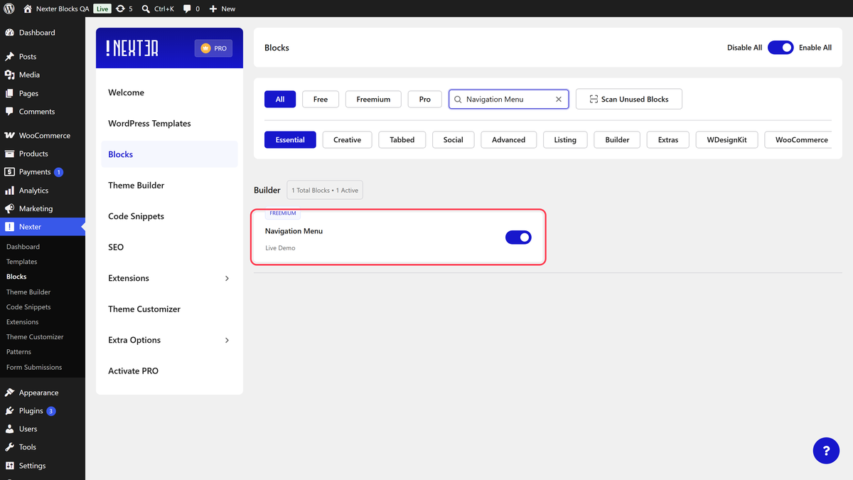
- Go to Nexter > Blocks, search for Navigation Menu and turn it on.
- Add the Navigation Menu block to your header template and click Design from Scratch.
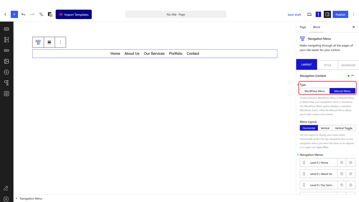
- In Navigation Content, choose a Type: Manual Menu to build the items in the block, or WordPress Menu (Pro) to use a menu from Appearance > Menus.
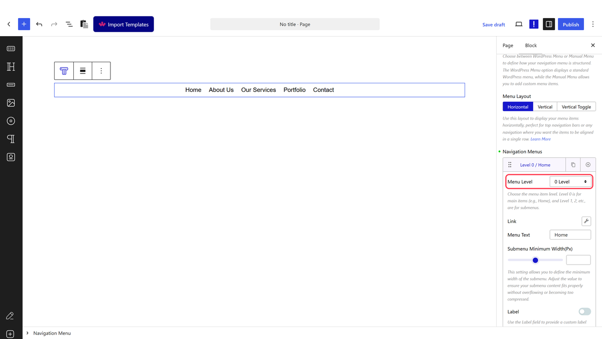
- For Manual Menu, open each item under Navigation Menus, set its Menu Level, Link and Menu Text, and click Add Menu for more items.
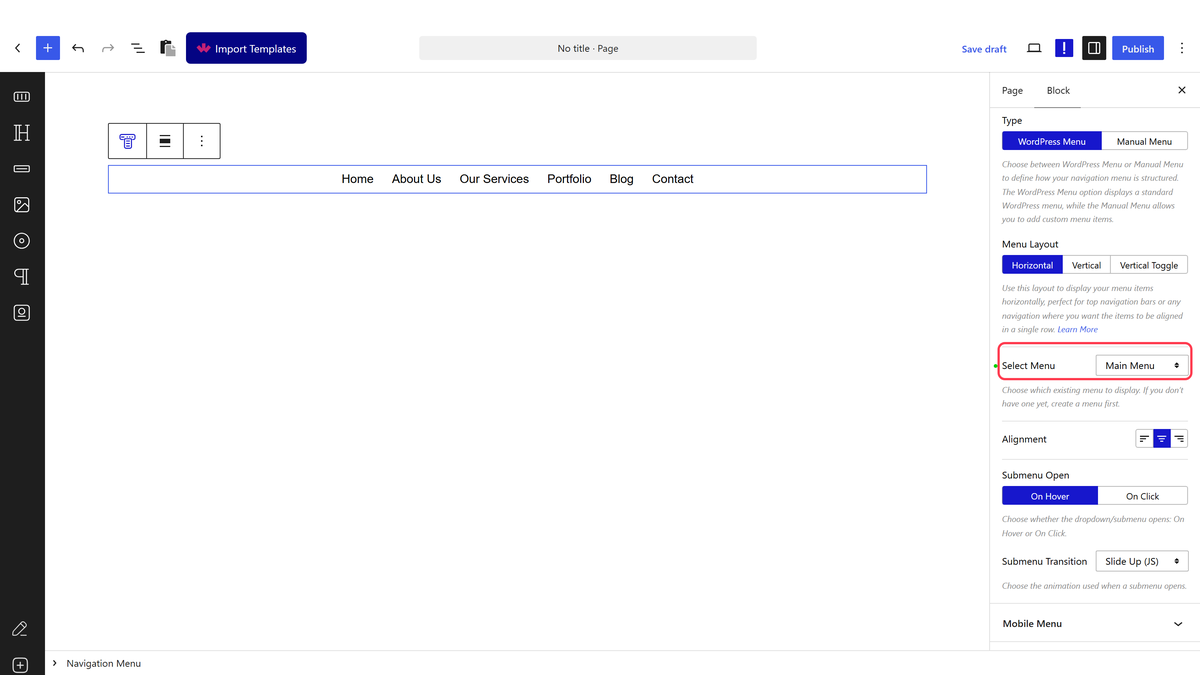
- For WordPress Menu, choose the menu in Select Menu. Its dropdowns come from Appearance > Menus.
- Pick a Menu Layout, then set Submenu Open and Submenu Transition.
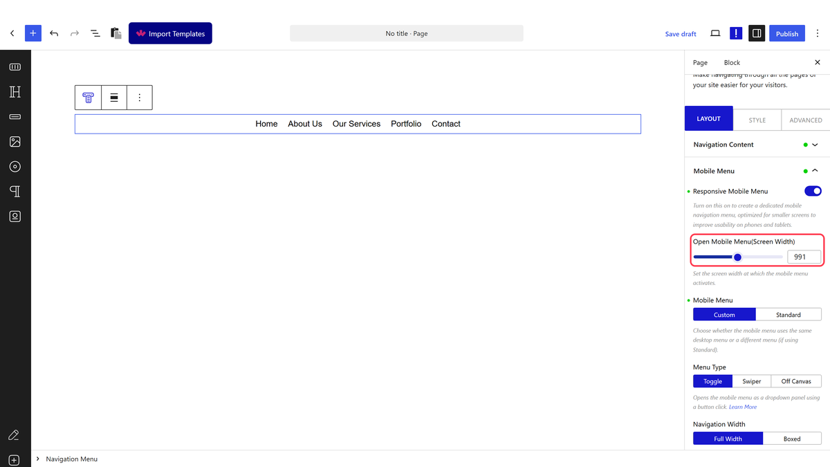
- Open Mobile Menu, turn on Responsive Mobile Menu, choose Custom and a Menu Type. Save.
Navigation Content Settings
| Setting | Options | What it does |
|---|---|---|
| Type | WordPress Menu (Pro), Manual Menu | Where the menu items come from |
| Select Menu | Your WordPress menus | The menu to show (WordPress Menu only) |
| Menu Layout | Horizontal, Vertical, Vertical Toggle | A row, a stacked list, or a stacked list behind a clickable title bar |
| Navigation Menus | Menu Level (0 Level to 6 Level), Submenu Type (Link or Mega Menu, Pro), Link, Menu Text, Label, Menu Icon Type, Description, Custom Class | The items of a Manual Menu. Level 0 items are top-level; higher levels become dropdown items under the item above |
| Submenu Open | On Hover, On Click | What opens a dropdown |
| Submenu Transition | Slide Up (JS), Fade In (JS), Slide Up, Fade In | How a dropdown appears |
| Toggle Bar settings | Toggle Bar, Toggle Open (Normal, Hover, Click), Title, URL, Prefix Icon, Toggle Icon | The title bar of the Vertical Toggle layout |
Mobile Menu Settings
| Setting | Options | What it does |
|---|---|---|
| Responsive Mobile Menu | On / Off | Replaces the menu with a mobile menu on small screens |
| Open Mobile Menu (Screen Width) | Pixels (default 991) | Below this screen width the mobile menu is used |
| Mobile Menu | Custom, Standard (Pro) | Custom reuses the block’s menu; Standard shows a WordPress menu you pick |
| Menu Type | Toggle, Swiper (Pro), Off Canvas (Pro) | A hamburger that slides a panel down, a swipeable row of links, or a side panel |
| Navigation Width, Toggle Style, Toggle Alignment, Navigation Alignment | — | Size and position of the mobile panel and the hamburger |
| Mobile Click Close Menu | On / Off | Closes the mobile menu when visitors tap outside it |
On the Style tab you style Main Menu, Submenu, Description, Mobile Menu and Mobile Submenu, plus Main Menu Label and Submenu Label when items use a label. Pro adds Web Accessibility styles.
How It Behaves
- Dropdowns open on hover or click, depending on Submenu Open.
- Below the Open Mobile Menu width, the desktop menu is hidden and the hamburger or swiper row is shown.
- Mega Menu items show a pattern you design in a wide dropdown.
- Manual Menu, dropdowns, vertical layouts and the Toggle mobile menu work the same in the free plugin.
Limitations
- In the free plugin, Mobile Menu starts on Standard (Pro). Choose Custom to see Menu Type and the other mobile settings.
- WordPress Menu needs Pro. Without Pro, a block set to WordPress Menu shows nothing on the page.
- Swiper and Off Canvas mobile menus need Pro.
Troubleshooting
I cannot find the Navigation Menu block
It is switched off. Go to Nexter > Blocks, search for Navigation Menu and turn it on.
My Select Menu dropdown is empty
Create a menu first under Appearance > Menus. WordPress Menu also needs Nexter Blocks Pro.
The hamburger shows on my laptop
Lower Open Mobile Menu (Screen Width). The mobile menu is used below that width.
