---
title: "How to Add a Mobile Menu in WordPress?"
url: https://nexterwp.com/docs/add-a-mobile-menu-in-wordpress/
date: 2024-12-02
modified: 2026-08-06
author: "Aditya Sharma"
description: "The Mobile Menu block in Nexter Blocks lets you add a custom mobile navigation menu to any WordPress site. Place it in the header template so it appears on every..."
image: https://nexterwp.com/wp-content/uploads/2024/12/How-to-Add-a-Mobile-Menu-in-WordPress_-1024x519.jpg
word_count: 859
---

# How to Add a Mobile Menu in WordPress?

## Key Takeaways

- Nexter Blocks Mobile Menu block adds a custom mobile navigation menu to any WordPress site and places it in the header template so it appears on every page.
- Mobile Menu block requires the default WordPress Block editor, the Nexter Blocks plugin, and the PRO version of Nexter Blocks; it is activated from Nexter → Blocks.
- Mobile Menu block offers two styles, Style 1 for a single mobile menu and Style 2 for a split mobile menu, plus Position options Fixed and Absolute.
- Mobile Menu block supports Swiper and Columns display types, an Active Page Indicator with Line or Dot styles, and an Extra Toggle that can use Link or Pattern content.

The Mobile Menu block in Nexter Blocks lets you add a custom mobile navigation menu to any WordPress site. Place it in the header template so it appears on every page, and configure the layout, position, and menu items from the block settings.

Use it for bottom navigation bars, off-canvas menus, swiper-style menus, or any mobile layout where a full desktop menu is too large for small screens.

[LIVE BLOCK LINK](https://nexterwp.com/nexter-blocks/builder/wordpress-mobile-menu/)

## Required Setup

- Make sure the default WordPress Block editor is active. 

- You need to have the [Nexter Blocks](https://wordpress.org/plugins/the-plus-addons-for-block-editor/) plugin installed and activated.

- This is a Premium block, and you need the [PRO version of Nexter Blocks](https://nexterwp.com/pricing/?utm_source=tpag&utm_medium=docs&utm_campaign=text).

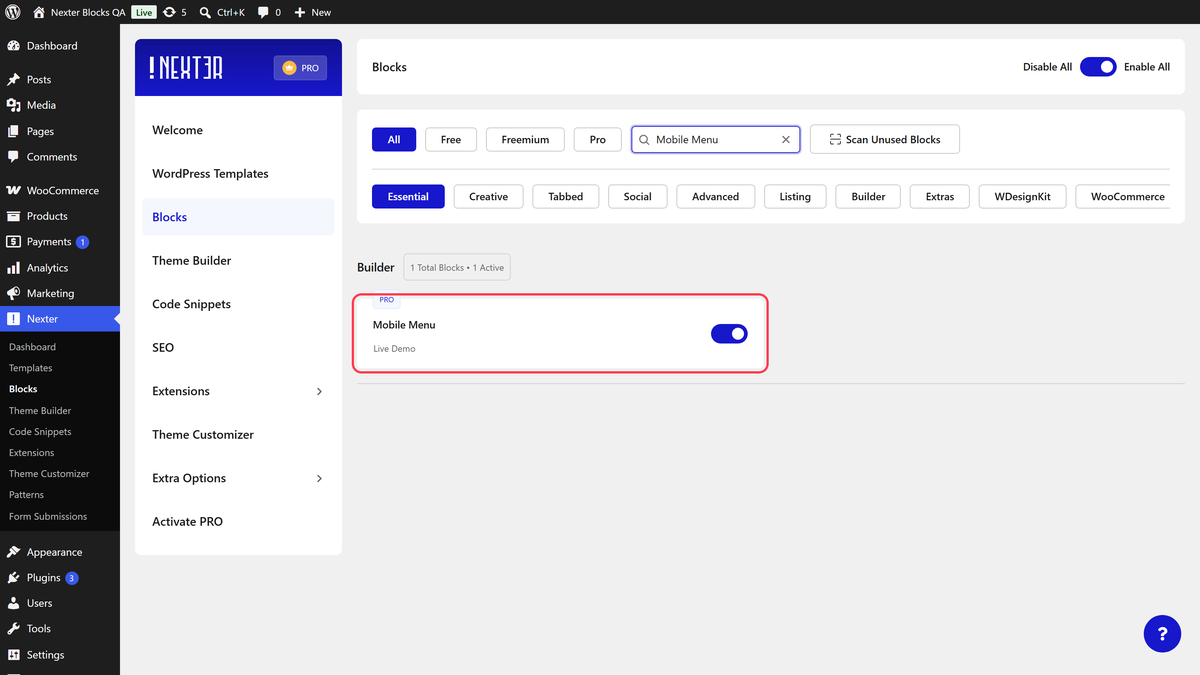
- Make sure the Mobile Menu block is activated, to verify this visit Nexter → Blocks → and Search for Mobile Menu and activate.

## How to activate the Mobile Menu Block?

Go to 

- **Nexter **→ **Blocks **

- **Search **for the block name and **turn on the toggle**.

![](https://nexterwp.com/wp-content/uploads/2024/12/mobile-menu-activation-new.png)

## Key Features

- **Two Mobile Menu Style** - You can select from two mobile menu styles.

- **Off Canvas Menu** - You can [create an off canvas menu with Patterns](https://nexterwp.com/docs/create-a-popup-mobile-menu-with-pattern-in-wordpress/).

- **Swiper Menu** - You can [create a swiper mobile menu](https://nexterwp.com/docs/create-a-swiper-mobile-menu-in-wordpress/).

## How to Use the Mobile Menu Block in WordPress?

To use the Mobile Menu block, you should add it in the header template so the menu is available on the entire website. 

> *Note:* To create the header template, you can use the free [Nexter Builder](https://nexterwp.com/docs/nexter-theme-builder-explained/).

### Mobile Menu

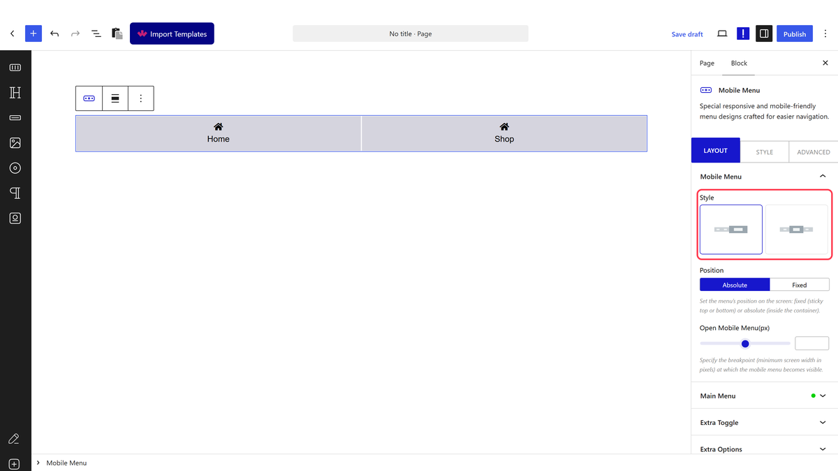
From the **Style** section, you have to select a style. You will find two styles -

![](https://nexterwp.com/wp-content/uploads/2024/12/mobile-menu-layout-position.gif)

**Style 1** - For creating a single mobile menu.

**Style 2** - For [creating a split mobile menu](https://nexterwp.com/docs/create-a-split-mobile-menu-in-wordpress/).

Select Style 1 here.

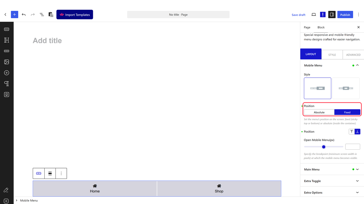
From the **Position** section, you can set the menu position. You will find two options - 

- **Fixed** - To create a fixed bottom or top mobile menu. Ideal for creating a sticky bottom mobile menu. 

- **Absolute** - This will keep the mobile menu in the container.

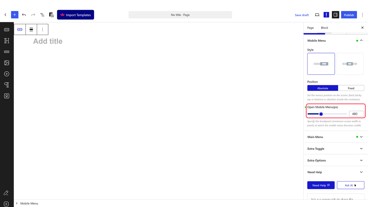
From the **Open Mobile Menu(px)** section, you can specify the minimum width when the mobile menu will be visible.

### Main Menu

You will find 5 menu items by default. Open an item. 

In the **Text** field, you can add text to the menu item.

![](https://nexterwp.com/wp-content/uploads/2024/12/mobile-menu-main-menu.gif)

From the **Icon Type** section, you can add an icon or image to the menu item.

In the **Link** field, you can add the menu link. 

Then you can use the **Pin Text** field to add a text to highlight the menu item.

You can repeat the same process to edit the remaining items.

To add more menu items, click on the **+ Add Item** button.

### Extra Toggle

You can enable the **Extra Toggle** toggle to add an extra menu item or toggle button.

![](https://nexterwp.com/wp-content/uploads/2024/12/mobile-menu-extra-toggle.gif)

In the **Text** field, you can add a text to the toggle button.

From the **Icon Type** section, you can add an icon or image to the toggle button.

From the **Content** section, you can select the content type of the menu item or toggle button. You will find two options - 

- **Link** - To add a normal link.

- **Pattern** - To [create an off-canvas popup menu with a Pattern](https://nexterwp.com/docs/create-a-popup-mobile-menu-with-pattern-in-wordpress/).

Select **Link** here.

In the **Link** field, you can add the menu link.

### Extra Options

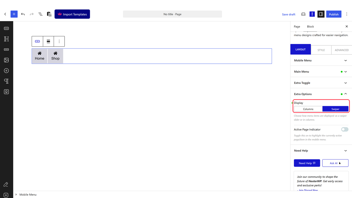
From the **Display** section, you can set the display type of the mobile menu. You will find two options -

![](https://nexterwp.com/wp-content/uploads/2024/12/mobile-menu-extra-options.gif)

- **Swiper** - To [create a swiper mobile menu](https://nexterwp.com/docs/create-a-swiper-mobile-menu-in-wordpress/).

- **Columns** - To make the menu items fit the screen size.

You can enable the **Active Page Indicator** toggle to highlight the active menu item. 

From the **Style **section, you can set the style of the active menu. You will find two options -

- **Line **- To create a horizontal line on the menu.

- **Dot **- To create a dot on the menu.

You can place the line at the top or bottom of the menu from the **Position** section.

For the dot, you can manage the top and bottom offset from the **Offset **section. 

If the menu item pin text hides behind other items from the **Pin Text Overflow** section, you can set the overflow to visible to fix the issue.

## How to Style the Mobile Menu Block?

All styling options for the Mobile Menu block are available under the **Style** tab.

![](https://nexterwp.com/wp-content/uploads/2024/12/mobile-menu-style-1.png)

**Icon / Image** – Controls the icon and image style for menu items.

**Extra Toggle Icon / Image** – Controls the icon and image style for the extra toggle item.

**Active Page Indicator** – Controls the style of the active page indicator.

**Menu** – Controls the overall mobile menu typography, color, padding, and background.

**Extra Toggle** – Controls the style of the extra toggle menu item or button.

**Extra Toggle Template** – Controls the style of the extra toggle template item, overlay, and close icon.

**Content Background** – Controls the menu container padding, background, border, and overflow.

**Pin Text** – Controls the pin text style.

**Extra Options** – Enable the **Show Mobile Menu Scroll Offset** toggle to set a scroll top offset. This will show the menu when you scroll down to equivalent pixels.

Advanced tab options are common across all Nexter Blocks blocks. For the full settings reference, see [Add advanced tab in WordPress](https://nexterwp.com/docs/add-advanced-tab-in-wordpress/).