












A long form feels shorter when it is split into a few simple steps, so more people finish it.
The Form block in Nexter Blocks Pro can turn any form into a multi step form with a progress indicator.
For every Form setting in one place, see the Form block guide.
Before You Start
- Edition: Pro — Multi Step Form needs Nexter Blocks Pro.
- Block to enable: Form, switched on under Nexter > Blocks in your WordPress dashboard.
Create the Multi Step Form
- Add the Form block, click Design from Scratch and choose Multi Step Form.
- The form starts with three steps. Each step is a Form Step block holding its own fields.
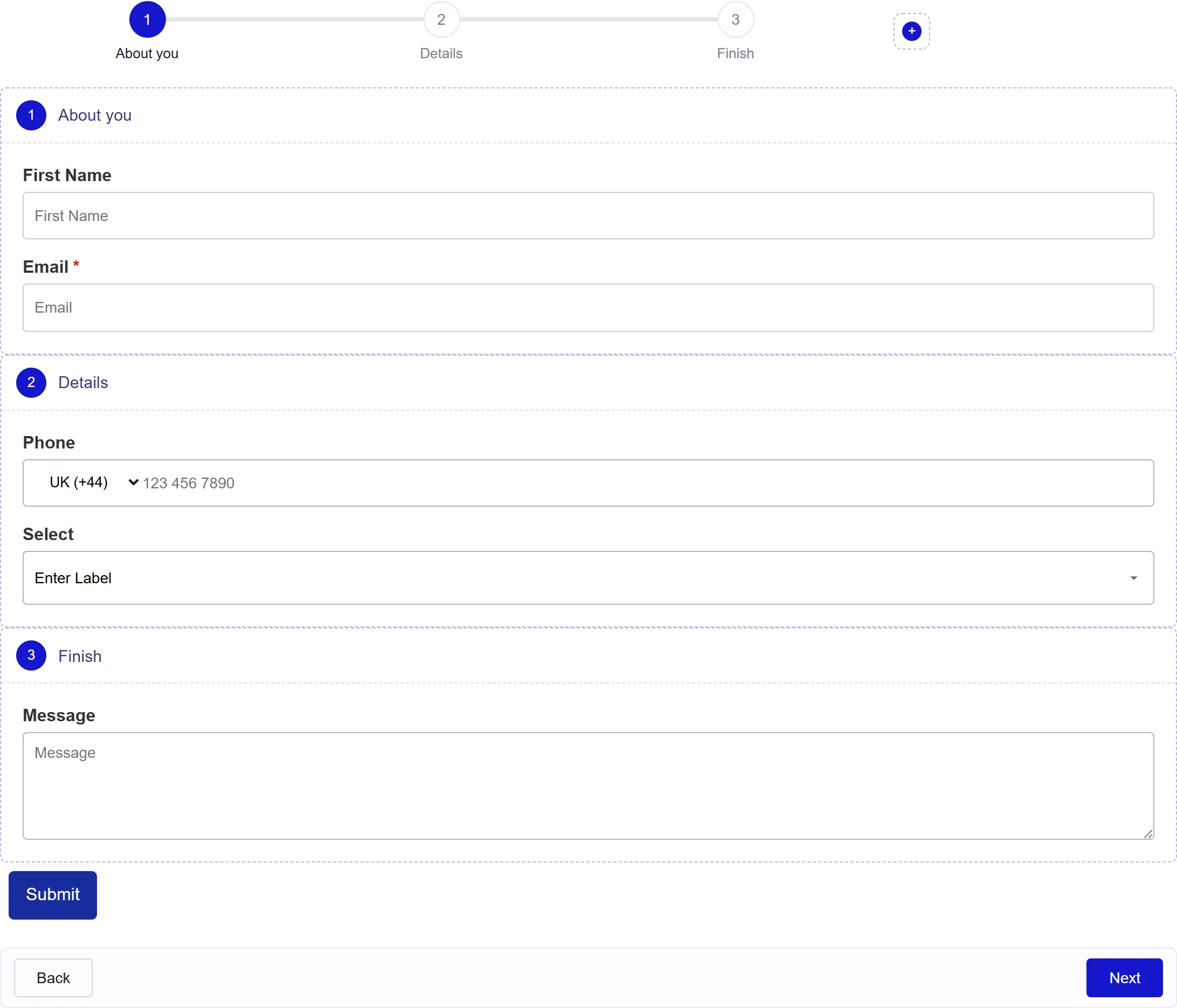
- Add fields inside each step with the + button, and move the Submit button below the last step.
- Select a Form Step block to name the step and, if you like, give it an icon or image instead of the step number.
Choose the Progress Style
Select the Form block and open Multi Step Progress.
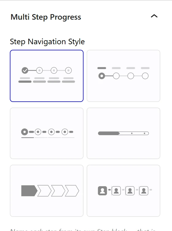
| Setting | What it does |
|---|---|
| Step Navigation Style | Checkmark Timeline (default), Dot Timeline, Numbered Tabs, Progress Pill, Chevron Steps or Icon Tiles |
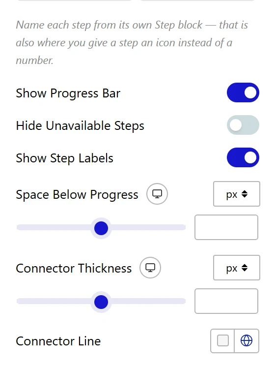
| Show Progress Bar | Shows or hides the whole step indicator |
| Hide Unavailable Steps | Hides steps the visitor has not reached yet |
| Show Step Labels | Shows or hides step names (not available for Progress Pill) |
| Space Below Progress | Gap between the indicator and the fields |
| Connector Thickness, Connector Line | Thickness and colour of the line between steps |
The Step Circles and Step Labels panels style the markers and step names, with separate colours for upcoming, current and completed steps. In Step Buttons you can change the Back Button Text and Next Button Text, the Space Above Buttons, and the button styles.
How It Behaves
- Visitors see one step at a time and move with Next and Back.
- Required fields are checked when the visitor clicks Next, and the message appears on that step.
- All steps are sent as one submission, so actions such as Email receive every field.
- Conditional logic keeps working across steps.
Limitations
- Pro only. The free plugin offers only Simple Contact Form and Newsletter Form.
- Some progress options only apply to certain styles, so the panel hides the ones that do not affect your design.
Troubleshooting
Next does not move to the following step
A required field on the current step is empty or invalid. Check the message under the field.
A step has no name in the progress bar
Select that Form Step block and fill in its Label.
