


Do you want to add a WordPress toggle menu for mobile? A toggle menu collapses your navigation into a compact button on small screens, giving mobile visitors a cleaner, tap-friendly browsing experience.
The Navigation Menu block in Nexter Blocks includes a built-in mobile toggle option that lets you add a responsive hamburger button to your WordPress header.
Best Used For:
- Mobile-first websites where compact navigation improves the browsing experience on phones and tablets.
- Business and portfolio sites that need a clean desktop header without cluttered navigation on smaller screens.
- WooCommerce stores where mobile visitors need quick access to shop categories through a collapsible menu.
To check the complete feature overview documentation of the Nexter Blocks Navigation Menu block, click here.
Requirement: This block is part of Nexter Blocks. Make sure it is installed and activated before following these steps.
To do this, add the Navigation Menu block to the header template and follow the steps below.
Note: To create the header template, you can use the free Nexter Builder.
1. From the Navigation Bar tab, select the appropriate Type, Layout and menu.
2. Go to the Mobile Menu tab and enable the Responsive Mobile Menu toggle. This activates the mobile menu system so that visitors on narrow screens see a toggle button instead of the full navigation bar.
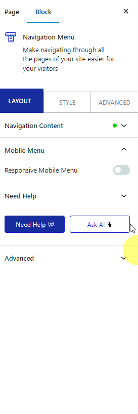
In the Open Mobile Menu (Screen Width) section, set the viewport width at which the mobile menu activates. Use this when you want the toggle button to appear only on devices narrower than a specific breakpoint, such as 768px for tablets or 480px for phones.
3. If you have selected Manual Menu in the Navigation Bar, you will see two options in the Mobile Menu section:
- Standard – For using a WordPress menu as the mobile menu. Use this when you have already created a menu under Appearance → Menus and want to assign it to the mobile view.
- Custom – For using your custom menu as the mobile menu. Use this when you have built a custom menu structure in the Navigation Menu block and want the same structure on mobile.
For this example, select Standard.
If you want to explore other mobile menu styles for your site, see How to Create a Hamburger Mobile Menu with Pattern in WordPress.
Note: If you’ve selected WordPress Menu in the Navigation Bar, then you’ll only get the Standard option in the Mobile Menu section.
4. Select your menu from the Select Menu dropdown. This is the menu that will appear when visitors tap the toggle button on mobile.
Note: For the Custom option you won’t get this option as your custom menu will be the mobile menu.
5. From the Menu Type section, select Toggle.
From the Navigation Width dropdown, set the maximum width of the mobile navigation panel.
From the Toggle Style dropdown, choose a visual style for the toggle button. Use this when you want to match the icon to your site design, such as a three-line hamburger icon or an X button.
From the Toggle Alignment section, set the horizontal alignment of the toggle button in the header.
From the Navigation Alignment section, set how menu items align within the mobile panel. Use this when your site design requires centered or right-aligned mobile navigation items.
The toggle button is now visible on mobile. For a sticky bar alternative that pins navigation to the bottom of the screen, see How to Create a Sticky Bottom Mobile Menu in WordPress.

