












The built in metro styles are fixed patterns, and sooner or later you want a different one.
The Media Listing block lets you write the pattern yourself as a short list of width to height ratios.
For every Media Listing setting in one place, see the Media Listing block guide.
Before You Start
- Edition: Pro — the Media Listing block is part of Nexter Blocks Pro.
- Block to enable: Media Listing, switched on under Nexter > Blocks in your WordPress dashboard.
- Your images uploaded: add them to the Media Library first so you can pick them straight from the block.
Steps
- Add the Media Listing block to your page and click Design from Scratch.
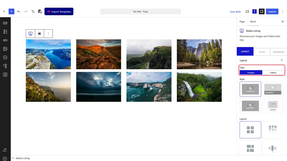
- In the Layout panel, set Type to Images.
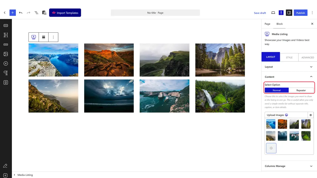
- Open Content and pick your images with Select Option on Normal.
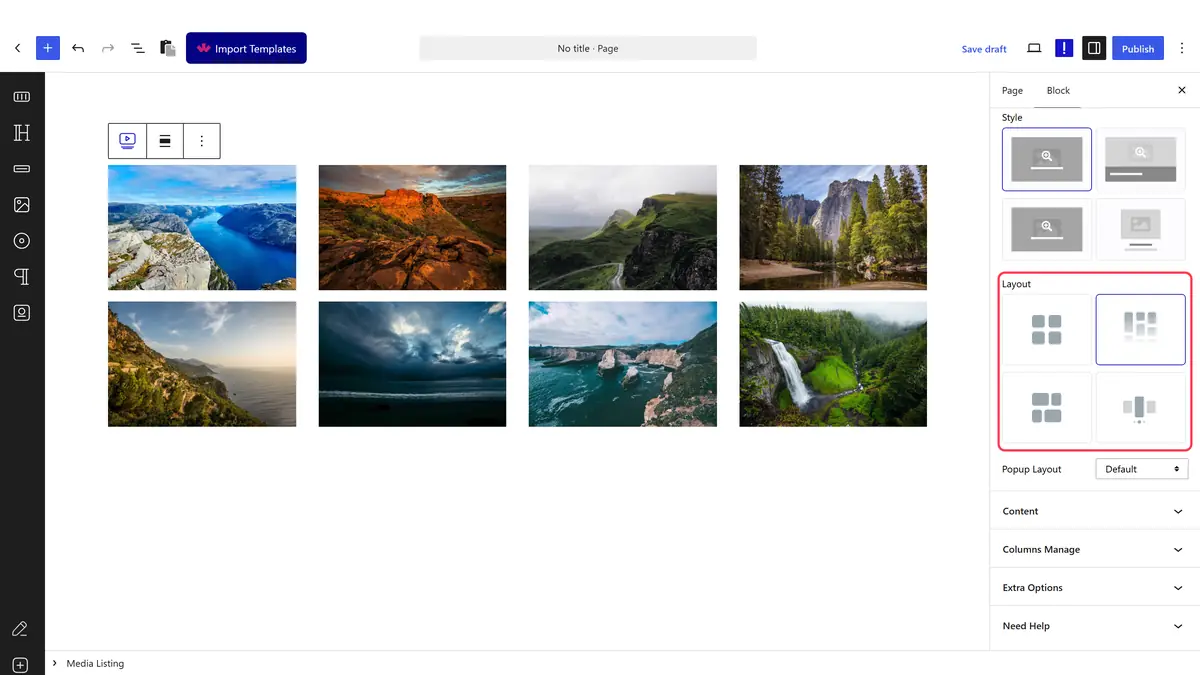
- Still in Layout, set Layout to Metro.
- In Columns Manage, set Metro Style to Custom. The Custom Layout field appears underneath.
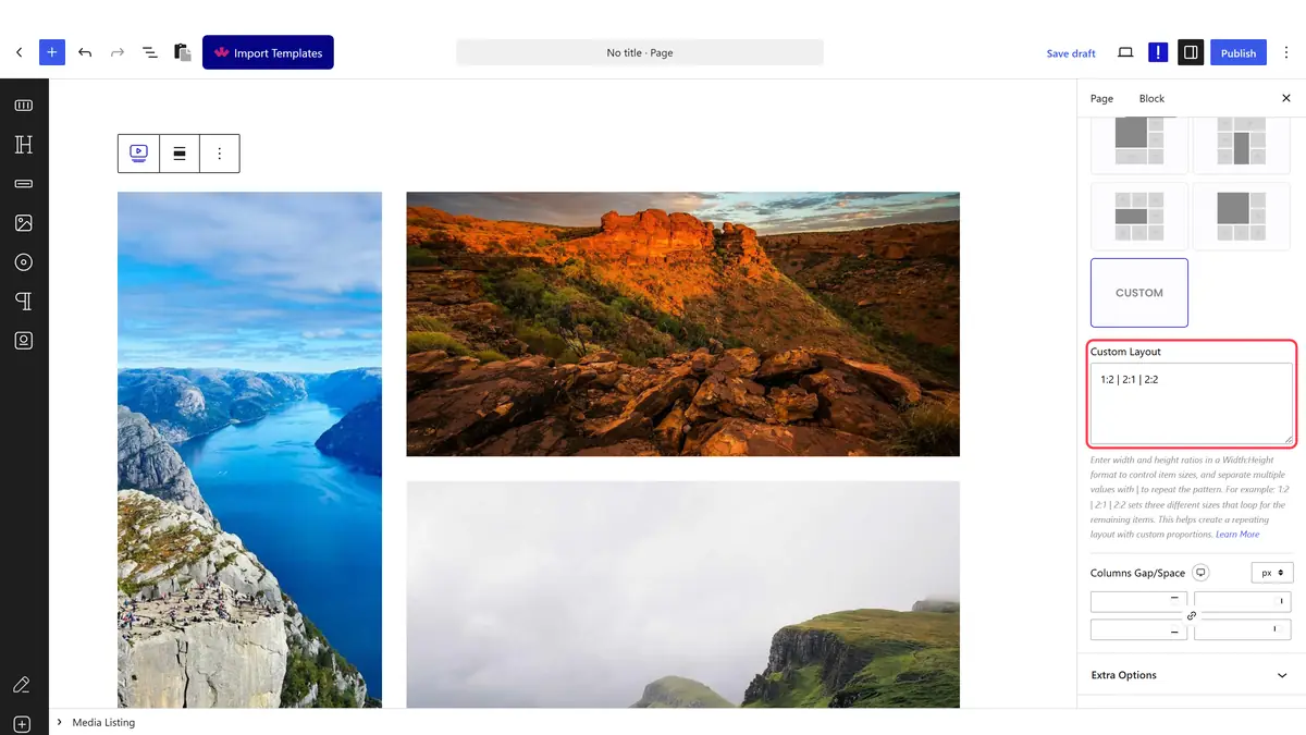
- Type your pattern as width to height ratios separated by vertical bars, for example 1:2 | 2:1 | 2:2, then publish.
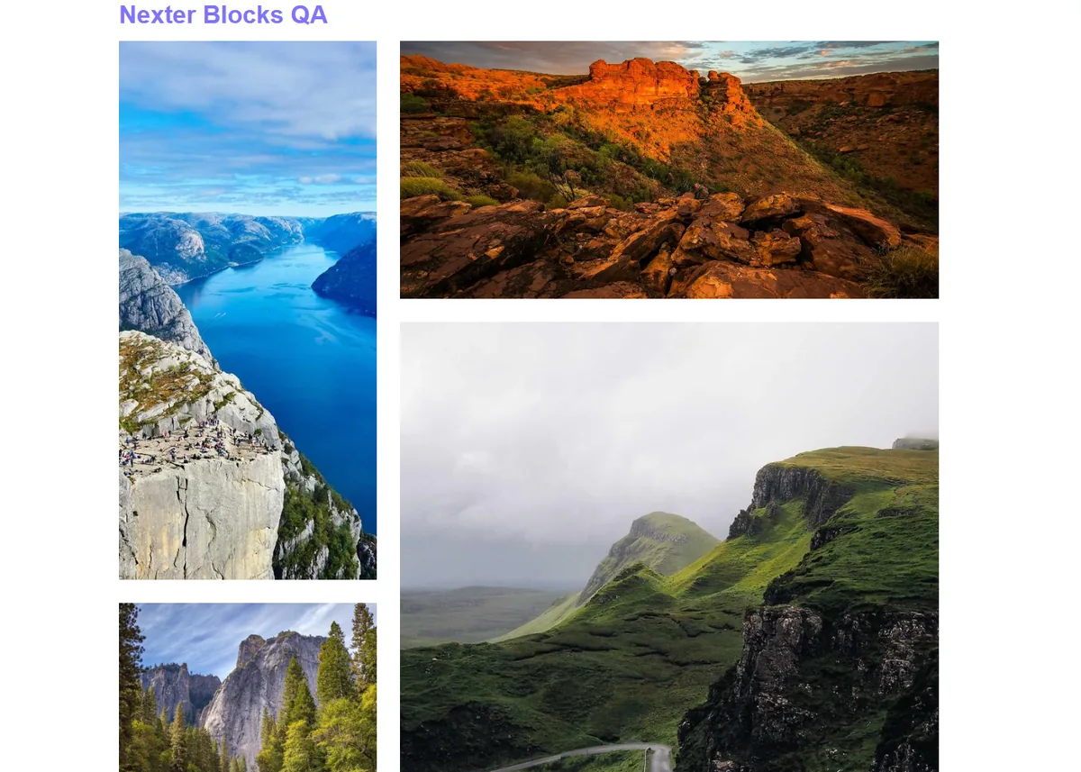
How the Pattern Is Written
Each entry is one tile, written as width:height in grid units and separated by a vertical bar. The pattern repeats once it runs out of entries.
| Entry | Tile it produces |
|---|---|
| 1:2 | One unit wide and two tall, so a portrait tile |
| 2:1 | Two units wide and one tall, so a landscape banner |
| 2:2 | A large square tile, twice the size of the default |
| 1:1 | A default sized square tile |
Set Metro Style to Custom for each device you want it on. The Custom Layout field only shows for the device you are currently editing, so tablet and mobile keep their own pattern.
How It Behaves
- With 1:2 | 2:1 | 2:2 the first three tiles render tall, wide and large in that order, and the fourth tile starts the pattern again.
- Ratios are relative to the base tile size, which comes from Metro Column.
- Images are cropped to fill their tile, so the ratio decides the shape, not the photo.
- An entry with no matching image is simply skipped.
Limitations
- Pro only.
- Custom Layout stays hidden until Metro Style is set to Custom for the device you are editing.
- The field takes no units or percentages, only whole number ratios.
- Very wide ratios can overflow the column count you set, so keep the numbers small.
Troubleshooting
The Custom Layout field is not there
Set Metro Style to Custom first, and check you are on the device you meant to edit.
The pattern has no effect
Check the separators. Entries are split on the vertical bar, and each entry needs a colon between the two numbers, as in 2:1.
