












A single column of posts reads like a feed. A grid lets a reader take in six at a glance and choose, which is what a blog index is for.
Grid is the Post Listing block’s default layout, and the setting that matters is how wide each item should be.
Before You Start
- Edition: Free — works in Nexter Blocks (free) and with Nexter Blocks Pro.
- Block to enable: Post Listing, switched on under Nexter > Blocks in your WordPress dashboard.
- Enough posts to see the effect. A listing with three posts cannot show pagination, filtering or a second row.
Steps
- Select your Post Listing block.
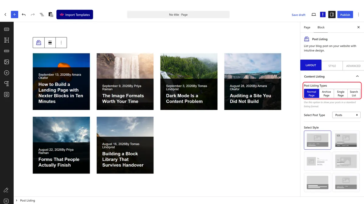
- Set the layout to grid. It is already the default.
- Set the column width for desktop.
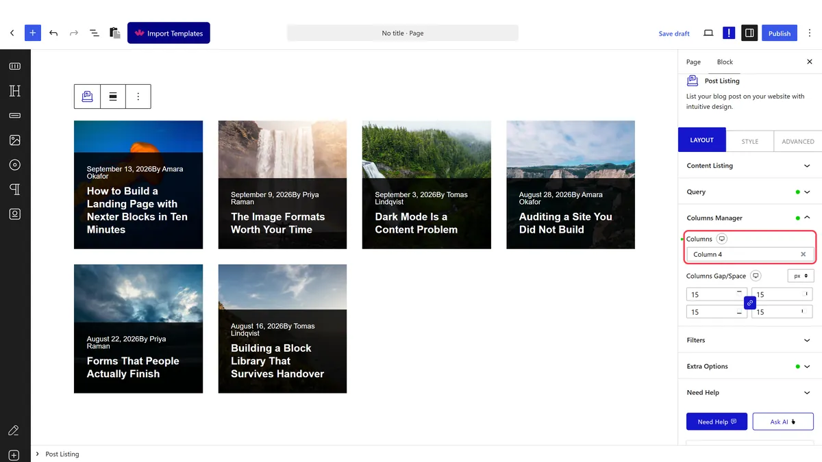
- Set it again for tablet and phone.
- Publish and check all three widths.
How It Behaves
The layout and the column width are both written onto the rendered markup.
- Measured on a published page: the wrapper rendered
data-layout="grid"and each post rendered asgrid-item tpgb-col. - Columns are widths on a twelve-column grid. Measured: a setting of 4 rendered
tpgb-col-lg-4, which is three items across. The default of 6 gives two across. - Each breakpoint keeps its own value, measured as separate
tpgb-col-lg,tpgb-col-mdandtpgb-col-smclasses. - Everything ends up in one attribute. The block writes its whole query configuration into a
data-dypostattribute on the published page, so if a setting is not doing what you expect, that is where to look. - Measured with Nexter Blocks Pro deactivated: the listing still renders its posts. The block itself is free.
Limitations
- The number is a width, not a count. This is the most common confusion with the block.
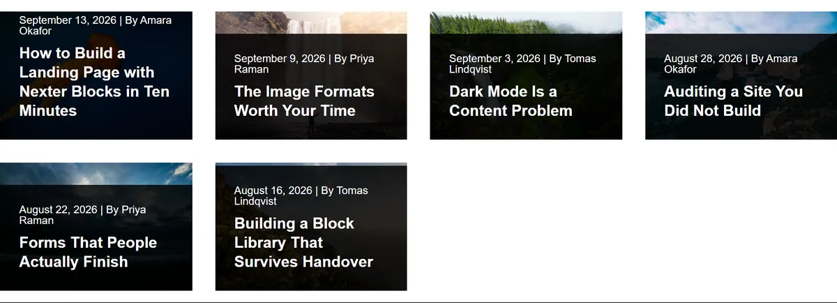
- Uneven post counts leave a ragged last row. Six posts three across leaves two on the second row.
- Different image shapes make the grid look untidy, because the cards align but the pictures inside them do not.
- Set the phone value explicitly, or the desktop width is inherited and the cards become unreadable.
Troubleshooting
I asked for four columns and got three
The number is the width on a twelve-column grid. Measured: 4 renders tpgb-col-lg-4, three across. Use 3 for four across.
The last row looks unbalanced
Your post count does not divide by your column count. Change how many posts the listing shows.
It is cramped on mobile
The desktop width is being inherited. Set the phone breakpoint to 12, which is one across.
The cards are different heights
Excerpt lengths differ. Trim them, or switch to masonry where varying heights are the point.
