











App bars usually keep one action in the middle and the rest either side of it.
Style 2 splits the bar into two groups, so a central button can sit between them.
For every Mobile Menu setting in one place, see the Mobile Menu block guide.
Before You Start
- Edition: Pro — the Mobile Menu block is part of Nexter Blocks Pro.
- Block to enable: Mobile Menu, switched on under Nexter > Blocks in your WordPress dashboard.
- Your menu items decided: four or five is the usual limit before a phone bar gets crowded.
Steps
- Add the Mobile Menu block to your page or template and click Design from Scratch.
- In the Mobile Menu panel, add your items — each one takes a label, an icon or image, and a link.
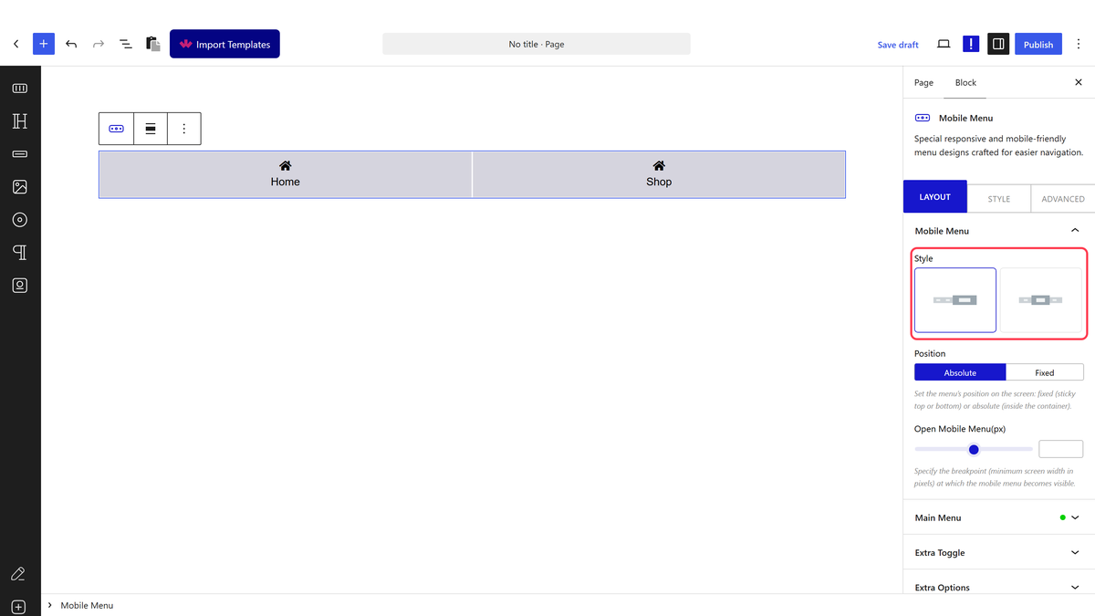
- Set Open Mobile Menu(px) to the width below which the menu should appear.
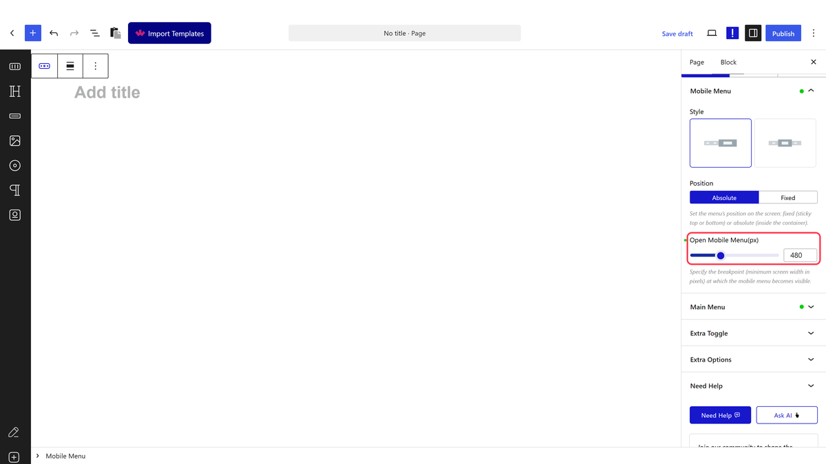
- Set Style to Style 2.
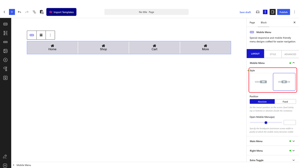
- Fill in the first item list for the left side and the second list for the right.
- Add an Extra Toggle if you want a central button between the two groups.
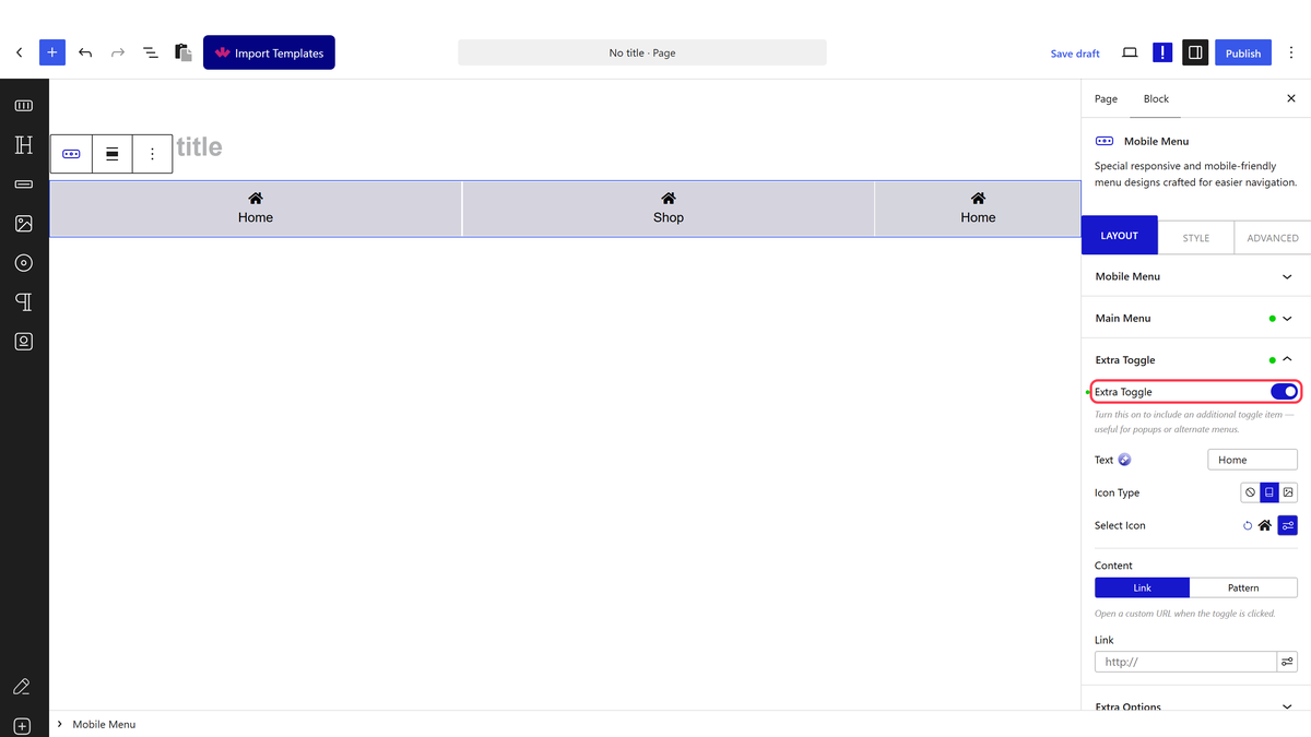
- Publish and check the bar on a phone.
Open Mobile Menu(px) is a maximum width, not a minimum — the menu appears on screens narrower than the number and stays hidden above it.
How It Behaves
- Style 2 is what creates the split. With Style 1 only the first item list renders; switching to Style 2 brings the second list in as well — measured on the front end.
- The two lists are edited separately, so each side is controlled on its own.
- An extra toggle sits between the groups, which is the usual home for a central action button.
- Everything else — position, breakpoint, indicator — works the same as a normal mobile menu.
Limitations
- Pro only.
- Two groups mean twice the crowding on a narrow screen. Two or three items a side is usually the limit.
- The split is a layout choice, not a separate block, so the second list is simply ignored on Style 1.
- There is no automatic balancing — uneven lists give an uneven bar.
Troubleshooting
Only half my items show
Style is still on Style 1, which renders the first list only. Switch to Style 2.
The two sides look lopsided
Put the same number of items in each list, or move one across.
