












Six items on a phone bar means six items nobody can read.
The swiper display keeps them full size and lets the visitor swipe along the bar instead.
For every Mobile Menu setting in one place, see the Mobile Menu block guide.
Before You Start
- Edition: Pro — the Mobile Menu block is part of Nexter Blocks Pro.
- Block to enable: Mobile Menu, switched on under Nexter > Blocks in your WordPress dashboard.
- Your menu items decided: four or five is the usual limit before a phone bar gets crowded.
Steps
- Add the Mobile Menu block to your page or template and click Design from Scratch.
- In the Mobile Menu panel, add your items — each one takes a label, an icon or image, and a link.
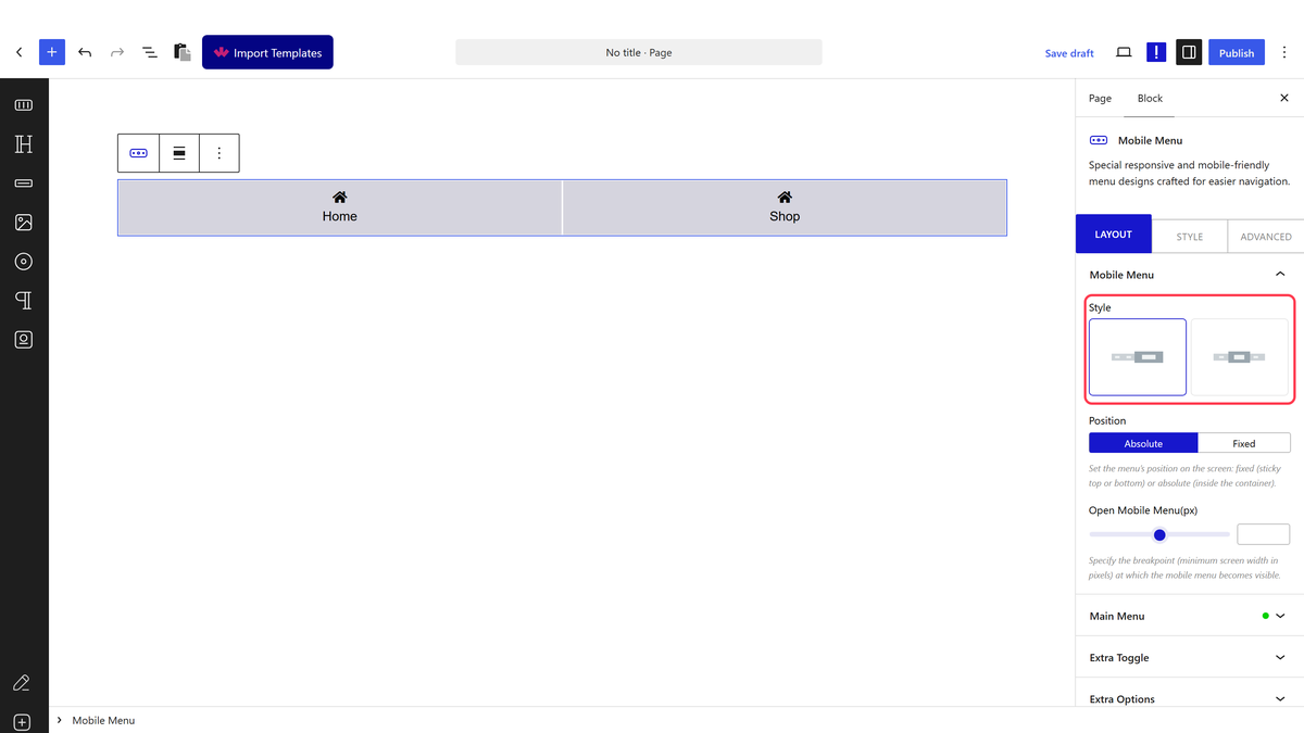
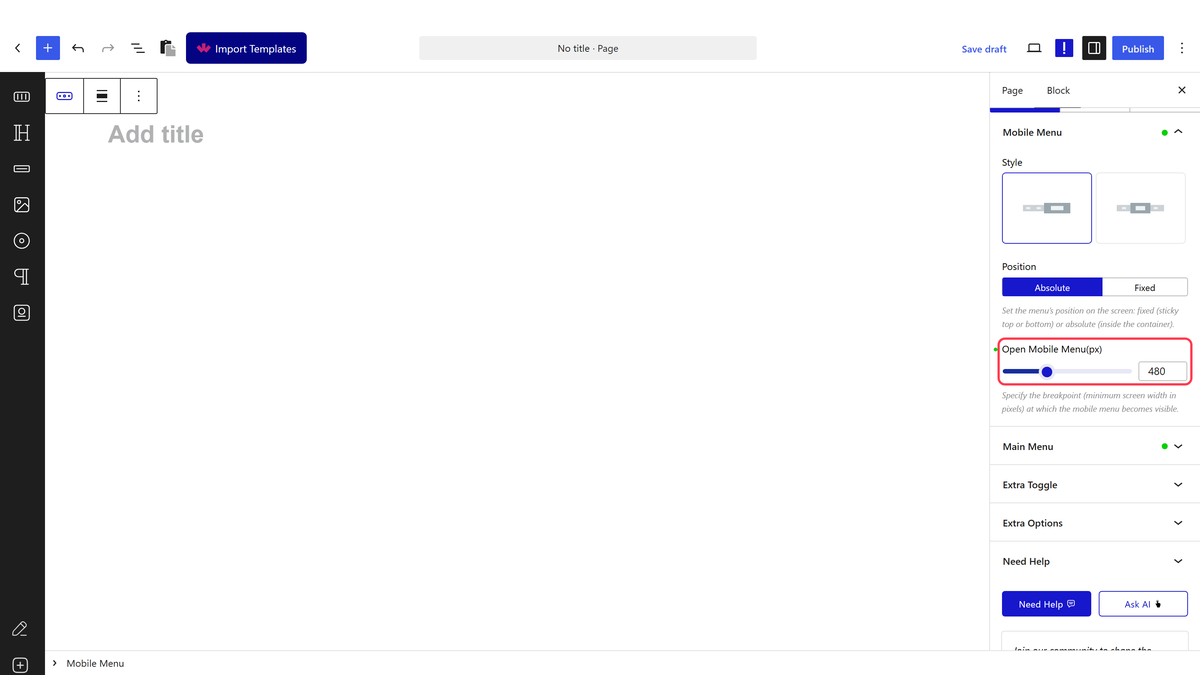
- Set Open Mobile Menu(px) to the width below which the menu should appear.
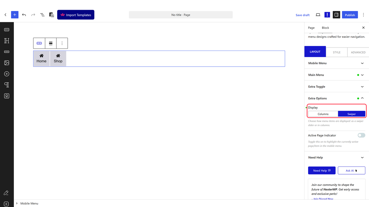
- In Extra Options, set Display to the swiper option.
- Add as many items as you need — they no longer have to fit at once.
- Publish and try swiping the bar on a phone.
Open Mobile Menu(px) is a maximum width, not a minimum — the menu appears on screens narrower than the number and stays hidden above it.
How It Behaves
- With the swiper display the bar becomes a slider — confirmed with six items, where swiper markup was present on the front end.
- Items keep their size rather than being squeezed to fit.
- Visitors swipe on touch screens and can drag with a mouse.
- Columns is the other option, which fits everything on screen at once.
Limitations
- Pro only.
- Items off the edge are out of sight until someone swipes, so put the most important first.
- There is no arrow to hint that the bar scrolls, which some visitors will miss.
- With only three or four items there is nothing to swipe and the setting makes no visible difference.
Troubleshooting
Nothing swipes
With few items they all fit, so there is nothing to scroll. Add more, or test on a narrower screen.
The items look squashed instead of sliding
Display is still on columns. Switch it to the swiper option.
