







Skip to content

How to Create a Popup Mobile Menu with Pattern in WordPress?

Key Takeaways

  • Nexter Blocks Pro incluye el bloque Mobile Menu, que se activa en Nexter > Blocks y permite añadir elementos con etiqueta, icono o imagen y enlace.
  • Open Mobile Menu(px) define una anchura máxima: el menú aparece en pantallas más estrechas que ese número y permanece oculto por encima de él.
  • Extra Toggle añade un botón junto a los elementos del menú que abre un patrón guardado, y la dirección del ajuste decide desde qué borde entra el panel.
Table of Contents

A phone bar holds five items; a site usually has more than five pages.

An extra toggle can open a saved pattern, giving you a full menu panel behind a single button.

For every Mobile Menu setting in one place, see the Mobile Menu block guide.

Before You Start

  • Edition: Pro — the Mobile Menu block is part of Nexter Blocks Pro.
  • Block to enable: Mobile Menu, switched on under Nexter > Blocks in your WordPress dashboard.
  • Your menu items decided: four or five is the usual limit before a phone bar gets crowded.

Steps

  1. Add the Mobile Menu block to your page or template and click Design from Scratch.
  1. In the Mobile Menu panel, add your items — each one takes a label, an icon or image, and a link.
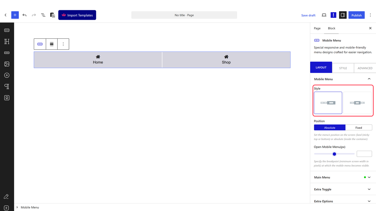
The Mobile Menu panel with Style and the item list
  1. Set Open Mobile Menu(px) to the width below which the menu should appear.
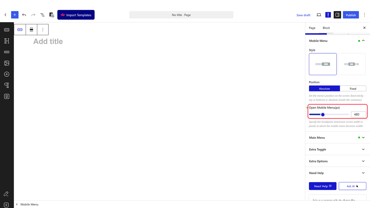
The Open Mobile Menu(px) breakpoint setting
  1. Build the full menu you want to open and save it as a pattern.
  1. Switch Extra Toggle on in its own panel.
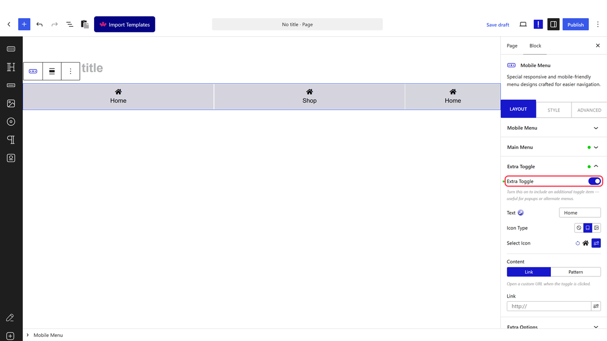
The Extra Toggle panel with its pattern and direction settings
  1. Choose your saved pattern and the direction it should open from.
  1. Publish and tap the toggle on a phone.

Open Mobile Menu(px) is a maximum width, not a minimum — the menu appears on screens narrower than the number and stays hidden above it.

How It Behaves

  • The extra toggle renders alongside the menu items as an additional button — confirmed on the front end.
  • Tapping it opens the pattern you chose, so the panel can hold a full menu, a search box or anything else you build.
  • The direction setting decides which edge the panel comes in from.
  • The rest of the bar keeps working as normal while the panel is available.

Limitations

  • Pro only.
  • The panel content has to exist as a saved pattern first; it cannot be typed into the block.
  • A pattern built for desktop widths will not fit a phone panel — build it for narrow screens.
  • Editing the pattern changes it everywhere it is used.

Troubleshooting

The toggle does nothing

Check a pattern is actually selected. A toggle with no pattern has nothing to open.

The panel content is cut off

The pattern is too wide for a phone. Rebuild it at a narrow width, or let it scroll inside the panel.

Related Docs

Share your Thoughts

Still in Doubt? Let’s Assist You

Have Feedback or Questions?

Join our WordPress Community on Facebook!

Related Frequently Asked Questions

What do I need before creating a popup mobile menu with a pattern in WordPress?

The key requirement is the Mobile Menu block from Nexter Blocks, because the popup menu is built from that block. The page also says the block needs to be installed and activated before it will work. In practice, that means the pattern-based menu setup depends on Nexter Blocks being available first, then you add the Mobile Menu block into a header template.

Why is my mobile popup menu pattern not showing on the page?

Backend Visibility is the first thing to check, because the page says blocks are hidden on the page by default for a smoother editing experience. Turn that toggle on if you want to see the block while editing, then turn it off again when you are done. If the pattern still feels delayed, also check whether you picked Default or Standard AJAX in the AJAX Load section.

Can I build this popup mobile menu without a paid builder?

The header template can be created with the free Nexter Builder, so the tutorial does not require a separate paid builder just to set up the header. That matters because the popup menu lives inside the header template, not as a standalone page element. For the broader setup flow, Nexter Builder is the part used to create that header structure.

What is the difference between Default and Standard AJAX for the mobile menu pattern?

Default shows the selected pattern result right away, while Standard AJAX makes you wait for it to load. That difference matters when you want faster perceived feedback versus an AJAX-loaded result. The page also notes that Standard AJAX only works if Enable Ajax Templates is turned on in Nexter Blocks > Extra Options > Settings.

How do I make the popup open from a specific direction?

The direction is controlled from the Direction section in the Mobile Menu block settings. That setting matters because it changes where users see the popup enter from, which affects how natural it feels on mobile screens. The same block also lets you adjust Open Content Style and Content Width, so direction is only one part of how the popup behaves.

What is the best way to control how wide the mobile popup menu appears?

Content Width is where you decide whether the popup stays compact or fills more of the screen. The page gives two options: Custom Width/Height for a specific size, or Full Width/Height for full-screen dimensions. For mobile navigation, that choice changes whether extra menu items feel like a small panel or a full overlay.

Last reviewed: September 15, 2026

Related Docs