


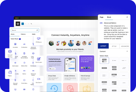
Do you want to create a sticky bottom mobile menu in WordPress? A sticky bottom mobile menu keeps navigation visible at all times, which is especially helpful on long-scrolling mobile pages.
With the Mobile Menu block from Nexter Blocks, you can create a sticky bottom mobile menu directly in the WordPress block editor (Gutenberg).
To check the complete feature overview documentation of the Nexter Blocks Mobile Menu block, click here.
Best Used For:
- Mobile-first sites and landing pages where bottom-pinned navigation improves one-handed browsing
- WooCommerce stores where you want persistent category or cart access on mobile
- Blogs and news sites with long-scrolling content where the header menu scrolls out of reach
Requirement — This block is a part of Nexter Blocks. Make sure it is installed and activated.
To do this, add the Mobile Menu block to the header template and follow the steps below.
Note: To create the header template, you can use the free Nexter Builder.
1. After selecting the appropriate style from the Style section, select Fixed from the Position dropdown. This locks the menu bar to a fixed position on screen so it does not scroll away with the page content.
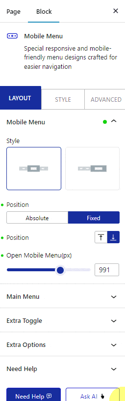
2. Then, from the second Position section, select Bottom. This moves the fixed menu bar to the bottom edge of the screen, creating the sticky bottom effect on mobile.
3. In the Open Mobile Menu section, add your desired screen width breakpoint so the sticky bottom menu only appears on mobile devices and does not interfere with the desktop layout.
4. Create the menu from the Main Menu and Right Menu tabs based on the style you selected in the Mobile Menu tab.
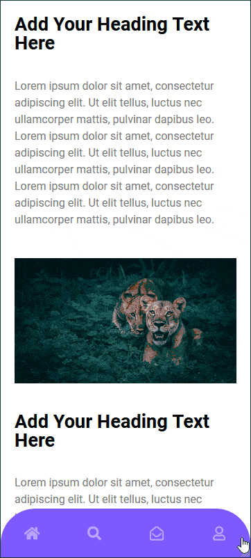
Your mobile menu will now stick to the bottom of the screen as visitors scroll.
To add a transparent or sticky header for desktop visitors alongside your mobile menu, see How to Add a Transparent Header in WordPress with Nexter.
For a standard navigation menu setup, see How to Add a Navigation Menu in WordPress.
