


Do you want to add custom content to your mobile off canvas menu in WordPress? Using a Pattern, you can display unique content such as contact details, a promo banner, or social links inside the off canvas panel.
With the Navigation Menu block from Nexter Blocks, you can use a Pattern as the content source for an off canvas mobile menu in the WordPress block editor (Gutenberg).
To check the complete feature overview documentation of the Nexter Blocks Navigation Menu block, click here.
Requirement — This block is a part of Nexter Blocks. Make sure it is installed and activated to use this feature.
Best Used For:
- Business sites that need a branded off canvas panel with contact info, CTAs, or a logo
- Portfolio and agency sites that want a custom hamburger menu with visuals instead of a plain link list
- WooCommerce stores that display cart links, promotions, or featured categories in the mobile menu
To do this, you must first create a Pattern with the menu content.
Go to Appearance > Patterns > Add New Pattern to create a Pattern.
Then add the Navigation Menu block to the header template and follow the steps below.
Note: To create the header template, you can use the free Nexter Builder.
1. From the Navigation Bar tab, select the appropriate Type, Layout, and menu.
2. Then go to the Mobile Menu tab and enable the Responsive Mobile Menu toggle.
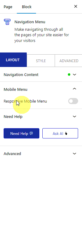
In the Open Mobile Menu (Screen Width) section, specify the minimum screen width at which the mobile menu activates. Use a value of 768px for tablet-and-below breakpoints, or adjust to match your site layout.
3. Do not select anything in the Mobile Menu section.
4. From the Menu Type section, select Off Canvas.
5. Enable the Show Template toggle, then select your mobile menu pattern from the Pattern dropdown.
Note: You can also create a Pattern from here by clicking on the Create Pattern button.
Set the popup width from the Custom Width section. Use this when your pattern includes wide content such as a multi-column layout or a featured image.
From the Toggle Style dropdown, select the toggle style that appears as the hamburger icon on mobile. Use this when your site header uses a custom color scheme that requires a matching toggle icon.
From the Toggle Alignment section, align the toggle button within the header.
From the Navigation Alignment section, align the menu items inside the off canvas panel.
Your Pattern will now appear as the off canvas mobile menu when visitors click the hamburger toggle. To add breadcrumb navigation to your site alongside the menu, see How to Add Breadcrumbs in WordPress.
