


An organized navigation structure improves the user experience on your WordPress website. Using breadcrumbs improves navigation by giving visitors a clear trail of links that shows where they are on a website and lets them go back to pages they visited before. They are useful, especially on websites with many pages and sections, because they help visitors navigate back through the page hierarchy.
With the Breadcrumbs block from Nexter Blocks, you can add breadcrumbs to your WordPress website in the WordPress block editor (Gutenberg).
Required Setup
- Make sure the default WordPress Block editor is active.
- You need to have the Nexter Blocks plugin installed and activated.
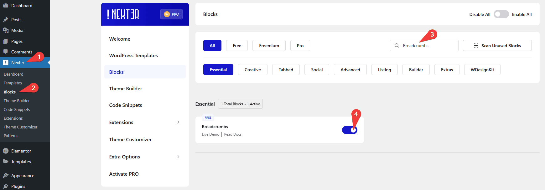
- Make sure the Breadcrumbs block is activated. To verify this, visit Nexter → Blocks → and search for Breadcrumbs and activate.
Learn via Video Tutorial

How to activate the Breadcrumbs Block?
Go to
- Nexter → Blocks
- Search the block name and turn on the toggle.
Key Features
- Two Styles – Choose from two unique breadcrumb styles. Use the Simple style for a clean linear trail and the second style when you want a distinct separator between items.
- Fullwidth Breadcrumb – Make the breadcrumb bar span the full width of its container. Use this when your header spans the full page width.
- Home Title/Icon – Add an icon or custom title text to the home link in the breadcrumb trail.
- Custom Home URL – Set a custom URL on the home link. Use this when the home link should point to a category landing page instead of the root domain.
- Visibility – Show or hide the home page, parent page or the current page from the breadcrumb trail.
How to Use the Breadcrumbs Block?
To add breadcrumbs to your WordPress website, add the Breadcrumbs block to the header template so it is accessible throughout the website.
To create the header template, you can use the free Nexter Builder.
Add the Breadcrumbs block.
Then click on the Design from Scratch button to design the layout from scratch.
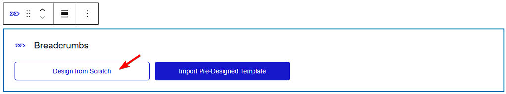
Note: By clicking on the Import Pre-Designed Template button, you can import a preset template and customize it as per your requirements.
Breadcrumbs Bar
In the Style section, you will find two pre-defined style options. Select the suitable option.
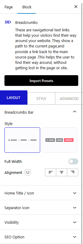
If you select the Simple style you will see the Breadcrumbs Full Width toggle. Enable it to make the breadcrumb bar span the full container width.
Then, from the Alignment section, manage the breadcrumb links alignment for different devices. Use this when your header has different alignment requirements for desktop and mobile views.
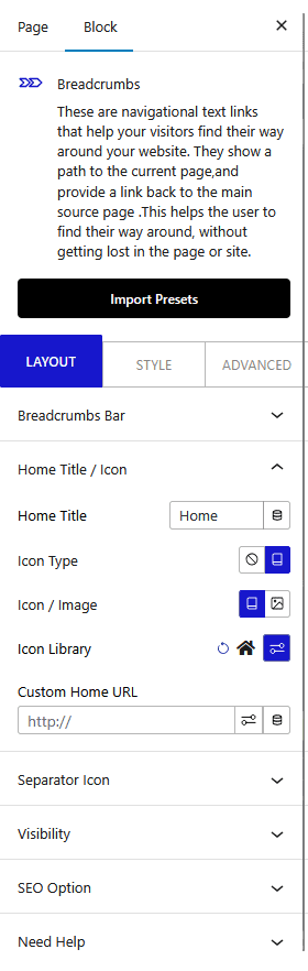
Home Title/Icon
From the Home Title field, change the home text of the breadcrumb.
Then, from the Icon Type, add an icon or image to the home text in the breadcrumb.
When enabled, from Icon / Image, add an icon or image to the home text in the breadcrumb.
Depending on the selection, you will get different options to add the image or icon to the home text in the breadcrumb.
In the Custom Home Url field, add a custom link to the home link of the breadcrumb. Use this when the home link should point to a subpage instead of the root domain.
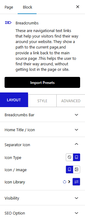
Separator Icon
From the Select Icon dropdown, add an icon or image as a separator in the breadcrumb. Use this when you want to replace the default slash or arrow separator with a branded icon.
When enabled, from Icon / Image, add an icon or image.
Depending on the selection, you will get different options to add the image or icon.
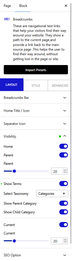
Visibility
In the Visibility tab, you will find four options:
Home – From here, show or hide the home link from the breadcrumb.
Parent – From here, show or hide the parent page link from the breadcrumb.
By enabling the Parent toggle, you can also adjust the limit of the parent title by words. Use this when parent page titles are long and you want to truncate them in the breadcrumb trail.
Show Terms – From here, show parent and child taxonomy on a single post template. Use this when your blog or WooCommerce site uses categories and you want the breadcrumb to reflect the taxonomy path.
When enabled, select a taxonomy (normal taxonomy and custom taxonomy) from the Select Taxonomy dropdown.
By enabling the Show Parent Category toggle, you can show the parent taxonomy.
Then, by enabling the Show Child Category toggle, you can show the direct child of the parent taxonomy.
Current – From here, show or hide the current page link from the breadcrumb.
By enabling the Current toggle, you can adjust the limit of the current title by words.
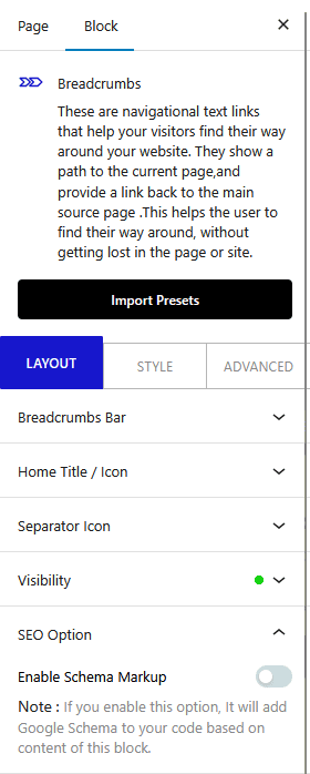
SEO Option
From the Enable Schema Markup toggle, make your breadcrumb SEO-friendly by adding Google Schema to it. Enable this to add BreadcrumbList structured data to your pages, which helps Google display breadcrumbs in search results.
If your site uses a custom off canvas mobile menu alongside the breadcrumb bar, see How to Create a Hamburger Mobile Menu with Pattern in WordPress.
How to Style the Breadcrumbs Block?
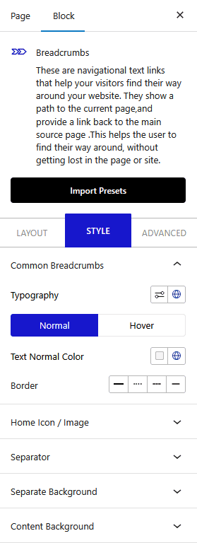
To style the Breadcrumbs block, you will find all the styling options under the Style tab.
Common Breadcrumbs – From here, manage the breadcrumb typography, color, and border.
Home Icon / Image – From here, manage the home icon padding, size, color, and border-radius.
Separator – From here, manage the separator icon padding, size, and color.
Separate Background – From here, manage the breadcrumb item padding, border radius, and background color separately. Use this when you want each breadcrumb item to have a distinct highlighted background.
Content Background – This option is only available for the Simple style. From here, manage the breadcrumb bar background, border, box shadow, and more.
Advanced options remain common for all Nexter Blocks. Explore all options from here.
