Skip to content

How to Add an Icon List in WordPress?

Key Takeaways

  • Stylish List block in Nexter Blocks adds an icon list in WordPress with vertical or horizontal layouts, tooltips, hover effects, and read more toggles built in.
  • Nexter → Blocks requires the Stylish List block to be activated, and the post says it is a Freemium block that needs the PRO version of Nexter Blocks for extra features.
  • Read More Toggle shows only a set number of list items by default and reveals the rest with a button, which the post says is useful when a list has more than five items.
  • Interactive Links must be enabled before Hover Background appears on individual list items, and Hover Inverse dims all other items when a user hovers over one.
Table of Contents

An icon list organizes information into scannable items with icons or images, helping visitors find key details without reading through large blocks of text.

The Stylish List block in Nexter Blocks lets you add an icon list in WordPress with vertical or horizontal layouts, tooltips, hover effects, and read more toggles built in.

Required Setup

  • Make sure the default WordPress Block editor is active. 
  • You need to have the Nexter Blocks plugin installed and activated.
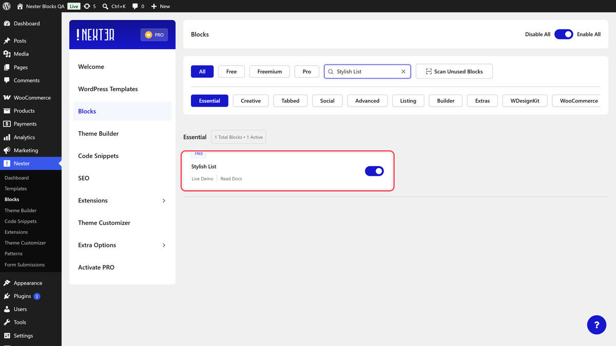
  • Make sure the Stylish List block is activated, to verify this visit Nexter → Blocks → and Search for Stylish List and activate.
  • This is a Freemium block, to unlock the extra features, you need the PRO version of Nexter Blocks.

Learn via Video Tutorial

Youtube video

How to activate the Stylish List Block?

Go to 

  • Nexter → Blocks
  • Search the block name and turn on the toggle.

Key Features

  • Two Layout – Select from two layout types, Vertical and Horizontal. Use Vertical when listing features or steps stacked in a column, and Horizontal when showing items side by side in a row.
  • Hint (Pro) – Highlight a specific icon list item to draw attention to it. Use this when you want to mark a recommended or featured item in the list.
  • Tooltip (Pro) – Add a tooltip to any icon list item to show additional context on hover. Use this when list items have descriptions that are too long to display inline.
  • Hover Background (Pro) – Change the icon list item background on hover. Use this when the list items are clickable and you want to signal interactivity to visitors.
  • Read More Toggle (Pro) – Add a read more button to show more icon list items. Use this when you have more than five items and want to keep the initial view compact.
  • Inverse Hover (Pro) – Dim all other list items when a user hovers over one item, making the hovered item stand out. Use this to guide focus in a long, dense list.

How to Use the Stylish List Block?

Add the Stylish List block to the page.

Then click on the Design from Scratch button to design the layout from scratch.

Note: By clicking on the Import Pre-Designed Template button, you can import a preset template and customize it as per your requirements.

List

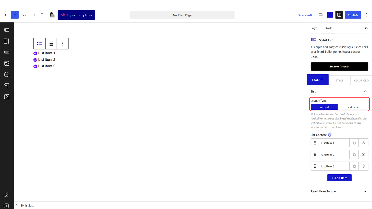
From the Layout Type section, select the layout format for your icon list. You will find two options:

  • Vertical – To create a vertical icon list. Use this when listing steps, features, or benefits stacked one below the other.
  • Horizontal – To create a horizontal icon list. Use this when showing items side by side, such as social proof icons or short feature comparisons.

Select the layout type that fits your design.

In the List Content section, add your icon list items. By default, you will find three items. Open an item to configure it.

In the Content section, add the text label for the list item.

In the Url field, add a URL to make the list item a clickable link. Use this when each item in the list should navigate to a different page or resource.

From the Icon Type section, add an icon or image to appear alongside the list item text.

Enable the Hint toggle to visually highlight this list item. Use this when you want to mark one item as recommended or featured within the list. This is a Pro feature.

Enable the Hover Background toggle to add a background color to this item when the user hovers over it. This is a Pro feature.

Note: You will only see the Hover Background toggle option when the Interactive Links toggle is enabled from the Extra Options tab.

Read More Toggle

Enable the Read More Toggle to show only a set number of list items by default, with a button visitors can click to reveal the rest. This is a Pro feature useful when you have a long list and want to keep the initial view compact.

Extra Options

Enable the Interactive Links toggle to make list items interactive, allowing each item to show a hover background effect on hover. This must be turned on before the Hover Background option appears on individual list items.

Enable the Hover Inverse toggle to dim all other list items when a user hovers over one. Use this when you want to focus the reader’s attention on a specific item in a dense list.

How to Style the Stylish List Block?

To style the Stylish List block, go to the Style tab.

List – Controls spacing between list items, alignment, and the separator color between items. Adjust these settings when you need to match the list layout to your page spacing system.

Icon – Controls icon size, color, and spacing from the text label. Use this to align the icon color and size with your brand palette.

Content – Controls font size, color, and weight of the list item text labels.

Read More Toggle – This section appears only when Read More Toggle is enabled. From here, control the font, color, and size of the read more button text.

Hint Text Style – Controls the appearance of the hint label added to highlighted list items.

Tooltip Options – Controls the tooltip size, background color, and positioning for list items with tooltips enabled.

Extra Options – Controls the inverse hover animation applied to list items when Interactive Links is enabled.

Advanced options are available across all Nexter Blocks in the Advanced tab. These include spacing, custom CSS, visibility conditions, and more.

View Advanced tab tutorial.

Share your Thoughts

Still in Doubt? Let’s Assist You

Have Feedback or Questions?

Join our WordPress Community on Facebook!