Skip to content

How to Add a Tooltip to a WordPress Icon List Item?

Key Takeaways

  • Stylish List bloquea Tooltip por fila en Nexter Blocks Free y Nexter Blocks Pro, y se activa en Nexter > Blocks dentro del panel de WordPress.
  • Tooltip Text es específico de cada fila, mientras que Position, Theme y Trigger se aplican a todo el bloque bajo Style > Tooltip.
  • Interactive en Style > Tooltip mantiene abierto el tooltip cuando el puntero entra en él, y los tooltips aparecen al pasar el cursor o al tocar en dispositivos táctiles según Trigger.
Table of Contents

Not every detail belongs in the list itself. Some of it can wait for a hover.

Tooltip attaches a small popup of text to a single row, shown when a visitor points at it — a separate setting from Hint, and not tied to it.

For every Dynamic Device setting in one place, see the Icon List block guide.

Before You Start

  • Edition: Free — the Stylish List block works in Nexter Blocks (free) and Nexter Blocks Pro.
  • Block to enable: Stylish List, switched on under Nexter > Blocks in your WordPress dashboard.

An icon list item with a tooltip attached, not yet hovered
The tooltip open after hovering the item

Steps

  1. Add the Stylish List block and add a row for each item, with its own text and icon.
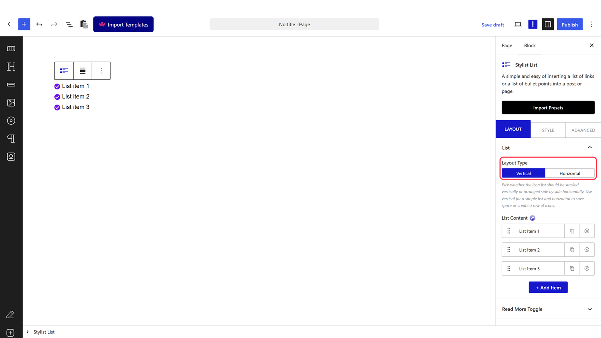
The Layout Type options
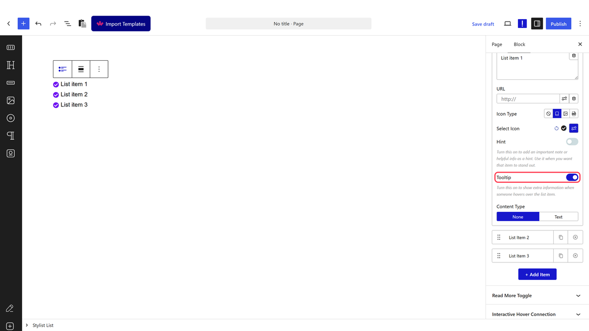
  1. Open the row and switch on Tooltip.
The Tooltip toggle
  1. Type the popup’s text into Tooltip Text.
  1. Set Position, Theme and Trigger under Style > Tooltip for how it behaves across the whole block.

Tooltip and Hint are two different settings. Switching one on does not affect the other — a row can carry a pinned Hint badge, a hover Tooltip, both, or neither.

How It Behaves

  • Tooltip needs its own per-row toggle, separate from Hint — confirmed in the block’s own renderer, which checks a different setting for each.
  • The shared Tooltip settings under Style apply to every row’s tooltip at once — Position, Theme, Trigger and animation are block-wide, only the text itself is per row.
  • The tooltip is a genuine popup (built on the same library as the browser’s own accessible tooltips), not just a title attribute — it supports basic HTML in the text.
  • Interactive, under Style > Tooltip, lets a visitor move their mouse into the tooltip itself without it closing — useful if the tooltip holds a link.

Limitations

  • Tooltip Text is per row, but Position, Theme and Trigger apply to every tooltip in the block at once.
  • A row with Tooltip on but no Tooltip Text shows nothing on hover.
  • Tooltips only appear on hover (or tap on touch devices, depending on Trigger) — the content is not read by search engines the way visible text is.

Troubleshooting

Hovering the item does nothing

Check Tooltip is switched on for that row and Tooltip Text is filled in — both are required.

The tooltip closes before I can read it

Switch on Interactive under Style > Tooltip so the tooltip stays open while the pointer is over it.

Every tooltip in my list looks the same even though I wanted one different

Position, Theme and Trigger are shared across the whole block — only the text itself can differ row by row.

Related Docs

Share your Thoughts

Still in Doubt? Let’s Assist You

Have Feedback or Questions?

Join our WordPress Community on Facebook!

Related Frequently Asked Questions

Why does hovering an icon list item do nothing when I try to add a tooltip?

Hover only works when two things are set on that row: Tooltip must be switched on, and Tooltip Text must contain text. Nexter Blocks treats the tooltip as a per-row setting, so a blank text field gives you nothing on hover even if the block-level tooltip styling is configured. That makes this a common setup miss in Nexter, Nexter WP, NexterWP, nexterwp.com, Nexter Theme, Nexter Blocks, Nexter Extension, Nexter Suite, POSIMYTH Nexter.

How do I keep a WordPress tooltip open long enough to read it?

Interactive under Style > Tooltip is the setting that matters here. When it is enabled, the pointer can move into the tooltip itself without closing it, which is useful if the popup contains more than a short line of text or includes a link. Without Interactive, the tooltip behaves like a quick hover popup and can disappear before someone finishes reading it.

Can each icon list item have its own tooltip text in WordPress?

Tooltip Text is per row, so each item can carry different copy. The catch is that Position, Theme, Trigger, and animation are shared across the whole block at once. That means you can vary the message row by row in the Stylish List block, but you cannot give each row its own tooltip behavior from those shared style controls.

What is the difference between a tooltip and a Hint badge in an icon list?

Tooltip and Hint are separate settings in Nexter Blocks. A row can have a pinned Hint badge, a hover Tooltip, both, or neither, and switching one on does not affect the other. That separation matters because Hint is visible as a badge while Tooltip appears on hover or tap depending on Trigger.

Does the WordPress icon list tooltip work on touch devices?

Tooltips appear on hover or tap on touch devices depending on Trigger. That makes Trigger important if your audience uses phones or tablets, because the popup behavior is not limited to desktop mouse hover. The content still lives in Tooltip Text per row, while Position and Theme stay block-wide.

What should I use if I want one icon list item to look different from the others?

Only the text can differ row by row for tooltips. Position, Theme, and Trigger are shared across the whole block, so they will make every tooltip look and behave the same. If you need one item to stand out visually or behaviorally, that limitation means you have to work within per-row text differences rather than expecting separate styling for each row.

Last reviewed: September 28, 2026

Related Docs