




Kadence Blocks shipped version 3.8.0 on 13 October 2026, and its headline feature is a Style Library: one place to set the colors, type sizes, spacing and other values that the plugin’s blocks then use. I read the changelog, the Nexcess guide that documents it, and then the Nexter Blocks pages for the features that do a similar job. I wanted to know where the two approaches are the same and where they are different.
The short version is that they are built on different ideas. Kadence has gone for a token system, where a block stores the name of a value and changes everywhere when the value changes. Nexter Blocks gives you global colors and typography that work across any element, plus Global Block Styles that save a whole block look as a preset. Neither is better in the abstract. Which one fits depends on how you build sites.
I will mark what I confirmed from documentation and what I did not. I did not install Kadence Blocks 3.8.0 for this post, and I did not click through either interface, so treat the details as documentation reading, not hands-on testing.
What Kadence Blocks 3.8 Shipped And What Changed Since
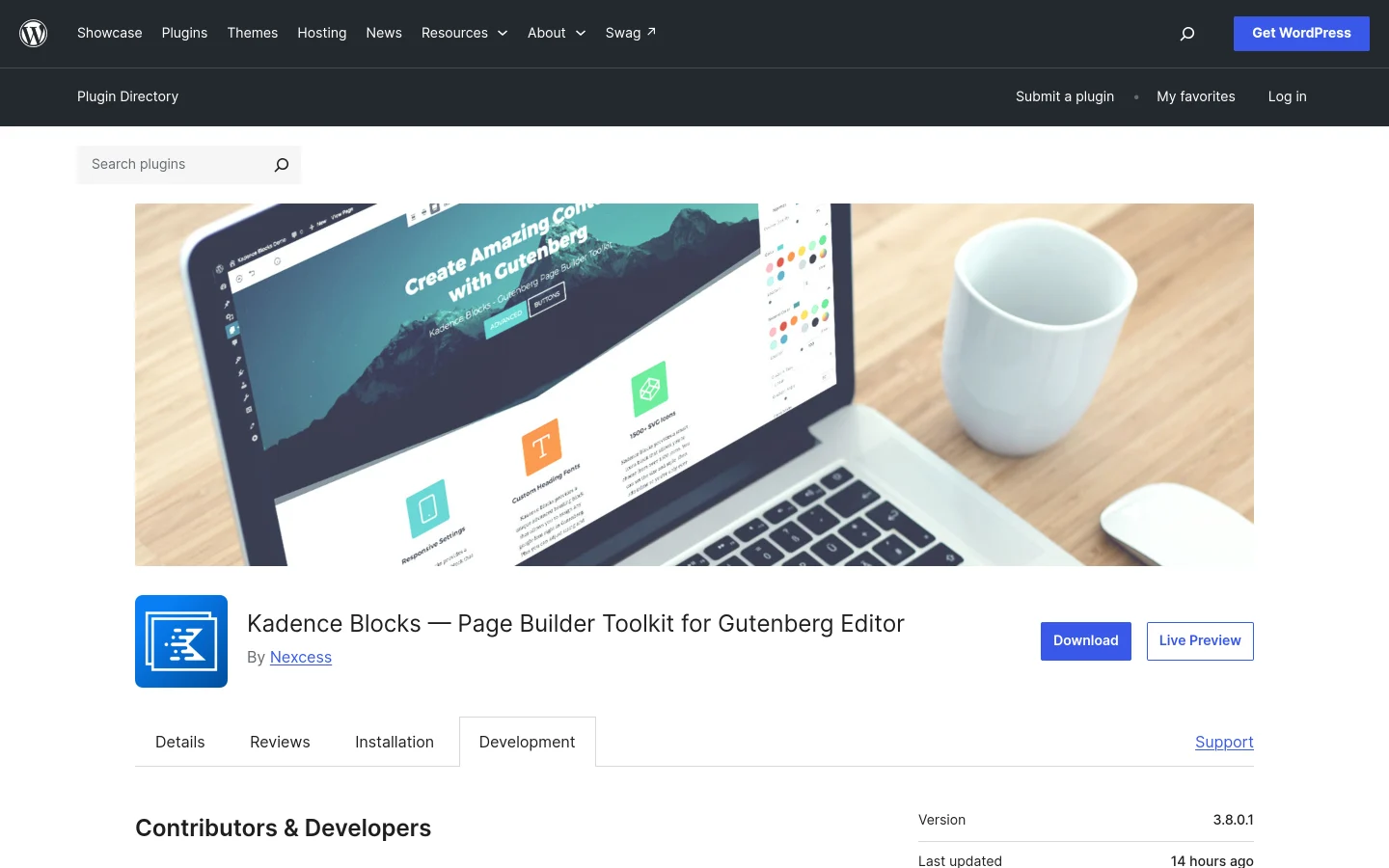
The Kadence Blocks page on WordPress.org lists version 3.9.1.2 as the current release and 600,000 plus active installations when I checked on 20 November 2026. The changelog entries that matter here:
- 3.8.0 (13 October 2026): adds the Style Library, described as a design system for setting colors, typography, spacing, borders, shadows and block presets once and applying them across Kadence blocks. It also includes security hardening for SVG sanitization.
- 3.8.0.1 (19 October 2026): fixes Design Tokens overriding palette reads for a non-active palette set, which had stopped Kadence Pro dark mode from applying its dark palette, and improves output handling in block front-end scripts.
- 3.8.0.2 (22 October 2026): design tokens no longer query the database on every lookup, and each token library is read once per request.
- 3.9.0 (5 November 2026): adds site-wide block styles for the Kadence theme’s Full Site Editing mode, so Kadence blocks can be styled once in Appearance, then Editor, then Styles.
- 3.9.1 (11 November 2026): fixes theme palette colors 10 through 15 missing from the Style Library. They now show in a new Extended group.
Two things stand out. First, the feature has had fixes in each release since: the first landed six days after launch, and another followed in 3.9.1. That is normal for a large new system, and I would read it as a sign to let a feature settle before moving a live site onto a new design layer. Second, the dark mode fix tells you the Style Library is already connected to palettes beyond the basics.
How The Kadence Style Library Works
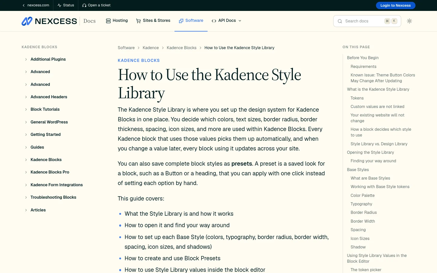
The most useful description I found is the Nexcess documentation page for the feature, published on 14 October 2026. It is a third-party host documenting a vendor product, so check it against Kadence’s own docs before you build a client process on it. Here is what it says.
Tokens: Named Values That Blocks Remember
Each value you save in the Style Library is a token, a named value such as a color called Button or a spacing step called Medium. When you choose a token on a block, the block remembers the token name and not just the value. Change what the token is set to and every block that uses it updates across the site.
The page gives an example: forty buttons use the Button color token, you change it from blue to red, and all forty turn red. A custom value, picked by hand with the color picker, is not linked to the library, so that block does not change.
Base Styles And Block Presets
The left sidebar of the Style Library has two groups. Base Styles covers Color Palette, Typography, Border Radius, Border Width, Spacing, Icon Sizes and Shadow. Block Presets covers Button, Advanced Image, Row Layout, Section, Icon and Advanced Text, with a count of how many presets each has. A preset is a saved look for a block that you can apply in one click.
The Three Layers A Block Checks
For each setting a block checks three layers in order: the value set on the block, then the block preset, then the theme default. The preset sits between the theme and the block, so a block can take most of its styling from a preset while you override one or two settings on that block only. It is the clearest rule of the whole system, and Nexter’s documentation does not describe an equivalent order in the pages I read.
What The Page Warns About
- It only applies to Kadence Blocks. The Style Library does not apply to core blocks such as Paragraph, Heading, Button or Image, or to blocks from other plugins.
- Your existing site should not change. Default tokens and presets match how Kadence Blocks styled content before this release. If you use the Kadence Theme, your theme color palette is imported as the Default palette.
- A known issue with theme buttons. The page says that for Kadence Theme users, updating can overwrite button colors and styles set in the Customizer with default preset colors, and recommends noting your settings and taking a backup first. It lists a fix as planned. I did not find that issue in any changelog entry from 3.8.0 to 3.9.1.2, and I did not verify whether it is resolved.
- It is not the Design Library. The Design Library is the pattern and page layout picker in the editor toolbar. The Style Library holds your design values and presets and opens from Kadence, then Style Library, in the dashboard.
What Nexter Blocks Offers For Global Styling
Nexter Blocks has three related pieces, and the naming trips people up, so I will separate them.
Global Colors And Global Typography
The Nexter Blocks Global Options page describes site-wide settings for typography, colors and spacing. Its body lists Global Colors, Global Typography and Global Box Shadow, each with the ability to add, rename, update and delete unlimited variations, and the typography option includes Google Fonts. The page does not label itself free or Pro.
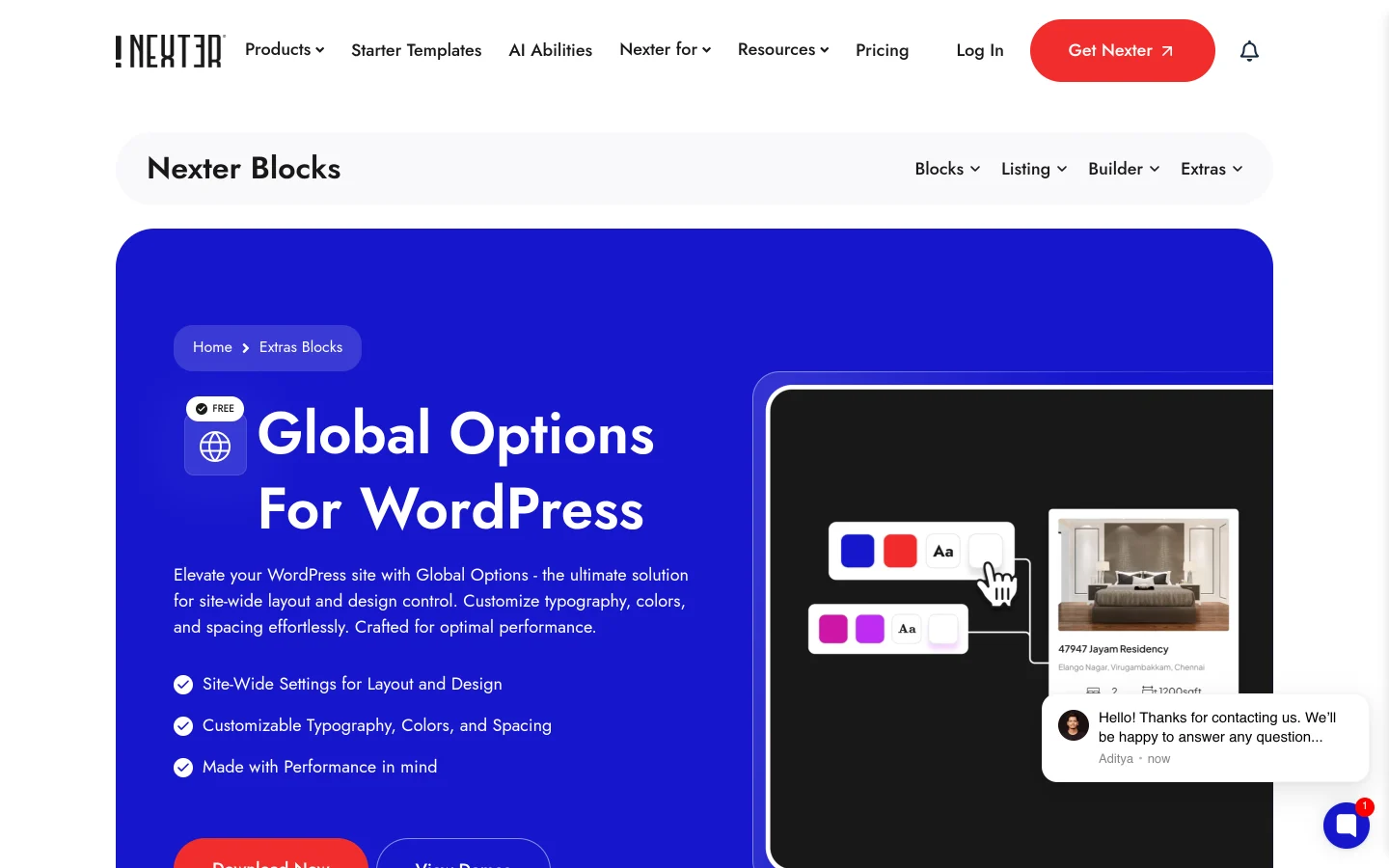
Nexter’s announcement post explains that Global Colors and Global Typography are block-independent. You pick a color or a type setting once and apply it to the color or typography of any element on the site, not only to one kind of block.
The Global Styles Manager
According to Nexter’s post on global styles for brand colors, fonts and spacing, the Global Styles Manager was revamped in the May 2025 update so that your global brand color, global typography or global spacing can be used across headings and paragraphs without depending on blocks. That post also warns you not to confuse it with Global Block Styles, and I agree: the two names sound like one feature.
Global Block Styles
Global Block Styles is the closest match to Kadence presets. The Nexter page describes four steps: add a block, style it, save the style as a global preset, then reuse it from a dropdown on any matching block. Change the preset and all matching blocks update site-wide. You can also keep several presets for the same block, for example one look for the blog and another for a product page.
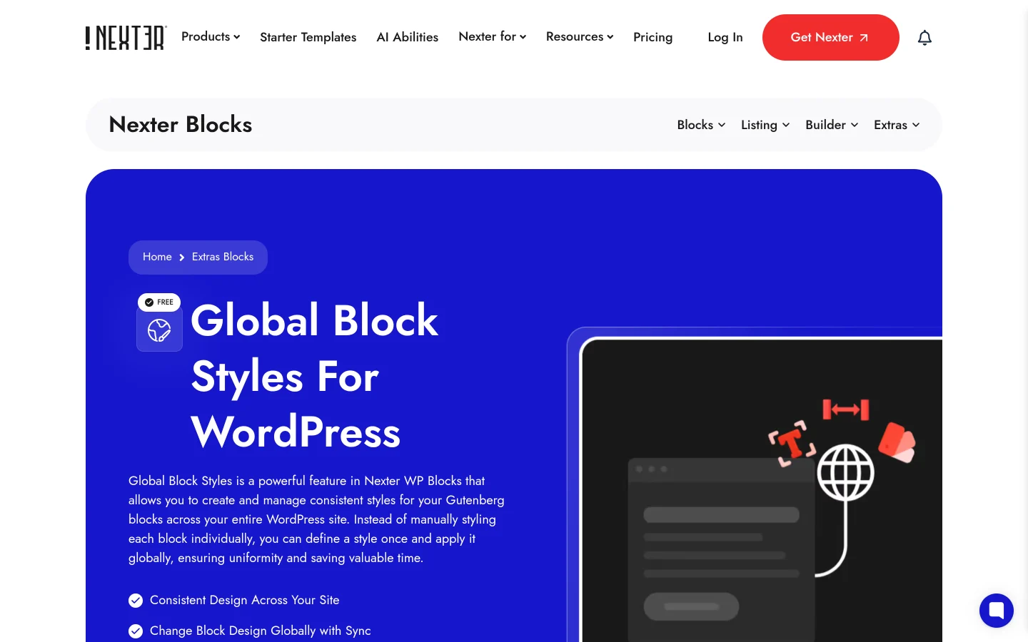
Setup is a toggle. The announcement post says to go to Nexter Blocks, then Dashboard, then Blocks, then Extras, and make sure Global Block Style is switched on. A preset is block-dependent: it applies to the same type of block only. The post compares it with Global Colors and Typography in a table to make that point.
One caution on plans. Nexter’s docs page on adding a global style to a block says Global Block Styles is a free feature that works with Nexter Blocks free and Pro, and keeps working with Pro deactivated. For the plan split of anything else, use the free versus Pro page, not my reading of a product page.
Side By Side: Tokens Versus Presets
| Question | Kadence Blocks Style Library | Nexter Blocks Global Styling |
|---|---|---|
| Core idea | Named tokens that blocks remember, plus presets | Global colors and typography for any element, plus block presets |
| What a block stores | The token name, so a change flows through | Documented as applying the saved preset to matching blocks |
| Colors and type | Color Palette and Typography in Base Styles | Global Colors and Global Typography, block-independent |
| Other design values | Border Radius, Border Width, Spacing, Icon Sizes, Shadow | Global Box Shadow is documented in Global Options, and spacing is covered in the Global Styles Manager post. I did not find radius, border width or icon size equivalents in the pages I read |
| Block presets | Button, Advanced Image, Row Layout, Section, Icon, Advanced Text | Documented as available for Nexter blocks such as Accordion, Info Box and Testimonial |
| Order of precedence | Block, then preset, then theme, documented | I did not find an order described |
| Works on other plugins’ blocks | No, Kadence Blocks only | Global Colors and Typography apply to any element. Presets are for Nexter blocks |
| Where you set it up | Kadence, then Style Library, in the dashboard | Global Options, plus a Global Block Style toggle in Nexter Blocks, then Extras |
Read the table as a difference in shape, not a score. Kadence has a more complete token vocabulary and a clear precedence rule. Nexter has colors and typography that reach beyond its own blocks, and presets that cover any Nexter block it documents. If you want a gap to point at, it is that I could not confirm radius, border width or icon size equivalents on the Nexter side.
Which Approach Fits Which Kind Of Site
Choose Tokens If You Run A Design System
If you maintain one brand across many pages and want a rule that says what wins when settings collide, the Kadence approach is attractive. The token names give you a shared vocabulary between designer and builder, and the three-layer rule gives you a predictable answer to “why does this button look different”. The cost is that it only covers Kadence blocks.
Choose Presets If You Build Page By Page
If you build sections one at a time and want to save a block look and reuse it, a preset workflow is quicker to learn. Nexter’s four-step flow is that. You do not need to plan a token vocabulary before you start, and global colors and typography still apply across the rest of the page.
Mixed Sites And Migration
If you are moving between block plugins, the question is what survives. A token system ties your styling to that plugin’s blocks. For plugin moves, I wrote a step-by-step in how to move from Spectra Legacy to Nexter Blocks, and compared options in my Kadence Blocks alternatives list. If you are weighing Kadence itself, my Kadence Blocks review covers the plugin more broadly.
Where Core Gutenberg Fits
Core is moving toward the same territory. Gutenberg 24.1 extended design tools to almost every core block, and 24.2 added button background support, as I covered in the Gutenberg 24.1 post and the button styling post. Core already has global styles through theme.json for block themes, and it is the only layer that applies to core blocks. If a site can live on core blocks, the cheapest design system is the one that does not depend on a plugin at all.
For broader context on how plugin block libraries compare, my GenerateBlocks alternatives post and my Spectra comparison take the same question from different angles.
Before You Update Kadence Blocks
- Take a full backup first.
- If you use the Kadence Theme, note your button colors and styles from Appearance, then Customize, before you update. The Nexcess page warns that they may be overwritten.
- Do not rebuild a whole design system in the first weeks of a new feature. The 3.8.0.1 fix landed six days after 3.8.0, and 3.9.1 fixed missing palette colors in the Style Library.
- Use tokens for values that should follow the site and custom values for one-off styles that should not change.
- Check your Kadence Pro dark mode after updating, because the 3.8.0.1 fix concerned dark palettes.
Questions People Ask About The Kadence Style Library
Is The Kadence Style Library Free?
I did not confirm which parts are free and which belong to a paid plan. The Nexcess page lists the Kadence Blocks plugin as the requirement and the changelog does not label the feature by plan. Check Kadence’s own pricing page.
Does It Change My Existing Site?
The Nexcess page says the default tokens and presets match how the plugin styled content before the update, so a site should look the same. The known button issue for Kadence Theme users is the exception it names.
Does Nexter Blocks Have Tokens?
Not by that name in the documentation I read. Nexter documents global colors, global typography, global spacing and block presets. Whether that is enough depends on whether you need the full token vocabulary.
What This Doesn’t Cover
- I did not install any Kadence Blocks version from 3.8.0 to 3.9.1.2, so I have not used the Style Library. The behaviour comes from the changelog and the Nexcess documentation, which is a third-party host, not Kadence itself.
- I did not open the Nexter Global Block Styles or Global Options interfaces in an editor. The steps come from Nexter’s product pages, docs and announcement post.
- I did not confirm whether Nexter has border radius, border width or icon size equivalents. I only report that I did not find them in the pages I read.
- I did not verify whether the Kadence Theme button issue is fixed in any later release, because the changelog does not mention it.
- I did not test performance, front end output or compatibility with block themes for either plugin.
- I did not compare other block plugins’ design systems today. Each vendor’s changelog needs checking on the day you read this.
Suggested Reading
- 6 Best Kadence Blocks Alternatives Compared (2026)
- Kadence Blocks Review
- Say Hello To Global Block Styles And Form Block In Nexter Blocks
- Best GenerateBlocks Alternatives For Building WordPress Sites Without Writing CSS
- Spectra Blocks Vs Spectra Legacy
- How To Add Global Style To A WordPress Block
To try the global styling side yourself, start with the Global Block Styles page and the Global Options page. Both are Nexter Blocks features.
