












Gutenberg 24.2.0 RC1 gives the core Button block background image, size and gradient support, and gives the Buttons container shadow support. If you style buttons for a living, that is the first time in a while that core moves toward what button plugins do. I wanted to know how much of it you can already get from Nexter Blocks today, so I read the RC1 changelog, then the Advanced Button block page and the two Nexter documentation pages about button images and hover animation.
The short answer is that Nexter Blocks already covers shadows on hover, images inside buttons, and separate Normal and Hover styling. It does not obviously cover a button background image, and I could not confirm it from the pages I read. I will say which is which, so you do not copy a claim I could not check.
Everything here is from the changelog and the documentation. I did not run Gutenberg 24.2 RC1, and I did not click through the Advanced Button settings in an editor. If a control name differs in your version, trust your editor over this post.
What Core Adds To Buttons In Gutenberg 24.2 RC1
These are the entries from the RC1 changelog that touch buttons directly:
- Button: add background image, size, and gradient support.
- Buttons: add shadow support.
- Buttons: add minimum width and height support.
- Button: only open the link popover on explicit user action.
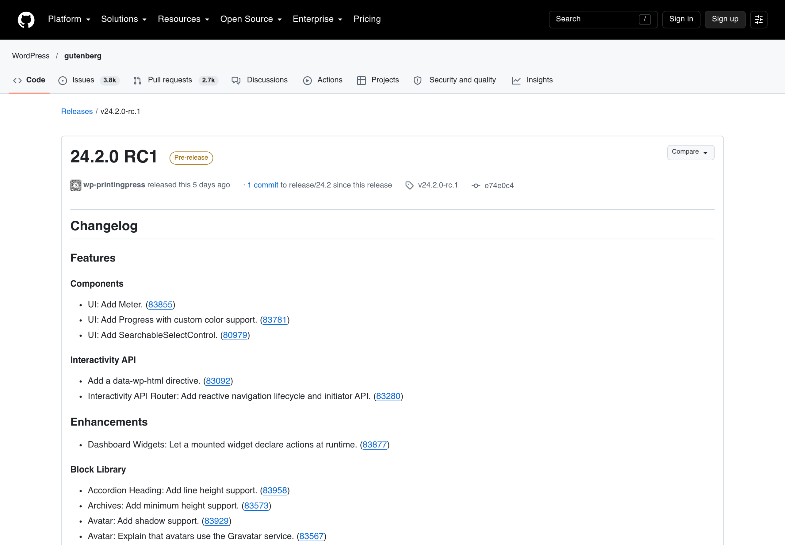
Two things matter before you plan around this. First, it is a release candidate, and stable is not out. Second, the Gutenberg plugin gets features before WordPress core does. I covered the timing and the full list in my Gutenberg 24.2 post, and I covered the same pattern for the previous release in the Gutenberg 24.1 post.
What The Nexter Blocks Advanced Button Already Does
The Advanced Button block is part of the free Nexter Blocks plugin. According to its block page it comes with 20+ button styles, icons on buttons and an accessibility focus. That page also lists a few effects by name: change button text on hover, a hover outline effect, a slide-in with icon effect, and a grow and float shadow button.
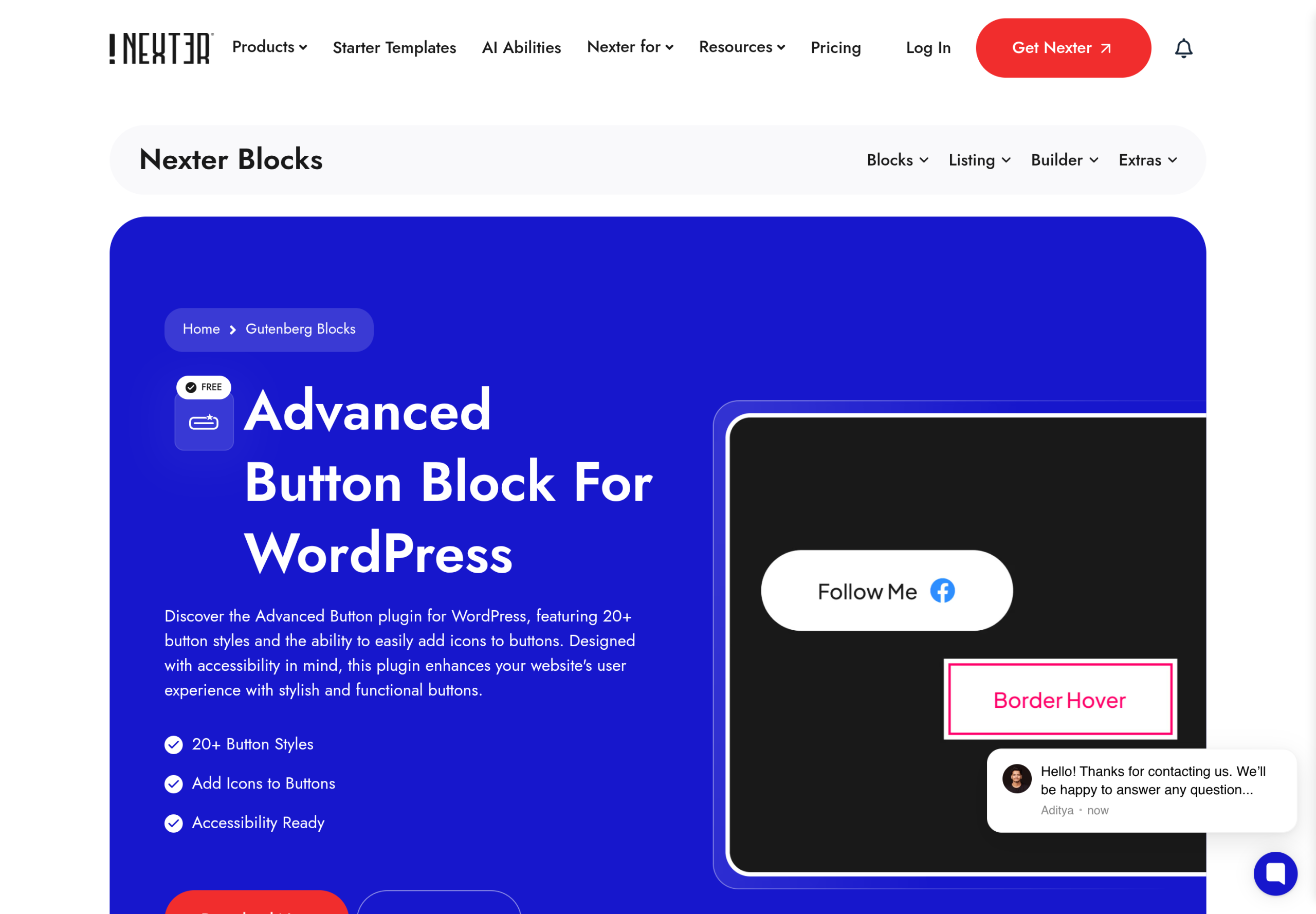
The same page lists these capabilities in its feature list:
- Icons positioned before, after or above the text, with adjustable spacing and size.
- Dynamic ARIA labels.
- Content hover effects and shadow box effects.
- Styling for default, hover and active states.
- Responsive controls for mobile and tablet.
Notice what is missing from that list: a background image or a background gradient on the button itself. That absence is not proof the block cannot do it. It means I could not confirm it from the public page, which is why I treat background image as the one place where the new core Button control is a real addition.
How To Turn On The Advanced Button Block
Both docs pages say the same thing about setup. The Advanced Button works in free Nexter Blocks and with Nexter Blocks Pro, and you switch it on under Nexter, then Blocks, in your WordPress dashboard. Once it is on, you add it from the inserter, pick a style and type your button text.
I would start there before touching any other setting, because the style you choose decides which options matter. Style 11, for example, swaps to a Hover Text on hover, and styles 3, 6, 7 and 9 use their own arrow and do not show an icon at all. I come back to that in the image section.
How To Add A Hover Shadow To A Button
Core 24.2 adds shadow support to the Buttons container block. The Nexter docs describe a different thing: a shadow that appears while the pointer is over the button. Here are the steps from the documentation:
- Add the Advanced Button block, pick a style and type the button text.
- On the Style tab, open Extra Options and turn on Content Hover Effect.
- Pick an effect in Select Effect and set the Shadow Color. Then save.
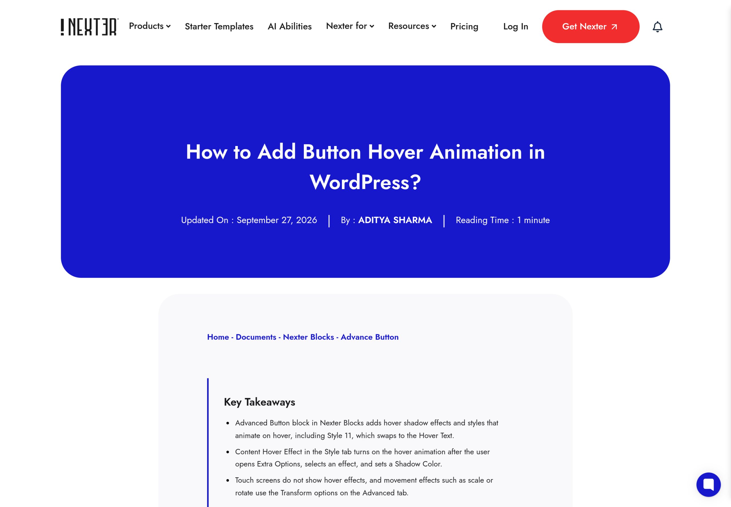
Three details from that page are easy to get wrong. The effect shows as a shadow in the colour you choose, so a Shadow Color that blends into the page background can look like nothing happened. Touch screens have no hover, so phone visitors will not see the effect even when it is set correctly. And movement effects such as scale or rotate are not part of this setting, they use the Transform options on the Advanced tab.
Separately, the Button panel has Normal and Hover colours that change the button itself on hover. If you only need a colour change and no shadow, that is the simpler route.
How To Put An Image Inside A Button
Core 24.2 adds a background image to the Button. Nexter takes a different approach: it can place a small image inside the button, next to the text. The documentation steps are:
- Add the Advanced Button block, pick a style and type the button text.
- Open the Icon panel and set Icon Type to Image.
- Choose your image and a small Image Size, such as Thumbnail.
- On the Style tab, open Icon to set Icon Position (Prefix or Postfix), Icon Spacing and Icon Size. Then save.
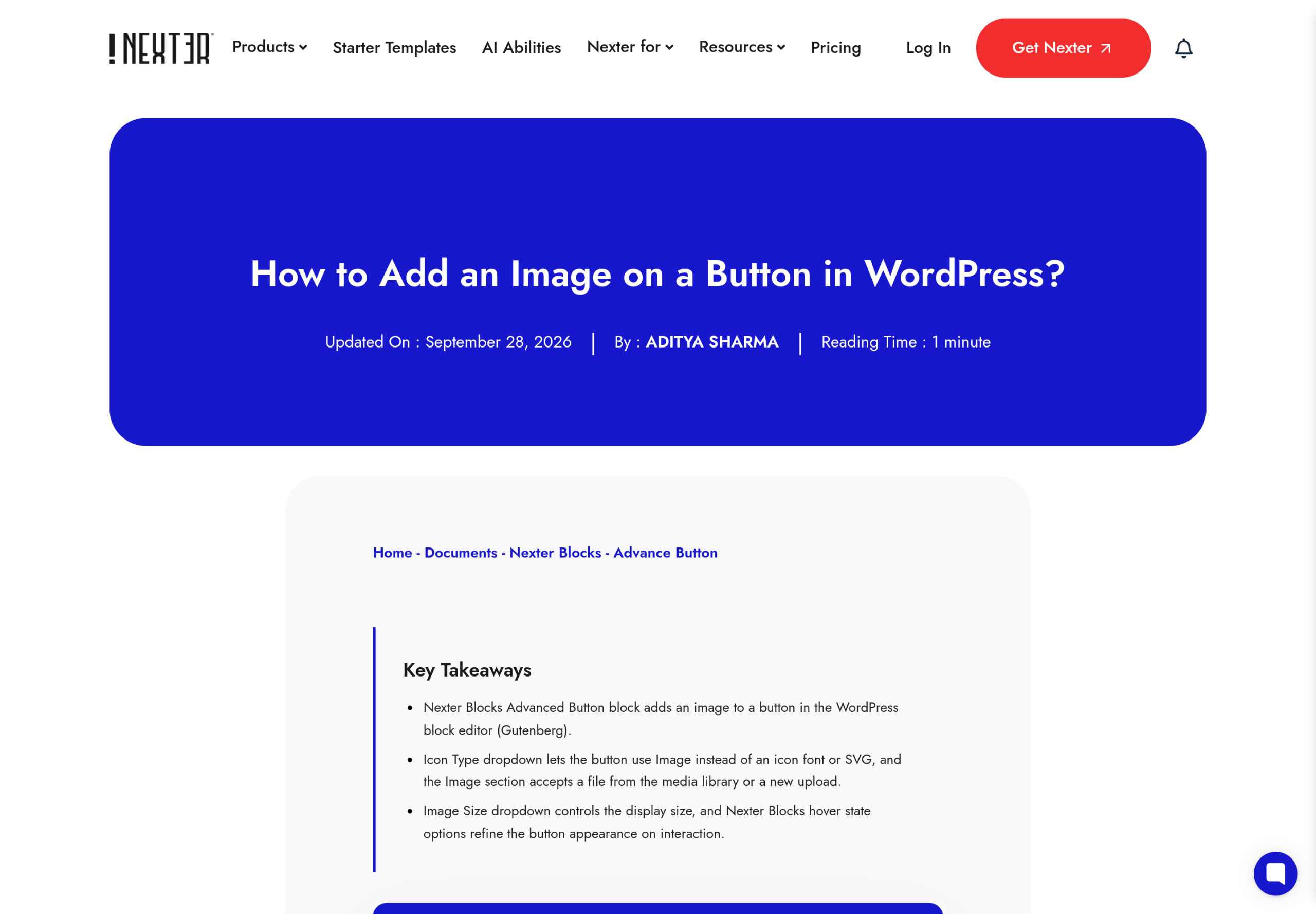
The page recommends a small PNG or SVG with a transparent background, ideally under 64px. It also explains why: Image Size picks the file WordPress serves, so a large size adds page weight even if Icon Size shrinks it on screen. If your image looks too big, set Icon Size on the Style tab and choose a smaller Image Size.
This is not the same as a background image. A background image fills the button behind the label. An image in the Icon panel sits inside the button link as a badge or icon. For an app store badge, a phone icon or a payment logo, it is the right tool. For a textured or photographic button, it is not.
Which Tool Fits Which Job
Here is how I would split the work after reading both sides:
- Gradient or background image behind the label: use the core Button once 24.2 is stable. I could not confirm an equivalent in the Advanced Button docs.
- Hover shadow: use Nexter Content Hover Effect. Core 24.2 adds a shadow to Buttons, and I did not see a hover version in the changelog.
- Image or icon inside the button: use the Advanced Button Icon panel.
- Button styles you can switch between: use the Advanced Button styles. The block page lists 20+.
- A single plain call to action: the core Button is enough, and it keeps your page free of an extra plugin.
This is also where I would be careful about a question that comes up often, whether a new core control makes a plugin block pointless. For buttons it narrows the gap in one area, backgrounds, and leaves the others alone. The broader argument is in my earlier post on whether you still need a blocks plugin.
A Practical Order Of Work For A New Button Row
If I were building a call to action row today, with nothing but the documentation to go on, this is the order I would follow. It keeps the decisions that are hard to undo at the front.
- Decide the job of the button first. A primary action, a secondary link and a download badge want different treatments, and the style you pick in the Advanced Button decides which options you will have.
- Pick the style before you touch colours. The docs call out that some styles use their own arrow and do not show an icon, so choosing the style last can quietly cancel an icon you already set.
- Set Normal and Hover colours on the Button panel. This is the cheapest way to signal that something is clickable, and it works on every device that has a pointer.
- Add the hover shadow only if the page can use it. It is a desktop-only polish effect, so do not rely on it to mark a button as interactive.
- Add an image or icon last, keep it small, and choose a small Image Size so you do not add page weight for something that displays at icon size.
- Check the row at phone width and at tablet width. The block page lists responsive controls, so use them instead of fixing the row with extra CSS.
Common Problems And Fixes From The Docs
The two Nexter pages each end with troubleshooting and a set of questions. These are the problems they name, and the fixes they give:
- The hover effect does not show: pick a Shadow Color that contrasts with the page background. If you are testing on a phone, remember touch screens have no hover.
- The image is too big: set Icon Size on the Style tab and choose a smaller Image Size. Page weight is set by Image Size, not by how small the image appears.
- An arrow shows instead of my image: the page lists styles 3, 6, 7 and 9 as using their own arrow. Pick a different style if you want the image to appear.
- I want the button to move on hover: the hover effects are shadows. Scale and rotate belong to the Transform options on the Advanced tab.
- The block is missing from the inserter: the docs say the Advanced Button is switched on under Nexter, then Blocks, in the dashboard.
Questions I Expect About Button Styling
Is The Nexter Advanced Button Block Free?
Both documentation pages say it is part of the free edition and that it works in Nexter Blocks free and with Nexter Blocks Pro. For everything else, the free versus Pro page is the source of truth.
Does Core Gutenberg 24.2 Make Button Plugins Unnecessary?
Not for the effects I covered above. It narrows one gap, the background of a button, and it has not shipped in stable yet. Hover shadows, images inside buttons and a set of ready-made styles are still on the plugin side of the line, as far as the RC1 changelog shows.
Can I Use A Background Image On A Nexter Button?
I could not confirm it. The Advanced Button block page does not list a background image control, and neither documentation page mentions one. If you need it today, check the block in your editor, or wait for the core Button control to reach stable.
Accessibility And Mobile Checks Before You Publish
Whatever you build, check three things. Contrast comes first: a gradient or image behind a label can drop contrast on part of the button, and a hover shadow that matches the page background reads as no effect. Second, touch devices: if the hover shadow is the only sign that a button is clickable, mobile visitors never see it. Third, the block page says the Advanced Button supports dynamic ARIA labels, so use them when the visible text alone does not say where the link goes.
None of this changes with the core update. A new control makes styling easier. It does not make a button readable.
What This Doesn’t Cover
- I did not install Gutenberg 24.2.0 RC1, so I have not seen the new Button controls, their names, or how they render on the front end.
- I did not open the Advanced Button block in an editor. The steps come from the Nexter documentation pages, and your settings labels may differ by version.
- I did not confirm whether Advanced Button has a background image or gradient control. The public page does not list one.
- I did not test hover effects on real touch devices. The documentation says touch screens do not show them.
- I did not compare Nexter Blocks with other button plugins. That needs each vendor changelog on the day you read this.
- The stable Gutenberg 24.2 notes may differ from RC1. I will re-check them before treating this post as final.
Suggested Reading
- Gutenberg 24.2: What Is New For Block Styling And The Interactivity API
- Gutenberg 24.1: Design Tools Now Reach Almost Every Core Block
- WordPress 7.1 Adds Tabs, but Not a Table of Contents. Do You Still Need a Blocks Plugin?
- How to Add an Image on a Button in WordPress
- How to Add Button Hover Animation in WordPress
- Advanced Button Block For WordPress
To try the Advanced Button yourself, start with Nexter Blocks. It is part of the free plugin, and the documentation pages above walk through the settings.
