Skip to content

How to Use an Image as a Hotspot Pin in WordPress?

Key Takeaways

  • Nexter Blocks Pro activa el bloque Hotspot en la edición Pro, y la opción se habilita bajo Nexter > Blocks en el panel de WordPress.
  • El tipo de pin Image muestra un elemento real en la página, usa una imagen separada del fondo y mantiene el posicionamiento, el tooltip, el trigger y el link igual que un pin con icono.
  • Los pins se colocan con Left (%) y Top (%) desde la esquina superior izquierda, y los valores 10/10, 50/50 y 85/80 quedan exactamente en esos puntos al medirse en una página publicada.
Table of Contents

A generic plus sign says “there is something here”. A product thumbnail, a brand mark or a face says what is there before the reader even hovers.

Any pin on a hotspot image can use your own image instead of an icon.

For every Hotspot setting in one place, see the Hotspot feature guide.

Before You Start

  • Edition: Pro — the Hotspot block needs Nexter Blocks Pro.
  • Block to enable: Hotspot, switched on under Nexter > Blocks in your WordPress dashboard.

Steps

  1. Add the Hotspot block and choose the background image.
  1. Open a pin in the pin list and set Pin type to Image.
  1. Choose the image for the pin and pick its size.
  1. Place the pin with Left ( % ) and Top ( % ), then add its Tooltip Text.
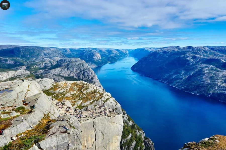
A hotspot pin using an image, at rest
The same image pin hovered, showing its tooltip

How It Behaves

  • The pin renders as a real image element on the page — measured on a published page, an <img> in place of the usual icon.
  • The pin image is separate from the background image, and has its own size setting.
  • Everything else about the pin is unchanged: positioning, tooltip, trigger and link all work the same as an icon pin.
  • Give the pin image real alt text in the media library. Without it the block falls back to the words “Pin Image”, which tells a screen-reader user nothing.

Each pin is placed with Left ( % ) and Top ( % ), measured from the top-left of the image. Measured on a published page, pins set to 10/10, 50/50 and 85/80 landed at exactly those points, so the numbers behave as plain percentages and the pins stay put as the image scales.

Limitations

  • Pin images are square-ish by nature of sitting on a point — a wide logo will usually read better as a text pin.
  • There is one image per pin; the pin does not accept a gallery or an animation.
  • A large pin image can cover the detail it is pointing at — keep the pin size small relative to the background.
  • Clear the Tooltip Text rather than relying on the Tooltip toggle — measured, the toggle alone does not stop the tooltip appearing.

Troubleshooting

My pin image is huge

Set a smaller image size for the pin, and crop the source image square before uploading — the pin renders the image at the size you choose, it does not crop it for you.

The pin image is not showing at all

Check Pin type is set to Image and that an image is actually chosen. With no image selected the block falls back to a placeholder.

My tooltip appears even though I turned the toggle off

Clear the Tooltip Text rather than relying on the Tooltip toggle — measured, the toggle alone does not stop the tooltip appearing.

Related Docs

Share your Thoughts

Still in Doubt? Let’s Assist You

Have Feedback or Questions?

Join our WordPress Community on Facebook!

Related Frequently Asked Questions

What do I need before using an image as a hotspot pin in WordPress?

Nexter Blocks Pro is required, and the Hotspot block has to be enabled under Nexter > Blocks in your WordPress dashboard. That matters because the image pin is part of the Hotspot block, not a separate feature. Once it is active, you can use an image instead of the usual icon for any pin, which is useful when a thumbnail, brand mark, or face communicates the hotspot better than a plus sign.

How do I use an image instead of an icon for a hotspot pin?

The pin type has to be set to Image inside the pin list. From there, choose the pin image, pick its size, then position it with Left (%) and Top (%) before adding Tooltip Text. Nexter Blocks keeps the rest of the hotspot behavior unchanged, so positioning, tooltip, trigger, and link still work like an icon pin. For the full hotspot setup, see the Hotspot feature guide.

Why is my hotspot pin image huge?

A large source image will still render at the size you choose, so the block does not crop it for you. The practical fix is to set a smaller image size for the pin and crop the source image square before uploading. That matters because oversized pins can cover the exact detail they are supposed to point at. Keeping the pin small relative to the background usually makes the hotspot easier to read.

Why is my hotspot pin image not showing at all?

The most common cause is that Pin type is not set to Image or no image was actually chosen. When that happens, the block falls back to a placeholder instead of rendering your custom pin. In Nexter WP, this is easy to miss because everything else about the hotspot can still look configured correctly. Checking those two fields first usually resolves it faster than changing placement or tooltip settings.

Should I use an image pin or a text pin for a logo hotspot?

A text pin is usually better for wide logos because image pins are square-ish by nature of sitting on a point. An image pin works best when the graphic reads cleanly in a compact shape, like a thumbnail or face. If you want a different style altogether, compare it with Use text as a pin and text pin.

Why does my tooltip still appear when I turn off the tooltip toggle?

The Tooltip toggle alone does not stop the tooltip from appearing. The reliable fix is to clear the Tooltip Text instead of depending on that toggle. That behavior matters because Nexter Blocks treats tooltip text as the real source of what shows on hover or trigger, so leaving text in place can keep producing output even when the switch looks off. For click-based behavior, see Open a tooltip on click.

Last reviewed: September 28, 2026

Related Docs