How to Create a Swiper Menu for Mobile in WordPress?

Key Takeaways

  • Nexter Blocks includes a Navigation Menu block that allows users to add a swiper menu for mobile navigation.
  • Users can specify the minimum width for enabling the mobile menu in the Open Mobile Menu section.
  • The Mobile Menu dropdown offers options for Standard and Custom menus, with Swiper as a selectable menu type.
Table of Contents

Adding a swiper menu for mobile in your WordPress website can improve the user experience as it creates a user-friendly navigation option that allows for easy navigation on smaller screens.  

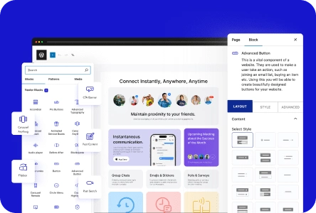
With the Navigation Menu block from the Nexter Blocks, you can easily add a swiper menu for the mobile menu.

To check the complete feature overview documentation of the Nexter Blocks Navigation Menu block, click here.

Requirement  – This block is a part of the Nexter Blocks, make sure it’s installed & activated to enjoy all its powers.

To do this, add the Navigation Menu block to the header template and follow the steps –

Note: To create the header template, you can use the free Nexter Builder. 

1. From the Navigation Bar tab, select the appropriate Type, Layout and menu.

2. Then go to the Mobile Menu tab and enable the Responsive Mobile Menu toggle.

navigation menu mobile menu swiper

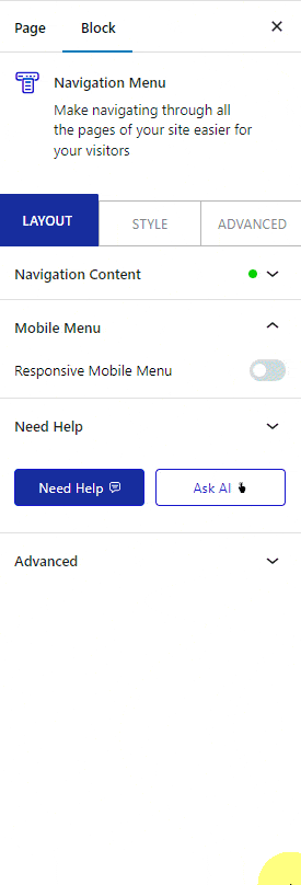
In the Open Mobile Menu(Screen Width) section, you can specify the minimum width for enabling the mobile menu.

3. If you’ve selected Manual Menu in the Navigation Bar, then you’ll see two options in the Mobile Menu dropdown –

  • Standard – For using a WordPress menu as the mobile menu.
  • Custom –  For using your custom menu as the mobile menu.

Let’s select Standard here.

Note: If you’ve selected WordPress Menu in the Navigation Bar, then you’ll only get the Standard option in the Mobile Menu section.

4. Select your menu from the Select Menu dropdown.

Note: For the Custom option you won’t get this option as your custom menu will be the mobile menu.

5. Then, from the Menu Type section, select Swiper.

From the Navigation Alignment section, you can align the mobile menu items.

Now you’ll see a swiper menu for the mobile menu.

navigation menu mobile menu swiper demo

About the Author

Photo of Aditya Sharma CMO of NexterWP
CMO at POSIMYTH Innovations · NexterWP · 7 years experience

He has spent years in the WordPress ecosystem building, breaking, and optimizing sites until they actually perform. He works at the intersection of speed, growth, and usability, helping creators ship websites that load fast and convert. An active WordPress community contributor sharing through tools, tutorials, and direct collaboration. Tested practice, not theory.

WordpressThemesElementorn8nAIClaudeAutomationServer

Share your Thoughts

Get Instant Answers to all your questions about Nexter Blocks,
Extensions & Theme trained on 1000+ Docs and Videos

Still in Doubt? Let’s Assist You

Have Feedback or Questions?

Join our WordPress Community on Facebook!

Related Frequently Asked Questions

What should I do if the swiper menu isn't displaying on mobile?

If the swiper menu isn't showing, check if the Responsive Mobile Menu toggle is enabled in the Mobile Menu tab. This setting allows the mobile menu to appear based on the screen width. Additionally, ensure that the Navigation Menu block is properly installed and activated, as it's essential for this feature.

What is the best practice for setting the minimum width for the mobile menu?

Setting the minimum width for the mobile menu is crucial for ensuring a smooth user experience. In the Open Mobile Menu (Screen Width) section, choose a width that aligns with your design goals, typically around 768px for tablets. This ensures that the mobile menu activates at the right screen size, enhancing usability.

What if I want to create a header template for the swiper menu?

To create a header template for the swiper menu, use the free Nexter Builder. This tool simplifies the process of designing your header, allowing you to add the Navigation Menu block and customize it according to your needs, ensuring a cohesive look across your site.

Last reviewed: April 14, 2026

Related Docs