


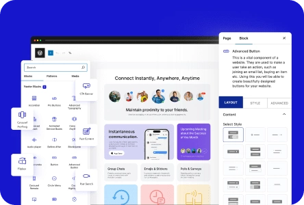
A circle menu is a special and innovative way to present your menu. Instead of the usual list, your menu items are arranged in a circular shape, giving your design a fresh and modern feel.
With the Circle Menu block from the Nexter Blocks, you can easily create a circle or straight toggle menu in WordPress.
Required Setup
- Make sure the default WordPress Block editor is active.
- You need to have the Nexter Blocks plugin installed and activated.
- This is a premium block; you need the PRO version of Nexter Blocks.
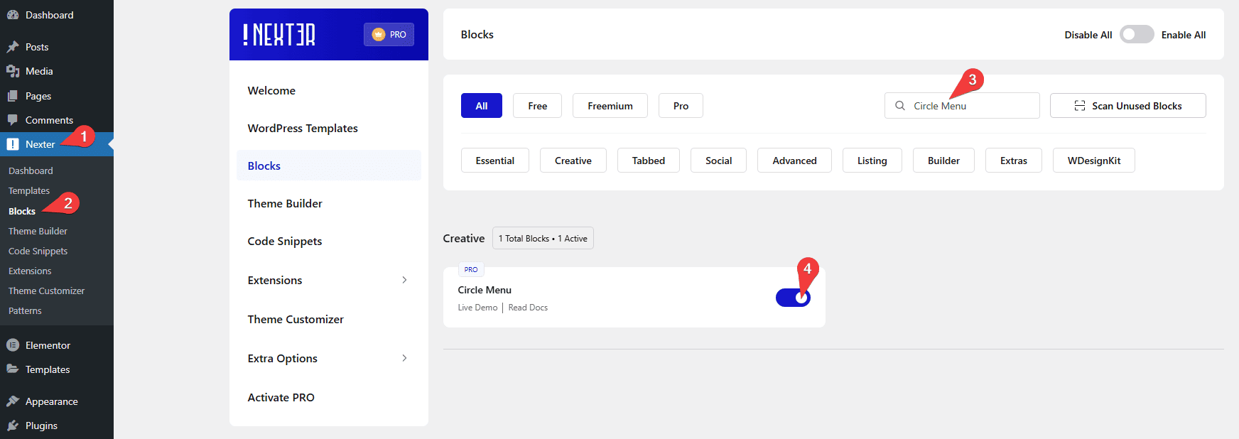
- Make sure the Circle Menu block is activated. To verify this, visit Nexter → Blocks → and search for Circle Menu and activate.
Learn via Video Tutorial

How to activate the Circle Menu Block?
Go to
- Nexter → Blocks
- Search the block name and turn on the toggle.
Key Features
- Two Menu Layout – You can select from two menu layouts.
- Different Link Type – You can easily add different types of links like URL, phone and email to menu items.
- Accessibility – You can easily add aria label to your menu items.
How to Use the Circle Menu Block in WordPress?
To use the Circle Menu block, add the block to the page.
Circle Menu
From the Layout section, you have to select the menu layout. Here, you’ll find two options –
- Straight – For creating a toggle vertical or horizontal menu.
- Circle – For creating a toggle circle menu.
Select the option that fits your requirements.
Let’s select Straight here.
From the Menu Style section, you can select a style.
Then, from the Direction section, you have to select the menu open direction.
In the Menu List section, you’ll find 4 menu items. Open an item.
From the Icon Type section, you can add an icon or image to the menu item.
In the Title field, you can add a title for the item in the backend.
From the Select Link Type section, you can select the link type. Here, you’ll find four options –
- URL – For adding a normal URL.
- Email – For adding an email link. So users can email directly by clicking the link.
- Phone – For adding a phone link. So users can directly call by clicking the link.
- No Link – For adding no links.
In the Aria Label field, you can add an Aria label to the item to improve accessibility for disabled users.
Then, you can manage the icon color, background color and border color for normal and hover states.
By enabling the Tooltip toggle, you can add a tooltip title to the menu item.
You can repeat the same process to edit the remaining items.
To add more menu items, click on the + Add Menu button.
Toggle Icon
From the Icon Type section, you can add an icon or image to the menu toggle button.
You can select a menu style from the Menu Style section.
From the Aria Label field, you can add an Aria label to the toggle button to improve accessibility for disabled users.
Icon Position
From the Position section, you can select the menu position. Here, you’ll find two options –
- Absolute – This will keep the toggle menu in the container.
- Fixed – To create a fixed position toggle menu.
Then, you can adjust the menu position from the Left (Auto/%), Right (Auto/%), Top (Auto/%), and Bottom (Auto/%) toggles.
Extra Options
From the Menu Between Gap (px), you can manage the menu item gap.
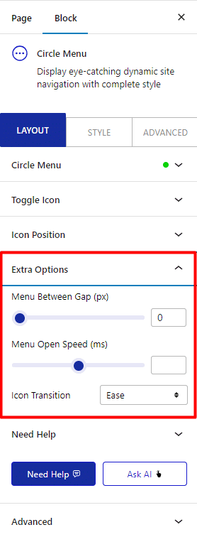
Then, from the Menu Open Speed (ms) section, you can manage the menu opening speed.
From the Icon Transition dropdown, you can select different transition effects.
How to Style the Circle Menu Block?
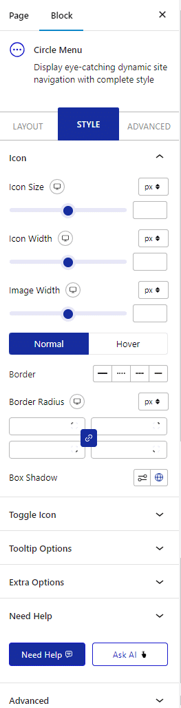
To style the Circle Menu, you’ll find all the options under the Style tab.
Icon – From here, you can manage the menu item icon and image style.
.Toggle Icon – From here, you can manage the menu toggle icon and image style.
Tooltip Options – From here, you can manage the tooltip text style and visibility.
Extra Options – Here, you’ll find a couple of additional options.
- Overlay Color – From here, you can set an overlay background color when the menu opens.
- Show Menu Scroll Offset – From here, you can scroll top offset to show the menu when you scroll down to equivalent pixels.
Advanced options remain common for all our blocks, you can explore all the options from here.
