












The first time I dropped fifteen posts onto a fresh WordPress blog, I stared at the default archive page and felt nothing. Title, excerpt, “read more,” title, excerpt, “read more,” all the way down. It worked. It also looked like a mailing list, not a publication. If you have ever wanted your WordPress blog to feel like an actual magazine, with a grid of cover images, a featured story up top, and posts that invite a click instead of a scroll, this guide walks through building exactly that with Nexter Theme, using the Post Listing block and the Blog Builder, no extra plugin required.
What Makes a Layout “Magazine-Style” (and Why Default WordPress Doesn’t Do It)
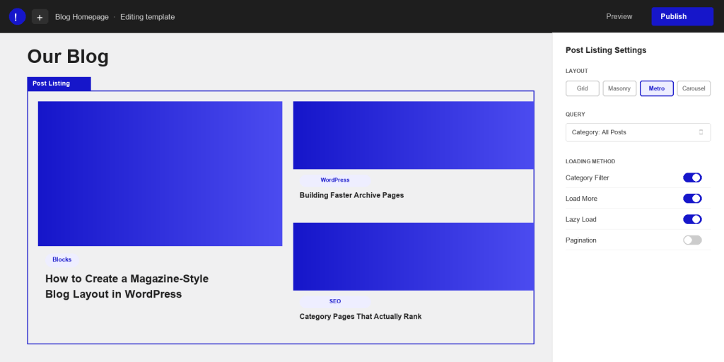
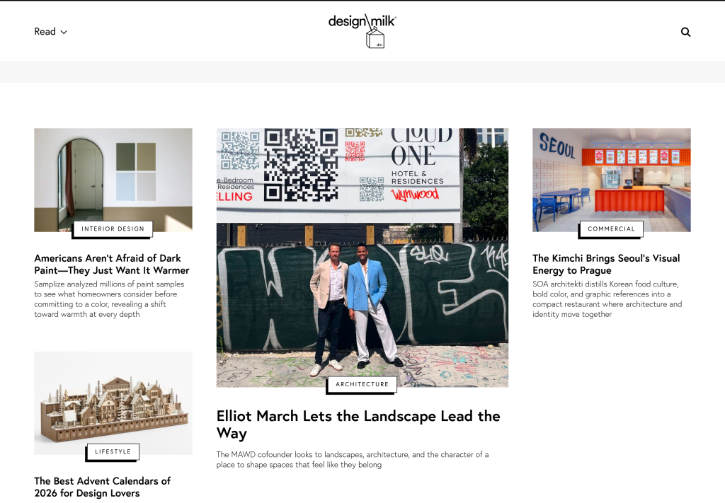
A magazine-style blog has three things a stock WordPress archive does not: visual hierarchy, mixed layout density, and a way to filter without reloading the page. Visual hierarchy means one or two stories are visibly bigger than the rest, so a reader’s eye lands somewhere on purpose instead of drifting top to bottom. Mixed density means some posts show as a wide card with a big image and some show as a small tile, the way a print magazine mixes a full spread with a sidebar brief. And filtering means a visitor can jump to “Reviews” or “Tutorials” without leaving the page.
Core WordPress gives you none of this out of the box. The default archive template loops through posts in one fixed pattern, and changing that pattern usually means a child theme, custom PHP, or a plugin that adds its own shortcodes and its own bloat. Nexter Theme builds this directly into the Gutenberg editor instead, through blocks you place and configure visually.
The payoff is not just cosmetic. A visitor who lands on a plain list of titles usually reads the one post they clicked in from and leaves. A visitor who lands on a grid with six other visible cover images and headlines tends to click a second, sometimes a third post before they go. More internal clicks means more pages per session, which is exactly the signal that tells search engines your site is worth spending more crawl budget on and worth ranking for more than one query.
Setting Up the Post Listing Block in Nexter
The block doing the heavy lifting here is Post Listing, part of Nexter Blocks. Add it to any page or template through the block inserter and search for “Post Listing.” Once it is on the canvas, the block’s query settings let you choose which posts to pull in: all posts, a specific category, a tag, or even posts excluding the one you are currently viewing. This query step is what turns a static page into a live, self-updating magazine front page. Publish a new post in the chosen category tomorrow and it appears in the grid automatically, no manual editing required.
Also Read: the full Nexter Blocks Post Listing feature breakdown for every layout and query option available on the block.
Inside the block’s style tab you will find the controls that matter most for a magazine feel: how many columns to show on desktop versus mobile, how much gap sits between cards, and whether the featured image crops to a fixed ratio. Set a consistent image ratio here first. Nothing breaks a magazine layout faster than one card with a tall portrait photo sitting next to a card with a wide landscape shot.
Grid vs. Masonry vs. Metro: Choosing Your Magazine Layout
Post Listing ships with four layout modes, and picking the right one is really about matching the shape of your content. Grid keeps every card the same height and width, which reads clean and organized. It is the safest default for a blog where posts do not vary much in image style.
Masonry lets card heights vary based on the image’s natural proportions, packing them into columns like a Pinterest board. This suits a blog with a mix of tall infographics, wide screenshots, and square product shots, since nothing gets awkwardly cropped to fit.
Metro mixes card sizes on purpose, giving one or two posts a larger footprint while the rest sit smaller around them. This is the closest to a genuine print magazine cover and works best when you want a handful of posts to visibly outrank the rest on the page. Carousel, the fourth option, turns the same set of posts into a swipeable slider, which is useful for a compact “latest posts” widget rather than a full archive page.
For a homepage or blog landing page, Metro at the top followed by Grid further down tends to give the strongest magazine impression without sacrificing readability.
A quick way to test a layout before committing to it site-wide: build it on a single draft page first, view it on desktop, tablet, and phone, and count how many posts show above the fold on each. If a Metro layout leaves only one visible post on mobile before a visitor has to scroll, drop it down to Grid at that breakpoint instead. The column and gap controls are separate per device, so this kind of adjustment takes seconds once you know where to look.
Building a Featured or Hero Post Section
A real magazine front page opens with one story, not a grid. You can build that in Nexter by placing a second Post Listing block above your main archive grid, querying it against a specific category such as “Featured,” and setting it to show a single post in Metro or Grid layout at a larger column width. Tag whichever post deserves the spotlight with that category, and the hero section updates the moment you publish the next one.
Keep the hero query separate from the main grid’s query, and exclude the featured category from the grid below it if you do not want the same post appearing twice on the page. This two-block approach, one for the hero and one for the rest, is the simplest way to get an editorial front page without touching any code.

Adding Category Filters and Load More (No Extra Plugin)
Once the grid is in place, the Post Listing block’s loading method settings add the interactive layer a magazine site needs. Post Category Filter drops a row of clickable category tabs above the grid, and clicking one re-filters the posts on the page without a reload. Pair that with Post Load More or Post Pagination so a visitor is not stuck scrolling through every post you have ever published just to reach page two.
Lazy Load, also in this same settings group, defers offscreen images until a visitor scrolls near them, which keeps a long, image-heavy archive page from loading everything at once. Turn this on for any grid past the first screen of content. Together, category filtering, load more, and lazy load are what let a reader browse forty posts without the page feeling slow or the layout feeling like a wall of cards.
If your blog spans several distinct topics, set the category filter to show only the categories that actually have enough posts to justify a tab. A filter row cluttered with categories that hold one or two posts each does the opposite of what you want: it makes the archive look thinner, not richer. Four to six well-stocked categories in the filter row is a reasonable starting point for most blogs.
Customizing the Single Post Template with Blog Builder
A magazine-style archive page looks out of place if clicking into a post lands you on a plain, unstyled single page. Nexter’s Blog Builder solves the other half of the layout with dedicated blocks for the single post template: Post Title, Post Featured Image, Post Meta, Post Author Box, Post Content, Post Navigation, and Post Comments. Because each piece is its own block, you can rebuild the single post layout to match the personality of the archive grid, for example a full-width featured image under the title, author details in a compact card, and a “next post” navigation styled like a magazine’s “continue reading” strip.
Also Read: see the complete Nexter Blog Builder block list for every single-post and archive template block available.
Because the templates apply theme-wide, you build the single post layout once, in the Nexter template editor, and every post on the site inherits it automatically. There is no need to design each post individually.

Mobile Responsiveness and Performance Checks
Every column and gap setting in Post Listing has its own mobile and tablet breakpoint, so a four-column Metro layout on desktop can drop to a single column on a phone without any custom CSS. Check this on an actual phone screen before publishing, not just by shrinking a browser window, since touch targets and image cropping sometimes behave differently on a real device.
On performance, three settings matter most: keep Lazy Load on for any grid below the first screen, cap the number of posts loaded per page rather than pulling in your entire archive at once, and use a consistent, compressed image size across posts so the browser is not stretching or shrinking wildly different file sizes. A magazine layout adds more images per page than a simple list view, so these settings are what keep the page fast instead of just good-looking.

Frequently Asked Questions
Do I need a plugin for a magazine layout in WordPress?
No. With Nexter Theme, the Post Listing and Blog Builder blocks handle the grid, the featured section, category filtering, and the single post template natively in the block editor. You are not adding a separate archive or grid plugin on top of your theme.
Can I mix grid and masonry layouts on the same page?
Yes. Each Post Listing block sets its own layout independently, so a common pattern is a Metro or Grid hero block at the top of the page and a separate Masonry or Grid block further down for the rest of the archive.
Does this work with the free version of Nexter Blocks?
Post Listing is a freemium block, so the core layout options, including Grid, Carousel, Masonry, and Metro, are available on the free plan. Some advanced query and filter combinations are part of the Pro plan, worth checking against your specific build before you commit to a layout.
How do I make one post stand out as the featured story?
Tag the post with a dedicated category, such as “Featured,” then point a separate Post Listing block at that category and place it above your main archive grid. Swapping which post carries that category tag changes the featured story without touching any block settings.
How many posts should I show per page in a magazine layout?
Somewhere between nine and twelve posts per page is a reasonable starting point for a Grid or Masonry layout on desktop. That is enough to fill the page without an empty-looking gap at the bottom, and it keeps the initial page load light when paired with Lazy Load. Adjust from there based on how tall your cards render once real content and images are in place.
Suggested Reading
- Video Background Hero Section: Build Guide
- Testimonial & Review Carousel Block
- Nexter Theme SEO Settings: What to Configure Before You Publish
- Code Snippets Manager: A Walkthrough
- Membership Website Build with Nexter Theme
