


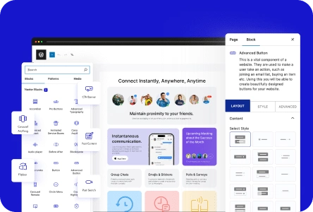
Do you want to add expandable service boxes to showcase information? These boxes are a great way to present multiple services or products in a compact, organized layout, allowing users to click and expand for more details, enhancing both functionality and design.
With the Animated Service Boxes block from Nexter Blocks, you can easily create expandable service boxes in WordPress.
To check the complete feature overview documentation of the Nexter Blocks Animated Service Boxes block, click here.
Requirement – This block is a part of the Nexter Blocks, make sure it’s installed & activated to enjoy all its powers.
To do this, add the Animated Service Boxes block to the page and follow the steps –
1. Select Services Element from the Main Style section.
2. Then select the Style 1 from the Style section.
Note: With Style 2 all items will always be visible.
You can add a button to the hover sections by enabling the Display Button toggle.
When enabled, you can select a button style from the Button Style section.
Then by enabling the Image/Icon toggle, you can add different image types to the service boxes.
2. In the Service Boxes section, you have to add the content for the hover section. By default, you’ll find three items, open one item.
3. Then add a title in the Title field. The title will always be visible.
You can add an icon or image, subtitle and description if required from the Select Icon, Sub Title and Description fields.
Note: The Select Icon, Sub Title, Description and Button content will show on hover only.
4. Then in the List Content section, you have to list service items. You can add multiple items separated by a separator (|) like this Small | Medium | Large.
You can edit the button text and URL from the Button Text and Button Link fields, respectively.
Note: Make sure the Display Button toggle is enabled to see the Button Text and Button Link fields.
Following this process, you can edit the other items.
You can click on the +Add Item button to add more service boxes.
You can select the image size from the Image Size dropdown.
From the Columns Manage tab, you can manage the number of items in a row for desktop, tablet and mobile separately. You can also manage the gap between the items as well.
Now when you hover over the service box it will expand to show the list of items.
