


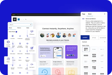
Infobox is a great way to show important information in a concise and visually appealing manner on your WordPress website.
With the Infobox block from Nexter Blocks, you can add infoboxes to your WordPress website.
Best Used For:
- Service pages and feature sections on SaaS or agency sites that need icon-based content cards
- Team or portfolio pages where each item needs an icon, image, title, and description
- Knowledge base or documentation sites that present topic categories with icons
Required Setup
- Make sure the default WordPress Block editor is active.
- You need to have the Nexter Blocks plugin installed and activated.
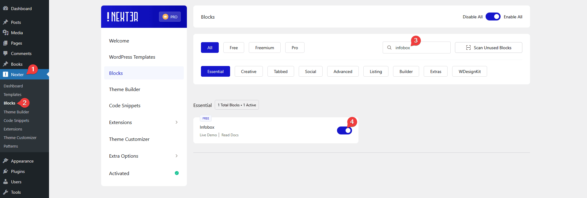
- Make sure the Infobox block is activated, to verify this visit Nexter → Blocks → and Search for Infobox and activate.
Learn via Video Tutorial

How to activate the Infobox Block?
Go to
- Nexter → Blocks
- Search the block name and turn on the toggle.
Key Features
- Info Box Carousel: You can create an infobox carousel.
- Full Box Link: You can add a full box link to the infobox.
- Unique Carousel ID: With the Unique Carousel ID, you can easily connect and control the infobox carousel with the Carousel Remote block.
How to Use the Infobox Block?
Add the Infobox block to the page.
Then click on the Design from Scratch button to design the layout from scratch.
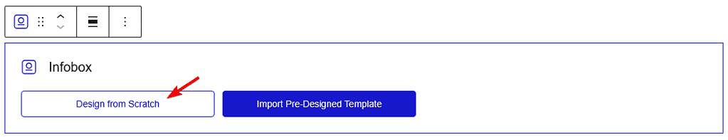
Note: By clicking on the Import Pre-Designed Template button, you can import a preset template and customize it as per your requirements.
Content
From the Select Layout section, you have to select the layout. Here you’ll find two options –
- Grid – To show infoboxes in a static grid layout. Use this when each infobox is equally important and you want all of them visible at once without scrolling.
- Carousel – To create an infobox carousel.
Select the option as per your requirements, let’s select Grid here.
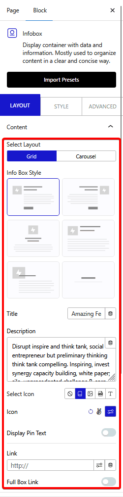
In the Info Box Style, you’ll find six different style options.
- Style 1: In this style, the icon is placed inline with the title & description in the right position.
- Style 2: In this style, the icon is placed inline with the title & description in the left position.
- Style 3: In this style, the icon is placed at the top and below the title & description in the center position.
- Style 4: In this style, the icon is placed in line with the title, and the description is placed below.
- Style 5: In this style, the icon is placed with the title & description in the left position.
- Style 6: This style gives an interactive hover animation effect to the entire Infobox. Use this when you want eye-catching content cards with motion feedback on hover, such as a feature section on a homepage.
If you want interactive cards that flip to reveal content on hover, the Flip Box block in Nexter Blocks provides a similar layout with animated hover effects for a more dynamic content display.
In the Title field, you can add a title to the infobox.
You can add a description to the info box from the Description field.
From the Select Icon section, you can select the icon type. Here you’ll find five options –
- None – With this, no icon will be added to the infobox. Use this when the infobox relies entirely on the title and description text, such as a minimal stat card.
- Icon – To add a standard icon to the infobox.
- Image – To add an image to the infobox.
- SVG – To add a custom SVG to the infobox. Use this when you have branded or custom icons not available in standard icon libraries.
- Text – To add a short text label beside the heading, such as a step number or "New" badge. Use this when you are building a numbered feature list or a process flow.
Note: The Display Pin Text toggle will not be available for the None option.
Select the option as per your requirements, let’s select Icon here.
From the Icon section, you can add an icon.
Enable the Display Pin Text toggle to add a small badge label to the infobox, such as "Featured" or "Popular". Use this when you want to draw attention to one item in a grid without changing its size.
From the Link field, you can add a link to the Infobox title.
Then from the Full Box Link toggle, you can make the entire info box clickable.
Button
By enabling the Show Button toggle, you can add a button to the infobox.
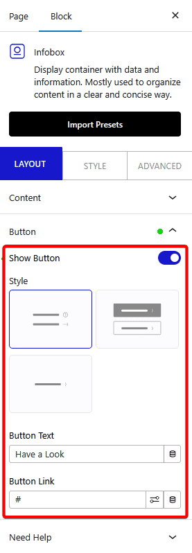
From the Style section, you can select a button style.
From the Button Text field, you can edit the button text.
Then, in the Button Link field, you can add a link to the button.
How to Style the InfoBox Block?
To style the Infobox, you’ll find all the options in the Style tab.
Title – You can manage the main title HTML tag and style from here.
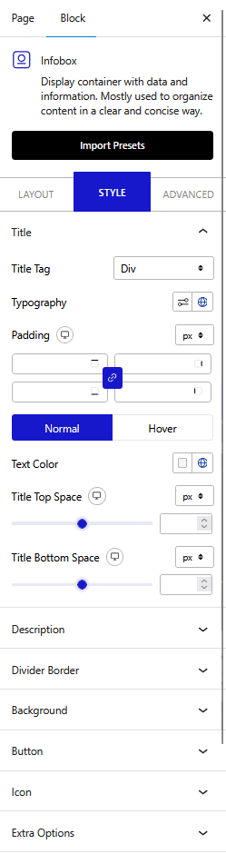
Description – From here, you can customize the description’s HTML tag style.
Divider Border – From here, you can add a border under the title.
Background – From here, you can customize the infobox background style.
Icon – This option will be visible only when you select Icon as the icon type from the Layout tab. From here, you can manage the icon style.
Image – This option will be visible only when you select Image as the icon type from the Layout tab. From here, you can manage the image style.
SVG Icon – This option will be visible only when you select SVG as the icon type from the Layout tab. From here, you can manage the SVG style.
Pin Text – This option will be visible only when the Display Pin Text toggle is enabled from the Layout tab. From here, you can manage the pin text style.
Extra Options – From here, you can vertically align the content of the infobox, add a divider after the icon, add a minimum height and different hover effects.
For collapsible information sections in a similar compact layout, the Accordion block in Nexter Blocks lets you stack expandable content sections without cluttering the page.
Carousel Options – This option will be visible when you use the Carousel layout. Here you’ll find many options to control the carousel.
- Slider Mode – From here, you can choose your slider orientation, Horizontal or Vertical.
- Slide Speed – Control your slide transition speed from here.
- Columns – You can set the number of columns for the slide for desktop, tablet, and mobile separately.
- Default Slide Active – From here, you can select any slide to be the active slide when the page loads.
- Next Previous – You can set the behavior of your next/previous slide movement from here. You can move one column at a time or all visible columns.
- Columns Gap – From here, you can adjust the gap of your slider.
- Draggable – Make your carousel draggable or non-draggable from here.
- Infinite Mode – You can turn your carousel into an infinite loop slider from here.
- Pause On Hover – Allow the users to pause the slider on mouse hover.
- Autoplay – Make your carousel slider autoplay from here and adjust its speed.
- Show Dots – From here, you can add dots slider navigation and you can style them as well.
- Show Arrow – You can also add arrow navigation for your carousel slider and style them from here.
- Center Mode – From here, you choose the center position of your slider.
- Wheel Navigation – With this option, you can navigate the slider with your mouse wheel.
- Keyboard Navigation – With this option, you can navigate the slider with your keyboard.
- Auto Scroll – With this option, you can make the slide auto scroll.
Advanced options remain common for all our blocks, you can explore all it options from here.
