



Most roundups of high converting landing pages have the same problem. They describe a page as it looked on the day the article was written, and then nobody opens the link again.
So this one was re-checked. Every page below was opened on 13 August 2026, and the description you read is what is actually on the page today. That turned out to matter: five of the twelve URLs have moved or been redesigned since this article first ran, one had its industry filed wrongly, and several of the pages most commonly cited as landing pages are not landing pages at all.
Here are 12 examples worth studying, what each one gets right, and the structure they have in common.
Short answer: the strongest single-goal landing page in this list is Row House (free first class, location-aware form, designed error states). Nauto is the best business-to-business template (gated eBook, form on the right, unchanged since 2024). Sunbasket is the best offer page (a $90 discount spread across four deliveries). For a paid tier fighting a free one, copy Canva‘s dual call to action; for one price and one promise, copy ExpressVPN; for the smallest possible first commitment, copy Codecademy.
Worth knowing before you copy any of them: only Row House, Sunbasket and Nauto are still true single-goal campaign pages. Airbnb and Curology now redirect elsewhere, Paramount+ redirects to a regional splash, Spotify and Canva are product pages, and Wix, ExpressVPN, Codecademy and Mooala are homepages doing landing page work. All checked 13 August 2026.
What is a Landing Page?
A landing page is a standalone page built to drive one action. Visitors arrive from an ad, an email or a social post, and the page exists to get them to do a single thing: book a class, download a guide, start a trial, buy a product.
The defining feature is subtraction. A landing page removes the menus, sidebars and outbound links that a normal page carries, because every extra link is a way to leave without converting. Common types include:
- Lead generation pages that trade something useful, such as an eBook or a template, for contact details. Nauto below is a clean example.
- Click-through pages that explain an offer and pass the visitor to a cart or signup form.
- Sales pages that carry the whole argument, usually with testimonials and pricing, and ask for the purchase directly.
Also Read: Landing page vs website: 8 key differences settles when a standalone page beats adding another page to your site.
What are the Benefits of a Landing Page?
- Higher conversion rates. One goal and no exits beats a general page that tries to serve everybody.
- Cleaner measurement. Because traffic arrives from a known campaign and can do only one thing, the conversion rate actually means something.
- Cheap testing. Headlines, images and buttons can be swapped on a standalone page without touching your site.
- Message match. The page can repeat the exact promise the ad made, which is the single most common reason paid traffic fails to convert.
- Lower cost than a redesign. A campaign page is far quicker to ship than a rebuild of your main site.
How We Checked These Landing Pages
Every page in this roundup was opened in a browser on 13 August 2026. For each one we recorded four things: the live headline, the primary call to action exactly as it is worded on the button, the offer, and what type of page the URL actually resolves to. Where a URL redirected, we followed it and described where it landed.
That check changed the article. What it found:
- Five URLs have moved or been redesigned. Airbnb’s host page, Curology’s free-trial page, Canva’s Pro page and the Paramount+ page all redirect somewhere new, and Wix, ExpressVPN, Codecademy and Canva have all changed the headline or button wording quoted in the earlier version of this article.
- Two specific claims were wrong. Codecademy’s form does not ask for a mobile number, and Nauto sells fleet safety software rather than shipping. Both are corrected below.
- Six of the twelve are not campaign landing pages. Four are homepages and two are product pages. They are kept because the design lessons hold, but each one is now labelled for what it is.
- The numbering is a tour, not a ranking. The pages are grouped roughly by industry. The short answer above carries the actual recommendation.
For context on what a good result looks like: Unbounce’s analysis of about 41,000 landing pages, 464 million visitors and 57 million conversions puts the median landing page conversion rate at 6.6% across all industries as of the fourth quarter of 2024. Rates vary widely by industry and traffic source, so treat that as a reference point rather than a target.
| # | Brand | Industry | Page type (checked 13 August 2026) | Primary CTA | Best for |
|---|---|---|---|---|---|
| 1 | Airbnb | Travel and hospitality | Dedicated campaign page | Airbnb your home | Turning a big, scary decision into a small arithmetic one |
| 2 | Wix | SaaS, website builders | Homepage | Get Started | A product that needs a story before anyone believes the pitch |
| 3 | ExpressVPN | Digital privacy and security | Homepage | Get ExpressVPN | A crowded category where the winner is whoever is easiest to understand |
| 4 | Row House | Fitness | Dedicated campaign page | Reserve my spot! | A local business selling an appointment rather than a download |
| 5 | Codecademy | SaaS, education | Homepage | Sign up with Google | A freemium product where the real conversion is the second visit |
| 6 | Sunbasket | Ecommerce, food and nutrition | Dedicated offer page | Get Started | A subscription where the first order has to feel almost free |
| 7 | Curology | Beauty and personal care | Redirects to a quiz funnel | Find your Rx formula | A considered purchase that needs personalising before it can be priced |
| 8 | Paramount+ | SaaS, entertainment | Redirects to a regional splash | Try it free | A library product where recognition does the persuading |
| 9 | Spotify | Audio streaming | Product and pricing page | Try 1 month for $0 | A page where one button has to win against rich imagery |
| 10 | Canva | SaaS, design | Product page | Start your Canva Pro free trial | A paid tier that has to be justified against a free one |
| 11 | Nauto | Fleet safety software | Dedicated gated-content page | Download Now | A long enterprise sales cycle that has to start with a name |
| 12 | Mooala | Ecommerce, food and beverage | Homepage | Shop Now | A physical product that has to look appetising before it looks affordable |
Examples of High Converting Landing Pages
Each entry below states what the page does well, what changed since this roundup was first published, and who should copy it.

1. Airbnb (Travel and hospitality)
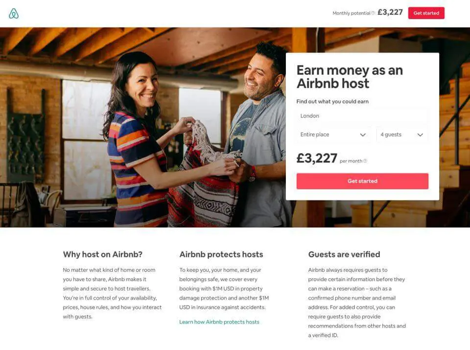
airbnb.com/host/homes and the headline now reads “Your home could make money on Airbnb” (checked 13 August 2026).Airbnb sells hosting the way a calculator sells a mortgage. The page leads with money, not with brand: the live headline reads “Your home could make money on Airbnb”, and the earnings estimate sits above everything else so the first thing a visitor does is picture a number attached to their own spare room.
The rest of the page exists to answer the objection that follows. Property damage protection and guest verification are named early, because the reason people do not become hosts is rarely the money and almost always the risk.
Status check: The URL this roundup originally cited, airbnb.com/d/designhost, now redirects to airbnb.com/host/homes.
Best for turning a big, scary decision into a small arithmetic one.
2. Wix (SaaS, website builders)
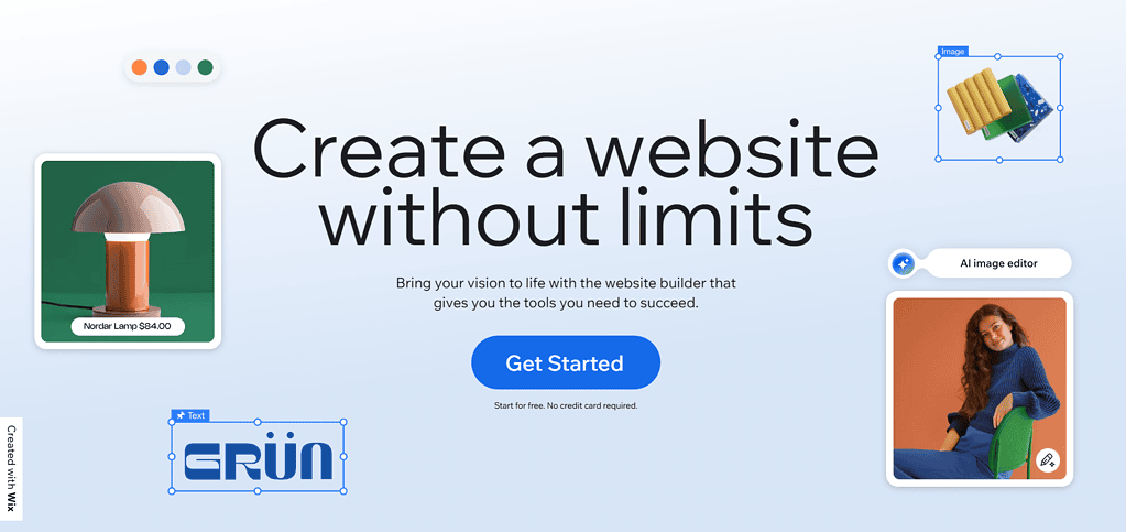
Wix earns its place here for scroll architecture rather than for a single offer. The hero states what the product is in one line, and every screenful after it pairs one idea with one button, so a visitor who is convinced at 20% of the page never has to scroll to the end to act.
That is the transferable part. A long page is not a problem as long as the decision is available continuously rather than only at the bottom.
Status check: This is the Wix homepage, not a campaign page. The “Start Now” button this roundup described is gone: the live primary call to action is “Get Started”, and the headline is now “The new way to create a website”.
Best for a product that needs a story before anyone believes the pitch.
3. ExpressVPN (Digital privacy and security)
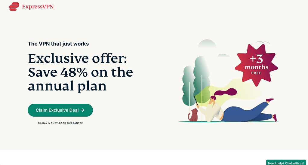
What survives the redesign is the discipline: one price, one claim, one button, and a 30-day money-back guarantee sitting close enough to the call to action to do its job. The page does not ask a visitor to hold more than two facts in their head.
Simplicity here is not the absence of content. It is the refusal to introduce a second decision before the first one is made.
Status check: Also a homepage rather than a campaign page. The “Claim Exclusive Deal” button described in the earlier version of this article no longer exists anywhere on the page. The live headline is “World’s #1 VPN. Now at $2.99 /mo.” and the button reads “Get ExpressVPN”.
Best for a crowded category where the winner is whoever is easiest to understand.
4. Row House (Fitness)
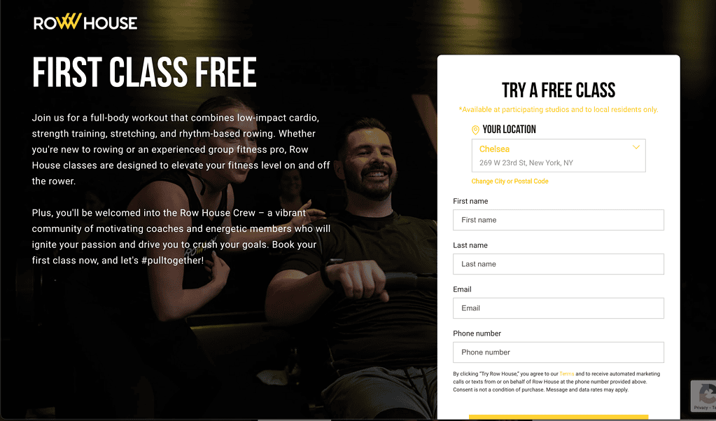
This is the cleanest example on the list of a page built for one action. The offer is free, the commitment is one class, and the form asks for a location and minimal contact details rather than a profile.
It also handles the unglamorous states properly. Pick a studio with no availability and the page says so, and offers the next class instead of failing silently. Most roundups never scroll far enough to notice that the error states were designed at all.
Status check: Still a genuine single-goal campaign page at lp.therowhouse.com/try, and the “First Class Free” offer described here is still live.
Best for a local business selling an appointment rather than a download.
Also Read: How to create a landing page in WordPress walks through building a page like this one, with and without a plugin.
5. Codecademy (SaaS, education)
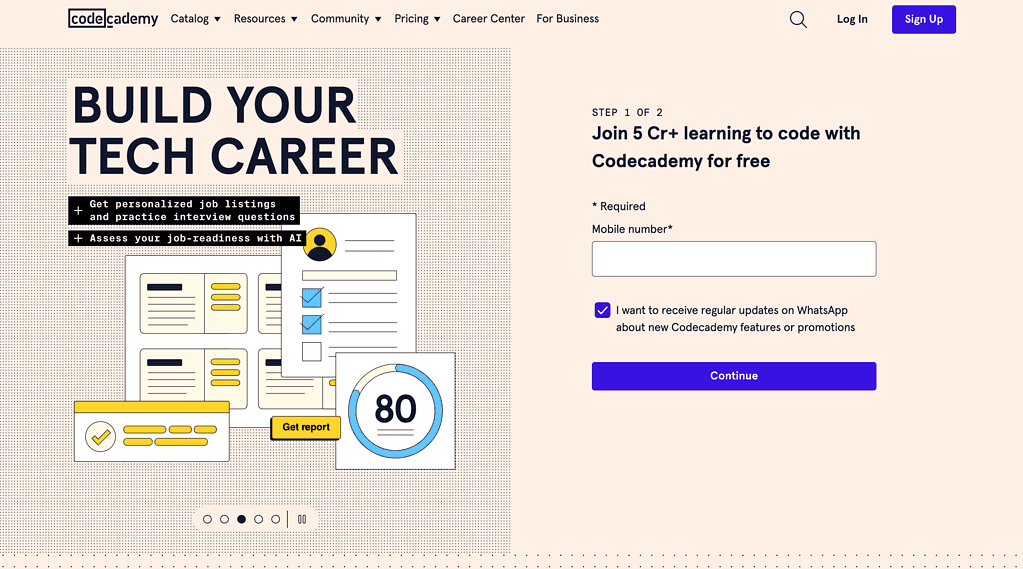
The mechanic worth copying is the size of the first commitment. Codecademy does not sell a subscription on this page. It sells an account, and it removes almost all of the typing required to get one.
For anything with a free tier, the page in front of a cold visitor should be optimised for the smallest yes available, not the most valuable one.
Status check: Two corrections. The “Build Your Tech Career” headline is gone; the live page reads “Develop your skills”. And the earlier version of this article said the form asks for a mobile number, which was wrong: there is no phone field, and the fastest route in is a one-click Google sign-up.
Best for a freemium product where the real conversion is the second visit.
6. Sunbasket (Ecommerce, food and nutrition)
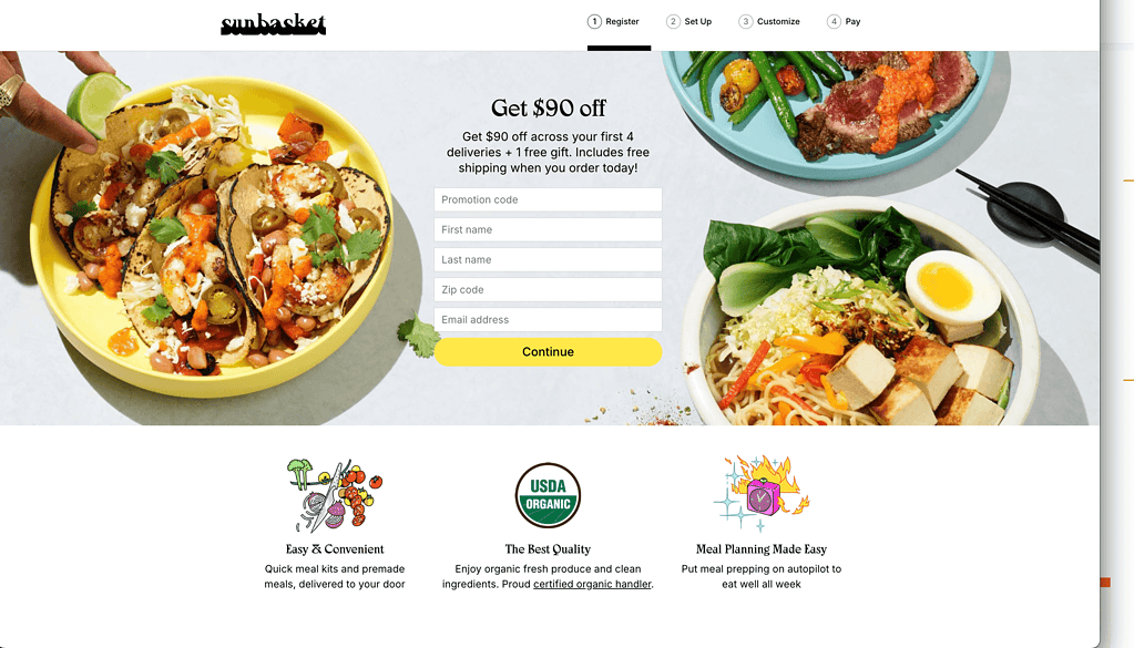
The headline is the offer, repeated as the page heading rather than buried in body copy: “Get $90 off”, with free shipping and a free gift stacked underneath it.
Food photography does the emotional work and icons carry the practical claims, which keeps the page short. The honest lesson is about the discount structure, not the photography: a stacked offer reads as larger than its parts, and spreading it across four orders buys retention rather than a single cheap box.
Status check: A real offer page at sunbasket.com/try/90off-sunbasket/. The offer still checks out, with one detail the earlier version left out: the $90 is spread across your first four deliveries, and free shipping applies to the first box.
Best for a subscription where the first order has to feel almost free.
7. Curology (Beauty and personal care)
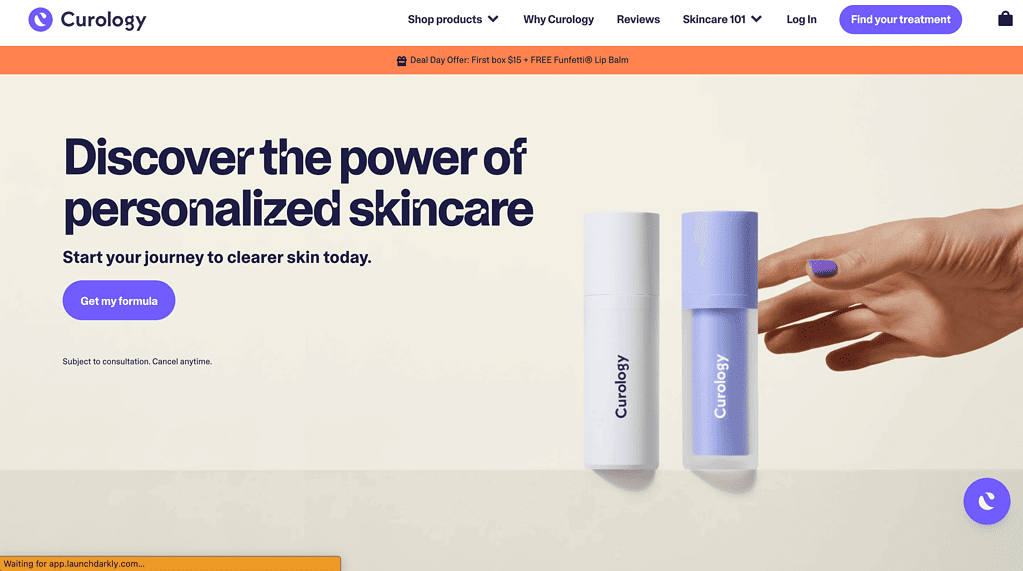
Curology no longer leads with a trial. It leads with a diagnosis, and the primary button is “Find your Rx formula”, which starts an intake quiz rather than a checkout.
The page also puts a number where most skincare brands put an adjective, citing that 90.5% of patients saw improvement in their acne at three weeks. A specific figure with an asterisk is more persuasive than any amount of soft language about gentle, custom care.
Status check: The free-trial URL cited here, curology.co/free-trial/1i0g/, now redirects to curology.co/start1/. The live headline is “Simple routine, serious results”.
Best for a considered purchase that needs personalising before it can be priced.
8. Paramount+ (SaaS, entertainment)
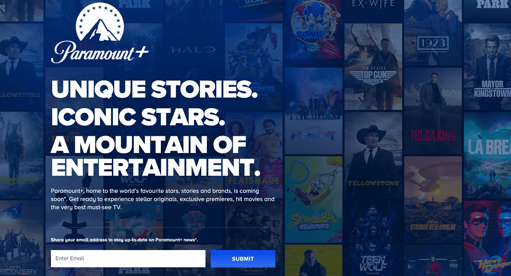
The idea the original page demonstrated is still worth keeping, because streaming services all reuse it: when the product is the catalogue, the catalogue is the argument. A wall of recognisable posters communicates breadth faster than any sentence about breadth.
The signup stayed at one field, an email address, so the page never asks a visitor to work before they have seen anything they want.
Status check: The URL cited here now redirects to paramountplus.com/intl/, a region-selection splash. The page is also rendered client-side, so its headline cannot be read from the served HTML.
Best for a library product where recognition does the persuading.
Also Read: 11 best interactive websites covers the same design ideas applied to full sites rather than single pages.
9. Spotify (Audio streaming)
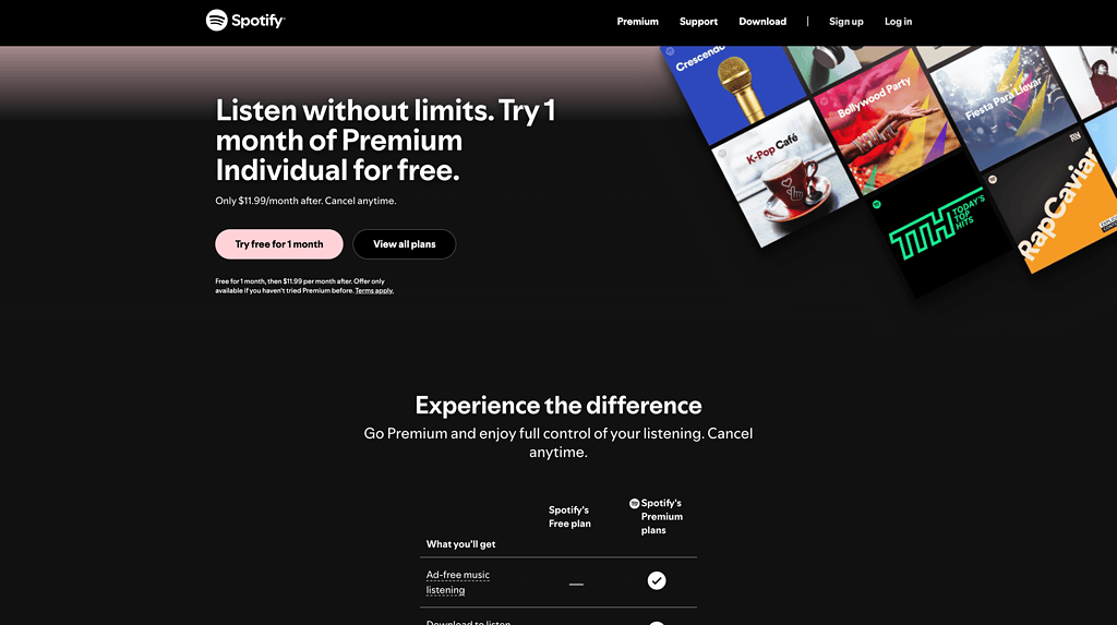
The dark palette is doing a specific job, not a stylistic one. Against near-black, album art and a single green button are the only things with saturation on the screen, so attention lands where Spotify wants it without a single arrow or animation.
That “$0” is worth noting too. A price of zero, written as a price, reads as more concrete than the word free.
Status check: A product page rather than a campaign page. The offer is intact but the wording changed: the button now reads “Try 1 month for $0” rather than advertising a “1-month free” trial.
Best for a page where one button has to win against rich imagery.
10. Canva (SaaS, design)
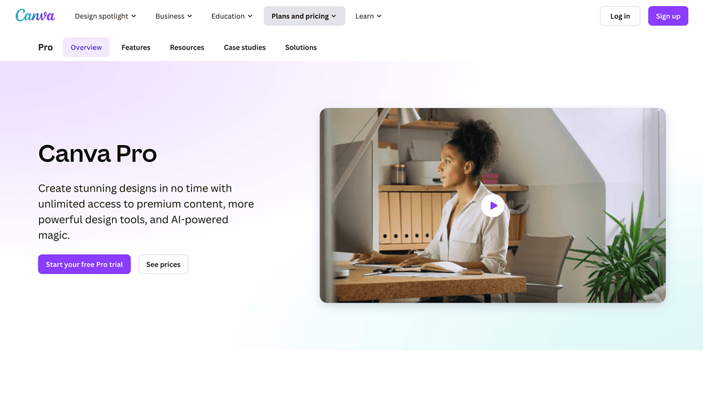
The dual call to action survived the redesign, which is the reason this page is on the list. One button starts the trial and the other one answers the objection, so a visitor who is not ready to sign up has somewhere to go that is not the back button.
The relabelling is itself instructive. “Compare Free and Pro” tells a hesitant visitor what they will get from the click, where “See prices” only told them where they would land.
Status check: The cited canva.com/q/pro/ now resolves to canva.com/pro/. The headline is no longer the words “Canva Pro” but “Design like a pro”, and the secondary button labelled “See prices” has been replaced by “Compare Free and Pro”.
Best for a paid tier that has to be justified against a free one.
11. Nauto (Fleet safety software)
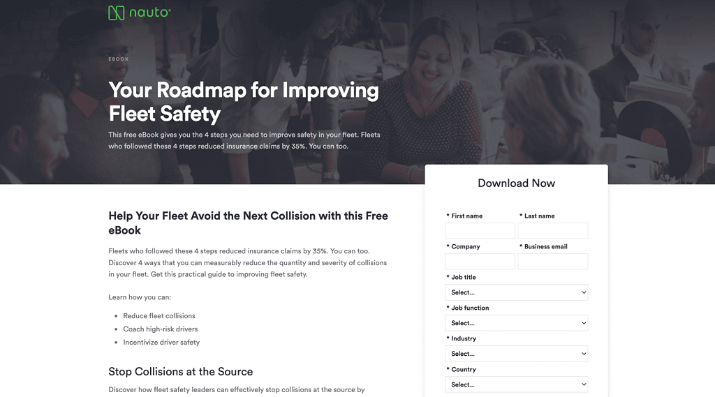
This is the textbook business-to-business lead-generation layout: headline and value on the left, form on the right, one thing on offer, which here is a free eBook rather than a demo.
Asking for a download rather than a sales call is the whole trick. It converts at a far higher rate than a demo request, and it still produces a named contact with a stated interest.
Status check: One label correction: Nauto sells fleet safety software, not shipping. This roundup previously filed it under shipping. The page itself is the only one on the list that is completely unchanged, headline included: “Your Roadmap for Improving Fleet Safety”.
Best for a long enterprise sales cycle that has to start with a name.
Also Read: How to add a pricing table in WordPress is the block you will need if your page has to justify a paid tier.
12. Mooala (Ecommerce, food and beverage)
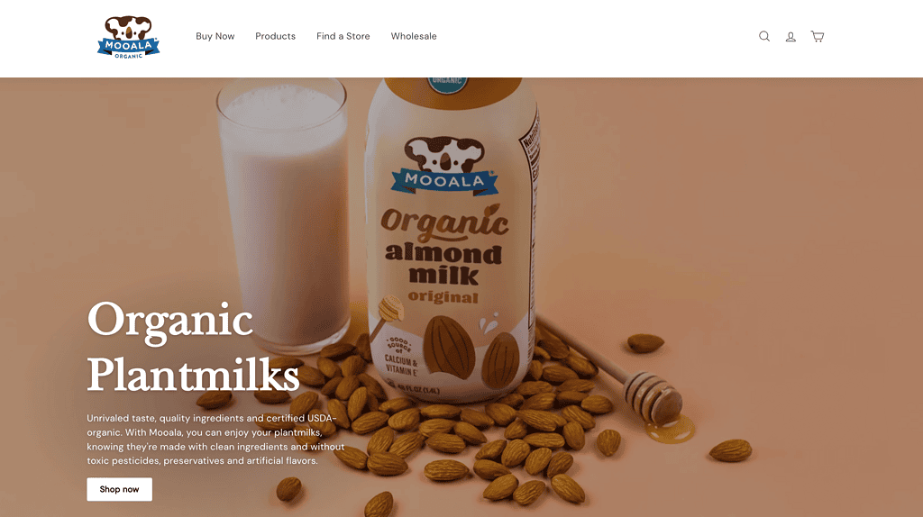
As a piece of product photography it still earns study. A muted beige background, one bottle, one glass and scattered almonds tell a visitor what the product is made of before they read anything, and the white “Shop Now” button is the only high-contrast element in the frame.
Treat it as a lesson in composition rather than in landing page structure, because on structure it is the opposite of what the rest of this list demonstrates.
Status check: The URL cited here is mooala.com, the brand homepage. Its live heading is “Mooala Brands” and it carries full site navigation, a product grid, press logos and a store locator advertising 15,000 stores, so it is a storefront rather than a single-goal page.
Best for a physical product that has to look appetising before it looks affordable.
The Pattern These 12 Pages Share
Strip the branding from all twelve and the same skeleton is underneath. This is the part worth reusing, because it is what survives when the visual trends move on:
- One promise, stated above the fold. Airbnb leads with earnings, ExpressVPN with a price, Row House with a free class. Not one of them opens with a description of the company.
- One primary action, repeated. Every page has a single button that matters. Canva is the only one with a genuine second option, and it exists to answer an objection rather than to offer an alternative.
- The objection handled next to the button. Property protection for Airbnb, a 30-day guarantee for ExpressVPN, easy cancellation for Curology, free-and-Pro comparison for Canva.
- Proof in numbers, not adjectives. Curology cites 90.5% of patients improving at three weeks. That is worth more than a paragraph about gentle, custom skincare.
- A form sized to the ask. An email address for Paramount+, a location and a name for Row House, one Google click for Codecademy. The form grows only when the offer justifies it.
- Images that show the thing. Real food, real rowing classes, a real bottle of almond milk. No abstract illustrations of concepts.
If you are building this in WordPress, you do not need a separate page builder for any of it. The structure above is a hero section, a benefit row, one form, one table and a set of call to action buttons.
Nexter Blocks covers that set with 90+ Gutenberg blocks, including the pricing table, form, accordion and advanced button blocks these layouts depend on, and it works in the standard block editor rather than replacing it. The full build, section by section, is in our guide to creating a high converting landing page with Gutenberg.
Also Read: Best Elementor landing page templates is the equivalent starting point if your site runs on Elementor rather than blocks.
Suggested Reading
- How to create a landing page in WordPress (with and without a plugin)
- How to create a high converting landing page with Gutenberg
- Landing page vs website: which to use when
- 7 best About Us page examples for websites, compared
- 11 best interactive websites, compared
- How to add a pricing table in WordPress, step by step
Wrapping Up
The most useful finding in re-checking these twelve pages was not a design trick. It was how quickly the details go stale: headlines rewritten, buttons relabelled, whole URLs redirected, all within about eighteen months. Any landing page roundup that has not been opened in a browser recently is describing pages that no longer exist in that form.
So use the pattern rather than the screenshots. One promise, one action, the objection answered beside the button, proof in numbers, and a form no larger than the ask. That structure held across all twelve pages even where every visual detail around it changed.
Then measure your own page against your own traffic rather than against a benchmark. The 6.6% median is a reference point, and the only number that matters is whether this month beats last month.
What’s the average conversion rate for landing pages?
Unbounce puts the median landing page conversion rate at 6.6% across all industries, based on about 41,000 landing pages and 57 million conversions measured in the fourth quarter of 2024. Rates vary widely by industry and traffic source, so compare against your own previous results rather than a single benchmark. You can engage visitors more effectively and boost your conversion rates by optimizing your landing page content and its design.
Does a landing page need a domain?
You don’t necessarily need a separate domain when you create high converting landing pages, but having one can be beneficial. A unique domain enhances your brand’s credibility and makes your page easier to share and remember, potentially improving visitor trust and boosting your conversion rates in the long run.
Do landing pages rank on Google?
Yes, landing pages can rank on Google, especially if they’re optimized with relevant keywords. A high converting landing page helps drive conversions while also improving your SERP rankings by offering valuable content and a great user experience. Google rewards helpful content by increasing your search rankings.
Should my landing page be my homepage?
Your landing page shouldn’t be your homepage because they serve different purposes. While a homepage introduces your brand broadly, a landing page focuses on guiding the visitor toward a specific call to action. Tailoring content to what the landing page visitor seeks increases the chances of conversion, while your website should encourage visitors to explore further.
Do I need a website if I have a landing page?
You don’t necessarily need a full website if you have a landing page focused on specific conversion goals. Landing pages are designed to stand alone for targeted campaigns. However, having a website and unique domain can improve your credibility, provide more information, and support your SEO efforts. This helps attract more visitors overall.
Are the landing page and product page the same?
No, a landing page and a product page aren’t the same. A landing page is designed to drive a specific action from visitors, often as part of a marketing campaign. On the other hand, a product page offers detailed information about a product within a broader website, so that visitors can understand your product better.
