


Frustrated with high bounce rates on your error pages? Here are the best examples of 404 pages to improve retention and experience!
404 error pages tell the user that the page they are looking for does not exist. Coming across 404 error pages can be incredibly frustrating, and most users leave the website immediately when they encounter them.
This is because by default 404 pages are generic and offer little more than a basic error message. The lack of customization or any useful redirection leads to a poor user experience and visitors leave.
In this article, we explore 404 error page ideas so that you can customize your error pages to create exceptional user experiences for your visitors.
What is a 404 Page?
A 404 error page is an HTTP status code that tells the user that a requested web page cannot be found on the server. It occurs when users click on a broken or incorrect link, mistype a URL, or access a page that has been moved or deleted. The 404 page informs the visitors that the content they are looking for is unavailable.
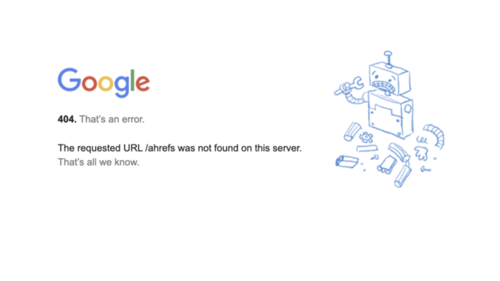
Most websites use generic 404 error pages such as the one above. While this informs the user of the issue, it can add to frustrations users feel when being able to find what they need.
The default error page does not provide any solutions for the visitor. On the other hand, customizing 404 pages gives you an opportunity to improve user experience, redirect visitors to useful resources, and improve overall engagement.
Locked out of your website? Here’s how to fix the “Sorry You Are Not Allowed to Access This Page” Error.
What Are the Benefits of a Custom 404 Page?
Creating a custom 404 page offers several advantages that go beyond simply informing users of an error. Here are the key benefits:
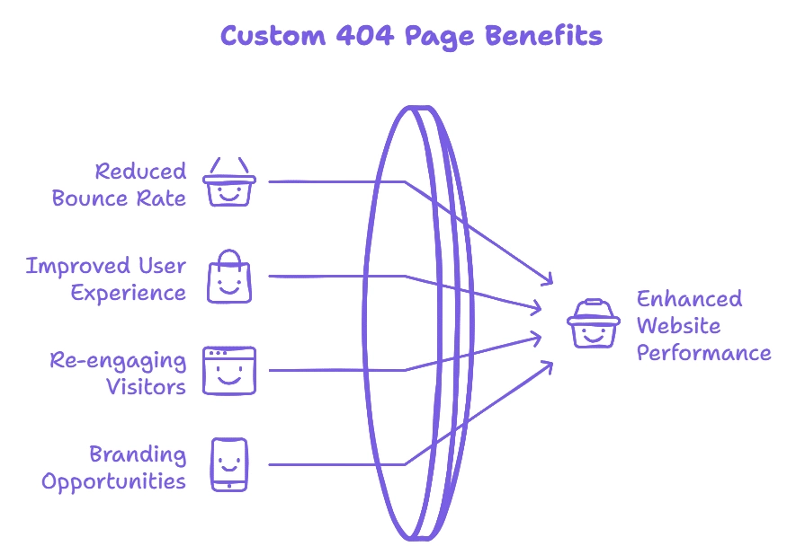
1. Reduces Bounce Rate
The bounce rate is the percentage of visitors who leave your site only after viewing one page. A well-designed custom 404 page can lower the bounce rate by providing them with clear navigation options, engaging and meaningful content, and helpful links. This can help keep users on your website even after they encounter an error.
2. Improves User Experience
A good user experience helps you retain visitors to your website and ensure that the interactions they have with your brand are positive. A custom 404 error page helps you maintain a consistent aesthetic even when an error occurs. You can customize the messaging on the error page to acknowledge the error and make the user feel valued. You can also guide them to find exactly what they were initially looking for.
3. Provides a Chance to Re-engage Visitors
A default 404 error page is often a dead end for users. However, if you customize your error page, you can use it as an opportunity to re-engage your visitors. You can do this by adding Call-to-Action buttons, interactive elements and personalized recommendations.
4. Promotes Branding Opportunities
Every touchpoint with a user is an opportunity to reinforce your brand identity. A 404 error page is one such touchpoint that you can use to demonstrate your brand’s personality. If your brand is friendly, professional, or creative, you can convey this through your 404 error page design, visuals, and language. It also helps increase brand recognition by giving users a unique and memorable experience.
Experiences frequent timeout errors? Learn how to fix 408 Request timeout errors.
Examples of 404 Pages
Some brands understand that their 404 error pages have to be more than just error messages. They’ve used a combination of design principles, interesting messaging and thoughtful elements to create pages that are memorable and improve user experience. Here, we’ll explore some of the most creative 404 page examples that you can learn from:
1. GitHub
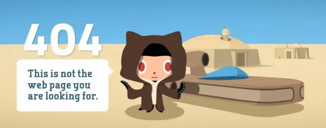
GitHub’s 404 page stands out for its simplicity. The page features a clean design with a clear message and intuitive navigation links that guide users back to the homepage or other essential sections of the site.
The clever use of the iconic Star Wars quote, “These aren’t the droids you’re looking for,” adds a touch of humor and familiarity, making the error less frustrating and more engaging for users.
Key Takeaways
GitHub demonstrates the power of simplicity and brand-related humor in a 404 page. Incorporating familiar phrases or cultural references can make the error experience more enjoyable. Ensure your 404 page provides clear navigation options to retain user engagement.
2. Airbnb
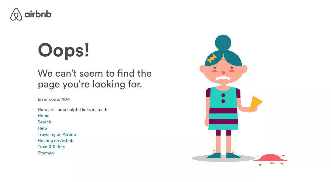
Airbnb’s 404 page features an adorable illustration of a girl with spilt ice cream, evoking empathy and a sense of whimsy. The page includes several helpful links that allow users to navigate back to different parts of the website effortlessly.
Key Takeaways
Using relatable and charming visuals can soften the impact of an error. Moreover, providing multiple navigation options helps users quickly find what they need.
3. Marvel
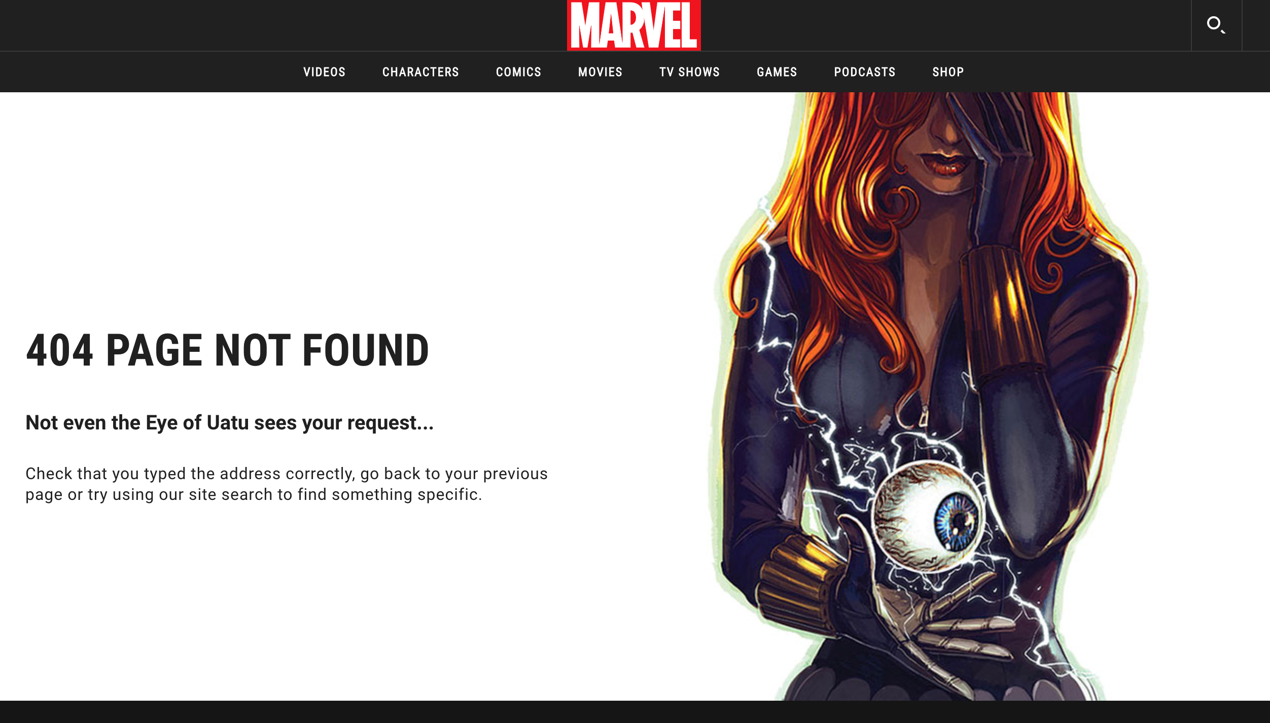
Marvel’s 404 page excels by deeply embedding the brand’s essence into the message. The artwork features a recognizable Marvel superhero holding the mystical Eye of Uatu, instantly tying into Marvel’s iconic universe.
The error message, “Not even the Eye of Uatu sees your request…” cleverly references Marvel lore, specifically Uatu the Watcher, an all-seeing being in the Marvel universe. This nod appeals directly to Marvel fans, using language they appreciate and understand.
Key Takeaways
Marvel showcases how integrating brand-specific elements and humor can transform a 404 page into an enjoyable experience. Leveraging iconic characters, lore and ideas that your visitors relate to creates a connection with the audience.
4. Slack
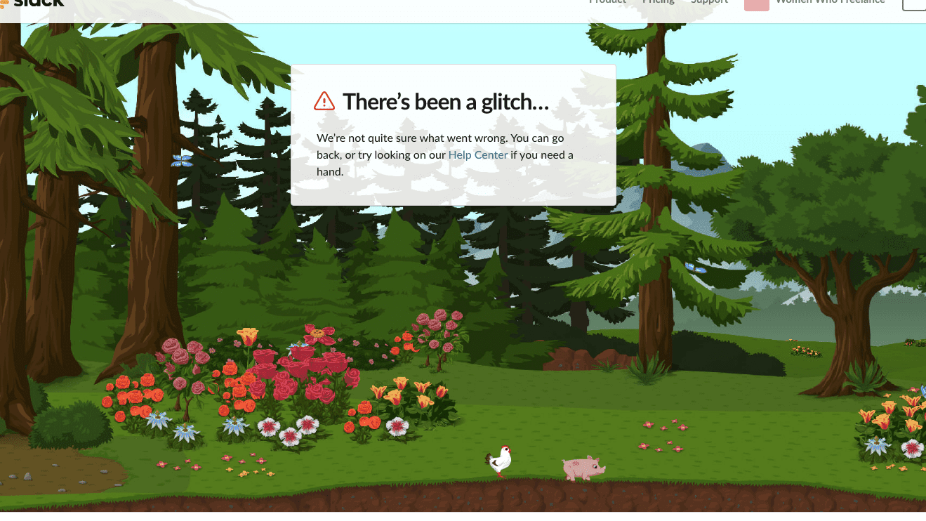
Slack’s 404 page example presents a charming forest scene where elements move as users hover their cursor around the screen. The playful interaction with a little pig and chicken adds a delightful surprise, enhancing the user experience.
Although the page primarily directs users to the Help Center, the engaging visuals and animations provide a moment of joy, aligning with Slack’s friendly and approachable brand personality.
Key Takeaways
Slack focuses on the value of interactive and visually appealing elements on a 404 page. Even with minimal navigation options, creative animations and engaging graphics can create a memorable experience.
5. Starbucks

Starbucks’ 404 page features a spilt coffee cup adorned with the familiar Starbucks logo, instantly connecting with the brand’s core identity. The casual and light-hearted tone, describing the missing page as a “spilt Vanilla Latte,” aligns perfectly with Starbucks’ conversational and friendly communication style.
Additionally, the page includes three call-to-action buttons, providing users with clear options to navigate back to relevant sections of the site.
Key Takeaways
Starbucks’ 404-page design example shows you that selecting images or illustrations that are closely tied to your brand’s products or services to reinforce brand identity. It also shows how to communicate in a friendly and approachable manner to make the error experience feel less formal and more relatable
6. LEGO
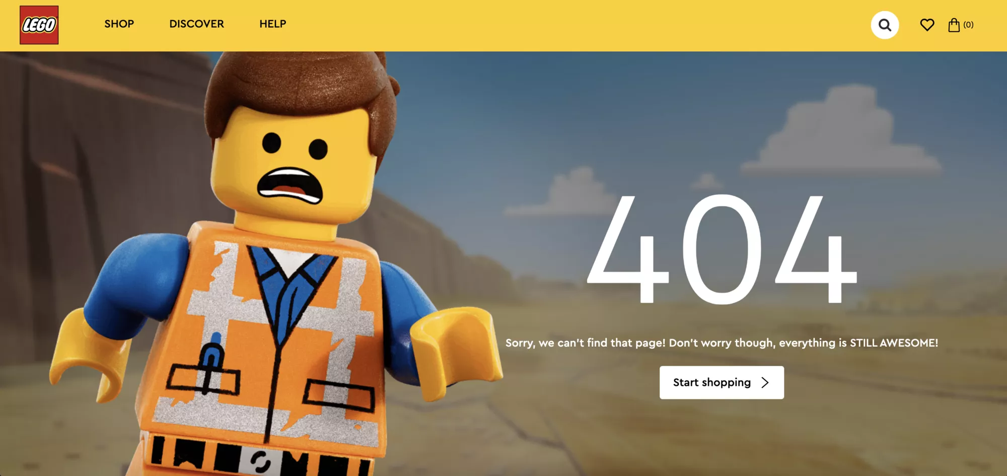
LEGO’s 404 page aligns perfectly with its brand personality. Featuring a simple yet charming lego character, a brief line of text, and a prominent “Start Shopping” button, the page effectively redirects users without overwhelming them.
The minimalist design ensures that users can quickly find their way back to the main activities, while the friendly visual element adds to the welcoming aesthetic.
Key Takeaways
Simple designs are effective as they communicate the error without unnecessary distractions. LEGO uses bright colors to make the page instantly recognizable. The prominent CTA means that users are more likely to continue into other parts of the website.
Facing server errors on your website? Here’s how to fix 400 bad request errors in Elementor.
7. Blizzard
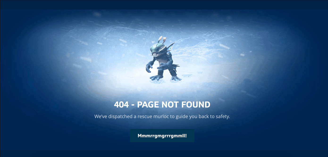
Blizzard’s 404 page is a creative extension of their immersive gaming universe. Visitors encountering the error are greeted by a friendly Murloc, an iconic character from their popular game, World of Warcraft.
The phrase “We’ve dispatched a rescue Murloc to guide you back to safety” is humorous and directly relates to the rescue themes often present in Blizzard’s games. The fictional “Mmmrrggrrmgmmll!” keeps it playful and thematic.
Blizzard excels at world-building, and this 404 error page extends that to their website, making the error page feel like a natural part of their branding.
Key Takeaways
Incorporate playful and thematic language that resonates with your audience, making the error message entertaining. You can create a better user experience by ensuring that the visual elements of the 404 page align with your brand’s overall aesthetic.
8. IMDB
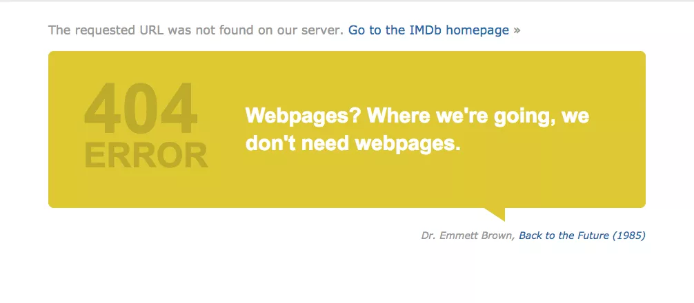
IMDb’s 404 page leverages its extensive connection to the film and TV industry by incorporating famous movie quotes adapted to fit the context. The witty and familiar quote appeals to IMDb’s cinephile audience.
The page’s design remains clean and focused, with a bright yellow speech bubble that draws attention without overwhelming the user. Additionally, users can hit refresh to see a new quote which keeps the experience dynamic and engaging.
Key Takeaways
Use quotes or references that are well-known within your industry to create a relatable and entertaining error message. You can also incorporate features like refreshable quotes or rotating messages to keep the user experience fresh and engaging.
9. LinkedIn
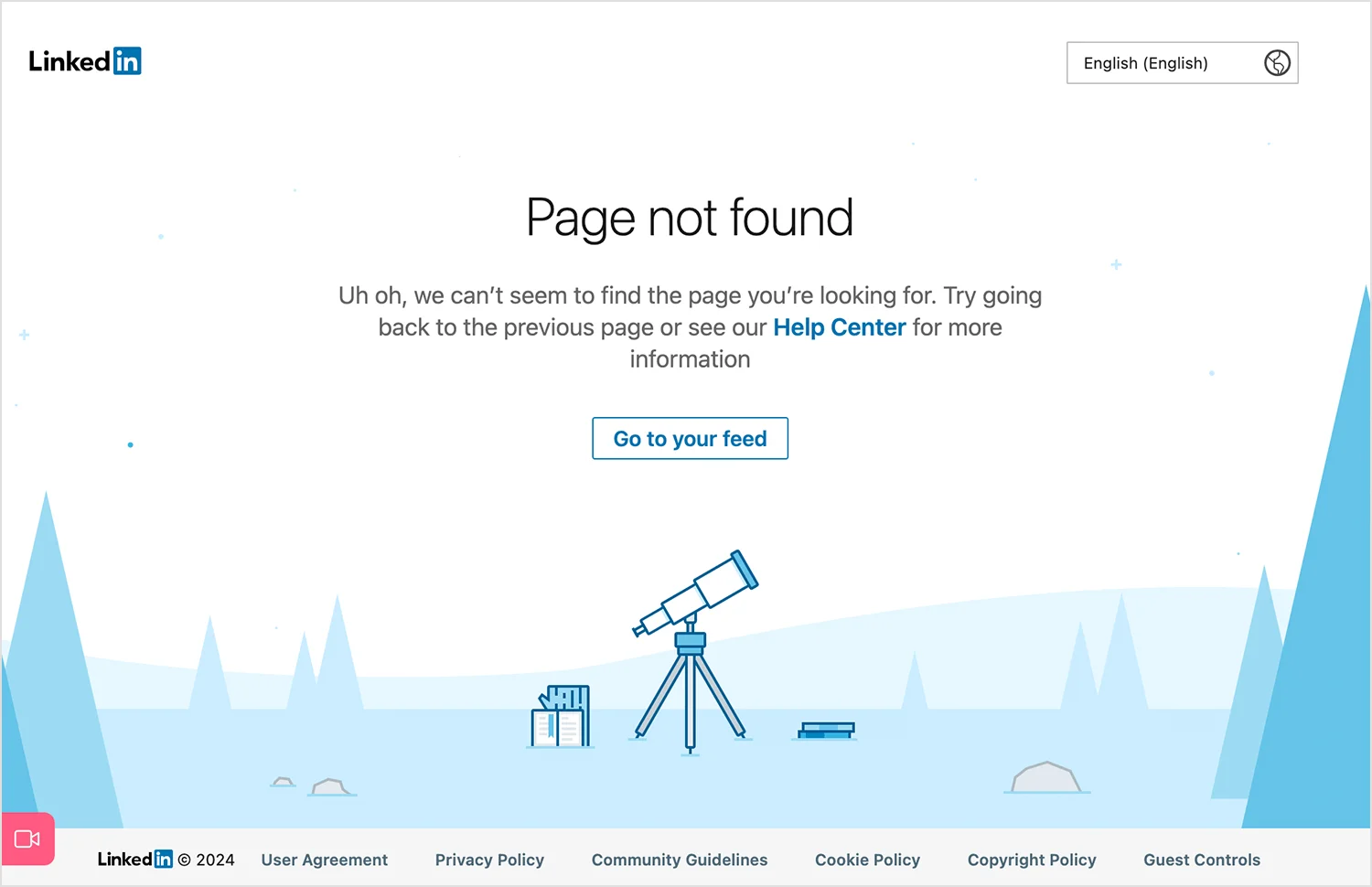
LinkedIn’s 404 page employs a professional and symbolic approach to guide users back on track. The use of a telescope as a visual suggests that even when users get lost, LinkedIn is there to help them find their way.
The tone of LinkedIn’s 404 page is professional yet approachable. Phrases like “Uh oh” add a human touch without being overly informal. The blue tones and clean design reflect LinkedIn’s consistent brand aesthetic.
Key Takeaways
Use visuals that symbolize your brand’s core values and mission to create a meaningful connection with users. The language and tone of your 404 page align with your brand’s overall voice and audience expectations.
10. Hubspot
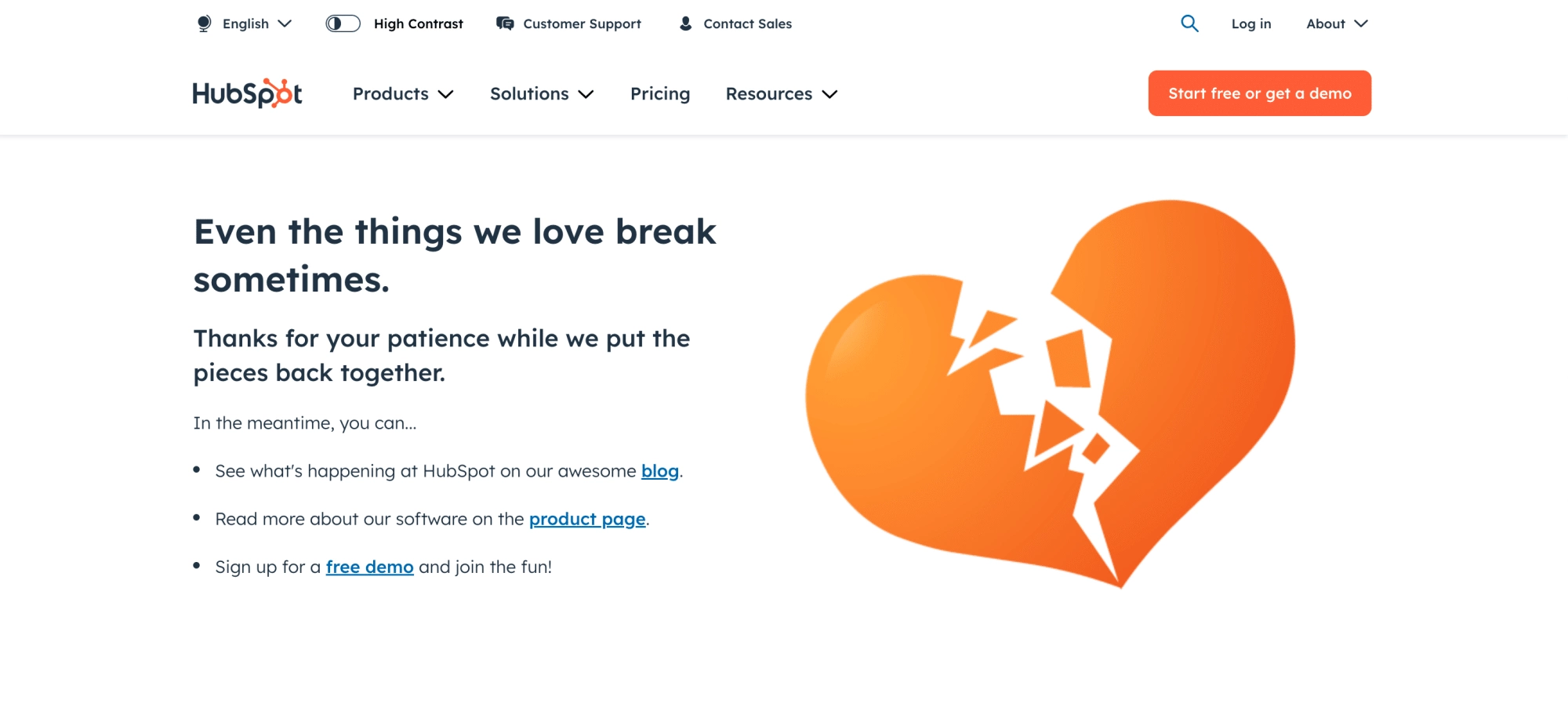
HubSpot’s 404 page features a broken heart graphic that aligns with its orange branding. The simple illustration, combined with a brief line of empathetic text, conveys the error in a light-hearted manner.
HubSpot’s focus on offering solutions is evident in its 404 page, which includes links to resources and demos. This speaks to their service-oriented brand, aiming to help users find what they need while keeping the tone light and supportive.
Key Takeaways
Providing actionable links and resources helps users navigate away from the error and continue their journey on your site. Like HubSpot, show your understanding and support through your messaging to create a positive user experience even during errors.
11. Pixar
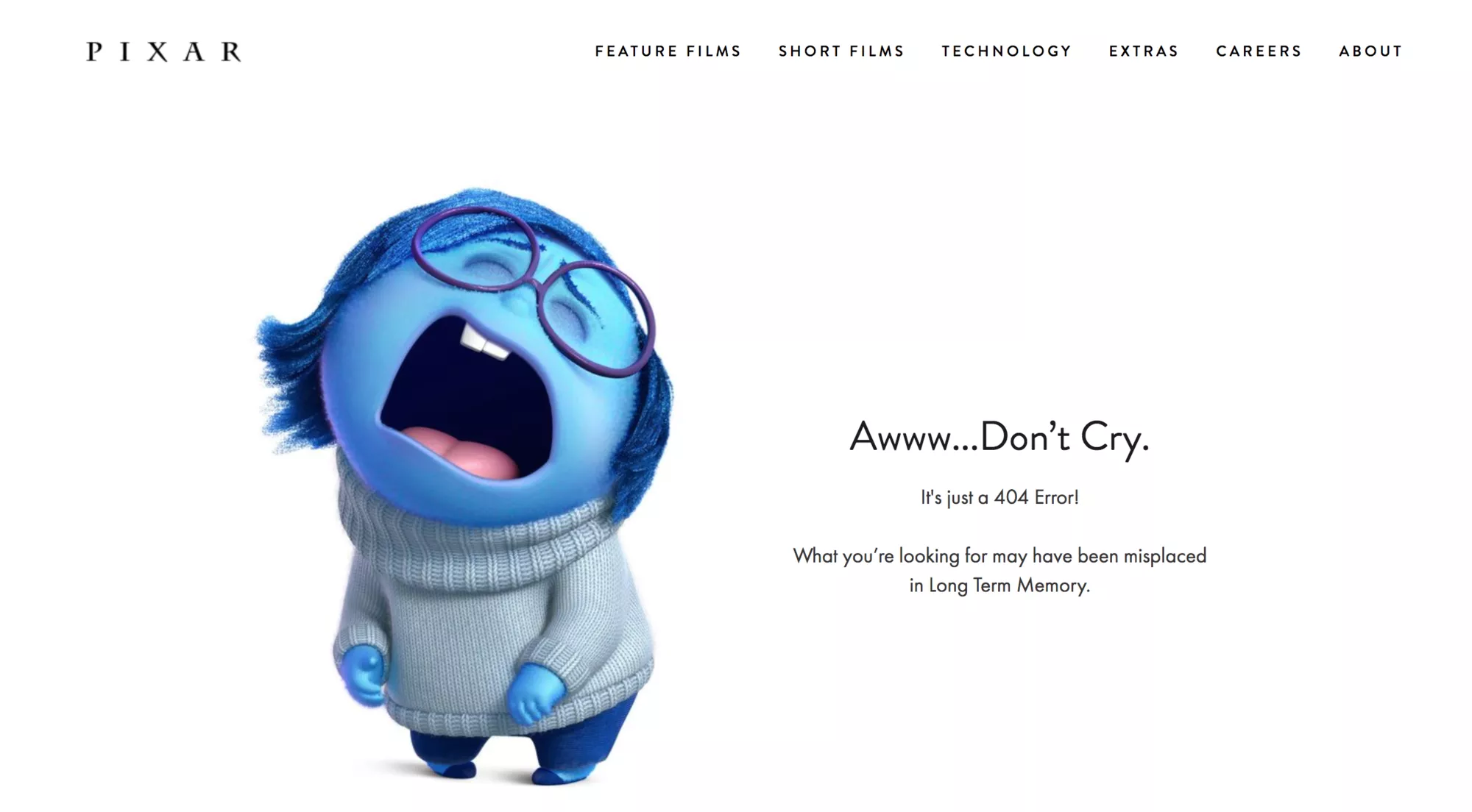
Pixar’s 404 page uses Sadness from their hit movie Inside Out to explain the error message. The page features a beautifully designed character that immediately connects with fans of the film. The tone of Pixar’s 404 page is emotional and engaging. The message, “Awww… Don’t Cry. It’s just a 404 Error!” evokes humor.
Key Takeaways
In some cases, using emotional elements that resonate with your audience can turn a mundane error into a memorable interaction. However, ensure that your 404 page reflects the same level of visual and storytelling excellence as the rest of your brand’s content.
12. Mailchimp
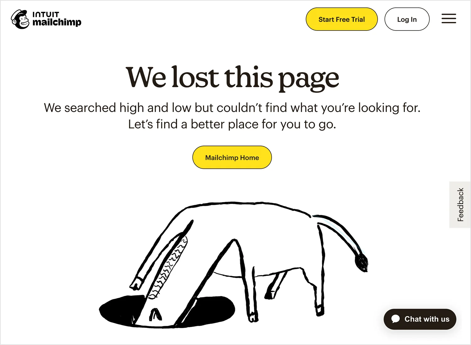
Lastly, Mailchimp’s error page is creative yet simple. The page features a playful, quirky illustration of a creature searching underground. The tone of Mailchimp’s 404 page is friendly and informal.
Phrases like “We lost this page” are simple and personable, reflecting Mailchimp’s casual and humorous communication style. This approach makes the error message feel less like a technical issue and more like a minor hiccup.
Key Takeaways
Use illustrations and design elements that reflect your brand’s unique personality. A friendly and informal tone can help the error message feel more approachable and less technical.
Also Read: Best About Us Page Examples for more page-design inspiration across your site.
Stay updated with Helpful WordPress Tips, Insider Insights, and Exclusive Updates – Subscribe now to keep up with Everything Happening on WordPress!
Wrapping Up
Having looked at some of the best 404 page examples, you can now implement these design principles to create custom 404 page designs for your website. Take care that you use these pages, not find examples only as inspiration, and create pages that match your brand personality, design, and voice.
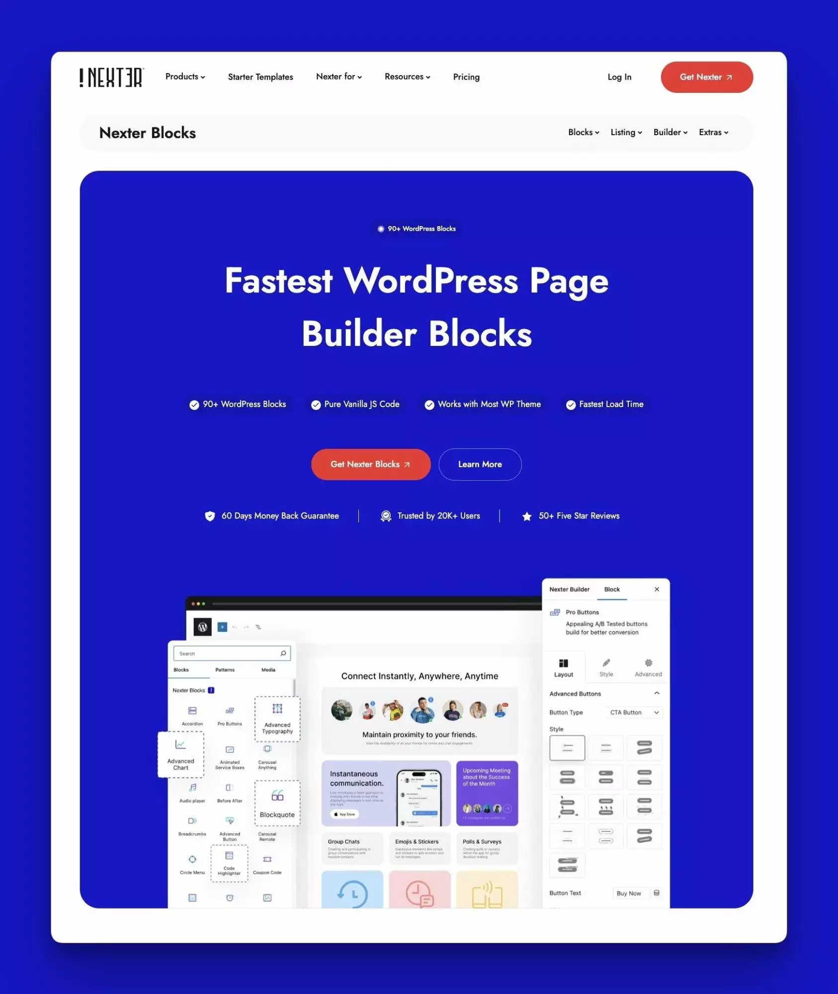
Don’t let ‘Page Not Found’ be a dead end! With Nexter 404 Page Builder, you can easily customize your 404 error page to match your brand and provide helpful content that keeps visitors on your site. Nexter Blocks offers 90+ Gutenberg blocks, giving you plenty of design options to create a clean, professional, and useful 404 page. Instead of losing visitors, you can guide them back to important pages and show off your brand’s style. Turn a simple error page into an opportunity with Nexter!
FAQs on 404 Page
What’s the purpose of a 404 page?
A 404 error page is an error message displayed when a user attempts to access a webpage that doesn’t exist or cannot be found on the server. It prevents user frustration by acknowledging the error and providing alternatives. Creative error pages can align with the brand’s identity for a better user experience.
How can I reduce the bounce rate on my 404 page?
You can reduce bounce rates on your 404 page by creating a custom 404-page design that aligns with your brand voice and helps the visitor find what they are looking for. Adding a navigation bar, engaging content, and a CTA button are some ways to reduce bounce rates on your error pages.
Should my 404 page include a search bar?
Yes, including a search bar on your 404 page is highly beneficial. A search bar on your unique 404 pages allows users to quickly search for the content they were looking for without having to navigate back to the homepage or menu. It reduces frustration by offering a direct path to finding relevant information.
Can a custom 404 page affect SEO?
Yes, a customer 404 page can affect your SE0. A well-designed 404 page can reduce bounce rates by guiding users back to valuable content, which can indirectly benefit SEO. Using the correct 404 HTTP status code prevents search engines from indexing non-existent pages, which maintains the integrity of your site’s index.
Can a 404 page include a call to action?
Yes, a 404 page can and should include a call-to-action (CTA) to guide users towards engaging with your website further, instead of leaving it. Including a CTA can transform an error encounter into an opportunity for interaction. You can use search prompts, links to other content, or subscription options as CTAs.
How do I track 404 errors on my site?
To track 404 errors on your site, use Google Analytics by setting up custom reports or event tracking for your 404 page. You can use Google Search Console’s Coverage report to identify broken links. You can also track individual links and analyze server codes to identify HTTP 404 status codes.
Can a 404 page help improve user retention?
Yes, a well-designed 404 page improves user retention by turning a potential point of frustration into a positive experience. A helpful 404 page acknowledges the inconvenience and provides paths like links to popular content, a search bar, or the homepage to continue exploring the site, reducing the likelihood of users leaving immediately.
Should I include links to other parts of my website on my 404 page?
Yes, including links to other parts of your website on your 404 page is highly recommended. This helps users quickly find alternative content without having to return to the homepage manually. It also encourages them to explore other sections of your site and increases the time they spend on your website.
Can a creative 404 page improve my brand image?
A creative 404 page can significantly enhance your brand image by showcasing your brand’s personality and commitment to user experience, increasing your credibility as a business. Using light-hearted humor to acknowledge the situation, funny graphics and illustrations, and custom animations and messages can create a lasting impression on your visitors.
Is it possible to track how many visitors land on my 404 page?
Yes, you can track how many visitors land on your 404 page using analytics tools. First, set up a specific page view tracking for your 404 page. Then, configure goals or events in Google Analytics to count visits to the 404 page and create custom reports to track this data.