An icon list not only captures attention but also organizes information in a visually appealing manner, making it easier for visitors to digest content quickly.
With the Stylish List block from Nexter Blocks, you can show information in a beautiful list format on your WordPress website.
Required Setup
- Make sure the default WordPress Block editor is active.
- You need to have the Nexter Blocks plugin installed and activated.
- Make sure the Stylish List block is activated, to verify this visit Nexter Blocks → Blocks → and Search for Stylish List and activate.
- This is a Freemium block, to unlock the extra features, you need the PRO version of Nexter Blocks.
Learn via Video Tutorial
How to activate the Stylish List Block?
Go to
- Nexter Blocks → Blocks
- Search the block name and turn on the toggle.

Key Features
- Two Layout – You can select from two layout types, Vertical and Horizontal.
- Hint (pro) – You can easily highlight an icon list item.
- Tooltip (pro) – You can easily add a tooltip to a WordPress icon list item.
- Hover Background (pro) – You can change the WordPress icon list item background on hover.
- Read More Toggle (pro) – You can add a read more button to show more icon list items.
- Inverse Hover (pro) – You can easily highlight an item on hover by adding an inverse hover effect on other items.
How to Use the Stylish List Block?
Add the Stylish List block to the page.
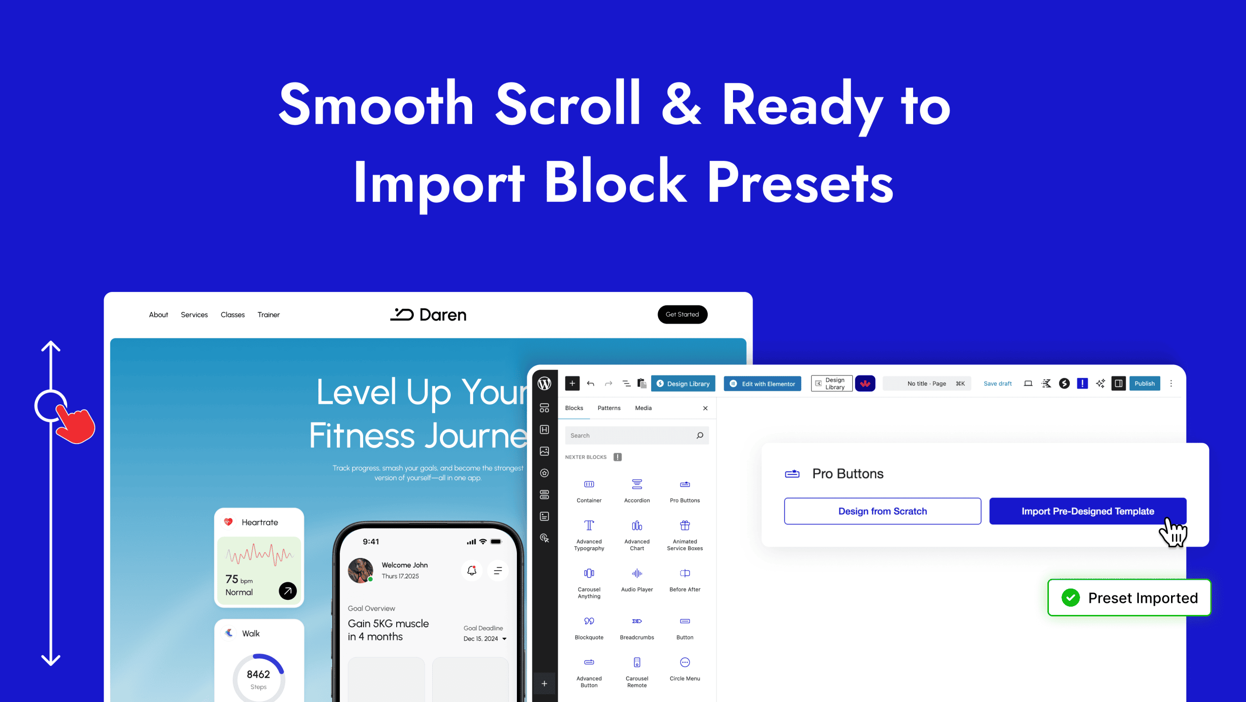
Then click on the Design from Scratch button to design the layout from scratch.

Note: By clicking on the Import Pre-Designed Template button, you can import a preset template and customize it as per your requirements.
List
From the Layout Type section, you can select the layout type. Here you’ll find two options –
- Vertical – To create a vertical icon list.
- Horizontal – To create a horizontal icon list.
Select the option as per your requirement, let’s select Vertical here.
Then from the List Content section, you have to add the icon list content. By default, you’ll find three items, open one item.
In the Content section, you can add the description of the list item.
In the Url field, you can add a custom link to the icon list.
From the Icon Type section, you can add an icon or image to the icon list.
By enabling the Hint toggle, you can highlight an icon list item.
Then, from the Hover Background toggle, you can change the icon list item background on hover.
Note: You’ll only see the Hover Background toggle option when the Interactive Links toggle is enabled from the Extra Options tab.
Read More Toggle
By enabling the Read More Toggle, you can add a read more button to show more icon list items.
Extra Options
By enabling the Interactive Links toggle, you can enable the option to change the icon list item background on hover on each item.
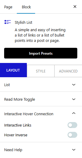
Then, from the Hover Inverse toggle, you can add an inverse hover effect on other items.
How to Style the Stylish List Block?
To style the Stylish List block, you’ll find all options in the Style tab.
List – From here, you can manage the icon list item spacing, alignment, separator color, etc.
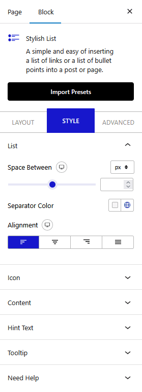
Icon – From here, you can manage the icon style.
Content – From here, you can manage the list content style.
Read More Toggle – You’ll see this option when Read More Toggle is enabled. From here, you can style the read more text.
Hint Text Style – From here, you can manage icon list item pin hint style.
Tooltip Options – From here, you can manage the icon list item tooltip style.
Extra Options – From here, you can add a reverse hover effect on icon list items.
Advanced options remain common for all our blocks, you can explore all it options from here.
