












A reader part-way down a long article has no idea whether two paragraphs remain or twenty.
The Progress circle style draws a ring around the pointer that fills as they scroll, so the answer follows their eye instead of sitting at the edge of the screen.
For every Mouse Cursor setting in one place, see the Mouse Cursor block guide.
Before You Start
- Edition: Pro — the Mouse Cursor block is part of Nexter Blocks Pro.
- Block to enable: Mouse Cursor, switched on under Nexter > Blocks in your WordPress dashboard.
- A page long enough to scroll. On a short page the ring has nothing to measure.
Steps
- Add the Mouse Cursor block and click Design from Scratch.
- Set Cursor Area to Body.
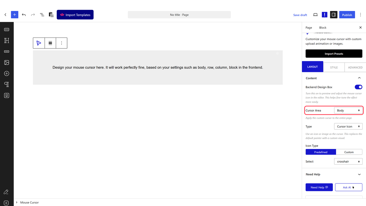
- Set Type to Follow Circle, with Circle Cursor Type on Predefined.
- Set Circle Style to Progress.
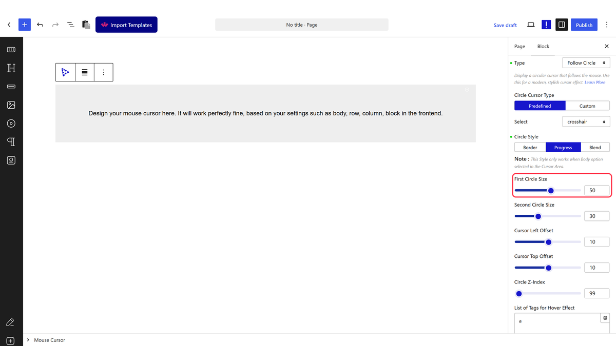
- Set First Circle Size for the outer track and Second Circle Size for the ring that fills.
- Colour the track and the progress ring in the Follow Circle panel on the Style tab.
- Publish and scroll the page.
Progress only works with Cursor Area set to Body. With Row or Block the ring is not rendered at all — measured on the front end, where both produced a plain circle and no ring.
How It Behaves
- The ring tracks scroll exactly. Measured on a page with 5935 pixels of scroll, the ring’s fill read 0%, 25%, 50%, 75% and 100% at each quarter of the way down — perfectly linear.
- First Circle Size is the outer track and Second Circle Size the ring that fills, so the second should be the smaller of the two.
- It is drawn as an SVG ring, so it stays sharp at any size.
- It measures the whole page, not the article, so long footers count toward the total.
Limitations
- Pro only.
- Body only. Row, Column and Block render no ring.
- A page too short to scroll shows a ring that never moves, which looks broken.
- The ring measures the document, so a very long footer or comments section skews what 100% means.
- Touch screens have no cursor, so phone and tablet visitors see none of this.
Troubleshooting
The ring never fills
Either the page is too short to scroll, or Cursor Area is not Body.
There is a circle but no ring
Cursor Area is set to Row, Column or Block. The ring is only rendered for Body.
The two circles overlap oddly
Second Circle Size should be smaller than First Circle Size.
