---
title: "How to Add a Follow Circle Cursor in WordPress?"
url: https://nexterwp.com/docs/add-a-follow-circle-cursor-in-wordpress/
date: 2024-12-16
modified: 2026-05-22
author: "Aditya Sharma"
description: "Do you want to add a follow circle cursor in WordPress? This type of cursor displays a circle that follows mouse movement, creating a visually engaging touch that increases the..."
image: https://nexterwp.com/wp-content/uploads/2024/12/How-to-Add-a-Follow-Circle-Cursor-in-WordPress_-1024x519.jpg
word_count: 587
---

# How to Add a Follow Circle Cursor in WordPress?

## Key Takeaways

- Nexter Blocks Mouse Cursor block adds a Follow Circle cursor in WordPress and lets the editor customize style, size, and hover behaviour directly in the block editor.
- Circle Style offers three options, Border, Progress, and Blend, with Progress animating as the page scrolls and Blend using a CSS blend mode to invert or mix colours against the background.
- Hover Effect supports multiple HTML tags separated by a comma, and the Style tab requires transform CSS for the hover effect while also controlling colour, border, opacity, and transition speed.

Do you want to add a follow circle cursor in WordPress? This type of cursor displays a circle that follows mouse movement, creating a visually engaging touch that increases the interactivity of your website.

With the Mouse Cursor block from Nexter Blocks, you can add a circle that follows the mouse cursor on your WordPress website and customise its style, size, and hover behaviour directly in the block editor.

*To check the complete feature overview documentation of the Nexter Blocks Mouse Cursor block, [click here](https://nexterwp.com/docs/add-a-custom-cursor-in-wordpress/).*

**Requirement - This block is a part of Nexter Blocks, make sure it is installed and activated to enjoy all its features.**

[LIVE BLOCK LINK](https://nexterwp.com/nexter-blocks/blocks/wordpress-custom-cursors/)

To do this, add the Mouse Cursor block to the page and follow the steps:

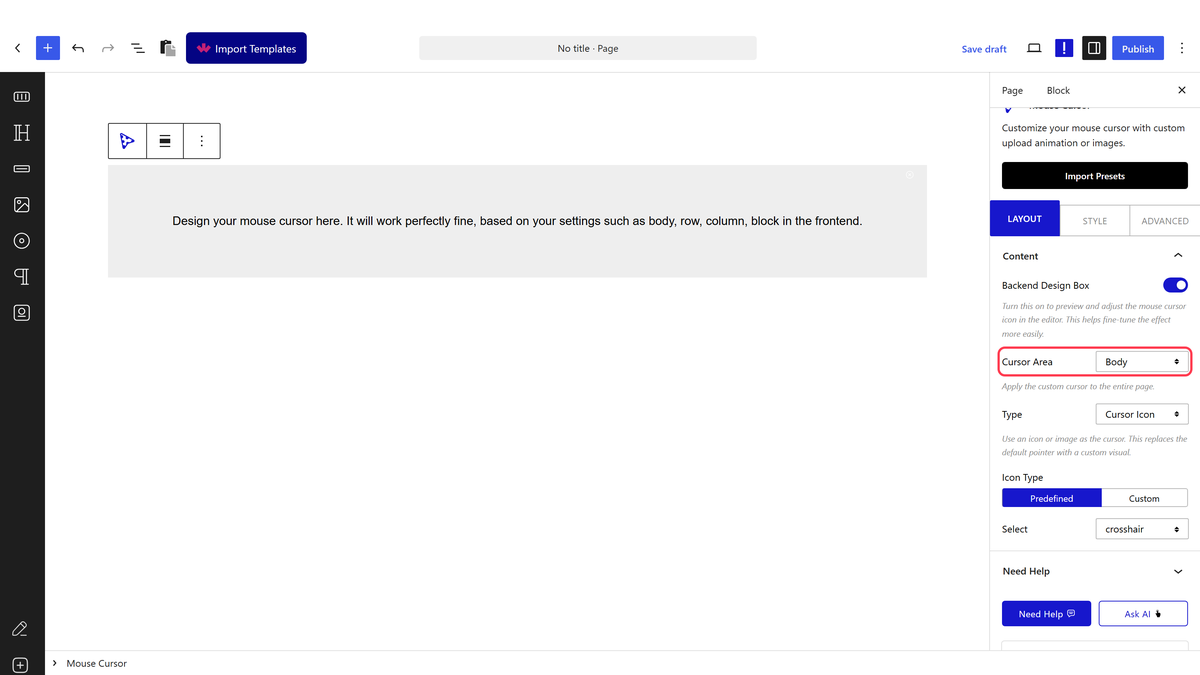
1. Select the appropriate cursor area from the **Cursor Area** dropdown. This controls which part of the page the circle cursor is active on. Use this when you want the cursor effect only on a specific section rather than the entire page.

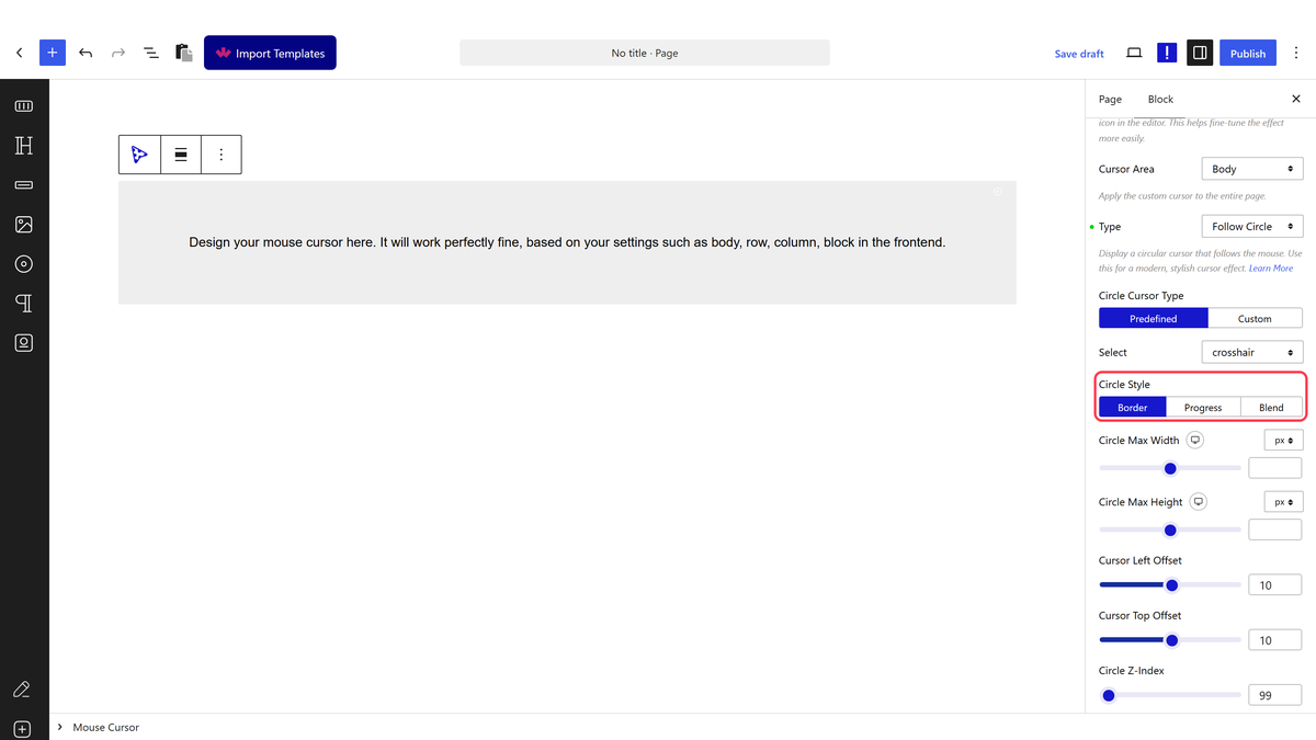
2. Then select **Follow Circle** from the **Type** dropdown.

3. From the **Circle Cursor Type** section, select the pointer type. You will find two options:

- **Predefined** - To add a preset icon as the cursor. Use this for a quick setup when you want a standard icon that matches the block's built-in styles.

- **Custom** - To use a custom image file as the cursor. Use this when you want to match the cursor to your brand or use a unique graphic.

Different options will appear depending on your selection. For this example, select **Predefined**.

4. From the **Select** dropdown, choose the cursor icon you want to display inside the circle.

5. From the **Circle Style** section, select the circle type. You will find three options:

- **Border** - Displays a circle with a visible border outline around the cursor. This is the most common choice for a clean, minimal cursor effect.

- **Progress** - [Creates a progress circle cursor](https://nexterwp.com/docs/add-a-progress-cursor-in-wordpress/) that animates as the page scrolls. Use this on long-form content pages where you want to show reading progress.

- **Blend** - [Creates a blend circle cursor](https://nexterwp.com/docs/add-a-blend-cursor-in-wordpress/) that uses a CSS blend mode to invert or mix colours against the background. Use this for creative or portfolio sites where a high-contrast cursor effect adds visual interest.

Select the option that matches your design. For this example, select **Border**.

From the **Circle Max Width** and **Circle Max Height** sections, set the width and height of the circle. Increase these values if you want a larger circle that is more noticeable on wide desktop screens.

Adjust the circle's position offset from the mouse pointer using the **Cursor Left Offset** and **Cursor Top Offset** sections. These control how far the circle sits from the actual cursor position.

From the **Circle Z-Index** section, set the stacking order of the circle. Increase this value if the circle does not appear above other elements on the page.

In the **List of Tags for Hover Effect** section, add the HTML tags on which you want the cursor hover effect to activate. This lets you trigger a visual change in the cursor when the visitor hovers over specific elements such as buttons, links, or headings.

> *Note: You can add multiple tags separated by a comma (,) and you have to add transform CSS for the hover effect in the Style tab.*

Style the circle further from the **Style** tab to control its colour, border, opacity, and transition speed.

Once configured, you will see the circle following the mouse cursor on the page.