












In a normal grid every product looks equally important. On a shop front that is rarely true, and the product you most want to sell deserves more room.
Metro lays products out as tiles of different sizes, so the first few are larger.
Before You Start
- Edition: Pro — the Product Listing block needs Nexter Blocks Pro.
- Block to enable: Product Listing, switched on under Nexter > Blocks in your WordPress dashboard.
- WooCommerce active, with published products. The block reads your real catalogue, so an empty store renders an empty listing.
- Enough products to fill the pattern, or the layout shows gaps.
Steps
- Select your Product Listing block.
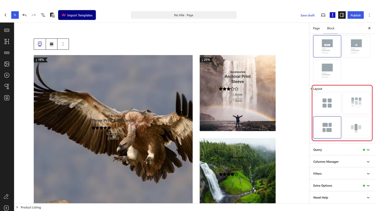
- Set the layout to metro.
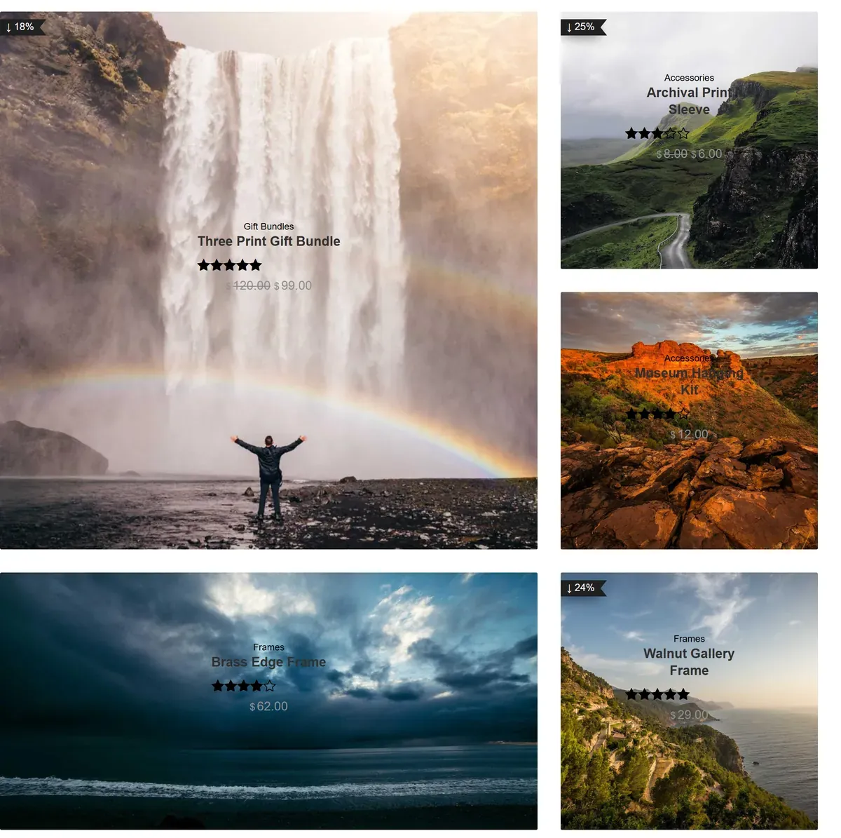
- Choose a metro style, which decides which tiles are large.
- Set the metro columns per device.
- Order your products so the right one lands in the large tile, then publish.
How It Behaves
Metro uses its own markup and carries its settings in a dedicated attribute.
- Measured on a published page: the wrapper rendered
data-layout="metro"with the classtpgb-metro, and the tile settings carried indata-metroAttrwith separate desktop, tablet and mobile values. - Tile size is positional. The block does not know which product matters most, so the largest tile is simply the first in the query. Control it with the ordering, or by listing specific products — see show a product by ID.
- Every card carries its own data. Measured on a published page, each product renders as an
articlewhose classes include its category (product_cat-...), its tags (product_tag-...), its stock state (instockoroutofstock) and whether it is on sale. - Metro suits a shop front, not a full catalogue, because the pattern repeats awkwardly over many rows.
- Measured with Nexter Blocks Pro deactivated: the block renders nothing at all — no wrapper, no products, no prices. This is a Pro-only block.
Limitations
- Pro only — measured with Nexter Blocks Pro deactivated, nothing renders.
- It needs enough products to complete the pattern, or gaps appear.
- Different tile sizes crop images differently, so a product image that looks right in a small tile may be badly cropped in a large one.
- Metro rarely survives a phone screen. At one column the size differences vanish.
- Reordering your products changes which one is featured, which is easy to do by accident when the ordering is by date.
Troubleshooting
There are gaps in the layout
Not enough products to complete the pattern. Increase the product count.
The wrong product is in the big tile
The large tile is the first product in the query. Change the ordering, or list specific product IDs.
My product images are cropped badly
Tiles of different shapes crop differently. Use images with the subject near the centre.
It looks like a plain grid
Check Nexter Blocks Pro is active. Measured with Pro off, the block renders nothing.
