

Skip to content

How to Create a Text Mask Effect in WordPress?

Key Takeaways

  • Nexter Blocks Pro uses the Advanced Typography block with Knockout Text to fill letters with a photo, colour, or gradient.
  • Advanced Typography is switched on under Nexter > Blocks in the WordPress dashboard before Knockout Text works.
  • Multiple text items each have their own Knockout Text in Extra Options, and thin fonts hide most of the image.
Table of Contents

A text mask fills the letters with a photo or gradient, like a mountain landscape inside a bold headline.

The Advanced Typography block in Nexter Blocks Pro does this with Knockout Text.

For every Advanced Typography setting in one place, see the Advanced Typography block guide.

Before You Start

  • Edition: Pro — Knockout Text needs Nexter Blocks Pro.
  • Block to enable: Advanced Typography, switched on under Nexter > Blocks in your WordPress dashboard.

Steps

  1. Add the Advanced Typography block and type a short word in Content. Use a large, heavy font so the image shows.
  1. Open Knockout Text and turn on Knockout Text.
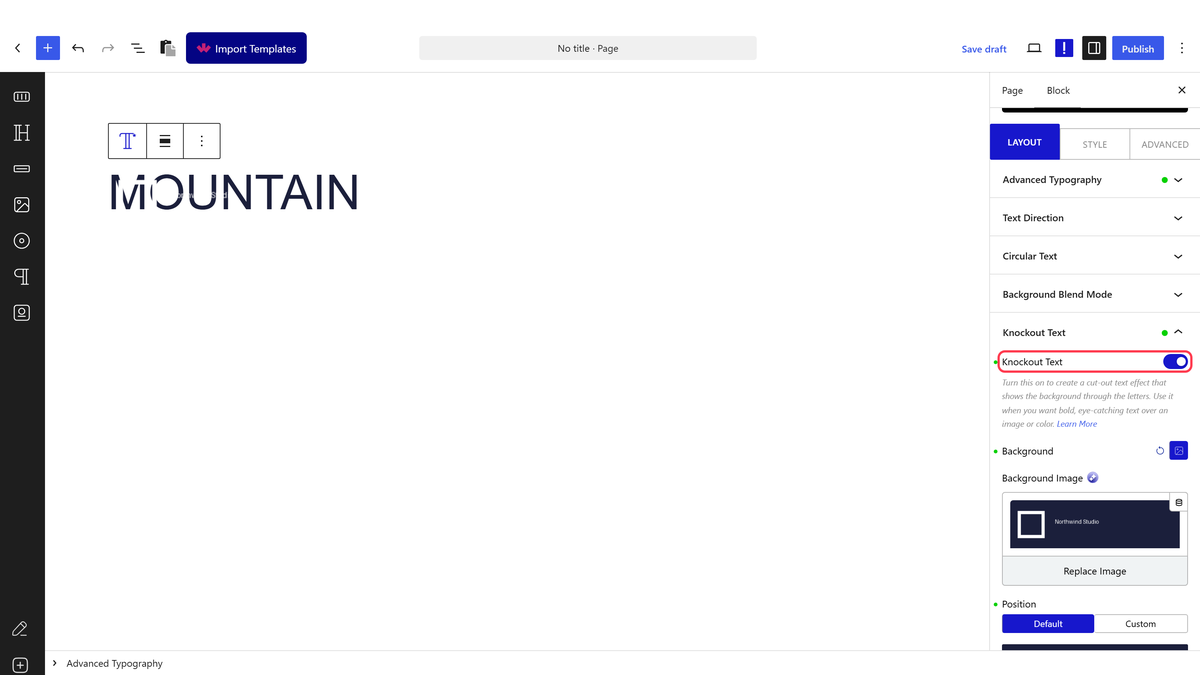
The Knockout Text panel with the switch on and the Background setting
  1. In Background, choose an image (or a colour or gradient). Save.

A bold headline filled with a mountain photo using Knockout Text

How It Behaves

  • The background is clipped to the letter shapes, so only the text shows the image.
  • With Multiple, each text item has its own Knockout Text in Extra Options.

Limitations

  • Thin fonts hide most of the image. Use bold weights and large sizes.
  • Busy images can make the text hard to read.

Troubleshooting

The text is invisible

No background is set yet. Add an image, colour or gradient under Background.

Related Docs

Share your Thoughts

Still in Doubt? Let’s Assist You

Have Feedback or Questions?

Join our WordPress Community on Facebook!

Related Frequently Asked Questions

What do I need before creating a text mask effect in WordPress?

Nexter Blocks Pro is the key requirement because Knockout Text lives in the Advanced Typography block. The setup also needs the Advanced Typography block enabled under Nexter > Blocks in your WordPress dashboard. That matters because the effect depends on the block being available before you can turn on Knockout Text and add a background image, colour, or gradient.

How do I make text show an image inside the letters?

The effect comes from the Advanced Typography block in Nexter Blocks Pro using Knockout Text. Add the block, type a short word, switch on Knockout Text, then set a background image, colour, or gradient. A short word and a heavy font help because the image has more room to show through the letter shapes. The Advanced Typography block guide covers the full settings in one place.

Why is my text mask effect invisible?

An invisible result usually means no background has been set yet. The page says to add an image, colour, or gradient under Background. That detail matters because Knockout Text clips whatever is behind the letters, so without a background there is nothing visible inside the text. If it still looks empty, check that Knockout Text is actually turned on in the Advanced Typography block.

What kind of font works best for a text mask effect?

Bold, heavy fonts work best because thin fonts hide most of the image. Large sizes also help since they give the background more space to show through each letter. That combination makes the masked photo or gradient readable instead of cramped. Busy images can still make the text hard to read, so stronger type and simpler backgrounds usually give cleaner results.

Can I use multiple text items with separate mask effects?

Multiple text items are supported, and each one gets its own Knockout Text in Extra Options. That means every item can carry its own masked look instead of sharing one background treatment across all text. This is useful when you want different words or lines to behave differently inside the same layout, but it also means each item needs its own setup.

What should I do if the masked text is hard to read?

A busy image is usually the problem, because it competes with the letter shapes instead of sitting cleanly inside them. The page recommends bold weights and large sizes for better readability. If you want more separation between the letters and what sits behind them, related options like Add a background text blend mode or Create a text stroke outline are natural next steps.

Last reviewed: September 27, 2026

Related Docs