Do you want to replace your default WooCommerce product page layout with a fully custom design you control from the WordPress block editor? The Product Page blocks in Nexter Blocks for Gutenberg let you build your WooCommerce single product page using eight dedicated blocks: Single Product Image, Single Product Pricing, Single Product Rating, Single Product Stock, Product Add to Cart, Single Product Meta, Single Product Review, and Single Product Tabs. Each block maps to a distinct section of the product page, so you can arrange, style, and configure every element independently.
Unlike the default WooCommerce single product template, which outputs all sections as one PHP-rendered block you cannot individually style, these Nexter Blocks give you per-element control over layout, typography, color, and spacing directly from the block inspector panel.
Best Used For:
- WooCommerce stores that need a custom single product page layout without writing PHP or CSS
- Online shops using Nexter Builder to create a global single product template for all products
- Product pages that need a unique visual identity, such as a gallery-first layout or a custom tab structure
Required Setup
- Make sure the default WordPress block editor is active.
- You need Nexter Blocks installed and activated.
- You need Nexter Blocks (Pro) for all eight Product Page blocks. See the Nexter Blocks pricing page for plan details.
- You need WooCommerce installed and activated on your WordPress site.
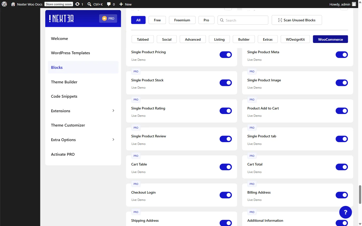
- Go to Nexter > Blocks, search for each block name, and toggle it on.
Note: These blocks are designed for use inside a Nexter Builder single product template. Place them on a product template page so they automatically pull data from the current product.
How to Activate the Product Page Blocks?
Go to Nexter > Blocks in your WordPress admin dashboard and activate each of the following blocks:
- Search Single Product Image and turn on the toggle.
- Search Single Product Pricing and turn on the toggle.
- Search Single Product Rating and turn on the toggle.
- Search Single Product Stock and turn on the toggle.
- Search Product Add to Cart and turn on the toggle.
- Search Single Product Meta and turn on the toggle.
- Search Single Product Review and turn on the toggle.
- Search Single Product Tabs and turn on the toggle.
How to Use the Single Product Image Block?
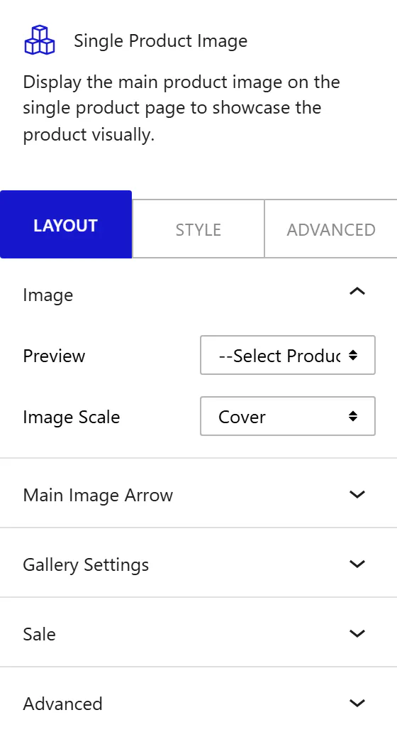
The Single Product Image block displays the main product image and optional gallery thumbnails for a WooCommerce product. To add it, open the WordPress block editor on your product template page, search for Single Product Image in the block inserter, and place it where you want the product image to appear.
From the Preview dropdown, select a product to preview how its image will appear in the editor. This selection is for editor preview only and does not change which product the block displays on the front end.
From the Image Scale dropdown, choose how the product image fills its container:
- None: display the image at its natural size with no scaling.
- Contain: scale the image to fit within the block area without cropping it. Use this when products have varied image dimensions and you want no cropping on any of them.
- Cover: fill the entire block area, cropping the image if necessary. Use this when all product images have a consistent subject centered in the frame.
- Fill: stretch the image to fill the block width and height exactly.
- Scale Down: apply the smaller of None or Contain, so the image never enlarges beyond its original size.
Main Image Arrow
Enable the Enable Navigation Arrows toggle to show left and right navigation arrows on the main product image. Use this when your products have multiple images assigned so visitors can cycle through them without scrolling to the gallery strip.
Gallery Settings
Enable the Enable Gallery toggle to show a row of thumbnail images below the main image. This gallery strip appears when the product has more than one image assigned in WooCommerce. When the gallery is enabled, additional controls appear.
From the Position dropdown, choose where the thumbnail strip appears relative to the main image:
- Top: place the gallery above the main image.
- Right: place the gallery to the right of the main image. Use this for landscape product images where vertical space is limited.
- Bottom: place the gallery below the main image.
- Left: place the gallery to the left of the main image.
From the Columns dropdown, set how many thumbnails appear in each row of the gallery strip. This control is responsive: set different column counts for desktop, tablet, and mobile. Use a higher column count on wide screens and reduce it to Column 2 or Column 1 on mobile to keep thumbnails large enough to tap.
Enable the Enable Gallery Navigation toggle to show navigation arrows on the gallery thumbnail strip when it overflows its container.
Sale
Enable the Sale toggle to display a sale badge on the product image when the product has a sale price in WooCommerce. This badge draws attention to discounted products without any additional WooCommerce template customization. When the toggle is on, additional controls appear.
From the Sale Design dropdown, choose the format of the sale badge:
- Text (Sale): show a static text label. In the Text field, enter the exact text you want the badge to display.
- Digit (-10%): calculate and show the discount percentage automatically from the product’s regular and sale price.
- (-10%) Off: show the discount percentage followed by “Off”.
From the Sale Position dropdown, choose which corner of the image the badge appears in: Top Left, Top Right, Bottom Left, or Bottom Right.
How to Style the Single Product Image Block?
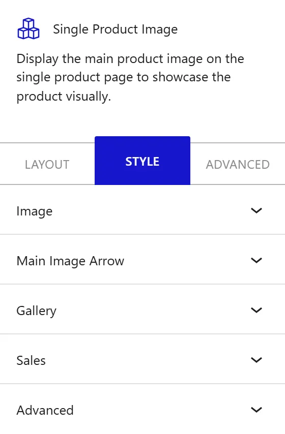
To style the Single Product Image block, go to the Style tab in the block inspector.
- Image: change the image container height, width, and size constraints. Set the vertical and horizontal position to control where the image sits within its container. Add or remove box shadow on the image.
- Main Image Arrow: change the icon size of the navigation arrows and their padding within the arrow button area. Add box shadow to the arrow buttons.
- Gallery: change the column gap between thumbnails, the spacing between thumbnail rows, the icon size used in gallery controls, and the arrow padding on gallery navigation buttons.
- Sales: change the typography, color, padding, border radius, and positioning offsets of the sale badge.
How to Use the Single Product Pricing Block?
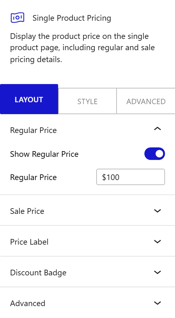
The Single Product Pricing block displays the WooCommerce product price, including regular price, sale price, a custom price label, and a discount badge. For variable products, the displayed price updates automatically when a customer selects a different variation. To add it, search for Single Product Pricing in the block inserter and place it on your product template page.
Regular Price
Enable the Show Regular Price toggle to display the product’s regular price on the page. When the toggle is on, the Regular Price text field appears. In this field, enter a custom price value to override the product’s WooCommerce price for display purposes only. Leave the field empty to show the actual WooCommerce regular price automatically.
Note: This field overrides the displayed price in the block only. It does not change the product price stored in WooCommerce.
Sale Price
Note: This panel appears only when the current product has a sale price configured in WooCommerce.
Enable the Show Sale Price toggle to display the product’s sale price alongside the regular price. When the toggle is on, the Sale Price text field appears. Enter a custom value to override the sale price display, or leave the field empty to show the WooCommerce sale price automatically.
Price Label
Enable the Show Price Label toggle to display a text label above or alongside the product price. When the toggle is on, the Label field appears. Enter the text you want to display as the price heading, such as “Price” or “Starting from”.
Discount Badge
Note: This panel appears only when the current product has a sale price configured in WooCommerce.
Enable the Show Discount Badge toggle to display a discount badge alongside the pricing. When the toggle is on, the Badge Label field appears. Enter the text you want to display on the badge, such as “Save 15%” or “Best Deal”.
How to Style the Single Product Pricing Block?
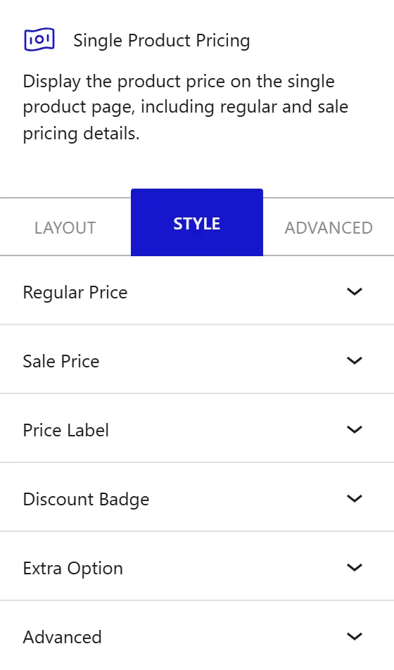
To style the Single Product Pricing block, go to the Style tab in the block inspector.
- Regular Price: change the regular price typography, color, padding, and alignment.
- Sale Price: change the sale price typography, color, left spacing between the regular and sale price, and alignment.
- Price Label: change the price label typography, color, alignment, and spacing.
- Discount Badge: change the badge typography, color, background, border radius, and padding.
- Extra Option: change additional global spacing and layout options for the pricing block.
How to Use the Single Product Rating Block?
The Single Product Rating block displays the WooCommerce product star rating and the number of customer reviews. To add it, search for Single Product Rating in the block inserter and place it on your product template page.
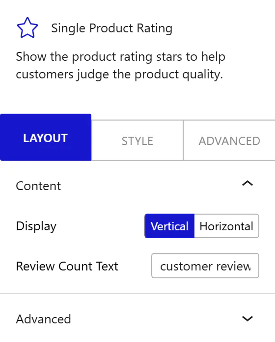
From the Display control, choose how the star rating and the review count are arranged:
- Vertical: stack the stars above the review count text. Use this for narrow single-column product layouts.
- Horizontal: place the stars and the review count on the same line. Use this for wide layouts where you want a compact single-line rating indicator.
In the Review Count Text field, enter custom text to replace the default “reviews” suffix that appears after the review count, such as “customer reviews” or “ratings”.
How to Style the Single Product Rating Block?
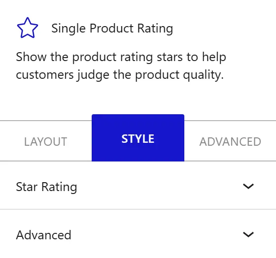
To style the Single Product Rating block, go to the Style tab in the block inspector.
- Star Rating: change the star icon size, color for filled and unfilled stars, alignment, and the spacing between the stars and the review count. Change the review text typography and color separately from the star row.
How to Use the Single Product Stock Block?
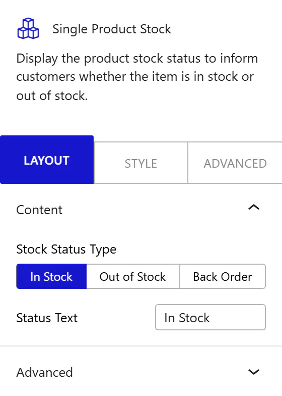
The Single Product Stock block displays the WooCommerce stock status of the current product, so shoppers know at a glance whether an item is available. To add it, search for Single Product Stock in the block inserter and place it on your product template page.
- In the In Stock field, enter the label shown when the product is in stock. The default is “In Stock”.
- In the Out of Stock field, enter the label shown when the product is out of stock. The default is “Out of Stock”.
- In the Backorder field, enter the label shown when the product is available on backorder. The default is “Available on backorder”.
- From the Alignment control, set how the stock status text aligns: left, center, or right.
- From the Preview control, choose which stock state (in stock or out of stock) to preview in the editor. This is for editor preview only and does not change the product’s real stock status.
How to Style the Single Product Stock Block?
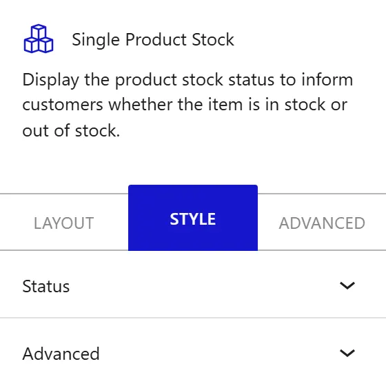
To style the Single Product Stock block, go to the Style tab in the block inspector.
- Typography: change the font of the stock status text.
- Colors: set separate text colors for the In Stock, Out of Stock, and Backorder states so each status reads clearly against your product page background.
How to Use the Product Add to Cart Block?
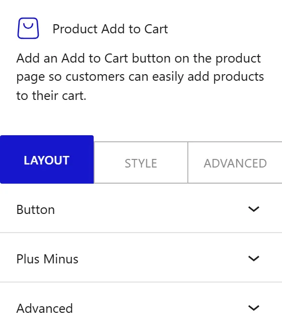
The Product Add to Cart block displays the WooCommerce add-to-cart button and the quantity selector for a product. To add it, search for Product Add to Cart in the block inserter and place it on your product template page. You can combine it with the WooCommerce Product Grid block to create a complete shopping experience: a product grid on the archive page and a fully designed product page with a custom add-to-cart layout.
Button
In the Button text field, enter the text you want the add-to-cart button to display, such as “Buy Now” or “Add to Cart”. Leave the field empty to use the WooCommerce default button label for the product type.
Variable Swatches
Variable Swatches replace the default WooCommerce variation dropdowns with visual swatches on your variable products — so visitors can pick a variation at a glance instead of expanding a dropdown.
How to Enable
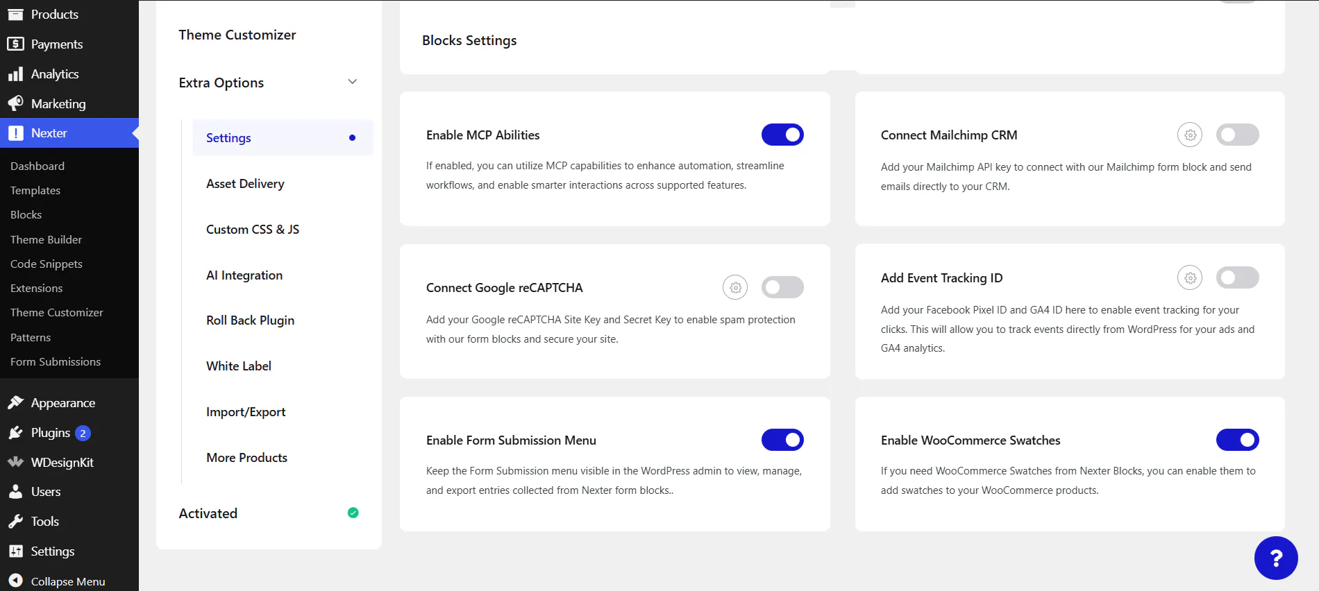
- Go to your Nexter Dashboard → Extra Options → Settings.
- In the Blocks Settings panel, turn on the Enable WooCommerce Swatches toggle.
- Once enabled, the swatch functionality becomes active and your variable products automatically display swatches in place of the variation dropdowns.
If this toggle is off, WooCommerce keeps its default variation dropdowns and no swatches are shown.
Swatch Types
The swatch type follows how each attribute is configured in WooCommerce:
- Color swatches — clickable color options, for attributes such as Red, Blue, or Black.
- Button swatches — clickable text buttons, for attributes such as S, M, L, or XL.
- Image swatches — thumbnail images, for attributes that use an image per option.
Selecting & Clearing
Swatches let visitors pick a variation with a single click, and a Clear option lets them reset the selection.
Styling
Style each swatch type (Color, Button, Image) from the Style tab.
Add to Cart Behaviour
What happens after a customer adds a product depends on your WooCommerce add-to-cart setting:
- Redirect to Cart Page: the page reloads and sends the customer to the cart after adding a product.
- AJAX View Cart notice: the product is added without a page reload, and a WooCommerce notice with a View Cart button appears so the customer can open the cart while continuing to browse.
You control the appearance of this notice and its View Cart button from the Style tab.
Plus Minus
Enable the Enable Plus Minus toggle to replace the default WooCommerce quantity input with a styled plus and minus button control. This makes the quantity selector easier to use on mobile and gives you full control over its appearance in the Style tab. When the toggle is on, the Position control appears:
- Both Side: place the minus button on the left and the plus button on the right of the quantity number. Use this for standard horizontal cart layouts.
- Left: place both buttons stacked on the left of the quantity number.
- Right: place both buttons stacked on the right of the quantity number.
How to Style the Product Add to Cart Block?
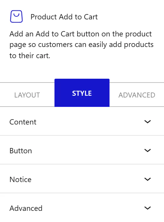
To style the Product Add to Cart block, go to the Style tab in the block inspector.
- Content: change the overall alignment of the add-to-cart row and the padding around the entire block.
- Quantity: change the width of the quantity input box and its internal padding.
- Plus Minus: change the size of the plus and minus buttons and the gap between the buttons and the quantity number. This section is only relevant when the Enable Plus Minus toggle is on.
- Button: change the spacing between the quantity selector and the add-to-cart button, and the button’s internal padding.
- Notice: change the typography, color, background, border, and padding of the WooCommerce notices below the add-to-cart area, including the out-of-stock or variation-required notice and the AJAX added-to-cart notice. The View Cart button inside that notice has its own Normal and Hover styles.
- Variable Swatches: change the size, border radius, and selected-state ring of color swatches; the typography, padding, border, and Normal, Hover, and Selected colors of button swatches; the width, height, border radius, and border colors of image swatches; and the Clear button styles. These controls apply when the Variable Swatches toggle is on.
How to Use the Single Product Meta Block?
The Single Product Meta block displays product metadata from WooCommerce: SKU, category links, and tag links. To add it, search for Single Product Meta in the block inserter and place it on your product template page.
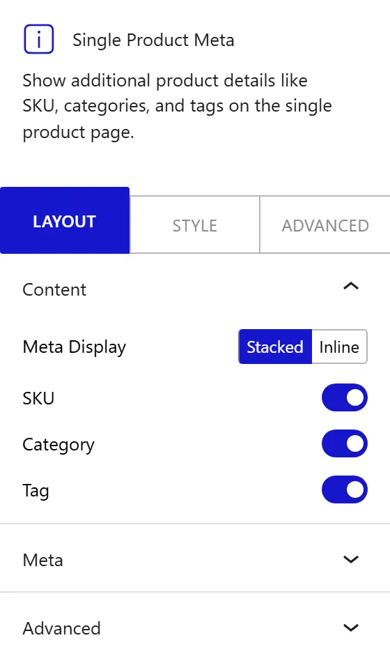
From the Meta Display control, choose how the meta items are arranged:
- Stacked: display each meta item (SKU, category, tags) on its own line. Use this when metadata is a secondary detail and you want it to take up minimal horizontal space.
- Inline: display all meta items on the same line, separated horizontally. Use this for wider layouts where you want the meta row to be compact.
Enable the SKU, Category, and Tag toggles to show each corresponding meta item.
Meta
The Meta panel has two sub-tabs: Label and Value. In the Label sub-tab, enable the Show Label toggle to display a text prefix before each meta item. When the toggle is on, three text fields appear:
- SKU Label: the text before the SKU value, such as “SKU:” or “Product Code:”.
- Category Label: the text before the category links, such as “Category:” or “Collection:”.
- Tag Label: the text before the tag links, such as “Tags:”.
In the Value sub-tab, enter replacement text for the SKU Value, Category Value, and Tag Value fields to override the label that precedes each meta value in the block.
How to Style the Single Product Meta Block?
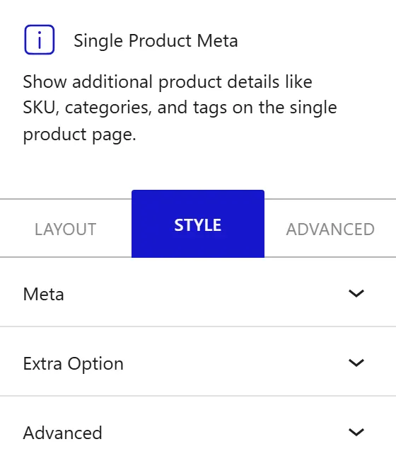
To style the Single Product Meta block, go to the Style tab in the block inspector.
- Meta: change the alignment of the meta row, the vertical spacing between meta items when stacked, and the typography and color for the meta label text and the meta value links.
- Extra Option: change additional global spacing and padding options for the meta block.
How to Use the Single Product Review Block?
The Single Product Review block displays the WooCommerce customer reviews and the review submission form for the current product, which helps build trust and social proof. To add it, search for Single Product Review in the block inserter and place it on your product template page.
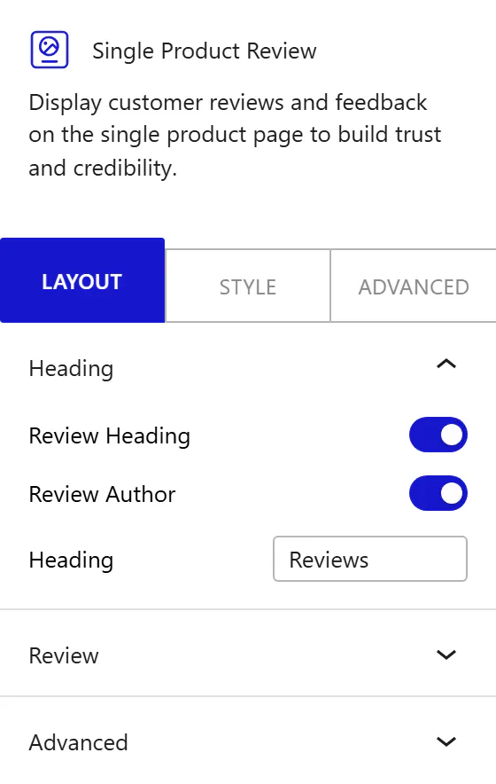
- Enable the Heading toggle to show a heading above the reviews section. When it is on, enter the heading text in the Review Heading field. The default is “Reviews”.
- Enable the Author toggle to show the reviewer’s name on each review entry.
Note: WooCommerce controls whether the review form appears and who can submit, based on your settings under WooCommerce and the product’s Reviews tab. When a product has no reviews yet, the block shows “No reviews available for this product.”
How to Style the Single Product Review Block?
To style the Single Product Review block, go to the Style tab in the block inspector.
- Heading: change the typography, color, and bottom spacing of the reviews heading.
- Star Rating: change the filled and blank star colors and the star size for the rating shown on each review.
- Review Text, Author, and Date: change the color and typography of the review body, the author name, and the date, plus the author size and the spacing between review entries.
- Form Wrapper: change the background, margin, border, border radius, padding, text color, and typography of the review form container.
- Form Labels and Inputs: change the label typography and color, and the typography, color, background, border, border radius, spacing, and padding of the Name, Email, and review input fields.
- Submit Button: change the Normal and Hover styles (typography, color, background, border, border radius, spacing, and padding) of the review submit button.
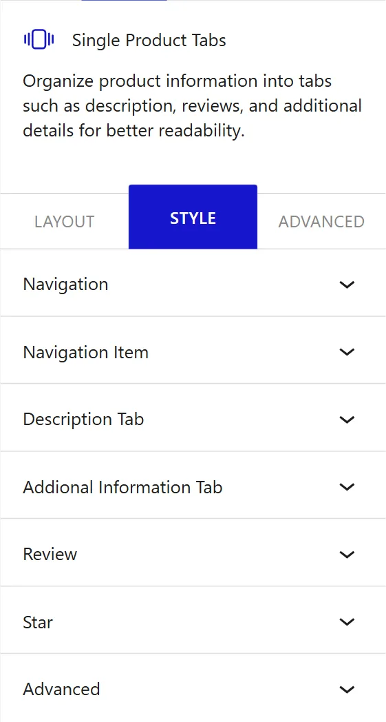
How to Use the Single Product Tabs Block?
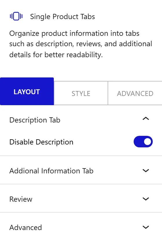
The Single Product Tabs block displays the WooCommerce product tab navigation and its content panels: Description, Additional Information, and Reviews. To add it, search for Single Product Tabs in the block inserter and place it on your product template page.
Description Tab
Enable the Disable Description toggle to hide the Description tab from the product page. Use this when your product template already shows the product description in a separate section above the tabs and you do not want to repeat it inside the tab panel.
Additional Information Tab
Enable the Disable Additional Info toggle to hide the Additional Information tab from the product page. This tab shows WooCommerce product attributes such as weight and dimensions. Disable it when none of your products use WooCommerce attributes or when you display attribute data elsewhere on the page.
Review
Enable the Disable Review toggle to hide the Reviews tab from the product page. When the toggle is on, additional customization fields appear.
Enable the Heading Disable toggle to replace the default reviews heading text with a custom value. When this toggle is on, the Heading text field appears. Enter the custom heading text you want at the top of the reviews section.
Enable the Author Disable toggle to hide the reviewer’s author name from each review entry. In the Text, Date, and Description fields, enter custom replacement text for the review body label, the date label, and the description label shown on each review.
How to Style the Single Product Tabs Block?
To style the Single Product Tabs block, go to the Style tab in the block inspector.
- Navigation: change the alignment of the tab navigation bar, the padding inside each tab button, the width of the active tab’s bottom border indicator, and the horizontal space between tab items.
- Navigation Item: change the padding inside individual tab items and the bottom spacing of the active tab indicator.
- Description Tab: change the padding and alignment of the Description tab content panel.
- Additional Information Tab: change the padding and alignment of the Additional Information tab content panel.
- Review: change the padding and alignment of the Reviews tab content panel.
This is how you can build a fully custom WooCommerce product page in WordPress with Nexter Blocks.