Want full design control over every section of your WooCommerce checkout? With Nexter Blocks for the WordPress block editor (Gutenberg), you can build a fully custom WooCommerce checkout page by placing individual blocks for each checkout component: coupon input, login prompt, billing form, shipping form, order notes, order summary, and payment selection.
Unlike WooCommerce's built-in checkout block, which renders the entire form as one unit, Nexter Blocks breaks the checkout into seven separately stylable blocks. You place each block where you want it on the page and style them independently using the Inspector panel. All seven blocks are part of Nexter Blocks (Pro).
Best Used For:
- WooCommerce stores that need a fully branded checkout page that matches their design system
- Agencies building multi-client stores where each client needs a distinct checkout experience
- Developers who want per-section control over checkout form styling without custom CSS
Required Setup
- Nexter Blocks (free) installed and activated.
- Nexter Blocks Pro installed and activated. All seven checkout blocks are Pro-only. See the Nexter Blocks pricing page for plans.
- WooCommerce installed and activated. The checkout blocks render WooCommerce forms and require WooCommerce to be active.
- A page designated as your WooCommerce checkout page, set under WooCommerce > Settings > Advanced > Page setup > Checkout page.
Note: Place all checkout blocks on the page assigned as your WooCommerce checkout page. The blocks pull live checkout data from WooCommerce. On any other page they render an empty form or show no output.
How to Activate the Checkout Blocks?
Before you can use the checkout blocks in the editor, enable them from the Nexter Blocks admin panel.
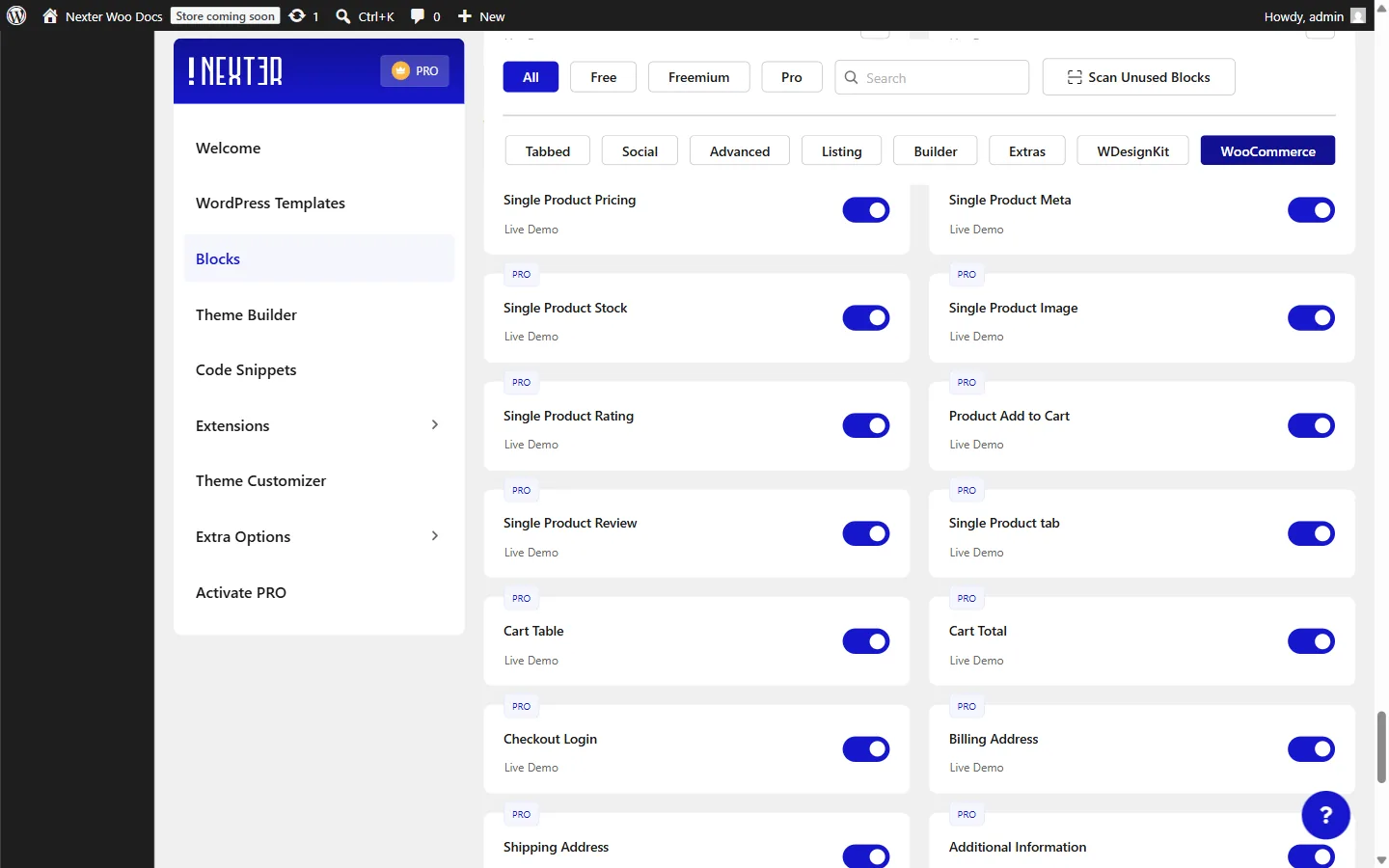
- Go to Nexter > Blocks in your WordPress dashboard.
- Click the WooCommerce category tab to filter the block list.
- Toggle on each of the seven checkout blocks: Checkout Login, Billing Address, Shipping Address, Additional Information, Apply Coupon, Payment Method, and Order Review.
- Open your WooCommerce checkout page in the WordPress block editor.
- Add each block using the + inserter by searching for the block name.
- Arrange the blocks in the order you want them to appear on the checkout page.
- Click Update. Your custom checkout layout is now live.
How to Use the Apply Coupon Block?
The Apply Coupon block adds a coupon code input section to your checkout page. Customers can enter a discount code and apply it to their order directly from the checkout form. This is different from WooCommerce's standard coupon field, which appears inside the cart page by default. The Apply Coupon block lets you place coupon entry at the checkout step instead. For stores that run frequent promotions, placing the coupon input at checkout reduces cart abandonment because customers do not need to return to the cart to apply their discount.
Add the Apply Coupon block to your checkout page from the block inserter.
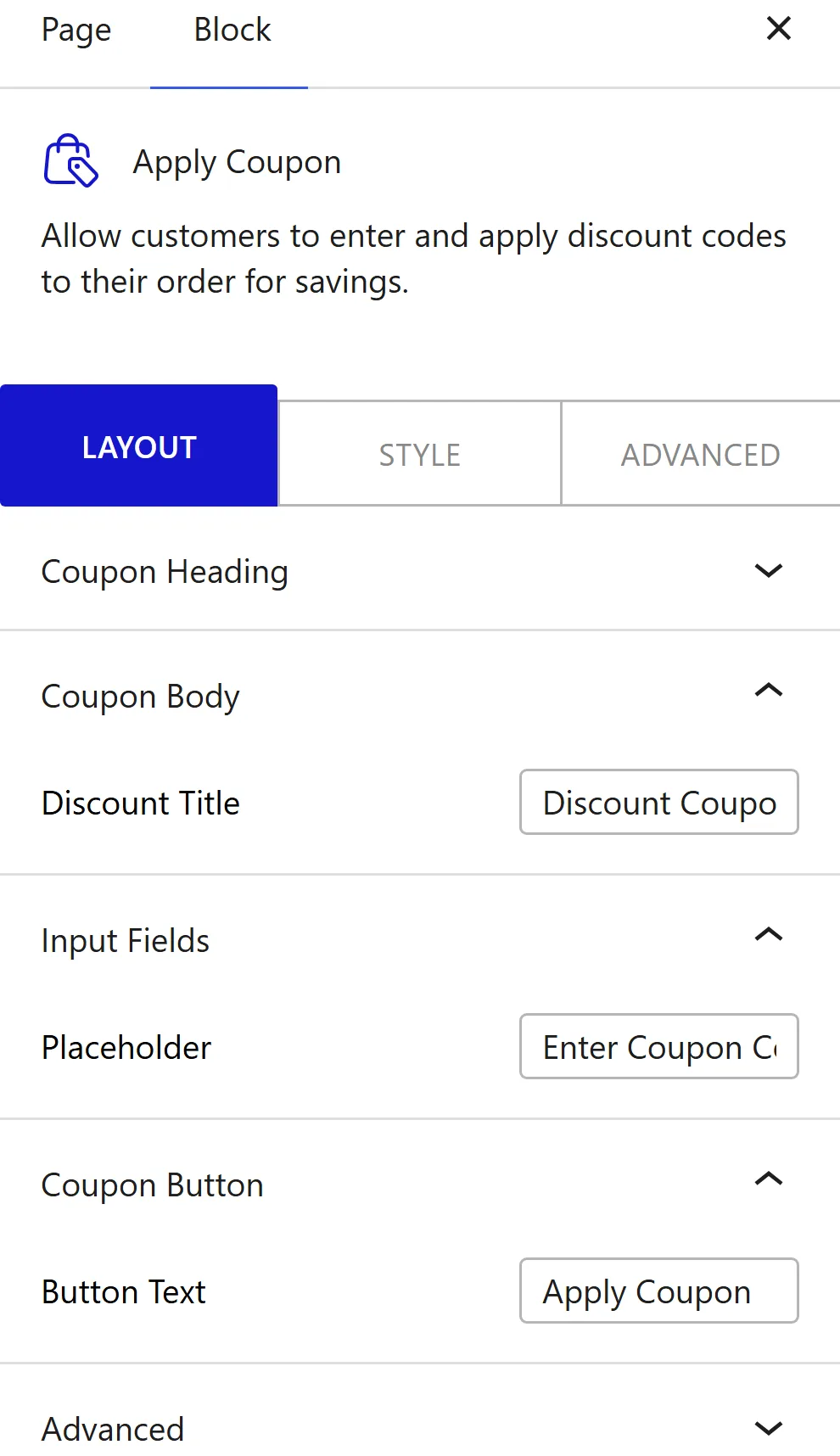
Coupon Heading
The Coupon Heading panel controls the collapsible header that toggles the coupon input open or closed. Enable the Coupon Heading toggle to show a clickable heading above the coupon form. When the toggle is off, the coupon input is always visible without a heading. In the Title Text field, enter the text that appears as the heading label, such as "Have a promo code?".
Coupon Body
The Coupon Body panel sets the label text that appears inside the open coupon form section. In the Discount Title field, enter the label shown above the coupon code input, such as "Discount Coupon" or "Promo Code".
Input Fields
The Input Fields panel controls the placeholder text shown inside the coupon code text box. In the Placeholder field, enter the hint text that appears inside the input before a customer types, such as "Enter Coupon Code Here".
Coupon Button
The Coupon Button panel sets the label on the button customers click to submit their coupon code. In the Button Text field, enter the button label, such as "Apply Coupon" or "Redeem Code".
How to Style the Apply Coupon Block?
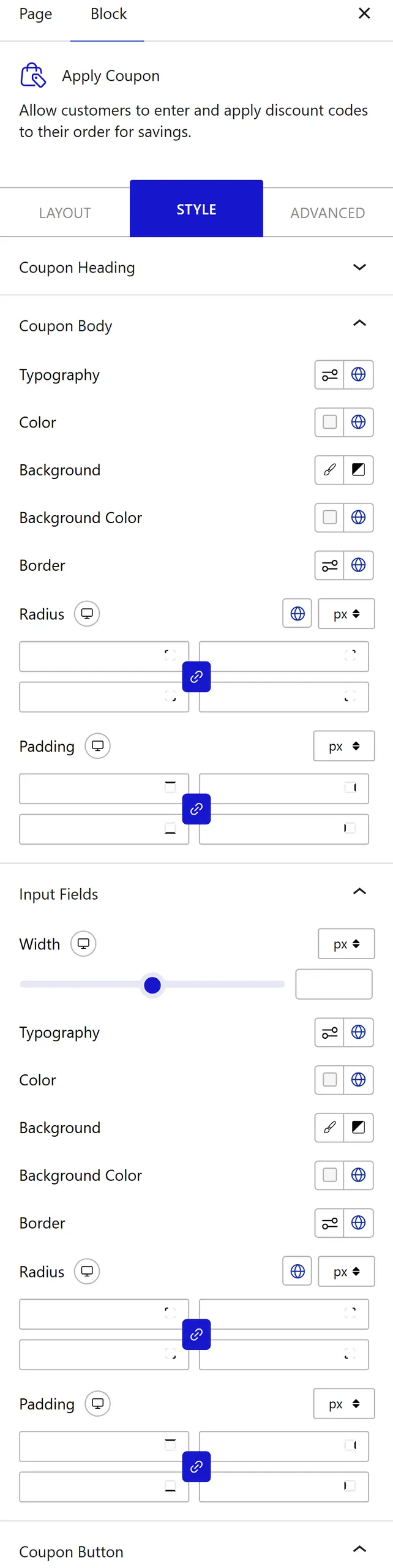
To style the Apply Coupon block, go to the Style tab in the Inspector panel.
- Coupon Heading: change the color, hover color, background, typography, border, border radius, and padding for the collapsible heading element.
- Coupon Body: change the background, border, border radius, and padding for the body container that wraps the coupon input and button.
- Input Fields: change the text color, placeholder color, background, typography, border, border radius, padding, and width of the coupon code text input.
- Coupon Button: change the normal and hover states for button text color, background, typography, border, border radius, and padding. The spacing option controls the gap between the input field and the button.
How to Use the Checkout Login Block?
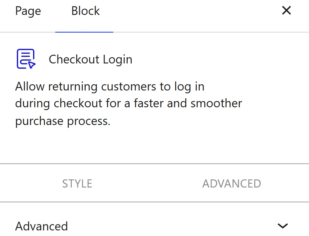
The Checkout Login block displays a returning-customer login prompt at the top of the checkout page. When a visitor clicks the prompt, a login form expands inline so they can sign in without leaving the checkout. This removes friction for returning customers who would otherwise need to go to a separate login page before completing their order.
Add the Checkout Login block to your checkout page and position it above the billing address section. The Checkout Login block has no Layout tab settings. The login form content (email, password fields, and the "Remember me" checkbox) is rendered directly by WooCommerce. All customization is done through the Style tab.
How to Style the Checkout Login Block?
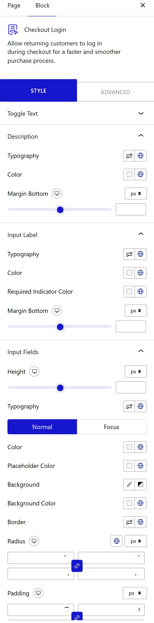
To style the Checkout Login block, go to the Style tab in the Inspector panel.
- Toggle Text: change the normal color, link color, hover color, background, typography, border, border radius, padding, and bottom spacing for the clickable text line that expands the login form.
- Description: change the color and typography for the instructional text that appears below the toggle after the form expands. Spacing controls the bottom margin between the description and the first field.
- Input Label: change the label text color, required-field asterisk color, typography, and bottom spacing for the Email and Password field labels.
- Input Fields: change the height, text color, placeholder color, background, typography, border, border radius, and padding for the email and password inputs. Separate focus-state color and border settings are available for when a customer clicks into a field.
- Remember Checkbox: change the color, typography, and bottom margin for the "Remember me" checkbox label.
- Button: change the normal and hover states for button text color, background, typography, border, border radius, and padding for the login submission button.
How to Use the Billing Address Block?
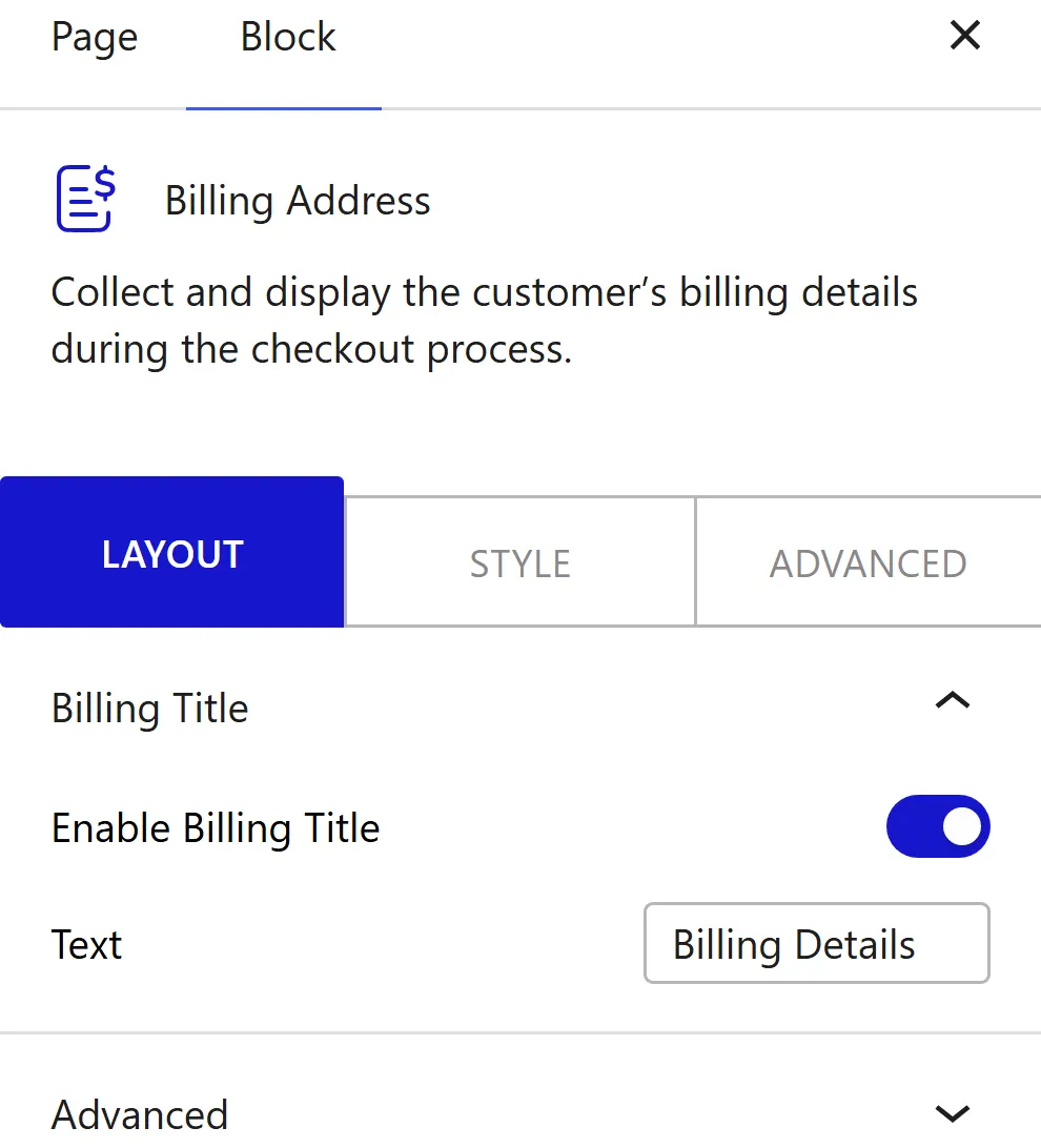
The Billing Address block renders the WooCommerce billing form fields: first name, last name, company, country, address line 1, address line 2, city, state, postcode, phone, and email. These fields are pulled from WooCommerce's checkout field configuration, so any custom billing fields you have added via code or plugins appear automatically in this block.
Add the Billing Address block to your checkout page.
Billing Title
The Billing Title panel controls the section heading that appears above the billing form fields. Enable the Enable Billing Title toggle to show a heading above the billing fields. When the toggle is off, the billing form renders without any heading. When the toggle is on, enter the heading text in the Text field. The default text is "Billing Details". Change it to match your brand voice, such as "Your Billing Information" or "Invoice Address".
How to Style the Billing Address Block?
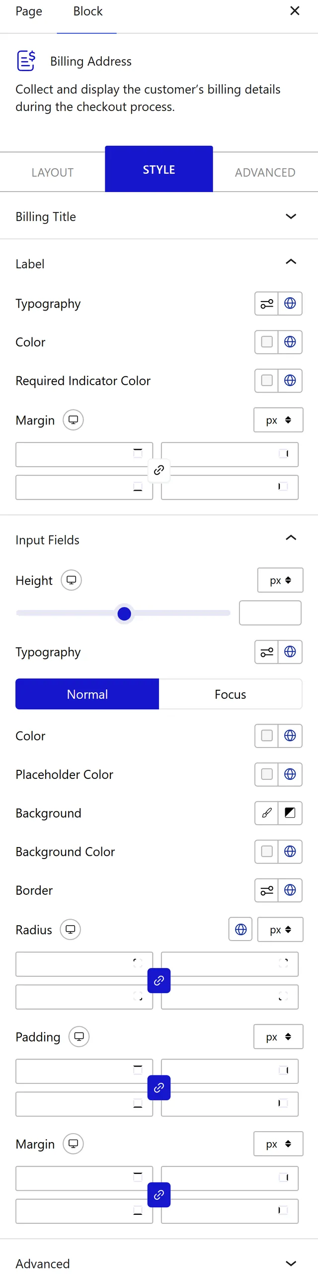
To style the Billing Address block, go to the Style tab in the Inspector panel.
- Billing Title: change the color, background, typography, text alignment, border, border radius, padding, and bottom spacing for the section heading.
- Label: change the text color, required-field asterisk color, typography, and margin for the field labels inside the billing form.
- Input Fields: change the height, text color, placeholder color, background, typography, border, border radius, padding, and margin for all text inputs and the country dropdown. Separate focus-state colors and border settings are available, and a hover state is available for the dropdown element.
How to Use the Shipping Address Block?
The Shipping Address block renders the WooCommerce shipping form and a "Ship to a different address?" checkbox. When a customer checks that box, the shipping fields appear so they can enter a separate delivery address. The block handles the show and hide logic for the shipping fields automatically based on WooCommerce's behavior. For stores that offer digital downloads only, you may want to omit this block from your checkout layout since no physical address is needed.
Add the Shipping Address block to your checkout page, typically below the Billing Address block.
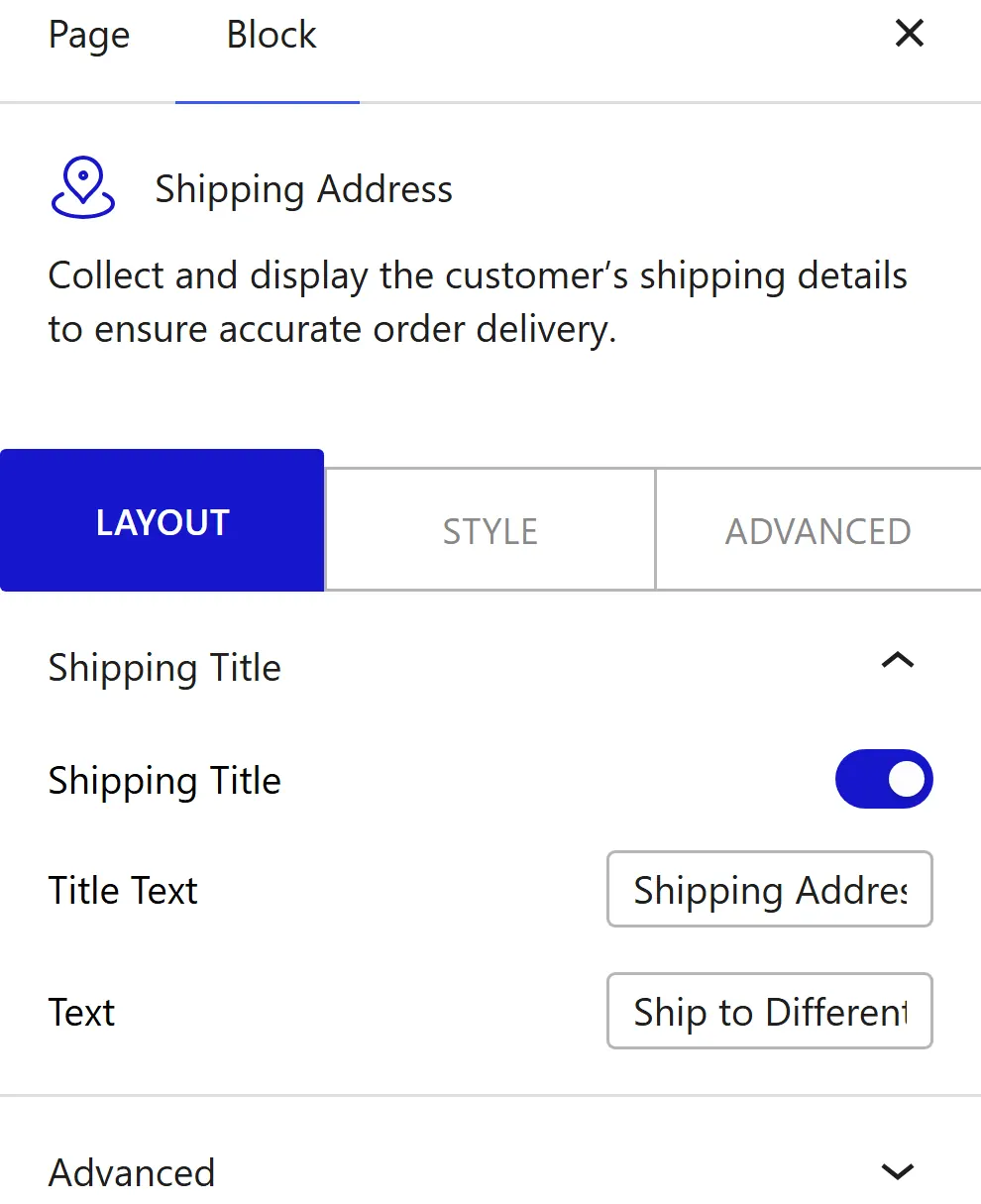
Shipping Title
The Shipping Title panel controls the heading above the shipping form and the label on the "Ship to a different address?" checkbox. Enable the Shipping Title toggle to show a heading above the shipping section. When the toggle is on, enter the heading text in the Title Text field, such as "Shipping Address" or "Delivery Details". In the Text field, enter the label for the checkbox that expands the shipping form. The default WooCommerce label is "Ship to a different address?", which you can change to match your store's language.
How to Style the Shipping Address Block?
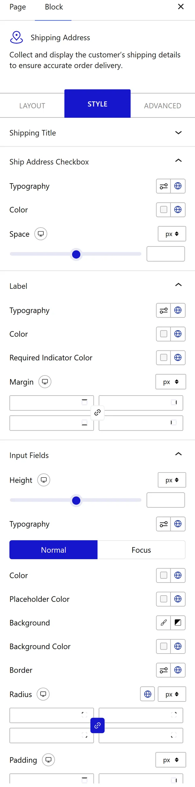
To style the Shipping Address block, go to the Style tab in the Inspector panel.
- Shipping Title: change the color, background, typography, text alignment, border, border radius, padding, and bottom spacing for the section heading.
- Ship Address Checkbox: change the color and styling for the "Ship to a different address?" checkbox element.
- Label: change the text color, required-field asterisk color, typography, and spacing for the shipping field labels.
- Input Fields: change the height, text color, placeholder color, background, typography, border, border radius, padding, and margin for all shipping form inputs and the state or country dropdown. Focus-state and hover settings are available.
How to Use the Additional Information Block?
The Additional Information block renders the WooCommerce order notes field. This is the text area where customers can leave special instructions for their order, such as delivery notes or gift messages. WooCommerce shows this field by default only if there are Order checkout fields defined. The Additional Information block lets you control the heading and optional text that appear above the notes text area.
Add the Additional Information block to your checkout page, typically below the Shipping Address block.
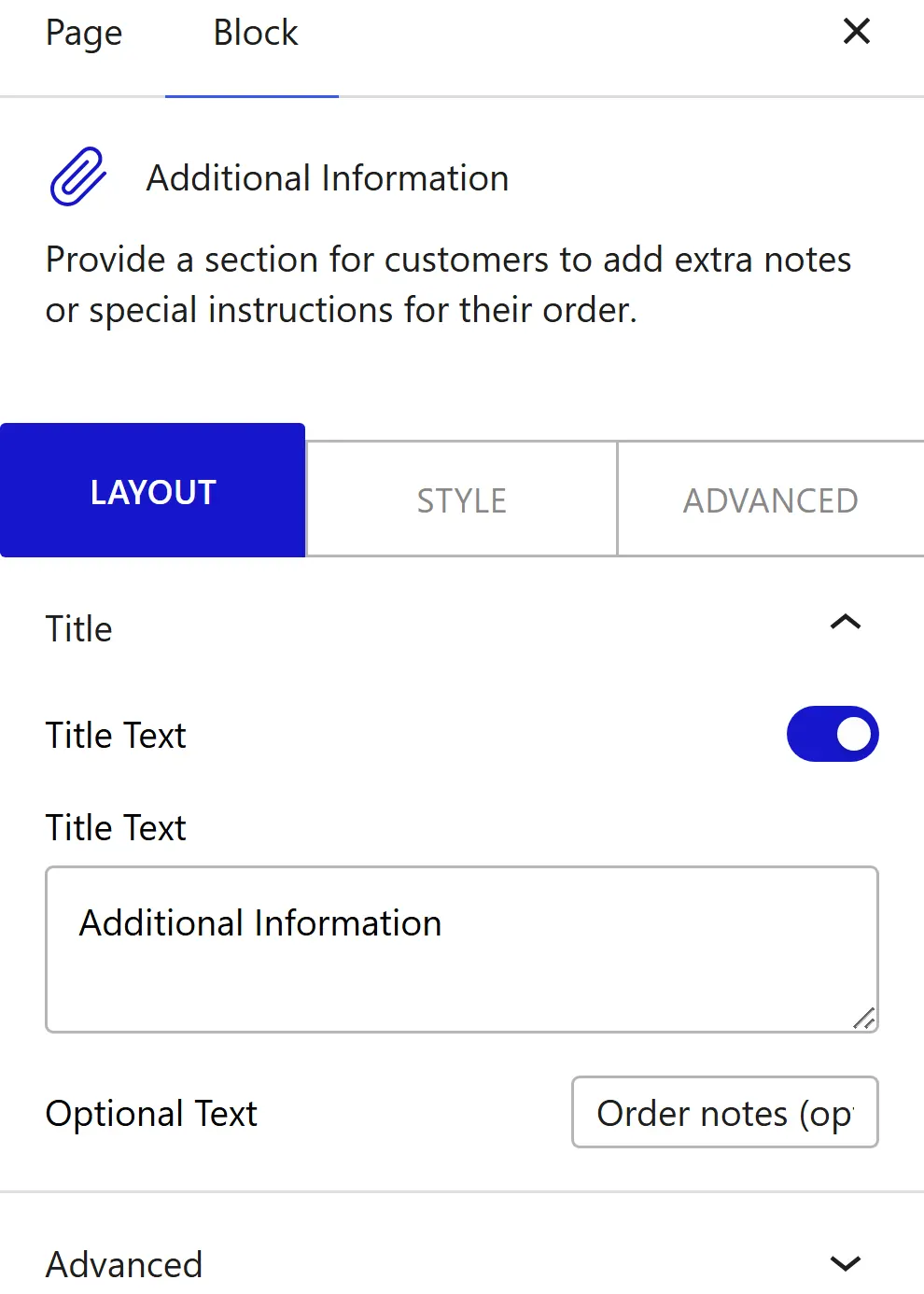
Title
The Title panel controls the heading and optional descriptive text that appear above the order notes field. Enable the Title Text toggle to show a heading above the notes area. When the toggle is on, enter the heading in the Title Text field, such as "Additional Information" or "Order Notes". In the Optional Text field, enter a short description below the heading to guide the customer, such as "Add a note to your order, for example special delivery instructions."
How to Style the Additional Information Block?
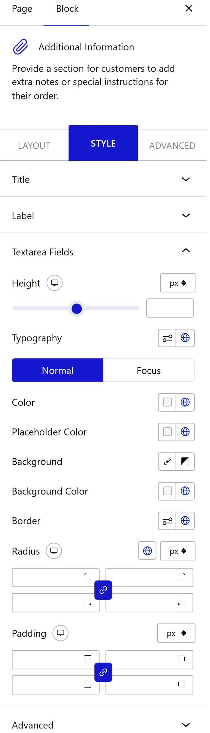
To style the Additional Information block, go to the Style tab in the Inspector panel.
- Title: change the color, background, typography, border, border radius, padding, and bottom spacing for the section heading.
- Label: change the text color, required-field asterisk color, typography, and spacing for any field labels in the notes section.
- Textarea Fields: change the height, text color, placeholder color, background, typography, border, border radius, and padding for the order notes text area.
How to Use the Order Review Block?
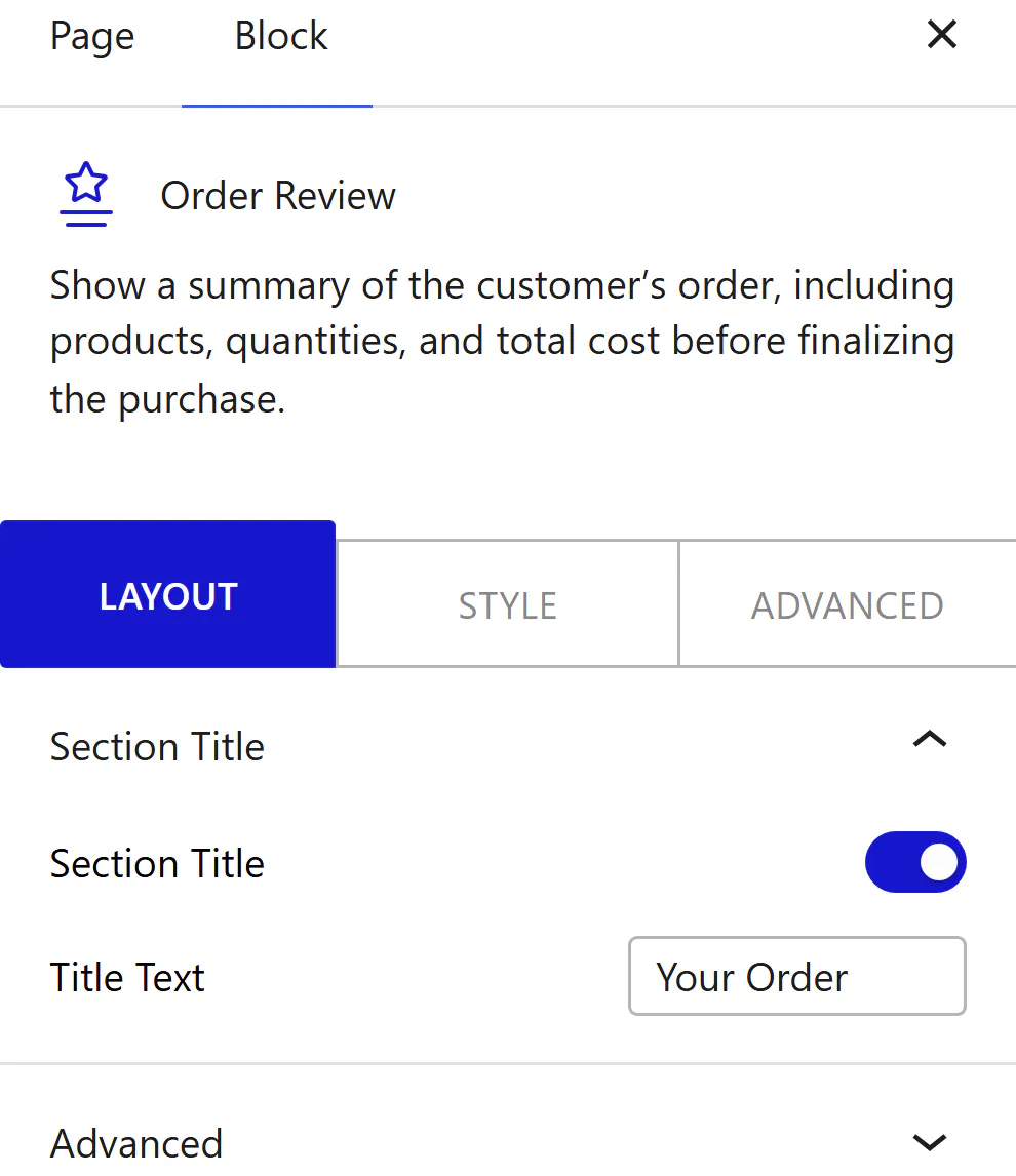
The Order Review block displays the cart summary at checkout: product names, quantities, subtotals, shipping costs, applied coupons, and the order total. WooCommerce populates this table automatically from the customer's active cart. The Order Review block replaces the standard WooCommerce order review table when you build a custom checkout page. It is a required part of any custom checkout layout. Without it, customers cannot see what they are purchasing before they pay.
Add the Order Review block to your checkout page.
Section Title
The Section Title panel controls the heading that appears above the order summary table. Enable the Section Title toggle to show a heading. When the toggle is on, enter the heading text in the Title Text field, such as "Your Order" or "Order Summary".
How to Style the Order Review Block?
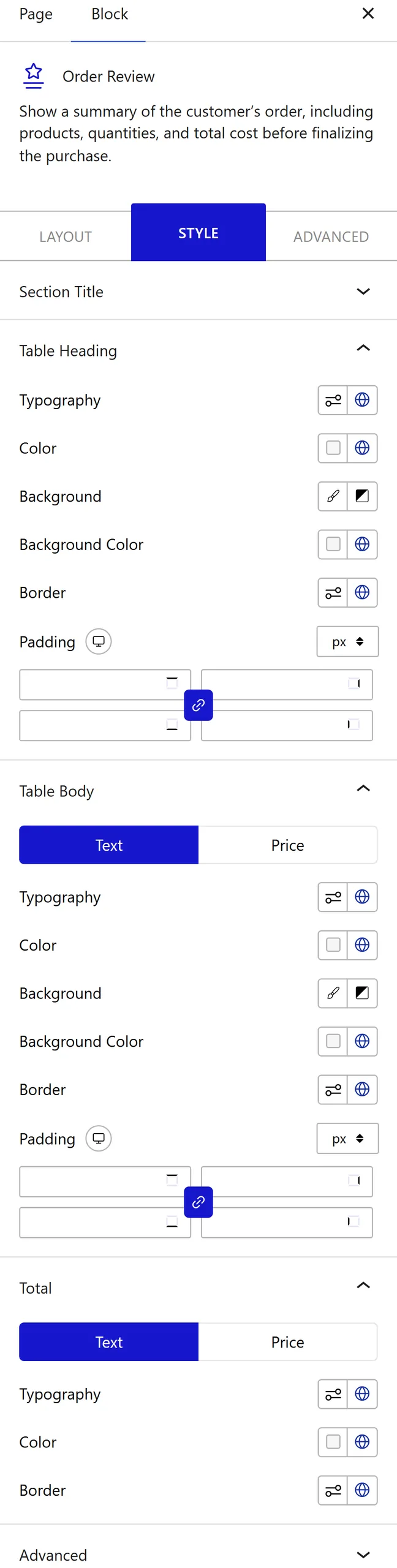
To style the Order Review block, go to the Style tab in the Inspector panel.
- Section Title: change the color, background, typography, text alignment, border, padding, and bottom spacing for the section heading.
- Table Heading: change the text color, background, typography, border, and padding for the column header row of the order table.
- Table Body: change the text color, background, typography, border, and padding for the rows in the order table that list each product.
- Total: change the text color, background, typography, border, and padding for the final totals row at the bottom of the order table.
How to Use the Payment Method Block?
The Payment Method block renders all available WooCommerce payment gateways, such as Stripe, PayPal, or bank transfer, as a list of selectable options. It also renders the Place Order button that submits the checkout form. This block generates the full checkout form wrapper, so it is the most critical block in the layout. Any payment gateway you have configured in WooCommerce > Settings > Payments appears automatically in this block without additional configuration.
Add the Payment Method block to your checkout page. Place it as the last block in the checkout layout since it contains the form submission button.
Section Title
The Section Title panel controls the introductory heading and message that appear above the payment gateway list. Enable the Section Title toggle to show a heading above the payment options. When the toggle is on, enter the heading text in the Title Text field, such as "Payment Information" or "How would you like to pay?". In the Message Text field, enter a short supporting line below the heading, such as "Your transaction is secured with SSL encryption." This message always appears regardless of the toggle state.
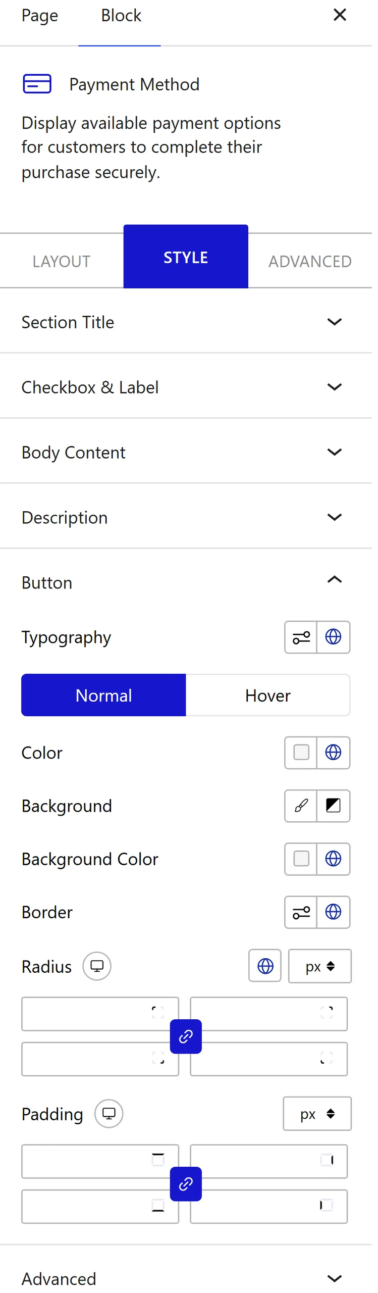
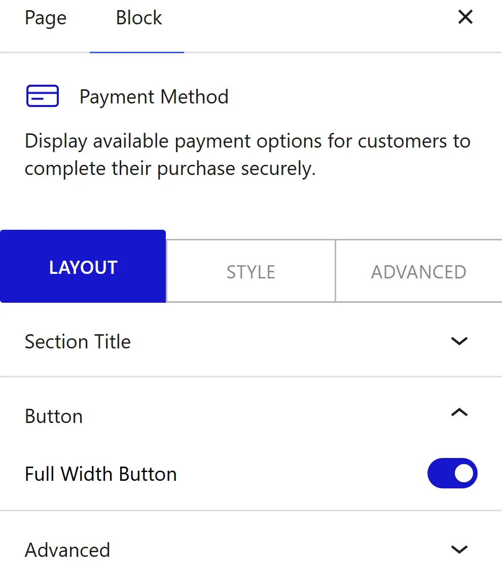
Button
The Button panel controls the Place Order submission button. Enable the Full Width Button toggle to make the Place Order button stretch across the full width of the block container. Use this when your checkout layout has a single-column design and you want the button to be prominent.
How to Style the Payment Method Block?
To style the Payment Method block, go to the Style tab in the Inspector panel.
- Section Title: change the color, background, typography, border, padding, and bottom spacing for the section heading.
- Checkbox and Label: change the color and typography for the payment gateway selection radio buttons and their labels, such as "Credit Card" or "PayPal".
- Body Content: change the background, border, and padding for the container that wraps each payment gateway's content area.
- Description: change the color, typography, and spacing for the descriptive text that appears under each payment gateway option.
- Button: change the normal and hover states for button text color, background, typography, border, border radius, and padding for the Place Order button.
This is how you can build a fully custom WooCommerce checkout page in WordPress with Nexter Blocks.