Do you want a WooCommerce cart page that matches your store's exact design instead of the default WooCommerce layout? The Cart Table and Cart Total blocks in Nexter Blocks give you complete control over every element of the cart experience, from column heading labels and quantity field styles to the checkout button, all built inside the WordPress block editor. Unlike WooCommerce's built-in cart template, which requires PHP template overrides to customize, these two blocks let you design directly on the page with no code.
Best Used For:
- WooCommerce stores that need a branded cart page matching their site's typography, colors, and button styles
- Shops with coupon workflows that require a prominently styled Apply Coupon input area
- Sites using a block-based layout where the default WooCommerce cart template does not match the page design
Required Setup
- Make sure the default WordPress block editor is active.
- You need WooCommerce installed and activated on your WordPress site.
- You need Nexter Blocks installed and activated.
- Both blocks require Nexter Blocks Pro.
Note: After building the cart layout, go to WooCommerce > Settings > Advanced > Page setup and set the page as your Cart page so WooCommerce uses it for all cart redirects.
How to Activate the Cart Table and Cart Total Blocks?
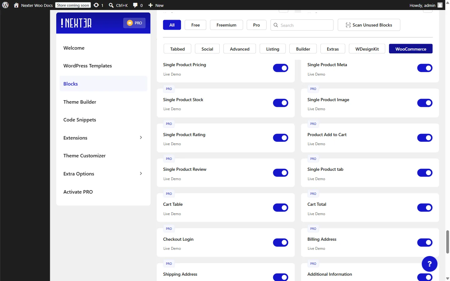
- Go to Nexter > Blocks.
- Search for Cart Table and toggle it on.
- Search for Cart Total and toggle it on.
How to Use the Cart Table Block?
The Cart Table block is a Nexter Blocks Pro block for the WordPress block editor that renders all items in the customer's WooCommerce cart as a styled table, with product image, name, unit price, quantity input, row subtotal, and a remove button per item.
- Open or create the page you want to use as your cart page in the WordPress block editor.
- Click the + block inserter icon.
- Search for Cart Table and click to add it to the canvas.
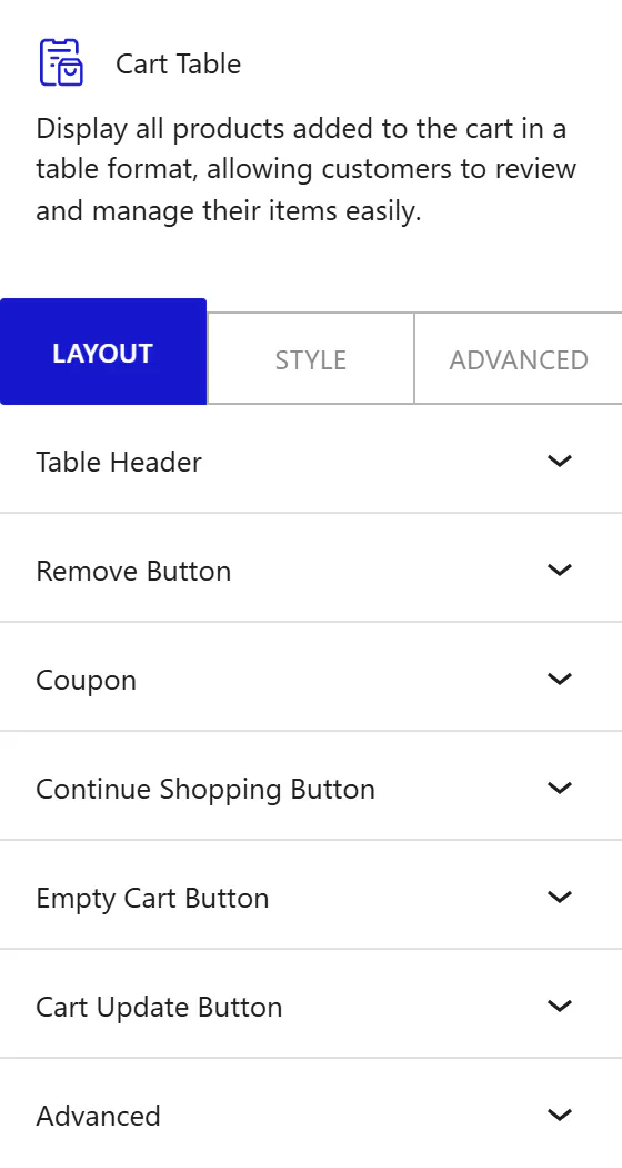
Table Header
This panel controls the text labels shown in the cart table column headings.
- Product Name: label for the product column heading.
- Price: label for the unit price column heading.
- Quantity: label for the quantity column heading.
- Subtotal: label for the row total column heading.
Use these fields when your store targets a non-English audience or when your brand terminology differs from the defaults. For example, a wholesale store might label the Subtotal column "Row Total" to match its invoice language.
Remove Button
From the Position options, choose where the remove icon appears in each product row:
- Left: place the remove button to the left of the product content.
- Right: move the remove button to the right side. Use this when your product thumbnails are large and you want to keep the remove action visually separate from the product image area.
Coupon
Enable the Enable Coupon Code toggle to show a coupon code input and apply button below the cart table. This toggle is on by default. Disable it when your store does not use promotional codes. When the toggle is on, two fields appear:
- Placeholder Text: the hint text displayed inside the input before the customer types. The default is "Enter Coupon Code".
- Button Text: the label for the apply button.
Continue Shopping Button
Enable the Enable Continue Shopping toggle to add a button that sends customers back to your shop page. This toggle is off by default. In the Button Text field, enter the button label. Enable this on stores where customers commonly browse and add multiple items before checkout, so they have a clear path back to the catalog.
Empty Cart Button
Enable the Enable Empty Cart toggle to add a button that removes all cart items at once. This toggle is on by default. In the Button Text field, enter the button label. Keep this on for stores where customers rebuild orders from scratch, such as subscription box or wholesale shops.
Cart Update Button
Enable the Enable Cart Update toggle to show a button that applies quantity changes the customer makes in the cart table. This toggle is on by default. In the Button Text field, enter the button label.
Note: If your WooCommerce configuration uses automatic AJAX cart updates, disabling this toggle keeps the cart interface cleaner since quantity changes apply instantly without a manual confirmation step.
How to Style the Cart Table Block?
To style the Cart Table block, go to the Style tab in the block inspector.
- Content: change the outer wrapper border, border radius, and padding for the entire cart table area.
- Table Header: change the heading row text color, typography, background, border, and cell padding. Use a distinct background color when your design needs the header row to stand out from the product rows beneath it.
- Table Body: change the text color, product name link color, link hover color, body typography, product title typography, background, border, and cell padding of all data rows. The two separate typography controls let you set different font sizes or weights for the product title link and the remaining body text.
- Quantity: change the quantity input field text color, background, border, padding, border radius, and width. Use Width to prevent the quantity field from stretching across the column on larger screens.
- Product Image: change the border radius and size of the product thumbnail in each row.
- Remove Button: change the icon color, hover color, background, hover background, border, border radius, icon size, icon spacing, and padding of the remove item button.
- Table Footer: change the background, border, border radius, and padding of the footer row that contains the action buttons.
- Coupon: change the styles for the coupon text input and the Apply Coupon button independently, including color, background, typography, border, border radius, and padding. This panel appears only when the Enable Coupon Code toggle is on.
- Continue Shopping: change the button text color, hover color, background, hover background, typography, border, border radius, and padding. This panel appears only when the Enable Continue Shopping toggle is on.
- Empty Cart Button: change the color, hover color, background, hover background, typography, border, border radius, and padding. This panel appears only when the Enable Empty Cart toggle is on.
- Cart Update: change the color, hover color, background, hover background, typography, border, border radius, and padding. This panel appears only when the Enable Cart Update toggle is on.
- Responsive Options: change the alignment of all table cells across breakpoints. Use this when your design requires left-aligned cells on mobile but centered cells on desktop.
How to Use the Cart Total Block?
The Cart Total block displays the WooCommerce cart summary panel: a heading, a table showing subtotal and final total rows (including any applied discounts and shipping), and a Proceed to Checkout button. Place this block alongside the Cart Table block on the same cart page.
- Click the + block inserter icon.
- Search for Cart Total and add it to the canvas next to the Cart Table block.
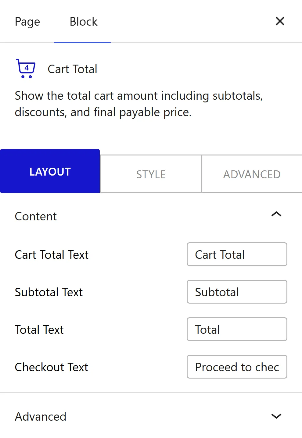
Content
- Cart Total Text: the heading shown at the top of the summary panel. The default is "Cart Total". Change this when your store uses different language, such as "Order Summary".
- Subtotal Text: the label next to the subtotal price row. The default is "Subtotal".
- Total Text: the label next to the final total row. The default is "Total".
- Checkout Text: the label for the Proceed to Checkout button. The default is "Proceed to checkout". Use this to align the button copy with your store's action language, such as "Go to Checkout" or "Complete My Order".
How to Style the Cart Total Block?
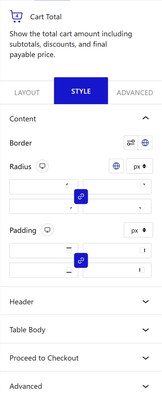
To style the Cart Total block, go to the Style tab in the block inspector.
- Content: change the border, border radius, and padding of the entire Cart Total wrapper. Adding a border creates a card-style boundary that helps visually separate the summary panel from the Cart Table block.
- Header: change the heading text color, background, typography, border, border radius, padding, and bottom spacing of the Cart Total heading row.
- Table Body: change the label text color, price text color, background, label typography, price typography, border between rows, and row padding. Setting the label and price colors independently lets you present the row labels in a muted tone while making the price amounts prominent.
- Proceed to Checkout: change the normal and hover text color, background, typography, border, border radius, hover border, hover radius, margin, and padding of the checkout button. The Margin control sets spacing around the button, which lets you push it away from the total row above it without adding extra padding inside the button.
This is how you can build a fully custom WooCommerce cart page in WordPress with Nexter Blocks.