---
title: "How to Create a Collapsible Section in WordPress?"
url: https://nexterwp.com/docs/add-expand-in-wordpress/
date: 2023-07-15
modified: 2026-08-18
author: "Aditya Sharma"
description: "When it comes to creating a website, WordPress is a popular platform among developers and businesses alike. It allows users to customize their websites easily and efficiently. One of them..."
image: https://nexterwp.com/wp-content/uploads/2024/05/expand-block-settings-overview-1024x519.jpg
word_count: 747
---

# How to Create a Collapsible Section in WordPress?

## Key Takeaways

- Nexter Blocks Expand block turns any content into a collapsible panel in the WordPress block editor.
- Expand block supports three content sources: Text, Pattern, and Editor, with Editor allowing images and videos inside the collapsible section.
- Expand block places toggle buttons above or below the content and adds an extra button with text, an external link, and an icon when expanded.
- Expand block includes Extra Options for Max Height, Custom Opacity, and Transition Duration, plus Style tab controls for title, description, toggle button, and extra button.

When it comes to creating a website, WordPress is a popular platform among developers and businesses alike. It allows users to customize their websites easily and efficiently. One of them is having collapsing sections, it helps reduce clutter and makes the page more organized and easier to navigate. It also allows users to add elements to a page without compromising the overall design.

However, creating collapsible sections in the WordPress block editor can be difficult. For this purpose, you can use the Expand block from the Nexter Blocks. It allows you to turn any content into a collapsible panel.

[LIVE BLOCK LINK](https://nexterwp.com/nexter-blocks/blocks/wordpress-unfold-read-more-button/)

## Required Setup

- Make sure the default WordPress Block editor is active. 

- You need to have the [Nexter Blocks](https://wordpress.org/plugins/the-plus-addons-for-block-editor/) plugin installed and activated.

- This is a Premium block, and you need the [PRO version of the Nexter Blocks](https://nexterwp.com/pricing/?utm_source=tpag&utm_medium=docs&utm_campaign=text).

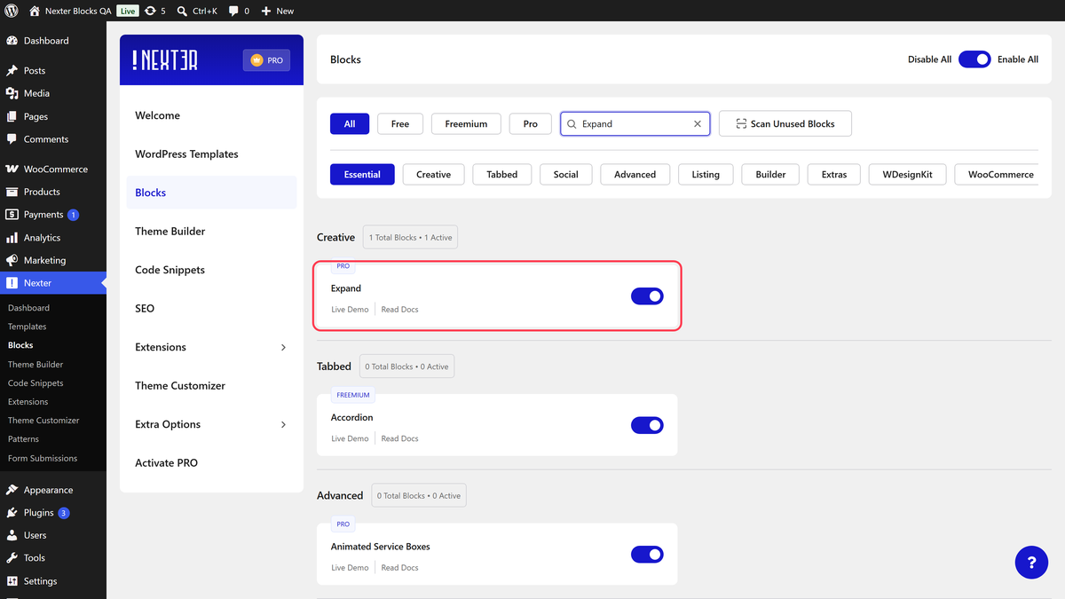
- Make sure the Expand block is activated, to verify this visit Nexter → Blocks → and Search for Expand and activate.

## Learn via Video Tutorial

https://www.youtube.com/watch?v=SyxzBIV3x68

## How to Activate the Expand Block?

Go to 

- **Nexter **→ **Blocks** 

- **Search **the block name and** turn**** on the toggle**.

![](https://nexterwp.com/wp-content/uploads/2023/07/Nexter-Blocks-Expand-Activation.png)

## Key Features

- **Multiple ways to add content** - There are multiple ways to add content, such as Text, Editor, and [Pattern](https://nexterwp.com/docs/use-reusable-block-in-expand-block/).

- **Extra button** - You can add an extra button to the expanded section. 

- **Flexible button placement **- You can place the collapsible buttons above or below the content.

## How to add content in the Expand block?

## Content

Once you add the Expand block on the page, you can add a title in the **Title** field.

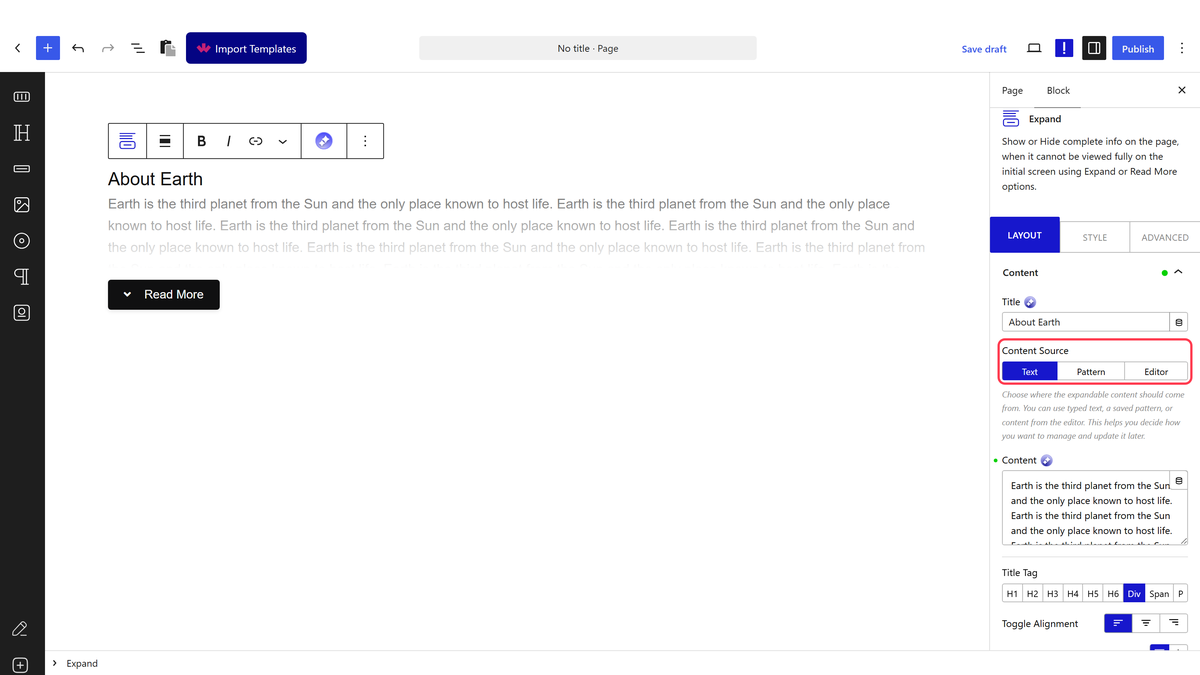
Then you have to select the content source of the block from the **Content Source** section. Here you’ll find three options -

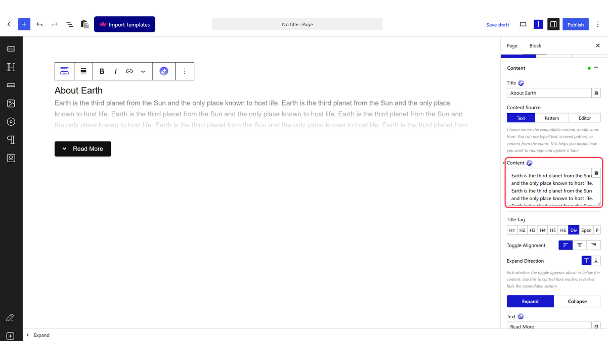
- **Text** - You can add the content directly using the editor in this option.

- **Pattern** - This option is similar to the Editor option. Here too you can use different Gutenberg blocks to create your content as a Pattern. [Check the process](https://nexterwp.com/docs/use-reusable-block-in-expand-block/).

- **Editor** - In this option, you can directly use the WordPress block builder within the Expand block. It’s a powerful option to add different types of content like images, videos, etc., and make them collapsible. [Learn more](https://nexterwp.com/docs/add-load-more-button-in-wordpress).

Then,** **You can add different tags to your title from **Title Tag** and align the buttons from **Toggle Alignment** Options.

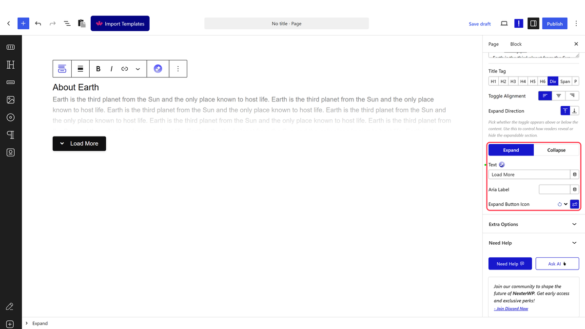
**Expand Direction** - You can place the buttons above or below the content. Here you’ll find two options -

- **Expand **- From the **Text** field, you can add the button text; from the **Expand Button Icon,** you can add an icon.

- **Collapse **- Similarly, you can add button collapse text and icon from the **Text** and **Collapse Button Icon** sections, respectively. 

In the **Aria Label** field, you can add an Aria label to the item to improve accessibility for disabled users. 

You can also add an extra button when the panel is expanded by turning on the **Extra Button** toggle.

![](https://nexterwp.com/wp-content/uploads/2023/07/expand-content-extra-button.png)

On this button, you can add the button text in the **Extra Button Text** field.

You can add an external link to the button from the **Extra Button Link** field and an icon from the **Extra Button Icon** field.
In the **Aria Label** field, you can add an Aria label to the item to improve accessibility for disabled users.

## Extra Options

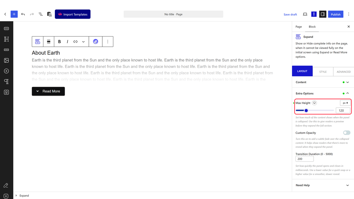
In the **Extra Options** tab, you’ll find more customization options.

![](https://nexterwp.com/wp-content/uploads/2023/07/expand-content-extra-options-2.png)

**Max Height** - You can set the initial height of the collapsible container for different devices.

**Custom Opacity** - You can adjust the content overlay's height and color.

**Transition Duration** - You can adjust the panel open and collapse speed from here.

## How to Style the Expand Block?

If you want to style the Expand block, you’ll find all the options under the Style tab.

**Title** - From here, you can style the collapsible section title. You can adjust its typography, color, alignment, and margin.

![](https://nexterwp.com/wp-content/uploads/2023/07/expand-style-2.png)

**Description** - You can add some margin to the collapsible panel content. But for **Text, **you can also adjust the typography, color, and alignment.

**Toggle Button** - To style the toggle buttons, you can use this panel. Here you’ll find all the styling options for the button, like padding, margin, width, typography, color, background, button icon size, placement, color, etc.

**Extra Button** - If you use the extra button feature, you can style it from here. You can manage the button typography, color, border, background, button icon size, placement, color, etc.

Advanced options remain common for all our blocks, you can explore all the options from here.

[View Advanced tab tutorial.](https://nexterwp.com/docs/add-advanced-tab-in-wordpress/)

## Frequently Asked Questions

**Q: Why is the Expand block not showing in WordPress?**
A: The Expand block only appears when the default WordPress Block editor is active and the Nexter Blocks plugin is installed and activated. It is also a Premium block, so the PRO version of Nexter Blocks is required. If it still does not appear, the usual miss is that the block itself has not been turned on under Nexter → Blocks. That activation step matters because the block stays hidden until it is enabled.

**Q: What can I use a WordPress expand block for on a page?**
A: Nexter Blocks uses the Expand block to turn any content into a collapsible panel, which is useful when you want to reduce clutter and keep a page easier to navigate. The page specifically calls out that collapsing sections help you add elements without compromising the overall design. That makes it a practical fit for long pages where you want content available without showing everything at once.

**Q: Can I add images or videos inside a collapsible section in WordPress?**
A: The Editor content source supports richer content inside the Expand block, including images and videos. That matters because it lets you build a collapsible panel with more than plain text, instead of being locked into a simple text-only accordion style. If you want to keep media tucked away until someone expands it, the Editor option is the one built for that use case.

**Q: What is the difference between Text, Pattern, and Editor in the Expand block?**
A: Text is for adding content directly in the editor, Pattern lets you build content with Gutenberg blocks as a reusable pattern, and Editor lets you use the WordPress block builder inside the Expand block itself. The practical difference is control: Text is simplest, Pattern is good when you want a structured layout, and Editor gives the most flexibility for mixed content like images and videos.

**Q: How do I make an expandable section easier to use on mobile?**
A: The Extra Options tab includes Max Height, which lets you set the initial height of the collapsible container for different devices. That matters on smaller screens because too much visible content can make the section feel heavy before it is expanded. The same tab also includes Custom Opacity and Transition Duration, so you can tune how much overlay shows and how fast the panel opens or collapses.

**Q: What styling options are available for a WordPress expand block?**
A: The Style tab covers the title, description, toggle button, and extra button. For the title, you can adjust typography, color, alignment, and margin. For the toggle button, there are controls for padding, margin, width, typography, color, background, icon size, placement, and color. Nexter Blocks also lets you style an extra button separately if you turn that feature on.