












Do you want to let shoppers save products and come back to buy them later without leaving your store? The Product Wishlist is a Pro block in Nexter Blocks for the WordPress block editor that adds a wishlist trigger button and an embedded popup modal to any WooCommerce store page. Unlike standalone wishlist plugins, this block works natively in Gutenberg without shortcodes or a separate wishlist page setup.
The block has two trigger modes with different placement requirements. Count Badge mode places a heart icon with a live count badge in your site header or any page section. It works standalone anywhere on the page and opens a modal drawer listing every saved product. Action Button mode places a per-product save toggle on individual product cards. This mode must be placed inside a Post Listing block configured with Custom Layout and post type set to product, so each card in the loop renders its own wishlist toggle using the current product's context. Both modes write to the same wishlist, so items saved from any location appear together.
Best Used For:
- WooCommerce stores that want to reduce cart abandonment by letting shoppers save products for a future visit
- Site headers where a Count Badge trigger shows a live wishlist count alongside the cart icon and opens a full modal drawer
- Product listing pages built with the Post Listing block using Custom Layout and post type set to product, where an Action Button on each card lets customers save or remove individual items on hover
Required Setup
- Make sure the default WordPress block editor is active.
- You need Nexter Blocks installed and activated.
- For the Product Wishlist block, you need Nexter Blocks (Pro).
- You need WooCommerce installed and active. The block does not render without WooCommerce.
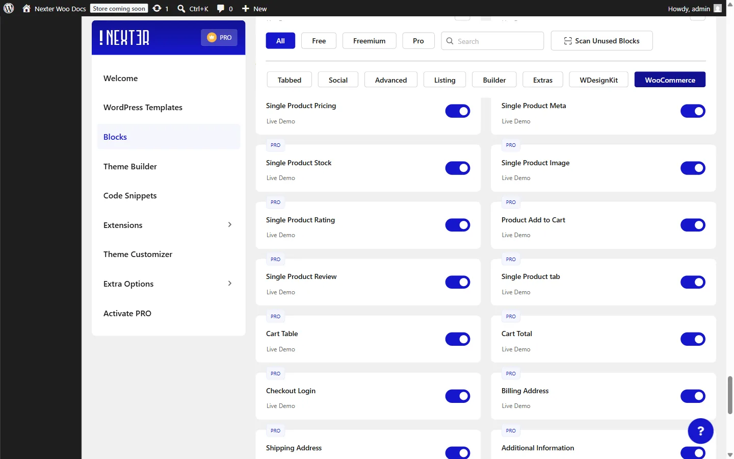
- Go to Nexter > Blocks, find the Product Wishlist block under the WooCommerce section, and toggle it on.
How to Activate the Product Wishlist Block?
Go to Nexter > Blocks, search for Product Wishlist, and turn on the toggle. The block appears under the WooCommerce section, which is visible when WooCommerce is active.
Key Features
- Two Trigger Modes: use Count Badge mode to display a heart icon with a live count badge in your site header so shoppers can see how many items they have saved. Use Action Button mode to display a per-product toggle button on listing cards. Both modes write to the same wishlist.
- Hover-Only Display: enable hover mode to hide the Action Button until the shopper moves their cursor over the product card. This works when the block is placed inside a Post Listing block using Custom Layout, where each card renders inside a grid-item wrapper.
- Built-In Wishlist Modal: the Count Badge trigger opens a slide-out modal drawer showing all saved products with thumbnails, titles, regular and sale prices, stock badges, and individual add-to-cart buttons, with no additional page or shortcode required.
- Add All to Cart: the modal footer includes a Continue Shopping link and an Add All to Cart button that moves every saved item to the cart in one click.
- Toast Notifications: when a product is added to or removed from the wishlist, a brief toast notification confirms the action. The add and remove states are independently styled in the Style tab.
- Empty State: when no products are saved, the modal shows a configurable icon, message, and Shop Now button that links visitors back to the store.
How to Use the Product Wishlist Block in WordPress?
How you add the Product Wishlist block depends on which trigger type you need.
Count Badge Mode (Site Header)
Use this mode to place a wishlist icon with a live item count in your site header. It works standalone on any page or template and opens a full modal drawer when clicked.
- Open your site Header template in the block editor.
- Search for Product Wishlist in the block inserter and place it next to your cart icon or navigation bar.
- In the block settings, confirm Type is set to Count Badge.
- Configure the icon, label, and badge appearance from the Trigger Button panel.
- Save the template. The count badge is now visible site-wide and updates live as shoppers add or remove items.
Action Button Mode (Product Cards)
Use this mode to place a per-product heart toggle on each card in a WooCommerce product listing. The block must be inside a Post Listing block configured with Custom Layout and post type set to product. This provides each card's product context so the block knows which item to save.
- Add a Post Listing block to your page.
- In the Post Listing settings, set Post Type to product.
- Set the Layout Style to Custom Layout.
- In the Custom Layout field, open or create a Nexter Template to use as the card design.
- Inside the Nexter Template editor, search for Product Wishlist in the block inserter and add it to the card layout.
- In the Product Wishlist block settings, set Type to Action Button.
- Optionally enable Enable Hover to hide the button until the shopper hovers over the card.
- Save the template and return to your page. Each product card in the Post Listing now shows its own wishlist toggle, reading the product ID from the loop context.
Trigger Button
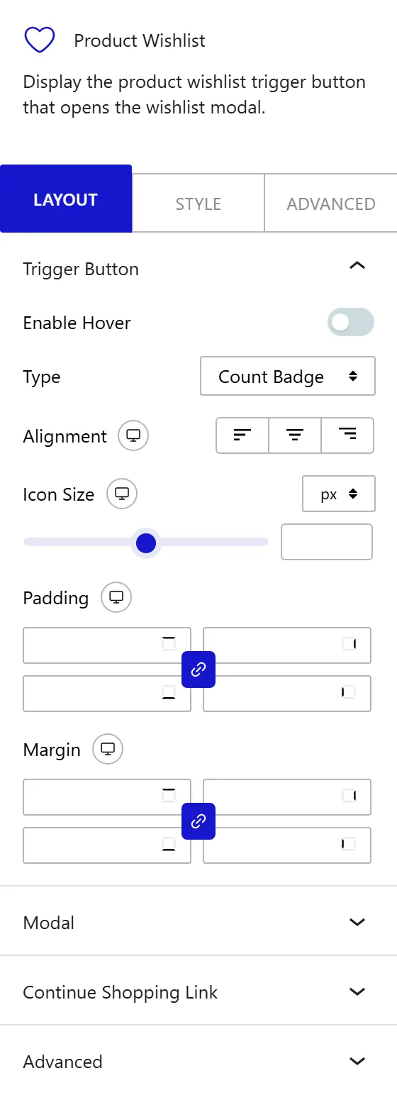
The Trigger Button panel controls the appearance and behavior of the wishlist trigger. From the Type dropdown, choose how the wishlist trigger appears:
- Count Badge: displays a heart icon with a circular count badge showing the total number of saved products. Place this trigger in your site header or navigation bar. This mode works on any page or template without a parent block requirement.
- Action Button: displays a heart toggle that saves or removes the current product from the wishlist. This mode requires the block to be inside a Post Listing block configured with Custom Layout and post type set to product. In Action Button mode, clicking the trigger saves the product directly and no modal appears.
Enable the Enable Hover toggle to hide the Action Button until the shopper moves their cursor over the product card. From the Alignment control, set the horizontal alignment of the trigger within its container (responsive). From the Icon Size control, set the width and height of the heart icon inside the trigger (responsive). From the Padding control, set the space between the icon and the outer edge of the trigger button area (responsive). From the Margin control, set the outer spacing around the entire trigger element (responsive).
Modal
The Modal panel controls the maximum width of the wishlist popup drawer that appears when the shopper clicks the Count Badge trigger. From the Modal Max Width control, set the maximum width of the wishlist drawer. The control accepts any CSS unit (px, %, vw) and is responsive.
Note: The Modal panel settings apply only when Type is set to Count Badge. In Action Button mode, clicking the trigger saves the product directly and no modal appears.
How to Style the Product Wishlist Block?
To style the Product Wishlist block, go to the Style tab.
- Trigger Icon Button: change the background, icon color, border, border radius, and box shadow of the Count Badge trigger button. Includes Normal and Hover sub-tabs. This panel appears only when Type is set to Count Badge.
- Trigger Action Button: change the typography, background, icon and text color, border, border radius, and box shadow of the Action Button trigger. Includes Normal, Hover, and Active sub-tabs. Use the Active sub-tab to set a distinct color for the saved state. This panel appears only when Type is set to Action Button.
- Count Badge: change the typography, background, text color, border radius, and padding of the count indicator circle on the trigger icon.
- Modal: change the background, border, border radius, box shadow, and overlay background color of the wishlist modal drawer.
- Modal Header: change the background, border, title color, title typography, title icon color, and padding of the header area.
- Modal Count Badge: change the typography, border radius, background, and text color of the count badge inside the modal header.
- Close Button: change the border radius, background, and icon color of the button that closes the modal. Includes Normal and Hover sub-tabs.
- Item Row: change the separator color between wishlist rows, the hover background color, the gap between the product thumbnail and text content, and the padding applied to each row.
- Thumbnail: change the border, border radius, and display size of the product thumbnail in each wishlist row.
- Item Title: change the typography and color of the product title link in each row. Includes Normal and Hover sub-tabs.
- Item Price: change the typography and color of the product price. Includes Regular and Sale sub-tabs so you can style the crossed-out original price and the active sale price independently.
- Stock Badge: change the typography and border radius of the stock status label. Includes In Stock and Out of Stock sub-tabs for distinct background and text colors.
- Remove Button: change the icon color of the remove button on each row. Includes Normal and Hover sub-tabs.
- Add to Cart Button: change the typography, border radius, background, text color, and border of the per-row Add to Cart button inside the modal. Includes Normal and Hover sub-tabs.
- Footer: change the background, border, and padding of the modal footer area that holds the Continue Shopping link and the Add All to Cart button.
- Continue Shopping: change the typography and color of the Continue Shopping link in the modal footer. Includes Normal and Hover sub-tabs.
- Add All to Cart Button: change the typography, border radius, background, text color, border, and padding of the Add All to Cart button. Includes Normal and Hover sub-tabs.
- Empty State: change the icon color, text color, text typography, and Shop Now button appearance for the empty wishlist view.
- Toast Message: change the typography, border radius, and padding of the toast notification. Includes Add and Remove sub-tabs for distinct background colors, text colors, and borders.
This is how you can add a WooCommerce product wishlist in WordPress with Nexter Blocks.
