
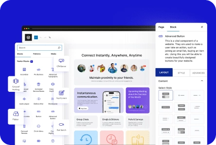
Containers in WordPress provide a way to organize and structure content on a webpage. With containers, you can easily group elements and control their layout, making your website more visually appealing and organized.
With the Container block from the Nexter Blocks, you can easily create sections in your WordPress layout.
Required Setup
- Make sure the default WordPress Block editor is active.
- You need to have the Nexter Blocks plugin installed and activated.
- Make sure the Container block is activated. To verify this, visit Nexter → Blocks → and search for Container and activate.
- This is a Freemium block to unlock the extra features; you need the PRO version of the Nexter Blocks.
Learn via Video Tutorial

How to activate the Container Block?
Go to
- Nexter → Blocks
- Search the block name and turn on the toggle.

Key Features
- Two Layout Types – You can select from two layout types, Flexbox and Grid.
- Full Width – You can easily make the container full width.
- Sticky (Pro) – You can easily make a container sticky.
- Wrapper Link – You can make a container clickable.
- Parallax Effect (Pro) – You can add a parallax effect to a container background.
- Video Background (Pro) – You can easily add a video background.
- Animated Color Background (Pro) – You can create an animated color background.
- Multiple Background Images (Pro) – You can easily add multiple background images.
- Animated Gradient Color Background (Pro) – You can create an animated gradient color background.
- Change Background Color on Scroll (Pro) – You can change the background color on scroll.
- Particle Effect (Pro) – You can easily add particle effect to the background.
- Image Scroll Animation (Pro) – You can add image scroll animation to the background.
- Auto Image Scroll Effect (Pro) – You can add an auto image scroll effect to the background.
- Shape Divider (Pro) – You can easily add different shape dividers to sections.
How to Create a Container in WordPress?
To create a container in WordPress add the Container block from the Nexter Blocks on the page.
Then, you’ll see two container layout types –
- Flexbox – To create a container using Flexbox layout.
- Grid – To create a container using Grid layout.
You have to choose the appropriate container layout as per your requirements. Let’s select Flexbox here.
You can add a single-column horizontal or vertical direction container, multi-column, multi-row, or multi row and column container.
Add Single Column Container
To add a single-column container you can choose either a horizontal or vertical direction container, let’s select horizontal here.
Layout
From the Content Width section, you can set the container width. Here you’ll find two options –
- Boxed – For creating a boxed container.
- Full – For creating a full-width container.
Let’s select Boxed here.
Similarly, you can select Full to create a full-width container.
Note: To create a full-width container make sure the active template supports a full-width container.
From the Width section, you can set the width of the container for responsive devices. You can set the value PX (pixels), % (percentage), and VW (viewport width).
Then from the Height dropdown, you can set the height of the container. Here you’ll find three options –
- Default – To keep the container height as per the content in the container.
- Fit To Screen – To make the container equal to the screen height.
- Min Height – To set a minimum height for the container. For this, you’ll get an option to set the height.
From the Gutter Space section, you can add space between columns of the container for responsive devices.
From the Overflow section, you can set the container overflow to visible or hidden.
Then from the HTML Tag dropdown, you can change the HTML tag of the container.
Flex Property
From the Direction section, you can set the container direction for responsive devices. Here you’ll find two options –
- Vertical – For creating a vertical direction container, where all its child elements will be vertically aligned.
- Horizontal – For creating a horizontal direction container, where all its child elements will be horizontally aligned.
By enabling the Reverse toggle, you can order the container child elements in the reverse order.
Then by enabling the Responsive Reverse toggle, you’ll get an option to order the container child elements in the reverse order for tablet and mobile separately.
From the Row Alignment (Align Items) section, you can align the container child elements based on CSS flex align-item properties for responsive devices.
From the Column Alignment (Justify Content) section, you can align the container child elements based on CSS flex justify-content properties for responsive devices.
Then from the Elements Gap section, you can manage the gap between the child elements of the container for responsive devices.
You can set the flex-wrap property for the container from the Wrap section for responsive devices. You can set the container to wrap or don’t wrap.
By enabling the Flex Child toggle, you can set different flex properties to the individual child items of the container.
Once enabled you’ll see an item, that will target the first element of the container. Open the item here you’ll find some options –
- Shrink – To set CSS flex-shrink property.
- Grow – To set CSS flex-grow property.
- Basis – To set CSS flex-basis property.
- Self Align – To set CSS align-self property.
- Order – To set CSS flex order property.
You can click on the + Add Item button to add more items to target subsequent elements.
Extra Options
From the Wrapper Link toggle, you can add a link to the container.
Then, from the Overlays toggle, you can make the container overlap the next section. This can be useful to create an overlay header effect.
From the Sticky toggle, you can make the container sticky.
Add Multi Column Container (Inner Container)
To add a multi column container, add the Container block and select a multi column layout.
You’ll see multiple inner containers inside the main container.
For the main container, you’ll see the same options available for the single-column container.
You’ll see additional settings for the inner containers.
Layout
From the Column Width section, you can set the width of the inner container for different devices.
Then from the Min Height section, you can set a minimum height of the inner container for responsive devices.
Flex Property
In this tab, you’ll find the same options available for the main container.
Extra Options
From the Wrapper Link toggle, you can add a link to the inner container just like the main container.
From the Sticky (Pro) toggle, you can make the inner container sticky within the main container. Once enabled you’ll see some options –
Top Spacing – From here, you can set the top offset i.e. the space from the top where the container will stick.
Bottom Spacing – From here, you can set the bottom space for the sticky container.
Sticky Desktop – From this toggle, you can make the container sticky on a desktop screen.
Sticky Tablet – From this toggle, you can make the container sticky on a tablet screen.
Sticky Mobile – From this toggle, you can make the container sticky on a mobile screen.
How to Style the Container Block?
To style the Container you’ll get all the options under the Style tab.
Background – From here, you can style the container background.

Border/Box Shadow – From here, you can add border, border-radius, and box shadow to the container.
Shape Divider – From here, you can add a custom shape to the container.
Background Deep Layer (Pro) – From here, you can add different creative backgrounds to the container.
- Animated Color – With this, you can add an animated color background to the container.
- Creative Image – With this, you can add a moving image and parallax effect to the container.
- Creative Video – With this, you can add a video background to the container.
- Creative Gallery – With this, you can add multiple background images to the container.
- Gradient Animate Color – With this, you can add an animated gradient color background to the container.
- On Scroll Animation – With this, you can change the background on scroll.
Background Middle Layer (Pro) – From here, you can add different creative backgrounds to the container.
- Canvas Effect – With this, you can add particle effect to the container background.
- Modern Image Effect – With this, you can add an image scroll animation effect to the container.
- Auto Moving Layer – With this, you can add an auto moving image background.
Background Top Layer (Pro) – From here, you can add an overlay background color or image to the container.
Texture Image – From here, you add an overlay image to the container.
Color – From here, you can add overlay background color to the container.
Note: In the HTML the Background Top Layer will be placed first then the Background Middle Layer and Background Deep Layer will be placed at last. These backgrounds will override the default container background style.
You’ll see some additional styling options for inner containers in the Style tab.
Advanced options remain common for all our blocks, you can explore all it options from here.
Also, see the Spacer block for adding precise vertical or horizontal space between blocks outside of a container’s gutter or gap settings.
