










A header does three jobs at once: hold your logo and navigation, stay usable on scroll, and not fight your homepage’s design. Most WordPress themes make you pick a header layout once and live with it. Nexter’s Header Builder treats the header as its own template, built visually, with sticky, transparent, and mega-menu behavior all available as settings rather than custom code — but knowing which combination to reach for, and the performance and accessibility tradeoffs each carries, is where most builds either get it right or quietly ship something worse than the theme default.
Where the Header Builder Lives
The header is a header-type template inside the Nexter Theme Builder (accessible from the Unified Dashboard). Like any other theme part, you can build it visually in Grid View, assign it display conditions (entire site, specific pages, specific post types), and swap between multiple header templates for different sections of the same site — a marketing header for the blog, a minimal header for the checkout flow, for example.
Sticky Headers
Enable Sticky from the header template’s settings and the header pins to the top of the viewport as visitors scroll, instead of scrolling away with the rest of the page. This is a toggle plus a handful of styling options (background on scroll, shrink-on-scroll sizing), not custom CSS or JavaScript.
Also Read: How to Add a Sticky Header in WordPress (CSS and Block-Native Methods) — for the plain-CSS approach if you’re not on Nexter, or want to understand what the setting does under the hood.
Why Sticky Headers Are (Usually) Cheap, Performance-Wise
A sticky header built on CSS position: sticky — which is what Nexter’s toggle implements — has essentially zero rendering cost on its own; it’s a layout behavior the browser handles natively, not a scroll-linked JavaScript effect that has to run on every frame. That’s a meaningful distinction from an older-style fixed header (position: fixed), which detaches the element from normal document flow entirely and typically needs a manual spacer element to stop the page content from jumping underneath it when the header switches to fixed. The performance risk with any sticky header isn’t the CSS property itself, it’s what gets attached to it afterward: a shrink-on-scroll animation or background-color transition driven by a scroll event listener can get expensive if it’s not implemented carefully (unoptimized listeners forcing layout recalculation on every scroll tick), so it’s worth spot-checking a sticky header’s real-world scroll performance on a mid-range phone, not just assuming the toggle is free because the underlying CSS property is.
Transparent Headers
A transparent header overlays your hero image or video instead of sitting in its own colored bar above it — common on landing pages and agency portfolio sites. Set the header background to transparent for the initial state, then combine it with the sticky setting’s “background on scroll” option so the header becomes solid once a visitor scrolls past the hero, keeping navigation readable against whatever comes next on the page.
The Contrast Trap With Transparent Headers
A transparent header’s biggest practical failure mode is contrast, not styling: nav links and a logo that read perfectly against one hero image can become unreadable the moment a content team swaps in a lighter or busier photo months later, since the header’s legibility was never actually independent of the specific background it launched with. Worth checking deliberately: does the nav text hold up against the lightest and darkest realistic backgrounds this header might sit over, not just the one hero image used at launch? A safer default for text-on-image legibility is a subtle text-shadow or a slight background gradient behind the nav itself, so contrast doesn’t fully depend on whatever image happens to be behind it at any given moment.
Mega-Menu Headers
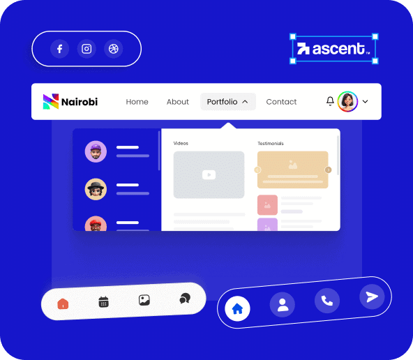
For sites with deep navigation — multiple product categories, docs sections, or content verticals — a standard dropdown menu buries too much. Nexter’s mega-menu option replaces a single-column dropdown with a multi-column panel that can include not just links but images, icons, and short descriptions per item, built the same visual way as the rest of the header.
Also Read: How to Add a Mega Menu in WordPress (4 Ways, With and Without a Plugin) — covers the non-Nexter methods too, including plain Gutenberg navigation and dedicated mega-menu plugins.
Making a Mega Menu Actually Accessible
The W3C’s own ARIA Authoring Practices Guide is specific about a common mistake here: a mega menu panel should almost never use role="menu" with role="menuitem" children, because that ARIA pattern is designed for application-style menus (a text editor’s File menu, with arrow-key navigation between items) rather than website navigation. The recommended pattern for site navigation, including mega menus, is the simpler disclosure pattern: a button carrying aria-expanded that toggles a panel of plain links, navigable with the regular Tab key rather than requiring arrow-key support. Practically, that means checking that a mega-menu panel opens and closes correctly using only Tab and Escape (not just mouse hover), that aria-expanded correctly reflects the open/closed state for screen reader users, and that content inside the panel is grouped under real headings rather than one flat, unlabeled list of links.
Mobile Headers: What Doesn’t Translate Directly
None of the three header behaviors above translate one-to-one to a phone screen. A sticky header eats permanent vertical space on a small viewport where every pixel of scroll real estate matters more than on desktop — worth testing whether it’s still worth keeping sticky on mobile, or whether it should un-stick below a certain breakpoint. A transparent header often needs a different contrast strategy on mobile, since hero images crop differently and the header frequently collapses into a hamburger icon that needs to stay visible regardless of what’s behind it. A mega menu almost never survives translation to mobile as-is; it typically needs to collapse into an accordion-style expandable list rather than the multi-column desktop layout, since a wide mega-menu panel simply doesn’t fit a narrow screen. Check each of the three settings specifically at mobile width rather than assuming what worked on desktop will translate.
Step by Step: Building a Sticky, Transparent Header
- Open the Theme Builder from Nexter’s Unified Dashboard and create (or edit) a header template.
- Build the header layout in Grid View — logo, navigation, and any secondary elements like a search icon or CTA button.
- Set the header’s background to transparent for its default state.
- Enable Sticky, then turn on the “background on scroll” option so the header switches to a solid background once the visitor scrolls past the hero.
- Set display conditions for where this header template applies — entire site, or specific pages/templates only.
- Preview against at least two different hero backgrounds (not just the one used at launch) to confirm nav text stays legible in both.
- Check the mobile breakpoint specifically — confirm the hamburger icon (if the nav collapses to one) stays visible against the transparent background too.
Troubleshooting Common Header Builder Issues
- The sticky header covers content when a visitor clicks an anchor link: the target section scrolls to the very top of the page, hidden behind the sticky header’s height. This typically needs a scroll-offset setting matching the header’s height, so anchor-linked content lands below the sticky bar rather than under it.
- The transparent header is unreadable over part of the hero image: revisit contrast against the specific image in use — a text-shadow, a subtle gradient behind the nav, or a slightly darker overlay on the hero image itself are all more reliable fixes than assuming any hero photo will happen to work.
- The mega menu panel gets cut off or overflows on smaller desktop widths: mega menus are usually designed against a specific minimum viewport width; check the panel’s behavior specifically at common laptop resolutions, not just a large desktop monitor.
- Different header templates seem to conflict on the same page: display conditions can overlap if two templates both target a broad condition (like “entire site”) — check the Theme Builder’s condition list for an unintended overlap rather than assuming only one template is active.
Which Combination to Actually Use
- Sticky alone: the safe default for most content sites and blogs — keeps navigation accessible without a specific design reason not to.
- Sticky + Transparent: the common landing-page and portfolio combination — transparent over the hero, solid once scrolled past it.
- Mega menu, with or without sticky: reach for this specifically when navigation depth genuinely requires it (multiple product categories, a large docs section) — not as a default upgrade over a normal dropdown, since a mega menu adds real complexity that a simple site doesn’t need.
- All three at once: possible, but worth a deliberate reason — a sticky, transparent, mega-menu header is a lot of behavior stacked on one component, and each addition is one more thing that can break on a background or viewport the design wasn’t tested against.
FAQ
Can I have different headers on different pages?
Yes. Each header template carries its own display conditions, so you can run a marketing header sitewide and a stripped-down header on checkout or landing pages.
Do sticky and transparent headers work together?
Yes, that combination (transparent on load, solid on scroll) is one of the more common setups for hero-heavy landing pages.
Is the Header Builder available on the free version of Nexter?
Core header building is available on Nexter’s free tier; some advanced styling and mega-menu options are part of Nexter Pro. Check the current Nexter pricing page for the exact free/Pro split.
Does a sticky header hurt Core Web Vitals?
A plain position: sticky header, which is what Nexter’s toggle uses, has essentially no performance cost on its own. The risk comes from extra scroll-linked effects layered on top of it, like an unoptimized shrink or color-change animation — not from the sticky behavior itself.
What’s the most common accessibility mistake with mega menus?
Using ARIA’s application-menu roles (role="menu"/role="menuitem"), which are built for arrow-key-driven app menus, rather than the simpler disclosure pattern the W3C actually recommends for website navigation: a button with aria-expanded toggling a panel of plain, Tab-navigable links.
Does a mega menu need to look different on mobile?
Almost always, yes. A multi-column desktop mega-menu panel typically needs to collapse into an accordion-style expandable list on mobile, since the wide desktop layout doesn’t fit a narrow viewport.
Why does my sticky header hide the section a visitor jumps to via anchor link?
The browser scrolls the target section to the very top of the viewport, which lands it directly underneath the sticky header rather than below it. Setting a scroll-offset equal to the header’s height (many builders, including Nexter’s, expose this as a setting) fixes the overlap.
Should every page on a site use the same header?
Not necessarily. A full marketing header with a mega menu makes sense on the main site, but a stripped-down, distraction-free header (logo only, no navigation) is a common and deliberate choice on a checkout or signup flow, where the goal is completing one action rather than exploring the site further. Nexter’s per-template display conditions make running both at once straightforward.
Conclusion
Sticky, transparent, and mega-menu behavior are independent settings you can mix freely, not an all-or-nothing package — most sites end up combining two of the three rather than using all of them at once. Start with whichever one solves your specific navigation problem, check transparent-header contrast against more than one background image, build any mega menu with the disclosure pattern rather than application-menu ARIA roles, and test all three settings specifically at mobile width rather than assuming desktop behavior translates directly.
Suggested Reading
- How to Add a Mega Menu in WordPress (4 Ways, With and Without a Plugin)
- How to Add a Sticky Header in WordPress (CSS and Block-Native Methods)
- The Nexter Grid View Theme Builder: What It Is and How to Use It
