





WooCommerce gives you the store engine: products, cart, checkout, orders. It does not give you a design system. That’s the job the Nexter Theme plus Nexter Blocks’ 27 dedicated WooCommerce blocks were built to do together. Here’s how the pieces fit, the actual build order that avoids the two most common mistakes people make on their first Nexter store, and the checkout-design research worth knowing before you style the payment step.
What You Need Before You Start
- WooCommerce installed and active — the Nexter WooCommerce blocks render live WooCommerce data, so the plugin itself has to be running first.
- Nexter Theme installed and activated (one click from the Unified Dashboard if you haven’t already).
- Nexter Blocks updated to the version that shipped the 27 WooCommerce blocks (July 2026) — the free version includes the core set; the full suite (customizable checkout, swatches, wishlist, compare, quick view, free-shipping progress bar) is Nexter Blocks Pro.
Step 1: Enable the WooCommerce Blocks
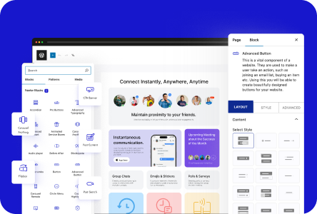
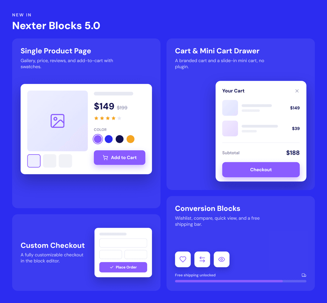
Go to Nexter Blocks → Blocks and toggle on the WooCommerce block set. This unlocks all 27 blocks in the Gutenberg inserter, grouped by the store page they build: single product, catalog, cart, checkout, and order/account.
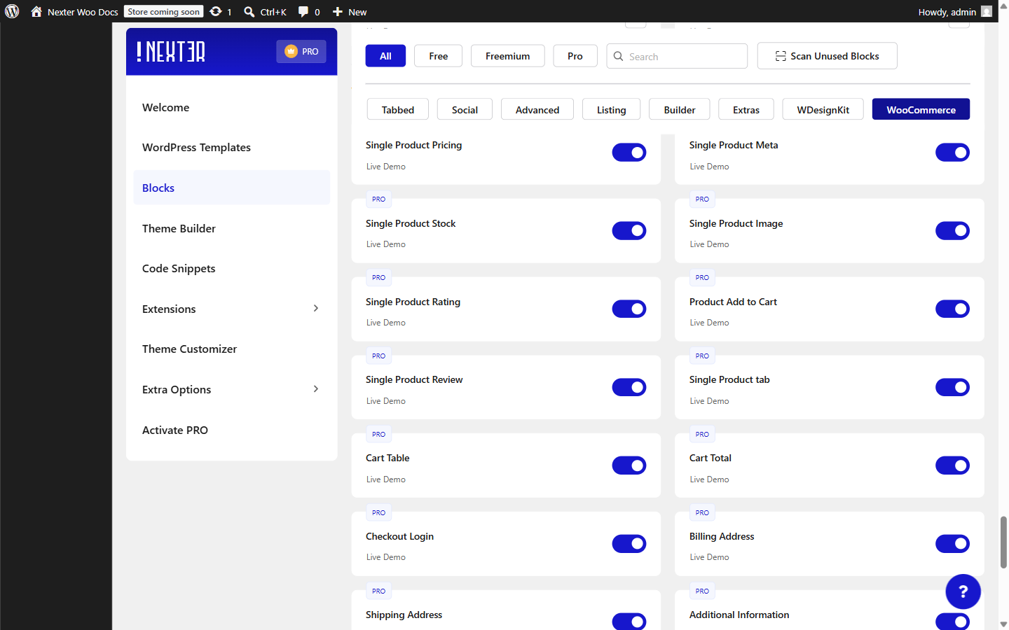
Step 2: Build the Single Product Page First, Not the Homepage
The most common mistake on a first Nexter store build is designing the homepage before the product template. The single product page is where the 8 dedicated blocks (image gallery, pricing, rating, stock, meta, reviews, tabs, add-to-cart) actually live, and because they pull live data from whichever product is being viewed, one template styles your entire catalog at once. Build this template inside the Nexter Theme Builder so it applies sitewide, rather than editing individual product pages one at a time.
Also Read: The Nexter Grid View Theme Builder: What It Is and How to Use It — this is exactly the kind of sitewide template the Theme Builder is for.
Step 3: Cart and Mini Cart
The Cart Table and Cart Total blocks build a branded, full cart page. Separately, the Mini Cart block adds a slide-in drawer so shoppers can review what’s in their cart from any page on the site without a full page load — add it to your header template once, and it’s available everywhere.
The Abandonment Numbers Worth Designing Against
Baymard Institute’s aggregated research across 50+ studies puts average cart abandonment at roughly 70%, with mobile running higher (73–75%) than desktop (65–68%) — meaning the majority of carts built with these blocks will never convert regardless of how well the store is styled, and closing even a fraction of that gap through checkout design has real revenue weight (Baymard estimates $260 billion recoverable across the US and EU through better checkout design alone). Two specific, well-documented causes are worth designing the Cart and Mini Cart around directly: unexpected costs revealed late in the process, and forced account creation. The Mini Cart drawer helps with the first by keeping running totals visible throughout browsing rather than only at a final checkout step; whether guest checkout is offered at all is a WooCommerce settings decision, not a block-layout one, but it’s worth confirming that setting is actually enabled before assuming the checkout blocks alone will fix abandonment.
Step 4: Checkout, Without a Separate Checkout Plugin
Six blocks — login prompt, billing address, shipping address, order notes, payment method, and order review — build the entire checkout flow. Because they’re native Gutenberg blocks, you style them the same way you’d style any other block on the page, instead of fighting a checkout plugin’s own settings panel.
Guest Checkout: The Single Highest-Leverage Setting Here
Forced account creation is specifically documented as the second-highest cause of checkout abandonment in cart-abandonment research, with roughly a quarter of shoppers citing it as their reason for leaving. The fix isn’t a Nexter block at all — it’s a WooCommerce setting (WooCommerce → Settings → Accounts & Privacy, allowing guest checkout, with account creation offered as an optional post-purchase step rather than a gate). It’s worth confirming this setting explicitly while building the Login Prompt block into the checkout flow, since a beautifully styled login step that still forces an account is solving the wrong problem.
What Styling the Payment Block Can and Can’t Touch
The Payment Method block gives you control over layout, spacing, and general presentation, but the actual card-entry fields for most modern gateways are hosted fields — secure iframes rendered inside the form, provided by the payment processor rather than by WooCommerce or Nexter. This is a deliberate security boundary, not a Nexter limitation: hosted fields keep raw card data flowing directly to the payment processor’s vault rather than through your server, which is what reduces your site’s PCI-DSS compliance scope in the first place. In practice, that means the surrounding layout (labels, spacing, button styling) is fully stylable through the block, while the card-entry fields themselves are constrained to whatever styling API the specific gateway’s hosted-fields implementation exposes — worth checking before promising a client pixel-perfect control over every element of the payment step.
Step 5: The Conversion Blocks (Where the Second Common Mistake Happens)
Variation swatches, Wishlist, Compare, Quick View, and the Free Shipping Progress Bar are the blocks people forget until after launch. Add them during the initial build instead of retrofitting later — swatches in particular change the layout of the Add to Cart block, so adding them after your product template is finalized often means redoing spacing across every product page.
Also Read: How to Build a Full WooCommerce Product Page Using Nexter Blocks (Step by Step) — a deeper, block-by-block walkthrough of just the product page.
A Worked Example: Building a Small Apparel Store
Take a real build order for a 40-product apparel store. Step 1 (enabling the WooCommerce block set) and installing the Nexter Theme happen together on day one. Step 2 builds the single product template first, with variation-triggered image swaps and a price range display, since most of the catalog is variable products with multiple sizes and colors — this template alone determines how all 40 products look, so it gets the most build time relative to its page count. Step 3 adds the Mini Cart to the header template immediately, since apparel shoppers commonly browse multiple categories before checking out and benefit from a persistent running total. Step 4 builds checkout with guest checkout explicitly confirmed enabled in WooCommerce settings, given that forced account creation is a documented top-two abandonment cause and this store has no loyalty-program reason to require an account. Step 5 adds variation swatches (color and size) during this same initial pass, not after — apparel is exactly the product category where swatches matter most, since a color dropdown is a genuinely worse shopping experience than a swatch row for anything you’d choose by looking at it.
Common Mistakes Beyond the Two Named Above
- Styling checkout against a test/sandbox gateway that renders differently than production: some hosted-field implementations look slightly different in test mode than in a live production account — confirm the final visual check happens against the real, live payment gateway before calling checkout finished.
- Never testing the mobile checkout flow specifically: given mobile cart abandonment runs measurably higher than desktop, a checkout flow only ever tested on a wide desktop browser is exactly the kind of gap that research keeps finding across the industry.
- Assuming the Mini Cart alone fixes shipping-cost surprise: the Mini Cart shows running product totals, but unless shipping is also estimable early (a rate calculator, a flat-rate note, or a free-shipping threshold), the classic late-stage-shipping-surprise problem can still occur at the final checkout step.
- Building the checkout blocks before confirming which payment gateways will actually be used: different gateways expose different hosted-field styling options; deciding on the gateway first avoids redesigning the payment block’s surrounding layout after finding out a chosen gateway constrains styling more than expected.
A Pre-Launch Checklist
- Guest checkout enabled in WooCommerce settings, not just a login block that looks optional.
- Shipping cost visible before the final checkout step, ideally via the Mini Cart or an early cart summary, not just revealed at the last moment.
- Conversion blocks (swatches, Wishlist, Compare) added before final spacing is locked in, not retrofitted after launch.
- Mobile checkout tested specifically, given the meaningfully higher mobile abandonment rate in the research above.
- Payment block styling checked against the actual gateway in use, since hosted-field styling constraints vary by processor.
FAQ
Do I need Elementor or another page builder for this?
No. The Nexter Theme and Nexter Blocks WooCommerce set both run in the native WordPress block editor.
Is the full WooCommerce block set free?
The core WooCommerce blocks are free in Nexter Blocks. The customizable checkout, swatches, wishlist, compare, quick view, and free-shipping progress bar are part of Nexter Blocks Pro.
Does this replace my SEO plugin too?
Separately, Nexter Extension now ships its own SEO module (Nexter SEO), covering audits, schema, sitemaps, and redirects, which many store builders use instead of a standalone SEO plugin — but that’s independent of the WooCommerce blocks covered here.
Why can’t I fully restyle the card-number field at checkout?
Most modern payment gateways render card-entry fields as hosted fields — secure iframes controlled by the payment processor, not by WooCommerce or Nexter. This is a deliberate PCI-compliance boundary that keeps raw card data off your server; styling is limited to whatever the specific gateway’s hosted-fields API allows.
Is forced account creation really that big a deal for conversion?
Research puts it as the second-highest cause of checkout abandonment, cited by roughly a quarter of shoppers who abandon. Enabling guest checkout in WooCommerce’s own settings, with account creation offered only as an optional post-purchase step, is a higher-leverage fix than most visual checkout styling changes.
What’s the actual average cart abandonment rate I should expect?
Aggregated research puts the average around 70% across ecommerce broadly, with mobile running higher than desktop. That’s a baseline to compare against, not a target to accept — guest checkout, early shipping-cost visibility, and a tested mobile flow are the highest-leverage levers for closing part of that gap.
Should I test checkout styling against a sandbox or a live payment gateway?
Do a final visual check against the live, production gateway before considering checkout finished. Some hosted-field implementations render slightly differently in test/sandbox mode than in a real production account.
Conclusion
Building the single product template before the homepage, and adding conversion blocks during the initial build rather than after launch, are the two habits that separate a smooth Nexter store build from a frustrating one. Beyond the blocks themselves, confirm guest checkout is actually enabled and surface shipping cost early — those two settings address documented abandonment causes that no amount of block styling alone will fix.
Suggested Reading
- How to Build a Full WooCommerce Product Page Using Nexter Blocks (Step by Step)
- The Nexter Grid View Theme Builder: What It Is and How to Use It
- 27 New WooCommerce Blocks And Nexter SEO Are Live
