












Do you want shoppers to preview product details without navigating away from your listing page? The Product Quick View block in Nexter Blocks adds a trigger button to each product card on your WooCommerce store. When a visitor clicks it, a modal opens showing the product image, gallery, title, price, stock status, and an Add to Cart button, all without a page reload.
The Product Quick View block is a Pro feature of Nexter Blocks. It requires WooCommerce to be installed and active. Unlike dedicated quick view plugins, this block is built directly into the Nexter Blocks ecosystem, so no additional plugin is needed.
Best Used For:
- WooCommerce shops where reducing page navigation increases conversions
- Product listing pages where shoppers compare multiple items before buying
- Mobile-friendly stores where full product page visits slow down the browsing experience
Required Setup
- Make sure the default WordPress block editor is active.
- WooCommerce plugin installed and activated.
- You need the Nexter Blocks plugin installed and activated.
- This is a premium feature. You need the Pro version of Nexter Blocks. To enable the block, go to Nexter Blocks > Blocks, open the WooCommerce category tab, and switch the Product Quick View toggle on.
Important: The Product Quick View block must be placed inside a Nexter Post Listing block configured to display WooCommerce products with the Custom Skin style. It does not render as a standalone block on a regular page.
Key Features
- Trigger Type Control: choose between a Count Badge (icon button) or an Action Button (text button) as the quick view trigger. Use the Count Badge style on product grids where space is limited, and the Action Button style on layouts that benefit from visible call-to-action labels.
- Hover Trigger Mode: show the trigger only when a visitor hovers over the product card. This keeps your product listing clean and reveals the quick view option at the moment of interest.
- Full Product Modal: the modal that opens displays the product thumbnail gallery, title, price range, stock status badge, Remove and Add to Cart buttons, a Continue Shopping link, and an Add All to Cart button. Style all of these from the Style tab.
How to Use the Product Quick View Block in WordPress?
The Product Quick View block must be placed inside a Nexter Post Listing block. The Post Listing block runs a WordPress query loop. When that loop is set to WooCommerce products and the Custom Skin style is active, the Product Quick View block renders a trigger button for each product in the listing.
- Open a page in the WordPress block editor. Search for Post Listing in the block inserter and add it to the page.
- Select the Post Listing block on the canvas. In the Inspector panel, set Post Type to product.
- In the Style settings, set the style to Custom Skin. This reveals an inner block area inside the Post Listing on the canvas.
- Click the + (Add Block) button inside the Custom Skin area. Search for Product Quick View and insert it.
- Click the Product Quick View block to select it. Its Inspector panels appear on the right side.
Trigger Button
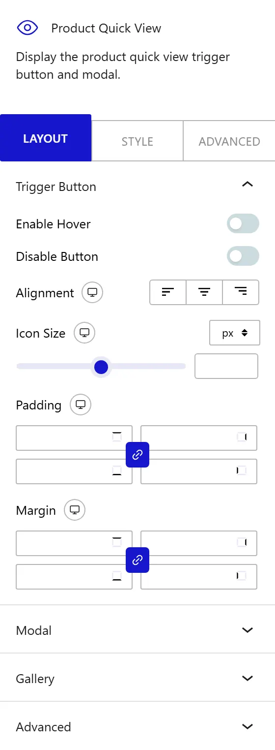
The Trigger Button panel controls the appearance, type, and position of the clickable element that opens the quick view modal. Enable the Enable Hover toggle to show the trigger button only when a visitor hovers over the product card. When this is off, the trigger is always visible on the product card.
From the Type dropdown, choose how the trigger appears on the product card:
- Count Badge: displays an icon-style button, similar to a shopping cart badge. Use this for compact product grids where you want an unobtrusive trigger.
- Action Button: displays a full text button. Use this when your product cards have space for a visible label and you want the quick view action to be obvious.
From the Alignment control, set the horizontal position of the trigger button within the product card. This control is responsive. In the Icon Size field, set the size of the icon or button in pixels, from 10px to 60px (responsive). From the Padding control, add spacing inside the trigger button around its icon or text. From the Margin control, set the spacing outside the trigger button, adjusting its distance from the product card edges. Both are responsive.
Modal
The Modal panel controls the size and spacing of the quick view popup that opens when the trigger is clicked. In the Modal Max Width field, set the maximum width of the modal in pixels, from 300px to 1400px (responsive). In the Image & Content Gap field, set the spacing between the product image and the product details column inside the modal. In the Body Padding field, set the inner padding of the modal body. Both are responsive.
How to Style the Product Quick View Block?
To style the Product Quick View block, go to the Style tab in the Inspector panel.
- Trigger Icon Button: change the border, border radius, box shadow, and background and icon colors for Normal and Hover states. This panel appears only when Type is set to Count Badge.
- Trigger Action Button: change the typography, border, border radius, box shadow, and background and icon or text colors for Normal, Hover, and Active states. This panel appears only when Type is set to Action Button.
- Count Badge: change the typography, background color, text color, border radius, and padding of the count badge that appears on the trigger icon.
- Modal: change the background color and overlay color of the modal popup container.
- Modal Header: change the background color, title color, title icon color, and padding of the modal header area.
- Modal Count Badge: change the background and text colors of the count badge inside the modal.
- Close Button: change the background, icon color, hover background, and icon hover color of the modal close button.
- Item Row: change the separator color, hover background, image and content gap, and padding of each product row displayed in the modal.
- Main Image: change the size of the main product image displayed in the modal.
- Thumbnails: change the size and spacing of the product gallery thumbnails displayed below the main image.
- Product Title: change the color and hover color of the product title in the modal.
- Item Price: change the typography for the Regular and Sale price states, and the color of each.
- Stock Badge: change the background and text colors for the In Stock and Out of Stock states.
- Remove Button: change the color and hover color of the remove button shown for items already in the cart.
- Add to Cart Button: change the padding, typography, background, text color, border, and border radius of the Add to Cart button for Normal and Hover states.
- Footer: change the footer background and padding.
- Continue Shopping: change the color, hover color, background, text color, and padding of the Continue Shopping link in the modal footer.
- Add All to Cart Button: change the shop button typography, background, and text color for Normal and Hover states.
- Empty State: change the padding, typography, color, background, border, border radius, and box shadow of the state displayed when no products appear in the modal.
- Toast Message: change the text color and padding for the Add and Remove toast notification messages.
This is how you can add a WooCommerce product quick view in WordPress with Nexter Blocks.
