With the Animated Service Boxes block from Nexter Blocks, you can add different types of animated content sections like image accordion, service box, portfolio section, info banner, and more.
Required Setup
- Make sure the default WordPress Block editor is active.
- You need to have the Nexter Blocks plugin installed and activated.
- This is a Premium block, and you need the PRO version of Nexter Blocks.
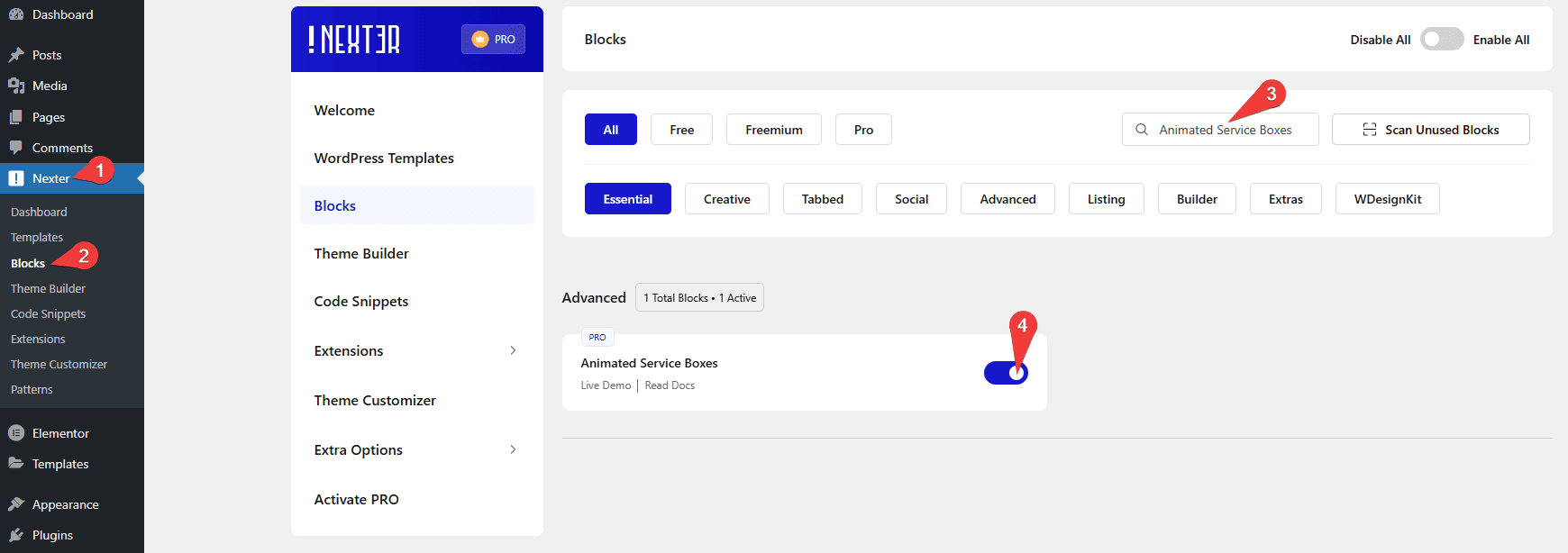
- Make sure the Animated Service Boxes block is activated. To verify this, visit Nexter → Blocks → and search for Animated Service Boxes and activate.
Learn via Video Tutorial
How to activate the Animated Service Boxes Block?
Go to
- Nexter → Blocks
- Search the block name and turn on the toggle.
Key Features
- Image Accordion – You can easily create an image accordion (vertical and horizontal).
- Sliding Boxes – You can create a sliding box effect.
- Article Box – You can create an article box (like a post).
- Info Banner – You can easily create an info banner.
- Hover Section – You can easily change the background image on hover.
- Fancy Box – You can add a fancy box to show content.
- Service Elements – You can easily add an animated service box.
- Portfolio – You can add unique portfolio sections.
How to Use the Animated Service Boxes Block?
Add the Animated Service Boxes block to the page.
Then click on the Design from Scratch button to design the layout from scratch.

Note: By clicking on the Import Pre-Designed Template button, you can import a preset template and customize it as per your requirements.
Animated Service Boxes
From the Main Style section, you can select the service box type. Here you’ll find eight options –
- Image Accordion – With this option, you can create an image accordion.
- Sliding Box – With this option, you can create a sliding box effect.
- Article Box – With this option, you can create an article box.
- Info Banner – With this option, you can create an info banner.
- Hover Section – With this option, you can change the background image on hover.
- Fancy Box – With this option, you can add a fancy box to show content.
- Service Elements – With this option, you can add an animated service box.
- Portfolio – With this option, you can add unique portfolio sections.
You’ll see different options based on your selection, let’s select Fancy Box here.
From the Style dropdown, you can select a style.
By enabling the Button toggle you can add a button to the service box.
When enabled you can select a button style from the Button Style section.
Then in the Service Boxes section, you have to add the content for the service box. By default, you’ll find three repeater items, open one item.
In the Title field, you can add the service box title.
In the Sub Title field, you can add a subtitle to the service box.
You can add a description to the service box in the Description field.
From the Featured Image section, you can add a background image to the service box.
In the Button Text field, you can add the button text of the service box.
Then, in the Button Link field, you can add a link to the button.
Note: Make sure the Display Button toggle is enabled to see the Button Text and Button Link fields.
You can improve the accessibility of the button by adding an Aria label in the Aria Label field.
Following this process, you can edit the other service box items.
You can click on the +Add Item button to add more service box items.
Then, from the Image Size dropdown, you can select the image size.
Columns Manage
From here, you can manage the number of service boxes in a row for desktop, tablet and mobile separately.
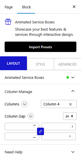
From the Columns Gap section, you can manage the gap between the items.
How to Style the Advanced Typography Block?
To style the Animated Service Boxes block, you’ll find all the options in the Style tab.
Note: You’ll find different styling options for different types of service boxes.
Title – From here, you can style the service box title.
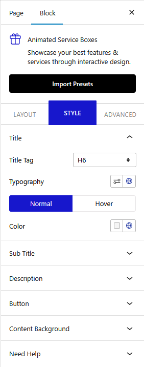
Sub Title – From here, you can manage the service box sub title style.
Description – From here, you can manage the service box description text style.
Icon – You’ll see this option only when the Image/Icon toggle is enabled from the Layout tab. From here, you can manage the service box icon style.
Featured Image – You’ll see this tab when the Portfolio type is selected. From here, you can style the service box image.
Listing – You’ll see this tab when the Services Elements is selected. From here, you can style the service box listing typography, color and margin.
Button – You’ll see this option only when the Display Button toggle is enabled from the Layout tab. From here, you can manage the service box button style.
Content Background – From here, you can manage the service box content area padding, border radius and hover overlay background.
Outer Content – You’ll see this tab when the Article Box is selected. From here, you can style the service box border, box shadow etc.
Content Background Back – You’ll see this tab when the Info Banner is selected. From here, you can manage the back of the content background overlay color and background.
Advanced options remain common for all our blocks, you can explore all it options from here.
