












Do you want to let shoppers compare WooCommerce products side by side before they buy? The Product Compare block in Nexter Blocks adds a floating compare trigger button and a pop-up modal to any Gutenberg page, so visitors can queue up products, review specs and prices together, and make a more confident purchase decision.
The Product Compare block is a Gutenberg block in Nexter Blocks for WordPress that works with WooCommerce. Unlike standalone comparison plugins, it integrates directly with the block editor, so you can place it in a header, a sticky bar, or inside product listing templates to show a compare trigger button wherever it makes sense for your store layout. (Pro)
Best Used For:
- WooCommerce stores selling similar products (electronics, clothing, accessories) where customers need to compare specifications before buying
- Shop pages using the Post Listing block set to query WooCommerce products, where a per-product "Add to Compare" button is placed inside a custom card template
- Header navigation bars where a compact count badge should show how many products are currently queued for comparison
Required Setup
- Make sure the default WordPress block editor is active.
- You need Nexter Blocks installed and activated.
- For this block, you need Nexter Blocks (Pro). The Product Compare block is available automatically, so no separate toggle is needed.
- WooCommerce must be installed and activated. The block will not render on the front end without it.
How to Use the Product Compare Block in WordPress?
The Product Compare block works in two modes selected by the Type setting in the Trigger Button panel. Choose the mode that matches where you are placing the block.
Mode 1: Standalone Trigger (Header or Navigation Bar)
Place the Product Compare block anywhere on a page or in a header template. Leave Type set to Count Badge (the default). The block renders as a compact icon button showing a live count of products the visitor has queued for comparison. When clicked, it opens the full comparison modal. This mode is standalone and does not need to be placed inside any other block.
- Open a page, header, or template in the Gutenberg block editor.
- Click the + inserter, search for Product Compare, and add it to the canvas.
- In the Trigger Button panel, confirm Type is set to Count Badge.
Mode 2: Per-Product Button (Post Listing Block with Custom Style)
To show an "Add to Compare" button on each individual product card, use the Post Listing block configured to query WooCommerce products with a Custom style. The Post Listing block loops through products using a standard WP_Query, and for each iteration the current product context is set so the Product Compare block can detect it and render a per-product button.
- Add a Post Listing block to your page or template.
- In the Content panel, set Post Type to Product to query WooCommerce products.
- Set Style to Custom.
- Under Custom Style, choose Reusable Block and select or create a reusable block that contains the Product Compare block with Type set to Action Button. Alternatively, use the Custom Skin option to add the Product Compare block directly as an inner block inside the Post Listing block.
The Post Listing block sets the product context for each loop iteration. The Product Compare block detects that context, renders a unique compare toggle for each product card, and updates the header trigger's count badge when a visitor clicks it.
Note: If you place the Product Compare block outside a product loop with Type set to Action Button, it falls back to the standalone trigger behavior and does not output a per-product button.
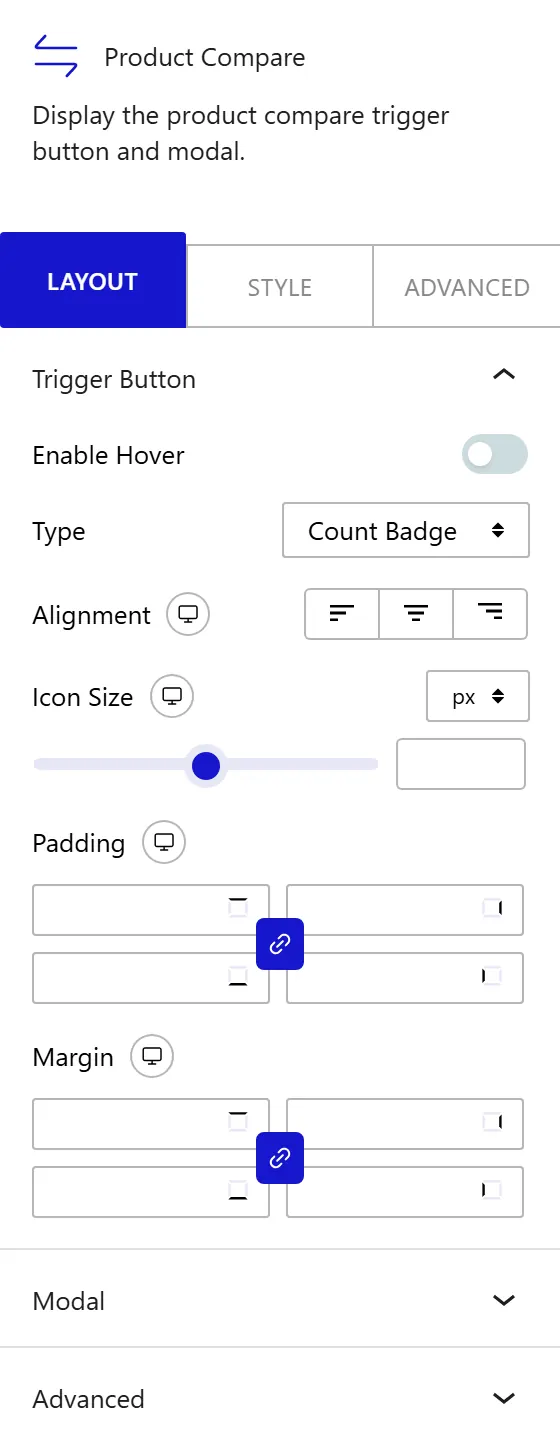
Trigger Button
The Trigger Button panel controls how the compare button appears on the page: its type, size, alignment, and spacing.
- Enable Hover: turns on hover interaction effects for the trigger button.
- Type: sets the button mode. Count Badge renders a standalone header trigger with a live product count, used outside product loops. Action Button renders a per-product toggle, used inside a Post Listing block configured with Custom style and Product type.
- Alignment: positions the trigger button left, center, or right within its container. Responsive.
- Icon Size: sets the width and height of the compare icon inside the button, from 10px to 60px. Responsive.
- Padding: adds space inside the button between the icon and the button edge. Responsive.
- Margin: adds space outside the button to push it away from surrounding elements. Responsive.
Modal
The Modal panel controls the size of the compare overlay window that opens when a visitor clicks the trigger button. In the Modal Max Width field, set the maximum width of the comparison modal in pixels, from 400px to 1600px. Use a wider value (1200px or more) when comparing products with many attribute rows so visitors can read each column without horizontal scrolling.
How to Style the Product Compare Block?
To style the Product Compare block, go to the Style tab in the block's Inspector panel. The Style tab has 24 panels covering every element of the trigger button, the comparison modal, and the product picker.
- Trigger Button: border, border radius, and box shadow of the trigger button. Sub-tabs set separate background and icon color for Normal, Hover, and Active states.
- Count Badge: typography, border radius, and padding of the count badge. Sub-tabs set background and text colors for Normal and Hover states.
- Modal: modal background, border, border radius, box shadow, and overlay backdrop color.
- Modal Header: background, border, title text color, title typography, title icon color, and padding of the header bar.
- Modal Count Badge: typography, border radius, background color, and text color of the count badge inside the modal header.
- Close Button: border radius and Normal or Hover background and icon colors for the close button.
- Clear All Button: typography, border radius, and Normal or Hover background, text color, and border for the "Clear All" button.
- Table: border color and cell padding for the product comparison table.
- Label Column: background color, text color, and typography of the first column, which displays attribute labels such as Price, Stock Status, and Review.
- Delete Button: typography, border radius, and Normal or Hover styling for the button that removes a product from the table.
- Add Product Button: typography, border radius, and Normal or Hover styling for the button that opens the product picker.
- Select and Read More Button: typography, border radius, and Normal or Hover styling for the action buttons at the bottom of each product column.
- Product Image: background, border, border radius, and image size for the product thumbnail in each column.
- Product Title: typography and Normal or Hover text color for the product name in each column.
- Price: typography and color of the product price in the comparison table.
- Stock Status: typography and color of the stock availability label.
- Quantity Control: appearance of the quantity input in each column, including field background, text color, and border.
- Add to Cart Button: typography, background, text color, border, border radius, and hover states for the Add to Cart button in each column.
- Review: color and size of the star rating display in each column.
- Product Picker: background, border, and padding for the product picker overlay that opens when a visitor clicks "Add Product".
- Picker Close Button: background color and icon color for the close button inside the product picker.
- Picker Search: background, text color, border, and padding for the search input inside the picker.
- Picker Item: background, text color, border, and hover states for each product result row in the picker.
- Picker Add Button: typography, background, text color, border, border radius, and hover states for the "Add" button on each picker result.
This is how you can add a WooCommerce product compare in WordPress with Nexter Blocks.
