


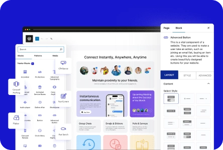
The Container block in Nexter Blocks introduces you to the Flexbox Container block, a powerful tool that helps you create flexible and responsive layouts easily.
Using this block, you can design your website pages with both full-width and boxed layouts, giving you more control over how your content appears on different devices. The Flexbox Container makes it simple to align, distribute, and organize your content without needing to write complex code. This means even beginners can craft professional-looking pages with ease.
One of the main benefits of the Flexbox Container is its responsiveness. It automatically adjusts to different screen sizes, ensuring your website looks great on desktops, tablets, and smartphones. This adaptability improves user experience and keeps visitors engaged with your content.
Another advantage is the ease of customization. With Nexter Blocks, you can easily change layout settings, add spacing, and align items within your container. Whether you are creating a hero section, a product showcase, or a content grid, the Flexbox Container offers the flexibility you need to bring your ideas to life.
By mastering this block, you unlock the ability to craft modern, attractive websites that are both functional and visually appealing. It simplifies the design process and empowers you to create unique layouts that stand out.
To learn more about adding a Flexbox Container in WordPress and get detailed guidance, visit this link.