












A row of cards with different amounts of text ends up with ragged bottoms, and the eye reads that as sloppy long before it reads the content.
The equal height option measures the items in a row and makes them all as tall as the tallest.
Before You Start
- Edition: Free — works in Nexter Blocks (free) and with Nexter Blocks Pro.
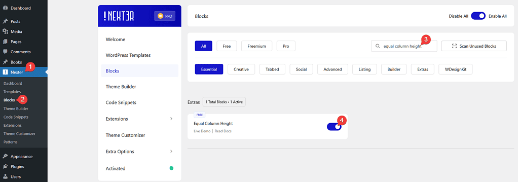
- Block to enable: Container, switched on under Nexter > Blocks in your WordPress dashboard.
- A row of items whose heights differ — columns in a Container, or a block such as Testimonials.
Steps
- Select the container or block holding the row.
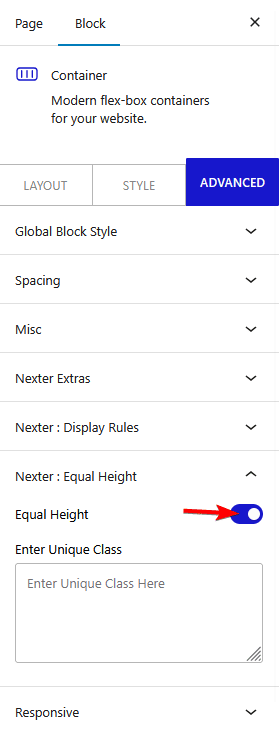
- Switch equal height on.
- Check the row at desktop width.
- Check it again at tablet and phone widths.
- Adjust the padding inside the items so the extra space looks deliberate.

- Publish and check the real page.

What It Looks Like
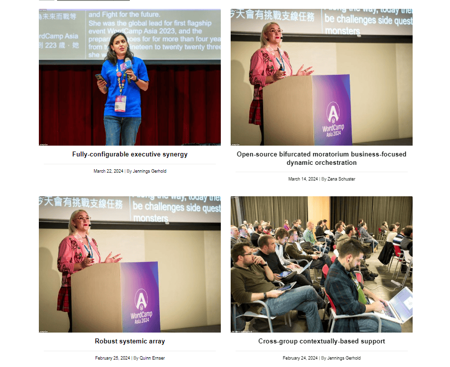
Three views of the same row: the cards matched across a full-width layout, the difference against a ragged row, and the finished section in place.
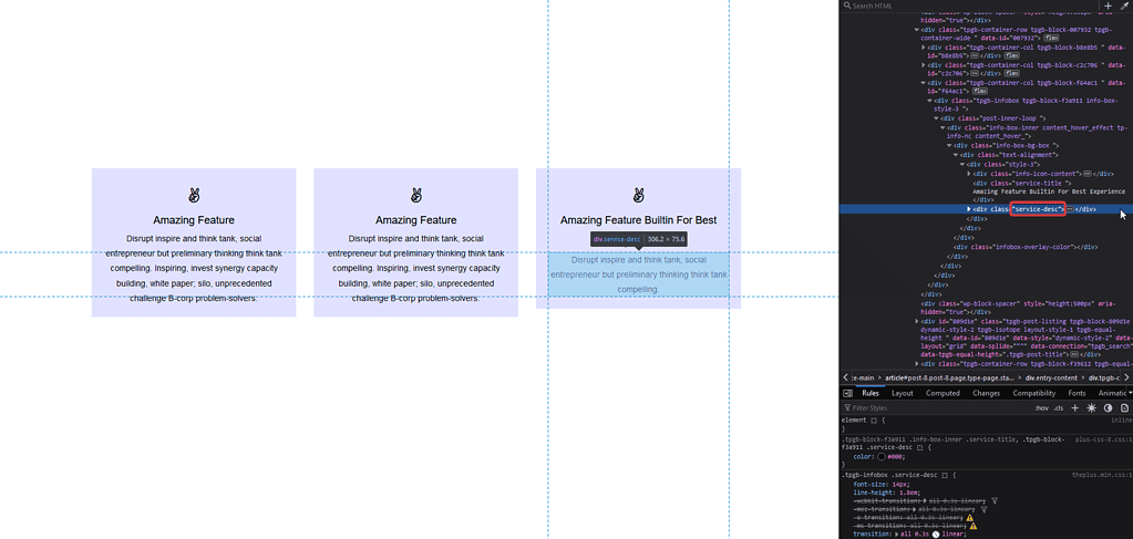
Without the option, the shortest card leaves a step in the bottom edge that the eye picks up immediately.
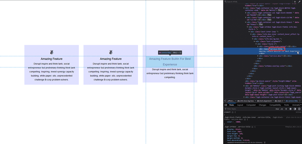
With the padding adjusted, the extra space inside the shorter cards reads as intentional rather than left over.
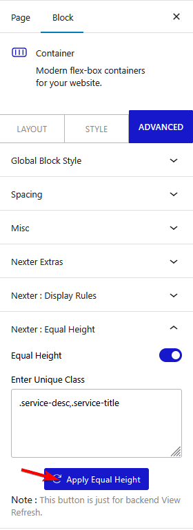
How It Behaves
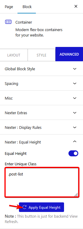
Switching the option on marks the row with an identifier, and the plugin’s script uses it to match the heights once the page has loaded.
- Measured on a published page: with the option on, the block rendered
data-tpgb-equal-heightcarrying the identifier it was given. With the option off, the attribute is absent. - The tallest item sets the height for the whole row. Shorter items gain space rather than the tall one losing any.
- It applies per row. With three items across and six in total, the two rows are matched independently.
- It runs after the page loads, because the heights cannot be known before the content is on screen.
- Measured with Nexter Blocks Pro deactivated: this still works. It is part of the free plugin.
Limitations
- One very long item stretches everything. A single card with three extra paragraphs leaves the rest full of empty space — the real fix is usually to trim that card.
- Images with different aspect ratios still look uneven, because matching the box height does not match the picture inside it.
- It cannot run before the content exists. A web font or a late-loading image can change an item’s height after the match, which is the usual cause of a brief jump.
- On a phone the items are usually stacked, so there is no row to equalise and the setting has nothing to do.
- If your items are genuinely the same length, you do not need this. A grid container already gives every item in a row the same height — see the Container block guide.
Troubleshooting
The heights are still uneven
Check the option is set on the element that holds the row rather than on an individual item, and that you are viewing the published page.
The heights jump shortly after the page loads
Something finished loading after the match was made — usually an image without width and height attributes, or a web font. Give your images explicit dimensions.
One card is enormous
That card is setting the height for the row. Shorten its content, or move it out of the row.
It does nothing on mobile
The items are stacked, so each is full width and there is no row to equalise. That is expected.
