Adding a process step is an excellent way to visually represent a workflow or series of steps, helping users easily follow and understand the process. This not only provides clear guidance but also improves the overall user experience by making complex information more digestible and organized.
With the Process Steps block from Nexter Blocks, you can easily create beautiful process steps in your WordPress website.
Required Setup
- Make sure the default WordPress Block editor is active.
- You need to have the Nexter Blocks plugin installed and activated.
- This is a Premium block, and you need the PRO version of Nexter Blocks.
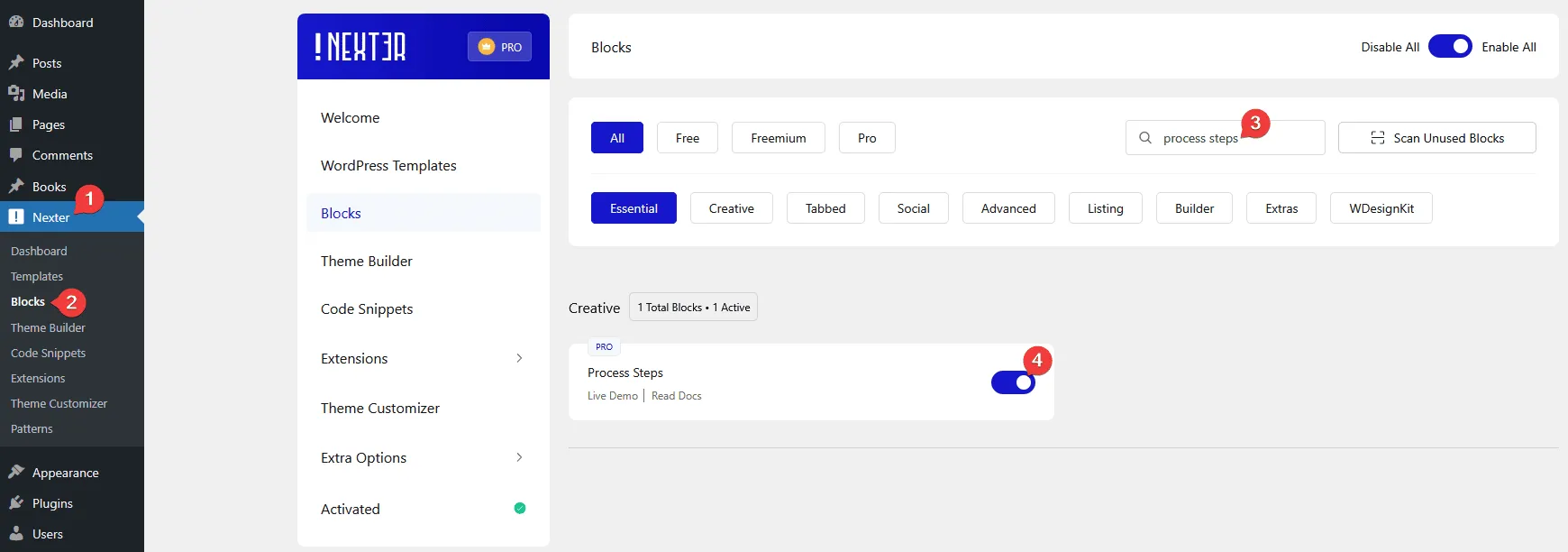
- Make sure the Process Steps block is activated, to verify this visit Nexter → Blocks → and Search for Process Steps and activate.
Learn via Video Tutorial
How to activate the Process Steps Block?
Go to
- Nexter → Blocks
- Search the block name and turn on the toggle.
Key Features
- Two Layout Styles – You can select from horizontal and vertical styles.
- Display Counter – You can show different types of counters on the steps.
- Carousel Anything Connection – You can easily sync with the Carousel Anything block.
How to Use the Process Steps Block?
Add the Process Steps block to the page.
Then click on the Design from Scratch button to design the layout from scratch.

Note: By clicking on the Import Pre-Designed Template button, you can import a preset template and customize it as per your requirements.
Content
From the Style section, you have to select the layout style. Here you’ll find two options –
- Vertical – To create vertical process steps.
- Horizontal – To create horizontal process steps.
Select the options as per your requirements, let’s select Horizontal here.
Then from the Steps section, you have to add the process step content. By default, you’ll find two repeater items, open one item.
In the Title field, you have to add the step title.
Then in the Description section, you can add the step content.
From the Icon Type section, you can select the content type you want to add to the step circle. Here you’ll find four options –
- None – To keep the step circle blank.
- Icon – To add an icon to the step circle.
- Image – To add an image to the step circle.
- Text – To add text to the step circle.
You’ll see different options to add content based on your selection.
Select the option as per your requirements, let’s select Icon here.
From the Select Icon section, you can add an icon.
In the Link field, you can add a custom link to the step item.
Then, from the Normal and Hover tabs, you can add backgrounds for the normal and hover states of the step circle.
You can set a height for the particular step, from the Height of Content section.
Following this process, you can edit the other items.
You can click on the + Add Step button to add more steps.
Counter
By enabling the Counter toggle, you can add a step counter.
From the Counter Type dropdown, you can select different types of counter styles.
Note: When you select the Custom Text option, you’ll get an option to add a custom label in each repeater item.
Extra Options
In this tab, you’ll find some extra options.
By enabling the Remote Sync Connection toggle, you can connect the steps with the Carousel Anything block.
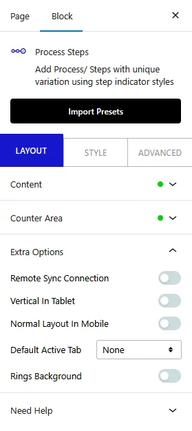
Then, by enabling the Vertical In Tablet toggle, you can convert the horizontal steps to vertical steps in tablet screens.
By enabling the Normal Layout In Mobile toggle, you can show the steps as normal blocks on mobile screens, but if disabled it will turn to vertical steps on mobile screens.
From the Default Active dropdown, you can select which step to set as active, this will add hover color to the selected step.
Then, you can add a ripple type background from the Rings Background toggle.
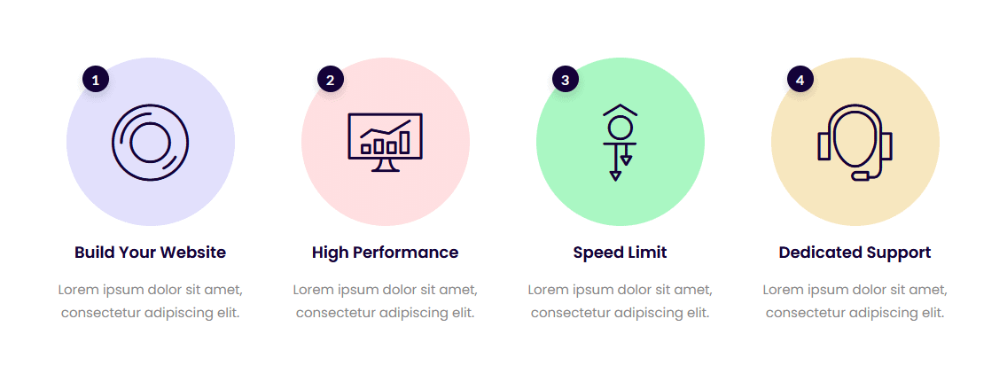
How to Style the Process Steps Block?
To style the Process Steps block, you’ll find all the options in the Style tab.
Title – From here, you can style the step title.

Description – From here, you can style the step description.
Icon Area – From here, you can manage the style of icon and image in the step circle.
Connecting Line – From here, you can style the connecting lines.
Counter Area – You’ll see this option only when the display counter toggle is enabled in the content tab. From here, you can style the counter in the step circle.
Content Background – From here, you can style the step content area.
Repeater Background – From here, you can style the repeater items.
Advanced options remain common for all our blocks, you can explore all it options from here.

