Accordion is a handy block when you want to show a list of content to your users and when they click on an item it expands to show the content. It is very frequently used to create FAQ sections on websites or blog posts.
With the Nexter Blocks Accordion block, you can create amazing accordions for your website using its unique set of features
Required Setup
- Make sure the default WordPress Block editor is active.
- You need to have the Nexter Blocks plugin installed and activated.
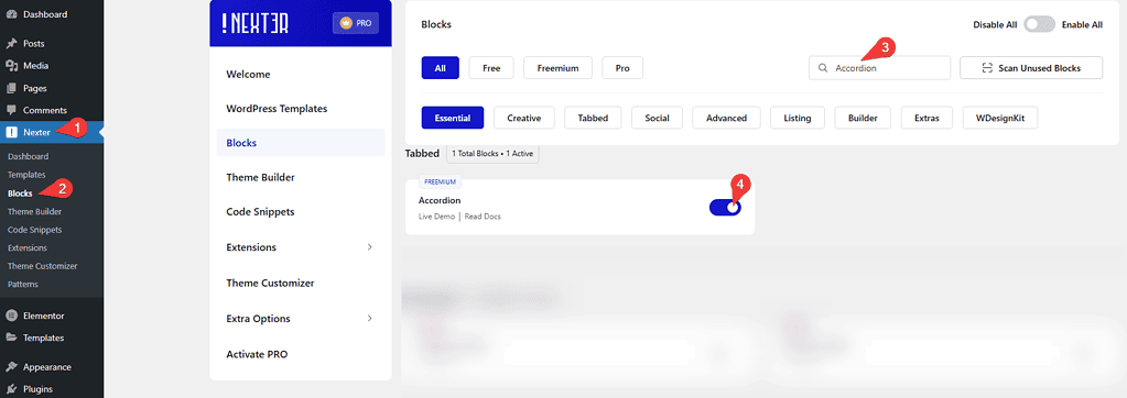
- Make sure the Accordion block is activated. To verify this, visit Nexter → Blocks → and search for Accordion and activate.
- This is a Freemium block to unlock the extra features, you need the PRO version of the Nexter Blocks.
Learn via Video Tutorial
How to activate the Accordion Block?
Go to
- Nexter → Blocks
- Search the block name and turn on the toggle.
Key Features
- Multiple content sources – There are three different content types you can use in your accordion, Content (Free), Editor (Free) and Pattern (Pro). With the Editor option, you can use other WordPress blocks like image, shortcode, container etc. inside the accordion.
- Show dynamic content in accordion (Pro) – You can make your accordions very versatile by showing dynamic data from different parts of your website like post title, post excerpt etc using the dynamic field options.
- Individual icons for each accordion (Free) – You can easily assign different icons for each accordion item from the Front Icon option located inside each accordion item. Turn on the toggle to set the icon.
- Unique ID (Free) – You can add a unique id for each accordion item to easily create anchor links directly to the accordion item.
- Set standard icons for all accordion items (Free) – You can easily add the standard open and close icons for all accordion items.
- Different HTML tag options for accordion headings (Free) – To help your SEO efforts you can set different HTML tags like H1, H2 etc. for the accordion headings.
- Active Accordion (Pro) – With this option, you can easily choose any specific accordion item to be your active item.
- On Hover Accordion (Pro) – You can open the accordion when someone hovers over the accordion title.
- Carousel Connection ID (Pro) – Connect your accordion with the Carousel Anything block using a unique ID to create truly unique accordions. So when a user clicks on an accordion item the slider will also change.
- SEO Schema Markup (Free)- Turn your accordion into SEO-friendly schema markup.
How to add content in the Accordion block?
Add the Accordion block to the page.
Then click on the Design from Scratch button to design the layout from scratch.

Note: By clicking on the Import Pre-Designed Template button, you can import a preset template and customize it as per your requirements.
The Nexter Blocks Accordion block has multiple ways to add content for both title and description.
To add content to a specific accordion, click on it, and you will see a field to add the title. You can write the title or use any dynamic field (pro) to dynamically create your accordion title.
This dynamic field option is an exclusive feature of the Nexter Blocks Pro.
To add a dynamic title, click on the cylindrical icon beside the title field and choose the desired field.
Once you choose the field, you will also see an Advanced Settings toggle, turn it on to set some prefix, postfix and fallback texts.
Note: Wherever you see that cylindrical icon within The Nexter Blocks blocks, you can use the dynamic fields.
Now for the description of the accordion, there are three options to choose from, Content (Free), Editor (Free) and Pattern (Pro).
With the content option, you will get the dynamic field feature to make your accordion description dynamic just like the title.
Second, on the list is Editor, this is a really powerful feature where you can directly use the WordPress block builder within the accordion content. So it opens up a lot of opportunities to add different types of content for your accordion. You can add almost any WordPress block like images, gallery, shortcodes, carousel, video or WooCommerce products, just name it.
Then there is the Pattern method which is equally powerful as the editor method. You will also get to use the power of the default Gutenberg block builder to create unique layouts by using a different set of blocks.
The only difference is that you don’t create the block within the accordion but use it as a Pattern.

To learn more about the process, click here.
Then, from the AJAX Load dropdown, you can select the content load type. Here you’ll find two options –
- Default – This will keep the content normally.
- Standard AJAX – This will load the content when it enters the viewport area.
Note: To make the Standard AJAX work, make sure to enable the Enable Ajax Templates toggle from Nexter Blocks > Extra Options > Settings.
Once you choose a pattern you will see a Backend Visibility toggle option, to keep the editing experience smooth by default the blocks won’t be visible on the page, turn on the toggle to see the block once done you can turn it off.
Next, you will see an option for Front Icon, from here you can set an additional icon to an accordion item apart from the standard opening and closing icon. You can set different icons for each accordion item, turn on the toggle and choose from a list of icons.
Then you will see a field for Unique ID, you can give a unique id to each accordion item. You can use this id to directly link to an accordion item. You can read more about this process from here.
You can use the + Add Accordion button to add more accordion items.
How to Add Icons to Accordion in WordPress?
To set the standard expand and collapse icon of the accordions go to the Toggle Icon tab and turn on the Show Icon toggle. You can choose different icons for opening and closing state and placement from here.
Expand Button (Pro)
By enabling the Expand/Collapse Button toggle, you can add a collapse and expand button to open and close all the accordion items at once.
From the Collapse Text and Expand Text fields you can edit the collapse and expand texts.
You can align the button from the Alignment section.

Extra options
These extra options make this Accordion block truly unique, we have covered a dedicated doc on each one of them so that you can understand them in depth.
- Default Active Tab (Pro) – From here, you can set any specific accordion item as the active item by default.
- Accordion Type (Pro) – From here, you can set the accordion to open on hover or on click.
- Title Tag (Free) – From here, you can change the accordion title tag.
- Force Accordion Open (Pro) – From here, you can keep at least one accordion item open, so all items doesn’t close.
- Carousel Connection ID (Pro) – From here, you can connect the accordion block with the Carousel Anything block using a unique ID.
How to enable SEO Schema Markup to Accordions Blocks in WordPress?
One of the most common use cases for an accordion is to create FAQs i.e. Frequently Asked Questions. If you can use the FAQ Scheme properly, it can boost your SEO and can show up in the Google SERP directly.
With Nexter Blocks Accordion block, you can easily turn your accordion into an SEO-friendly structure using the built-in Schema Markup.To do this, add the accordion block to the page and go to the SEO Option tab and turn on Enable Schema Markup toggle. This will add the required structure for Schema support.

How to style accordion block in WordPress?
The Nexter Blocks Accordion block gives you many styling options to style your accordions. You will find all the styling options under the Style tab.
Title (Free) – You can control the typography, alignment, and color for the accordion title’s normal, hover and active state from the Title tab.
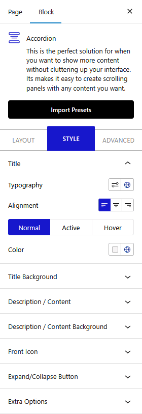
Title Background (Free) – You can use the title background tab to style the background of the accordion title. From here you can control the title’s inner padding, border, background and spacing between the accordion items.
Description/Content (Free) – Under this tab, you will find the typography and alignment options for the accordion inner content.
Description/Content Background (Free) – From here you can style the background of the accordion description area apart from that you can also control the padding, margin and border.
Toggle Icon (Free) – Use this tab to style the standard expand and collapse icons of the accordions. Here you can control the icon color, size and gap (from the title text).
Front Icon (Free) – If you want to control the style of the additional icons of your accordion, you can do so from this tab. You can manage the size, color and spacing of the icon.
Expand/Collapse Button (Pro) – You’ll see this tab only when the Expand/Collapse Button toggle is enabled from the Layout tab. From here, you can style the expand and collapse button.
Extra Options (Pro) – Under the Extra Options, you will get two unique hover styles that you can use for the accordion title. You can also customise the hover background color as well.
Advanced – This is our global extension available for all our blocks. From here you can add a custom CSS class in the Additional CSS class(es) field. If you know CSS you can use this class to further finetune the style by using your own custom CSS.
Advanced options remain common for all our blocks, you can explore all it options from here.

