


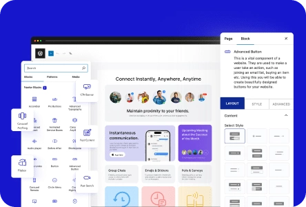
A carousel slider lets you display multiple content pieces, such as images, videos, posts, or custom layouts, in a single scrollable area. The Carousel Anything block in Nexter Blocks gives you a flexible Gutenberg carousel that works with any WordPress block content.
The block supports vertical and horizontal layouts, multiple columns, autoplay, infinite loop, keyboard navigation, mousewheel control, and remote sync with other Nexter Blocks.
Best Used For:
- Agency portfolios cycling through project case studies in a single section
- SaaS landing pages alternating between feature highlights and testimonials
- WooCommerce stores displaying product collections with custom slide layouts per item
Required Setup
- Make sure the default WordPress Block editor is active.
- You need to have the Nexter Blocks plugin installed and activated.
- This is a premium block; you need the PRO version of the Nexter Blocks.
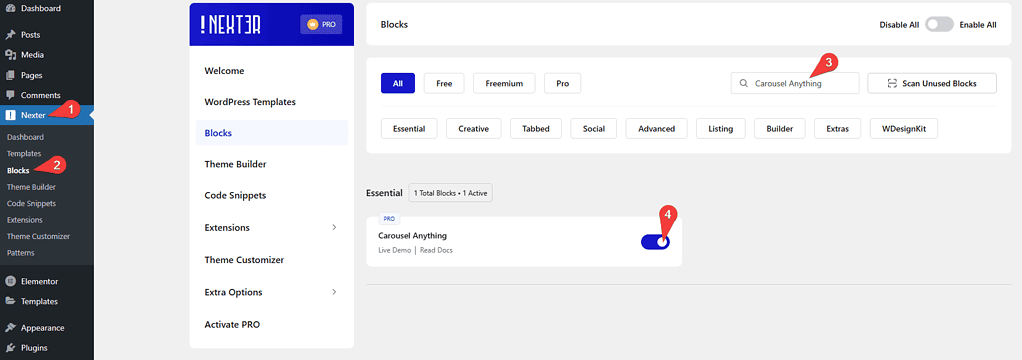
- Make sure the Carousel Anything block is activated. To verify this, visit Nexter → Blocks → and search for Carousel Anything and activate.
Learn via Video Tutorial:

How to activate the Carousel Anything Blocks?
Go to
- Nexter → Blocks
- Search the block name and turn on the toggle.
Key Features
- Use WordPress Patterns – Add any WordPress Pattern as the content of a carousel slide. Use this when you want to reuse a pre-designed layout across multiple slides.
- Unique Carousel ID – Connect the Carousel Anything block to other Nexter Blocks using a shared ID to sync slide transitions across blocks on the same page.
- Vertical Carousel – Create a vertical carousel slider that scrolls up and down instead of side to side.
- Multiple Columned – Add multiple columns to each slide to display several items at once in a single carousel row.
- Custom active slide – Set any specific slide as the active slide when the page loads.
- Infinite loop carousel – Create an infinite loop carousel that cycles through slides continuously without stopping.
- Mousewheel – Allow visitors to advance slides by scrolling with their mouse wheel.
- Keyboard Navigation – Let visitors navigate the carousel using keyboard arrow keys.
- Autoplay carousel – Set the carousel to advance automatically without user interaction.
How to add content in WordPress Carousel Anything block?
To add content in the Carousel Anything block, use WordPress Patterns or the built-in block editor. Patterns let you design slide content using any combination of WordPress blocks, so each slide can have its own layout and structure.
Add images with text, video backgrounds, product showcases, or any other block layout to individual slides.
Content
Add the Carousel Anything block to the page and select the slide item you want to add content to.
Then click on the Design from Scratch button to design the layout from scratch.

Note: By clicking on the Import Pre-Designed Template button, you can import a preset template and customize it as per your requirements.
In the Title field, add a label for the slide. This label does not appear on the front end and is for your reference only.
From the Content Type section, select the type of content to add to the slide. Two options are available:
- Pattern – Use a WordPress Pattern as the slide content. Use this when you have a pre-designed layout saved as a Pattern.
- Editor– Add content directly using the WordPress block editor. Use this when you want to build the slide content from scratch.
Select Pattern for this example.
From the Select Pattern dropdown, choose the pattern you want to use.
Click the + Create Pattern button to create a new pattern if you do not have one already.
After choosing the pattern, the Backend Visibility toggle appears. This is turned off by default to keep the editor clean. Turn it on to preview the slide content in the backend editor, and turn it off again when you are done.
Click the +Add Slide button to add more slides to your carousel.
From the Carousel Transition section, choose the transition type between slides. Two options are available:
- Slide – To add a sliding transition between slides.
- Fade – To add a fade transition between slides.
From the Layout section, choose the carousel orientation. Two options are available:
- Horizontal – To create a horizontal slider.
- Vertical – To create a vertical slider.
From the Column dropdown, set the number of columns to display on each slide. Use multiple columns when you want to show several items at once, such as a product row or a testimonial grid.
For dedicated slider types such as a testimonial carousel, WooCommerce product carousel, or blog post carousel, Nexter Blocks has specific blocks designed for each use case:
- Post Listing Block
- Product Listing Block
- Testimonial Block
- Media Carousel (Includes Image and Video)
- Service Box Carousel
Carousel Layout
From the Active Slide dropdown, select which slide is active when the page loads. Use this when you want to highlight a specific slide, such as a featured product or an important announcement.
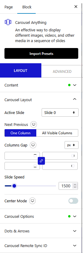
From the Next Previous section, set how many columns advance when a visitor clicks the next or previous control. Two options are available:
- One Column – To move one column only.
- All Visible Columns – To move all the visible columns at once.
Note – Depending on the number of columns set in the Column dropdown.
Adjust the spacing between columns from the Columns Gap section.
From the Slide Speed section, set the transition speed between slides.
Enable the Center Mode toggle to highlight the center slide with padding, scale, or opacity effects. Use this when your layout has multiple visible columns and you want to draw attention to the middle item.
Carousel Options
Enable the Wheel Navigation toggle to allow visitors to advance slides by scrolling with their mouse wheel. This is useful when embedding the carousel in a full-screen layout where mouse scroll would otherwise be intercepted by the page.
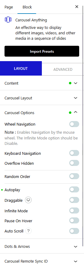
Enable the Keyboard Navigation toggle to allow visitors to navigate slides using keyboard arrow keys. This is useful for accessibility and for users who prefer keyboard-only navigation.
Enable the Overflow Hidden toggle to hide slide content that extends beyond the carousel container. Use this when your slides contain scaled or rotated elements that would otherwise break outside the carousel boundaries.
Enable the Random Order toggle to display slides in a randomized sequence each time the page loads. Use this when you want to show different content on each visit, such as rotating promotional banners.
Enable the AutoPlay toggle to advance the carousel slides automatically without user interaction. Use this when you want to showcase content without requiring visitors to click through manually.
Enable the Draggable toggle to allow visitors to drag slides left and right with their cursor or touch input. Use this when your carousel is embedded in a touch-first or mobile layout where swiping is more natural than clicking navigation arrows.
Enable the Infinite Mode toggle to loop the carousel continuously when it reaches the last slide. Use this when you want the carousel to feel continuous, or when you have fewer slides than the number of visible columns.
Enable the Pause On Hover toggle to pause automatic slide advancement when a visitor hovers over the carousel. Use this alongside AutoPlay when your slides contain text or CTAs that visitors need time to read.
Enable the Auto Scroll toggle to make the carousel advance at a continuous speed without pausing between slides. Use this for logo strips or ticker-style carousels where you want smooth, uninterrupted movement rather than slide-by-slide transitions.
Note: For Auto Scroll to work properly, make sure to disable Autoplay. This feature only works in the front end, you won’t see any preview in the backend.
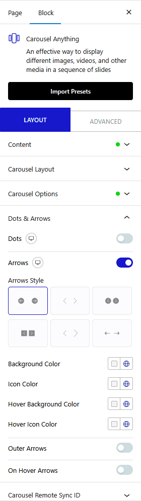
Dots & Arrows
Enable the Dots toggle to show dot navigation below the carousel. Choose a pre-set dot style and adjust border color, top spacing, and device-level visibility.

Enable the Arrows toggle to show navigation arrows on the carousel. Choose a pre-set arrow style and adjust icon colors, position, and device-level visibility.
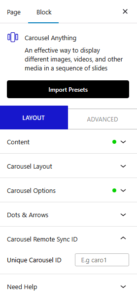
Carousel Remote Sync ID
From the Unique Carousel ID section, enter a shared ID to connect the Carousel Anything block to another Nexter Blocks element on the same page.
How Does This Work?
The connection feature in Nexter Blocks links two blocks using a shared ID. Enter the same ID on both blocks to establish the connection.
Both blocks must have matching item counts for connected properties. For example, if you connect the Carousel Anything block to the Process Steps block, the number of slides must match the number of steps.
Once connected, advancing the carousel also advances the linked block.
The following docs cover common use cases for this connection:
- Carousel Anything with Carousel Remote
- Carousel Anything with Tabs & Tours
- Carousel Anything with Accordion block
- Carousel Anything with Process Steps block
Advanced options are available for all Nexter Blocks. Review all available settings from the Advanced tab documentation.
