The Progress Bar block from the Nexter Blocks helps you show data and stats in a fun and attractive way, making it easier to share information with your audience.
Required Setup
- Make sure the default WordPress Block editor is active.
- You need to have the Nexter Blocks plugin installed and activated.
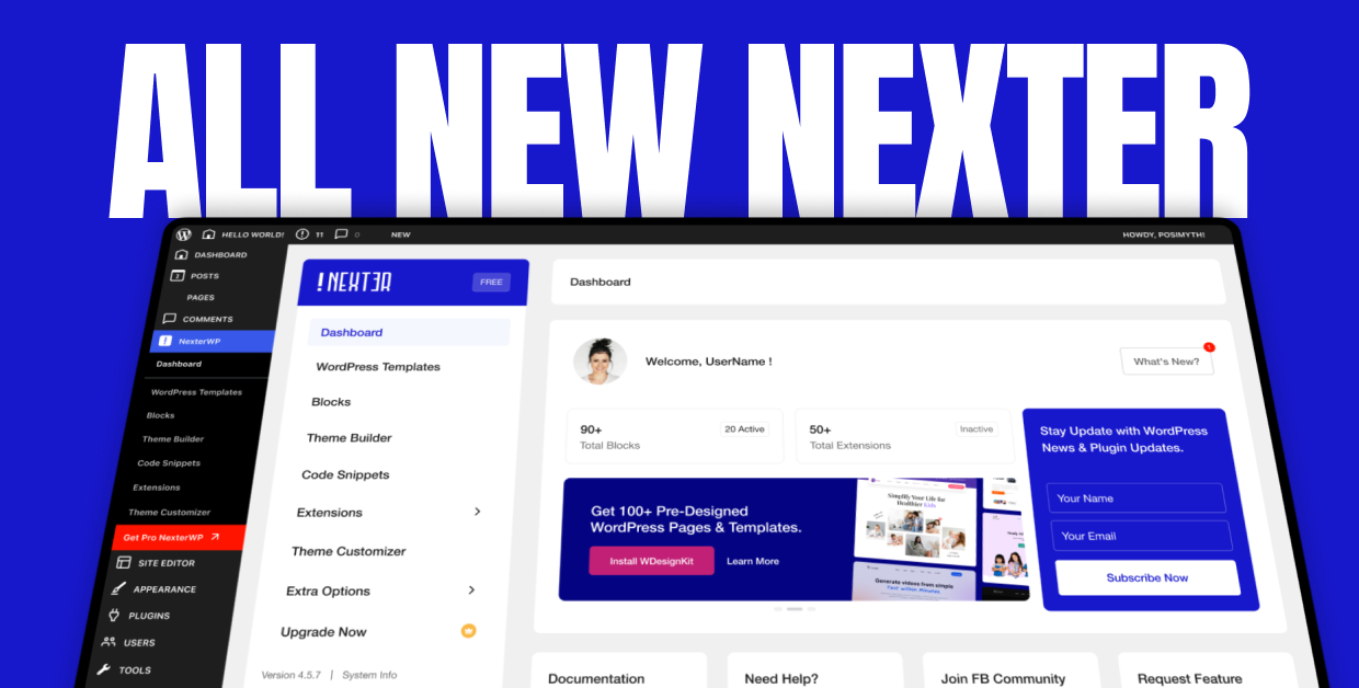
- Make sure the Progress Bar block is activated, to verify this visit Nexter Blocks → Blocks → and Search for Progress Bar and activate.
Learn via Video Tutorial
How to activate the Progress Bar Block?
Go to
- Nexter Blocks → Blocks
- Search the block name and turn on the toggle.

Key Features
- Bar Progress – You can easily add linear progress bars.
- Circle Progress: You can create circular progress bars.
- Multiple Styles – You can add multiple styles for progress bars.
- Multiple Image Type – You can select multiple types of Image/Icon for the progress bar.
How to Use the Progress Bar Block?
Add the Progress Bar block to the page.
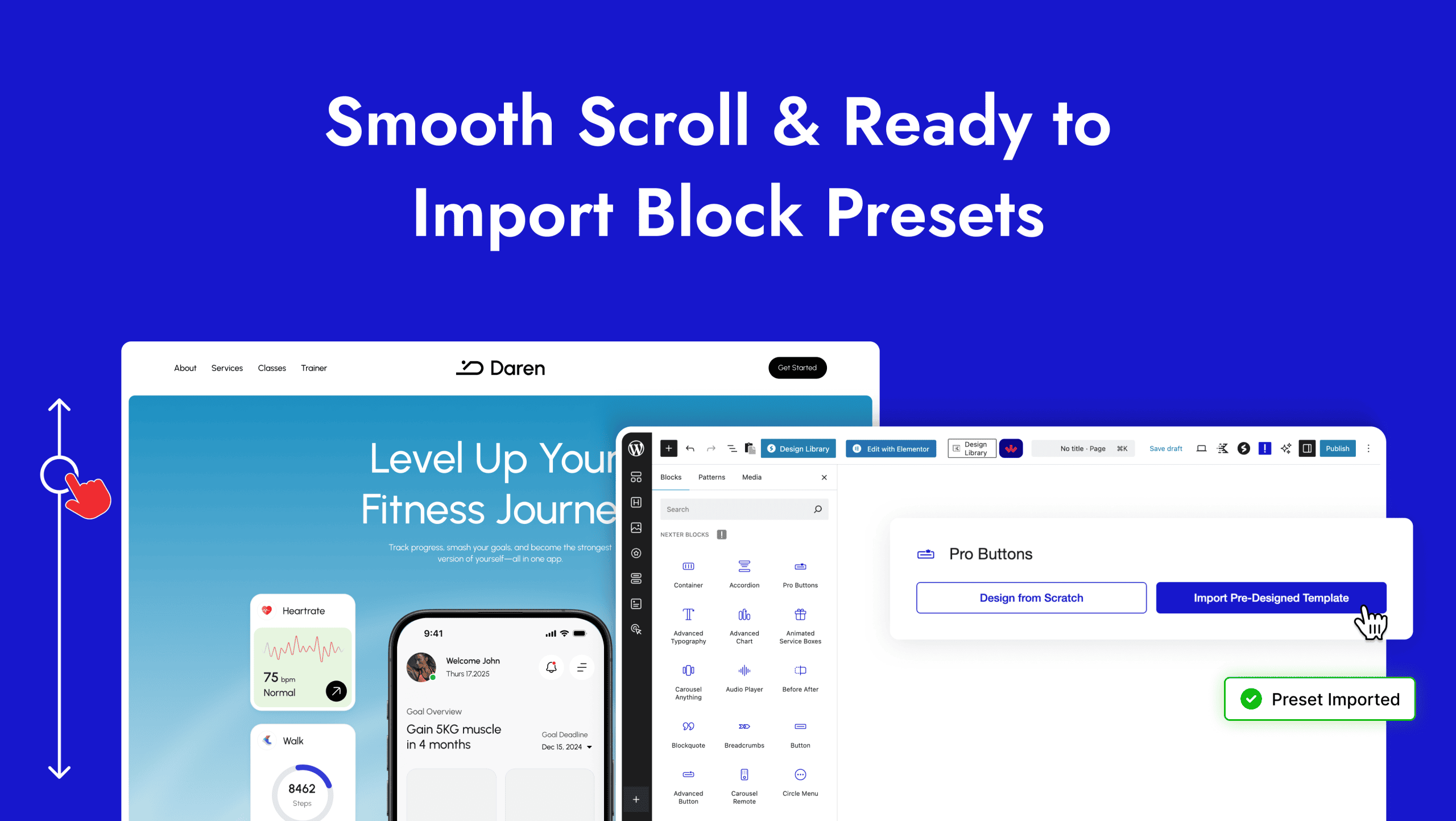
Then click on the Design from Scratch button to design the layout from scratch.

Note: By clicking on the Import Pre-Designed Template button, you can import a preset template and customize it as per your requirements.
Layout
From the Select Layout section, you have to select the layout type. Here you’ll find two options –
- Progress Bar – To add a line progress bar.
- Pie Chart – To add a circle progress bar.
Let’s select Progress Bar here.
Then, from the Style section, you can select a style for the progress bar.
From Title, you can add a title for the progress bar.
From Sub Title, you can add a subtitle for the progress bar.
After that in the Value (0-100) field, you have to set a value between 0 and 100 that will control how much of the progress bar is filled in.
From the Display Number toggle, you can show or hide the Value from the progress bar.
In the Symbol field, you can add a symbol to the progress bar.
With the Symbol Position section, you can select whether the symbol appears before or after the progress bar.

Icon/Image
From here you can add an icon for the progress bar.
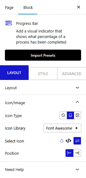
From the Icon Type section, you can select the icon type. Here you’ll find three options –
- None – To add no icon in the progress bar.
- Icon – You can add Font Awesome icons and text in this option.
- Image – In this option, you can use an image with text.
After that, from the Position section, you can select whether the icon appears before or after the progress bar.
How to Style the Progress Bar Block?
To style the Progress Bar, you’ll find all the options in the Style tab.
Progress Bar – From here, you can manage the top margin and add background color to the progress bar.
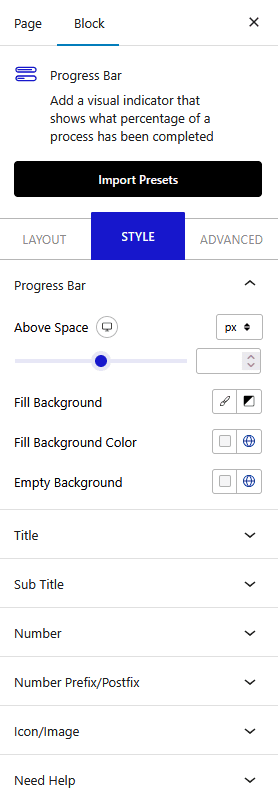
Title – From here, you can manage the title style.
Sub Title – From here, you can manage the sub-title style.
Number – From here, you can manage the number style. You can change the typography and number color.
Number Prefix/Postfix – From here, you can manage the symbol style in the progress bar.
Icon/Image – From here, you can manage the icon style.
Advanced options remain common for all our blocks, you can explore all it options from here.
