


If you are looking for a smarter way to tweak your website navigation, an off-canvas menu in WordPress is all you need. These slide-in navigation menus that otherwise remain hidden instantly enhance your website’s UI and keep the navigation minimal and uncluttered.
With a sleek layout, these responsive menus combine the best of functionality and aesthetics, offering a rewarding user experience on mobiles and even desktops. However, this feature is not available in WordPress by default.
Fortunately, you can easily create a responsive flyout menu in WordPress with custom code or a third-party plugin.
How? In this article, we’ll discuss what an off-canvas menu in WordPress is, why it’s important, and how to create an off-canvas menu in WordPress for developers.
What is an Off-Canvas Menu in WordPress?
An off-canvas menu is a navigation menu that slides in from the edge of your WordPress screen, typically triggered by an icon or a button.
An off-canvas menu or WordPress sidebar menu makes your website navigation highly responsive, allowing users to access different pages of the site seamlessly on any device.
The menu stays hidden and becomes visible only when your users need it. That way, it offers a quick and easy way to navigate without cluttering your website screen.
Benefits of Using an Off-Canvas Menu
Adding an off-canvas menu to your WordPress website is an excellent way to make your website navigation more intuitive and engaging. Here’s why it is a good idea-
- Improved mobile user experience: It makes your website mobile-responsive while having a great smartphone experience.
- Saves screen space: An off-canvas menu saves screen space by allowing you to make the navigation menu pop up only when you need it, otherwise staying out of sight.
- Clean and minimal design: Ensures your WordPress website has a sleek design, keeping the interface clean and clutter-free.
- Supports sub-menus: With an off-canvas menu, you can add other granular options, such as sub-menus, that let you present your menu items in an organized manner. This will be a smart move for launching featured products and those requiring special promotion.
Looking to enhance your website navigation with a clutter-free menu style? Learn How to Create a Mega Menu in WordPress Using Gutenberg.
How to Add Off-Canvas Menu in WordPress Manually (For Developers)
Adding an off-canvas menu in WordPress can be best achieved through custom code in CSS and JavaScript. These tailored snippets enable you to include complex functionality in an off-canvas menu.
To begin, write the following HTML code for your website off-canvas menu-
<div id="mySidenav" class="sidenav">
<a href="javascript:void(0)" class="closebtn" onclick="closeNav()">×</a>
<a href="#">About</a>
<a href="#">Services</a>
<a href="#">Clients</a>
<a href="#">Contact</a>
</div>
<!-- Use any element to open the sidenav -->
<span onclick="openNav()">open</span>
<!-- Add all page content inside this div if you want the side nav to push page content to the right (not used if you only want the sidenav to sit on top of the page -->
<div id="main">
...
</div>Next, create a new CSS class in your stylesheet to control the appearance of the off-canvas menu and add the following code-
/* The side navigation menu */

.sidenav {

  height: 100%; /* 100% Full-height */

  width: 0; /* 0 width - change this with JavaScript */

  position: fixed; /* Stay in place */

  z-index: 1; /* Stay on top */

  top: 0;

  left: 0;

  background-color: #111; /* Black*/

  overflow-x: hidden; /* Disable horizontal scroll */

  padding-top: 60px; /* Place content 60px from the top */

  transition: 0.5s; /* 0.5 second transition effect to slide in the sidenav */

}

/* The navigation menu links */

.sidenav a {

  padding: 8px 8px 8px 32px;

  text-decoration: none;

  font-size: 25px;

  color: #818181;

  display: block;

  transition: 0.3s;

}

/* When you mouse over the navigation links, change their color */

.sidenav a:hover {

  color: #f1f1f1;

}

/* Position and style the close button (top right corner) */

.sidenav .closebtn {

  position: absolute;

  top: 0;

  right: 25px;

  font-size: 36px;

  margin-left: 50px;

}

/* Style page content - use this if you want to push the page content to the right when you open the side navigation */

#main {

  transition: margin-left .5s;

  padding: 20px;

}

/* On smaller screens, where height is less than 450px, change the style of the sidenav (less padding and a smaller font size) */

@media screen and (max-height: 450px) {

  .sidenav {padding-top: 15px;}

  .sidenav a {font-size: 18px;}

}
Finally, you will also need to add JavaScript and jQuery code to dynamically display or hide the menu on the website based on the user interaction. This includes adding the following lines of code-
/* Set the width of the side navigation to 250px and the left margin of the page content to 250px */

function openNav() {

  document.getElementById("mySidenav").style.width = "250px";

  document.getElementById("main").style.marginLeft = "250px";

}

/* Set the width of the side navigation to 0 and the left margin of the page content to 0 */

function closeNav() {

  document.getElementById("mySidenav").style.width = "0";

  document.getElementById("main").style.marginLeft = "0";

}
However, while CSS/JavaScript code lets you create an offcanvas mobile menu in WordPress tailored to your needs, this approach requires sound technical skills.
Want to add more dynamic content to your WordPress website to improve user experience? Do it with custom fields. Know How to Add Custom Fields in Gutenberg.
How to Add an Off-Canvas Menu in WordPress Using a Plugin
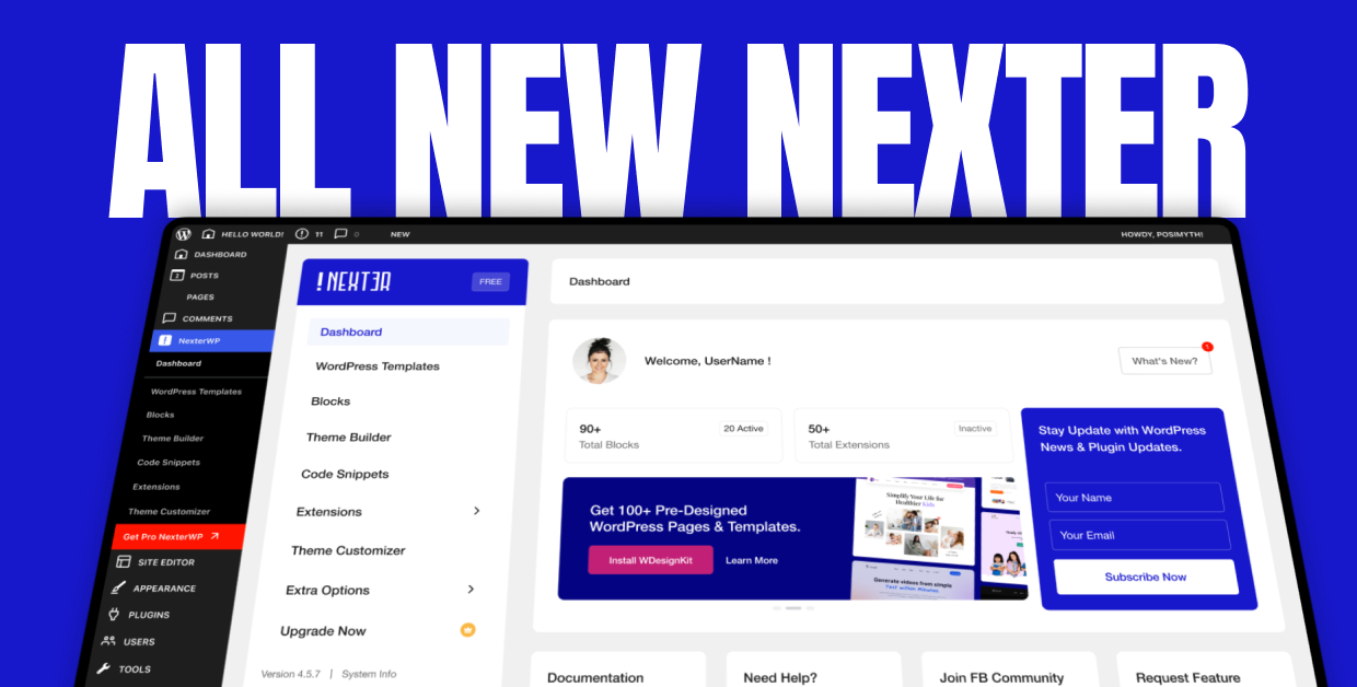
If coding isn’t your cup of tea, there are other ways to create a hidden WordPress menu, such as using a WordPress plugin. With a reliable plugin like Nexter Blocks, you can create an off-canvas navigation menu effortlessly, as it offers a simple drag-and-drop interface and user-friendly features.
Let’s see how.
Method 1: Using Nexter Blocks (Gutenberg)
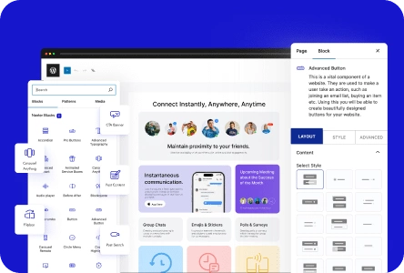
Nexter Blocks offers an effortless and no-code way to build off-canvas menus on your WordPress pages. With the Navigation Menu Block from Nexter Blocks, you can easily add an off-canvas menu to your website to enhance user navigation.
Step 1: Install Nexter Blocks
To get started, go to Plugins > Add New Plugin on your WordPress dashboard and search for Nexter Blocks.
Install and activate the plugin.
Step 2: Add the Navigation Menu Block
Back on the WordPress dashboard, go to Pages to add a new website page or open an existing one and edit it in the Gutenberg editor.
Click on the ‘+’ icon and search for the Navigation Menu block. Click on it to add the navigation menu header.

Next, go to the Navigation Content tab on the right. Select Type, layout, and menu.

Step 3: Edit the Mobile Menu
Next, click on the Mobile Menu tab. Enable the Responsive Mobile Menu on the toggle.

Under the Open Mobile Menu (Screen width) section, enter an appropriate width for your offcanvas mobile menu.
Now, you will see two options in the Mobile Menu drop-down if you have selected Manual Menu in the Navigation Bar–
- Standard: This lets you use your WordPress menu as a mobile menu.
- Custom: This lets you use a custom menu as a mobile menu.
For this process, let’s select Standard.

Step 4: Create the Off-Canvas Menu
From the Select Menu drop-down, choose from the pre-existing menus that you want to display on the website. Go to Menu type and choose Off-Canvas.
Next, click on the Show Template toggle to enable it and use a pattern as an off-canvas mobile menu. After this, you can start customizing the menu location and design-
- Go to the Custom Width section and set a pop-up width.
- From the Toggle style drop-down, set the desired toggle style.
- Use the Toggle Alignment section to set a specific toggle alignment.
- In the Navigation Alignment section, you can align your mobile menu items.
This will create a highly responsive hamburger menu in your WordPress website that you can access by clicking on the toggle button on mobile.
Method 2: Other Free Plugins
While Nexter blocks let you create an off-canvas menu in WordPress in just a few steps, there are other free plugins that you can explore.
Among these, the WP off-canvas menu is an extremely robust and customizable plugin that offers all the settings essential to make changes on WordPress. Max Mega Menu is another that offers a host of WordPress-compatible menu management plugins that enable you to enhance the functionality of your existing menus.
If you’re looking for more, Quad Menu is a fully customizable WordPress plugin that makes it easy to create responsive WordPress mobile menus across different developer skills.
Here’s a table comparing various attributes of different off-canvas menu plugins, including the Nexter Gutenberg Blocks menu:
| Plugin name | Mobile Optimization | Suitability | Free Version | Pros | Cons |
|---|---|---|---|---|---|
| Nexter Blocks | Yes | Good for beginners and expert developers | Yes | Easy to use, no-code Gutenberg plugin to create responsive and customized off-canvas menus. | You may need the Pro version to unlock full plugin functionalities and design elements. |
| Max Mega Menu | Yes | Great for websites that need mega menus | Yes | The user-friendly plugin offers a wide range of customization and styling options for your navigation menus. | Initial setup and configuration can be complicated. |
| WP Mega Menu | Yes | Offers easy setup for creative menus | Yes | Compatible with most of the popular WordPress themes and WooCommerce. | Complex mega menu designs rich in media and animation can slow down the performance. |
| Quad Menu | Yes | Expert developers looking to create a bespoke solution | Yes | Quad Menu offers extensive customization options and a user-friendly interface to create responsive flyout menus. | The plugin lacks a live preview, so you may not be able to see the changes in real time. |
Customizing Off-Canvas Menu Design and Behavior
When creating an off-canvas menu on WordPress, it’s essential to strike a balance between aesthetics and functionality. Overdoing or downplaying either could impact the design and performance, leading to a bad user experience.
With Nexter Blocks, you can customize and stylize your off-canvas menu in WordPress to seamlessly align with your overall website design and aesthetic.
A. Menu Styling
Visual elements such as icons, buttons, text, and overall menu layout ensure you achieve the expected results. When editing the off-canvas navigation menu in WordPress, simply go to the Style section on the right and click on Mobile Menu to style your website menu.

Here, you can customize the toggle height, margin, and color. You can also change the typography, background images, color, margins, and more. While doing so, here are some tips to make the design stand out-
- Ensure your flyout menu visually aligns with your site’s design
- Make the hamburger menu icon easy to spot.
- Choose a text font and size that appears legible on all devices.
- Use a consistent layout that aligns with your page.
- Include relevant images or icons, but don’t let them override your menu.
If your menu includes profile logos or previews of posts, make sure any thumbnails follow social media image sizes so elements stay sharp across devices.
B. Responsive and Accessible
Another pivotal aspect in customizing your menu is ensuring responsiveness and accessibility. Nexter Blocks lets you create a stunning fly out menu for mobile that makes it easy for users to navigate around the site. Here are some ways to enhance the responsiveness of your mobile menu when styling with Nexter Blocks-
- Choose an appropriate width and height for the menu to ensure enough screen spacing.
- Apply and adjust padding suitably for a better mobile-friendly experience.
- Include a text-to-background contrast feature to assist visually challenged users.
C. User interactivity
You must focus on designing a menu that best suits your users’ needs while creating a seamless browsing experience. Here are some ways to improve user interaction with your website menu-
- The menu’s elements, like text highlighting, font, and more, should appear instantly when a user hovers over them.
- The menu must open and close smoothly without lagging.
Improve your website menu and navigation with a sticky header. Understand How to Create a Sticky Header Navigation in WordPress.
Best Practices for Off-Canvas Menus
As a website developer or owner, your primary focus is on providing your website users with a fantastic experience. However, there’s another essential point that may slip your mind. And that’s SEO.
Unless your website ranks, you can’t find users, and there’s no question of user experience, either. It’s that straightforward. A little-known fact is that sometimes hidden menus can impact SEO. Check out these best practices to reap the best from an off-canvas menu without affecting the SEO.
- Make your menu crawlable: Your off-canvas menu may include links with some critical content. A golden rule in such cases is to keep your menu accessible to search engine crawlers.
- Keep the menu simple: Search engines fetch the best results with a crisp and clear menu layout. Don’t stuff your menu with too many links. The more cluttered your menu, the more difficult it is for users and crawlers.
- Avoid hiding too much content: Off-canvas menus remain hidden until you trigger them with a specific action. However, having too much content within the menu may confuse the search engines. The rule of thumb is to:
o Keep “the most” important information visible to users and crawlers
o Never link your home page or other critical sections to these menus.
o Main content and CTAs must only be on visible menus.
Stay updated with Helpful WordPress Tips, Insider Insights, and Exclusive Updates – Subscribe now to keep up with Everything Happening on WordPress!
Wrapping Up
To sum up, adding an off-canvas menu in WordPress makes your website mobile-responsive, offering a great experience to users. Additionally, it saves space and keeps your page clutter-free while providing an additional optional navigational menu.
Developers can use their CSS/JavaScript skills to build a WordPress mobile menu and customize it. And, for our non-technical audience, there are useful no-code, user-friendly plugins that make crafting an off-canvas menu in WordPress super-quick and easy.
With Nexter Blocks, unlock an extensive library of over 90+ blocks that boost your Gutenberg editor’s functionality and make website building an absolute breeze.
FAQs on Off-Canvas Menus in WordPress
Can I create an off-canvas menu without a plugin?
Absolutely. However, that requires expertise in coding in CSS and JavaScript. For beginners, a plugin works the best.
Is an off-canvas menu mobile-friendly?
Yes, creating an off-canvas menu is the smartest way to make your website mobile-friendly and offer a great user experience.
What’s the best plugin to add an off-canvas menu?
Nexter Blocks is an excellent no-code, user-friendly plugin option that lets you create an off-canvas menu easily.
How do I trigger an off-canvas menu with a button or icon?
The off-canvas menu automatically pops up when you click on a hamburger icon or a button. These clicks trigger the menu.
Can I add multiple off-canvas menus on the same site?
While you can add multiple off-canvas menus to a site, only one of them is shown at a time.
Will an off-canvas menu affect SEO or Core Web Vitals?
Yes, an off-canvas menu may affect the website’s SEO and ranking. However, you can follow the SEO best practices to make sure your website performs well.
Can I use off-canvas menus on the desktop, too?
While an off-canvas menu may not be necessary on a desktop, you can still use it to make navigation more intuitive and engaging.