---
title: "How to show/hide Arrows & Dots in WordPress Carousel slider?"
url: https://nexterwp.com/docs/showhide-arrows-dots-in-wordpress-carousel/
date: 2023-02-17
modified: 2026-08-30
author: "Aditya Sharma"
description: "By default, a WordPress carousel slider will have some navigation controls like arrows or dots but at times you might want to hide them, especially if you are controlling the..."
image: https://nexterwp.com/wp-content/uploads/2024/05/showhide-arrows-dots-in-wordpress-carousel-1024x519.jpg
word_count: 958
---

# How to show/hide Arrows & Dots in WordPress Carousel slider?

## Key Takeaways

- Nexter Blocks Carousel Anything block adds a dedicated Dots & Arrows section with independent show/hide toggles for dots and arrows.
- Dots settings include 7 style presets, border color, background color, top spacing in px, and hover-only visibility.
- Arrows settings include 6 style presets, position options for top-right, bottom-left, bottom-center, or bottom-right, plus icon color, background color, outer-arrows, and hover-only visibility.
- Nexter Blocks plugin must be installed and active for the Dots & Arrows section to appear in the Carousel Anything block settings.

By default, a WordPress carousel slider will have some navigation controls like arrows or dots but at times you might want to hide them, especially if you are controlling the slider with some other blocks like the Carousel Remote block.

*To check the complete feature overview documentation of the Nexter Blocks* Carousel Anything block, [click here](/docs/carousel-anything-block-settings-overview/).

***Requirement - This block is part of Nexter Blocks. Make sure it is installed and activated.***

[LIVE BLOCK LINK](https://nexterwp.com/nexter-blocks/blocks/wordpress-advanced-carousel-sliders/)

## What It Does

The Dots & Arrows section inside the Carousel Anything block lets you show or hide the pagination dots and the previous/next arrow navigation on a WordPress carousel slider independently of each other. Each control has its own toggle, and once a toggle is on, a full set of styling options appears for desktop, tablet, and mobile.

## Why It Matters

Carousel navigation is not one-size-fits-all. Visible arrows or dots can clash with a minimal design, become redundant when a separate Carousel Remote block already drives the slider, or physically overlap a full-screen hero. Being able to switch each control off (or restyle it) independently means the carousel fits the layout instead of the layout working around the carousel.

## What You Get

- A dedicated Dots & Arrows section in the Carousel Anything block settings

- Independent on/off toggles for dots and for arrows

- Per-device styling (desktop, tablet, mobile) once a toggle is enabled

- Preset style options, color controls, and hover-only visibility for both dots and arrows

## Benefits

- Ship minimal, on-brand carousels without writing custom CSS to hide default navigation

- Avoid duplicate or conflicting navigation when a carousel is already driven by a Carousel Remote block

- Keep full-screen hero sections clean by hiding dots that would otherwise sit on top of content

## Capabilities

Verified against the block's current settings panel:

**Dots:**

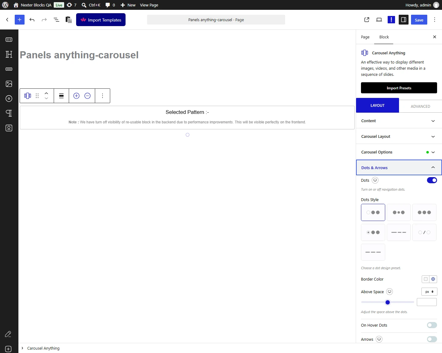
- Show/Hide toggle for the dots navigation

- 7 dot style presets (Style 1 through Style 7)

- Border color and background color for normal and active-dot states

- Top spacing control (px) above the dots row

- Hover-only visibility, so dots appear only when the visitor's cursor is over the carousel

**Arrows:**

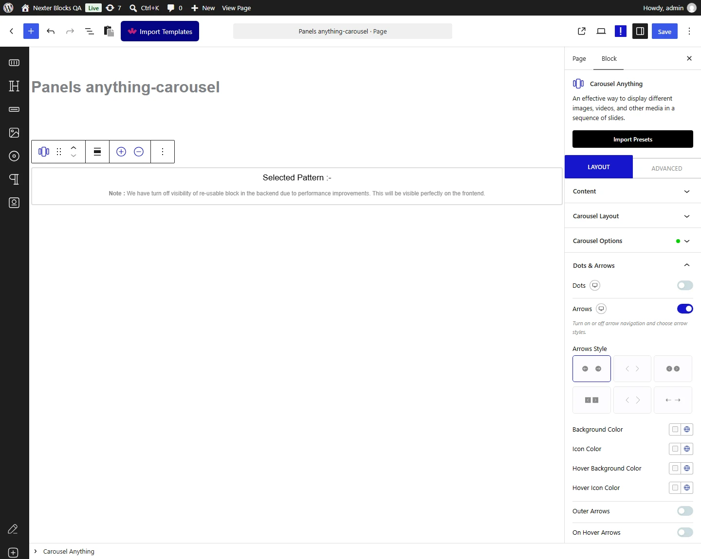
- Show/Hide toggle for the arrow navigation

- 6 arrow style presets (Style 1 through Style 6)

- An arrow position control (top-right, bottom-left, bottom-center, or bottom-right)

- Icon color and background color for normal and hover states

- An outer-arrows option that renders the arrows outside the carousel container (horizontal mode only)

- Hover-only visibility, so arrows appear only when the visitor's cursor is over the carousel

Both dots and arrows are styled through these preset and color fields rather than a raw custom-CSS field, so shape and size beyond the listed presets are not directly editable from the panel.

## How It Works

Each toggle (Dots, Arrows) simply switches the corresponding navigation element on or off for the whole carousel; it is not evaluated per slide. When a toggle is on, the block reveals its matching style group, and those settings apply per breakpoint, so you can, for example, show arrows on desktop but hide them on mobile.

## How to Use It

- Add the Carousel Anything block to the page and create your slides.

- Open the **Dots & Arrows** section in the block settings.

- To hide the dots navigation, toggle off **Dots**. With **Dots** enabled instead, choose a dot style, set the border and background color, adjust the top spacing, and optionally enable hover-only visibility.

- To hide the arrow navigation, toggle off **Arrows**. With **Arrows** enabled instead, choose an arrow style and position, set the icon and background colors, optionally move the arrows outside the carousel container, and optionally enable hover-only visibility.

![Dots & Arrows section in the Carousel Anything block settings panel showing the Dots style, color, and spacing controls](https://nexterwp.com/wp-content/uploads/2023/02/carousel-anything-dots-new2.png)Dots settings in the Carousel Anything block's Dots & Arrows section

![Dots & Arrows section in the Carousel Anything block settings panel showing the Arrows style, position, and color controls](https://nexterwp.com/wp-content/uploads/2023/02/carousel-anything-arrows-new2.png)Arrows settings in the Carousel Anything block's Dots & Arrows section

## Use Cases

- Minimal design portfolios where visible navigation chrome breaks the aesthetic

- Carousels synced to a Carousel Remote block, where the built-in arrows or dots are redundant

- Full-screen hero sections where dot navigation would overlap the content

## Limitations

- The Dots toggle is all-or-nothing for the whole carousel; it cannot automatically hide a single dot for one empty dynamic slide while keeping the rest visible.

- Dot and arrow styling is limited to the built-in style presets plus color and spacing fields; there is no raw custom-CSS field for shape or size in the panel itself.

- The outer-arrows option only applies in horizontal slider mode.

- The Dots & Arrows section only appears when the Nexter Blocks plugin is installed and active.

## Troubleshooting

- **Dots won't hide only for empty/dynamic slides.** A customer running dynamic content in slides asked for a way to hide the dot for a slide left empty by a dynamic field, so the dot count would match only the populated slides (support ticket, closed). The Dots toggle controls the whole navigation row, not individual dots per slide; there is no per-slide dot suppression in the current panel. If your slides come from dynamic fields that can be empty, plan the slide count around that limitation or filter empty entries before they reach the carousel.

- **Arrow styling looks locked to a preset.** A customer asked why arrow styling only offers preset options (Style 1, Style 2, and so on) instead of full custom styling, and a separate customer asked about swapping in fully custom arrow icons (both support tickets, closed). This matches current behavior: arrows are styled through the listed presets plus color and position fields, not a free-form icon or CSS override.

- **The Dots & Arrows section is missing entirely.** Not sourced from a support ticket; this is grounded in the block's own documented requirement above. If the section does not appear in the Carousel Anything settings at all, confirm the Nexter Blocks plugin is installed and active on the site, then reload the editor.

Also, check [How to increase size of Center slide in WordPress Carousel](https://nexterwp.com/docs/increase-slide-in-wordpress-carousel/).

## Frequently Asked Questions

**Q: Why won't the dots hide only for one empty slide in a WordPress carousel?**
A: The Dots toggle controls the whole navigation row, not individual dots per slide. That matters when your slides come from dynamic fields, because an empty slide still affects the dot count. Nexter Blocks only gives you all-or-nothing control here, so the practical fix is to plan the slide count around that limit or filter empty entries before they reach the carousel.

**Q: How do I hide arrows and dots when another control already drives the carousel?**
A: The cleanest setup is to switch off the built-in arrows or dots in the Carousel Anything block when a Carousel Remote block is already handling navigation. Nexter Blocks provides independent toggles for both controls, so you can remove duplicate navigation instead of stacking two systems on top of each other. That keeps the slider from feeling cluttered and avoids conflicting controls.

**Q: What should I use for a full-screen hero carousel so the navigation does not cover the content?**
A: Hiding dots is usually the safer choice for a full-screen hero because pagination can sit on top of text or buttons. Nexter Blocks lets you turn off dots and arrows independently, so you can keep the hero visually clean instead of forcing the layout to work around default navigation. If you still need navigation, hover-only visibility is another option.

**Q: Can I style carousel arrows and dots differently on desktop, tablet, and mobile?**
A: Per-device styling is built into the Dots &amp; Arrows section once a toggle is enabled. That means Nexter Blocks can show one setup on desktop and a different one on tablet or mobile without custom CSS. This matters because carousel controls often need more spacing or less visual weight on smaller screens, especially when they sit near content edges.

**Q: What are the limits of arrow and dot customization in this carousel block?**
A: Customization stays inside preset controls rather than free-form CSS. Dots have 7 presets, arrows have 6 presets, and both expose color fields plus spacing or position options. The tradeoff is simple: you get fast styling inside Nexter Blocks, but shape and size beyond those presets are not directly editable from the panel.

**Q: Why is the Dots & Arrows section missing from my Carousel Anything block settings?**
A: That section only appears when Nexter Blocks is installed and active. If it is missing, the first thing to verify is that requirement before looking at anything else in the editor. Once Nexter Blocks is active, reload the editor so the Carousel Anything block settings can expose the Dots &amp; Arrows controls.